DatePicker
Allows to pick a date, time or interval with flickable tumblers. More...
| Import Statement: |
import Felgo 4.0 |
| Inherits: |
Rectangle
|
Properties
Methods
Detailed Description
The DatePicker control lets the user specify a date or time with flickable Tumbler items. It allows to handle date and time input in a user-friendly
way, especially on mobile platforms with touch input.
The DatePicker control handles all date calculations and formatting. It is set up for ease of use with QML and offers four basic modes:
You can configure your desired mode with the datePickerMode property. For dates and times, the current value is reflected by the selectedDate property. The time interval for countDownMode relies on the countDownDuration property instead.
Usage Examples
Simple Picker for Date and Time
This example shows how to use the default DatePicker to select a date and time:
 import Felgo
 import QtQuick

 App {
   NavigationStack {
     AppPage {
       title: "Date Picker"

       AppText {
         text:  datePicker.selectedDate.toUTCString()
         anchors.horizontalCenter: parent.horizontalCenter
         anchors.bottom: datePicker.top
       }

       DatePicker {
         id: datePicker
         anchors.centerIn: parent
       }
     }
   }
 }
Picking a Time Interval
This example shows how to use the DatePicker to select a time interval:
 import Felgo
 import QtQuick

 App {
     NavigationStack {
       AppPage {
         title: "Time Interval Picker"

         AppText {
           text:  "Duration: "+datePicker.countDownDuration+" minutes"
           anchors.horizontalCenter: parent.horizontalCenter
           anchors.bottom: datePicker.top
         }

         DatePicker {
           id: datePicker
           anchors.centerIn: parent
           datePickerMode: datePicker.countDownMode
         }
       }
     }
 }
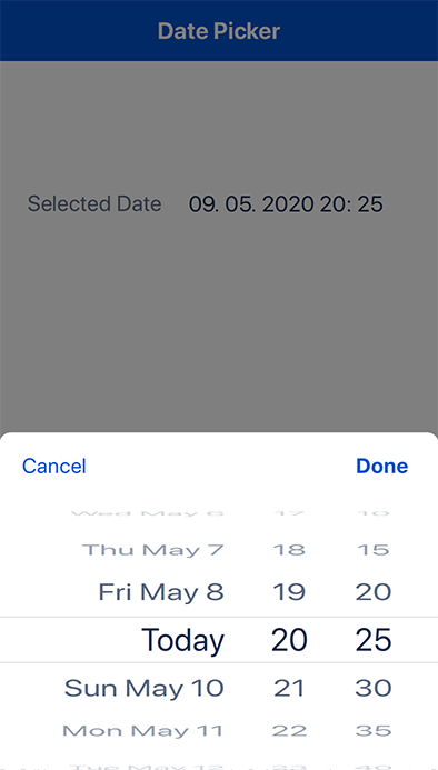
Showing a Modal Date Picker
You can add the date picker anywhere in your user interface. Mobile apps often show an overlay that slides in from the bottom when the user wants to edit a date.
To create such an overlay, you can combine the DatePicker with an AppModal:
import Felgo
import QtQuick
App {
NavigationStack {
AppPage {
title: "Modal Date Picker"
Column {
anchors.centerIn: parent
AppText {
text: pickerModal.pickerDate.toUTCString()
}
AppButton {
text: qsTr("Pick Date")
onClicked: pickerModal.open()
anchors.horizontalCenter: parent.horizontalCenter
}
}
}
}
AppModal {
id: pickerModal
fullscreen: false
modalHeight: doneButton.height + datePicker.height + NativeUtils.safeAreaInsets.bottom
property date pickerDate: new Date()
onClosed: datePicker.setDate(pickerModal.pickerDate)
AppButton {
text: qsTr("Cancel")
anchors.left: parent.left
flat: true
fontBold: false
onClicked: pickerModal.close()
}
AppButton {
id: doneButton
text: qsTr("Done")
anchors.right: parent.right
flat: true
fontBold: true
onClicked: {
pickerModal.pickerDate = datePicker.selectedDate
pickerModal.close()
}
}
DatePicker {
id: datePicker
anchors.top: doneButton.bottom
selectedDate: pickerModal.pickerDate
}
}
}
Customizing the Date Picker
The date picker is a QML Rectangle that holds a row of Tumbler items for date
selection. It uses Theme.backgroundColor as default color, and provides an AppText item as itemDelegate for the tumblers.
Based on the Qt Locale's date format and the datePickerMode, the picker creates and configures Tumbler items automatically.
To customize the picker, you can change the datePickerMode, overwrite the locale setting, or modify derived
configuration properties like:
-
useCombinedDate: Choose whether to have a single date tumbler, or use individual tumblers for year, month and day.
-
dateFormat: Specify a custom date format to change the text of entries when using a single date tumbler.
-
use24HourFormat: Show an AM/PM tumbler, or use a 24 hour format for time selection.
You can also pass own settings for each internal Tumbler item. These properties are available:
You can configure a JSON object with QML property values, which are passed to the tumbler on creation. This is allows to hide individual tumblers, change their width, and more. The examples below show some reference use
cases:
Date Picker for Year and Month
This example uses the dayTumbler property to hide the day selection. The user can only choose the year and month.
 import Felgo
 import QtQuick

 App {
   NavigationStack {
     AppPage {
       title: "Year and Month Picker"

       AppText {
         text:  datePicker.selectedDate.toUTCString()
         anchors.horizontalCenter: parent.horizontalCenter
         anchors.bottom: datePicker.top
       }

       DatePicker {
         id: datePicker
         anchors.centerIn: parent
         datePickerMode: dateMode
         dayTumbler: { "visible": false }
       }
     }
   }
 }
All available QML Tumbler properties can be configured.
Date Picker with Custom Text or Delegate
Each Tumbler also provides a formatDelegateText(index, entry) function, which determines the display text for each entry. Overwrite it with
your own implementation to show custom text instead:
 import Felgo
 import QtQuick

 App {
   NavigationStack {
     AppPage {
       title: "Custom Delegate Text"

       AppText {
         text:  datePicker.selectedDate.toUTCString()
         anchors.horizontalCenter: parent.horizontalCenter
         anchors.bottom: datePicker.top
       }

       DatePicker {
         id: datePicker
         anchors.centerIn: parent
         datePickerMode: dateMode
         useCombinedDate: true
         dateTumbler: {
           "formatDelegateText": function(index, entry) {
             var date = new Date(entry)
             return date.getFullYear()+" | "+(date.getMonth() + 1)+" | "+date.getDate()
           }
         }
       }
     }
   }
 }
To fully replace the default AppText delegate item with your own implementation use the itemDelegate property.
Property Documentation
The last and bottom-most date available in the picker. By default the last available date is 20 years from the current date.
See also startDate and selectedDate.
Whether one or more picker tumblers are currently moving due to a user flick or drag.
Each Tumbler column of the date picker uses a common delegate item for styling the entries. Relevant properties available in the delegate are:
-
parent.tumbler: The Tumbler item instance that holds the delegate.
parent.itemIndex: The index of the entry within the tumbler.parent.itemData: The data value of the entry.
This example wraps a green Rectangle around each entry:
 import Felgo
 import QtQuick

 App {

   NavigationStack {

     AppPage {
       title: "Date Picker with Custom Item Delegate"

       AppText {
         text:  datePicker.selectedDate.toUTCString()
         anchors.horizontalCenter: parent.horizontalCenter
         anchors.bottom: datePicker.top
       }

       DatePicker {
         id: datePicker
         anchors.centerIn: parent
         itemDelegate: Component {
           Rectangle {
             id: delegate
             implicitWidth: parent.width
             implicitHeight: parent.height
             color: "lightgreen"

             AppText {
               anchors.centerIn: parent
               text: delegate.parent.tumbler.formatDelegateText(delegate.parent.itemIndex, delegate.parent.itemData)
             }
           }
         }
       }
     }
   }
 }
To use the picker's date formatting for showing a text value, you can pass the itemIndex and itemData to the formatDelegateText function of the parent tumbler. See Customizing the Date Picker for further details.
|
maxCountDownDuration : int
|
Reflects the selected date of the picker. You can use this property to set or read the current date configuration. This property is not used in countDownMode.
Note: Changing the selectedDate initializes the tumblers from scratch. For moving the tumblers to a new position, use the scrollToDate(date) method
instead.
See also startDate, endDate, and setDate.
The earliest and top-most date available in the date picker. By default it refers to the beginning of year 1970.
See also endDate and selectedDate.
Whether the date picker uses the 24-hour format for time selection. By default it is active for dateTimeMode. Other modes change dynamically based on the timeFormat.
See also timeFormat.
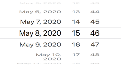
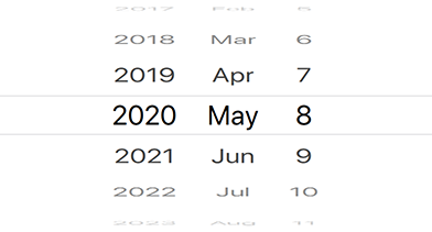
Whether the picker should only provide a single tumbler for date selection, rather than three tumblers for the year, month and day. By default it is only active if the picker operates in dateTimeMode.
See also datePickerMode, dateTimeMode, and dateMode.
The total number of visible items per picker column. The default is 11 items, which means you can see 5 items above and 5 items below the selected date.
Method Documentation
|
[since Felgo 3.10.0] scrollToDate(date)
|
|
[since Felgo 3.10.0] scrollToDuration(duration)
|
|
[since Felgo 3.10.0] setDate(date)
|
Use this function to reset the DatePicker to a specific date. This initializes the date tumblers from scratch and interrupts any ongoing tumbler movement.
This method was introduced in Felgo 3.10.0.
See also selectedDate and scrollToDate.
|
[since Felgo 3.10.0] setDuration(duration)
|
Use this function to reset the DatePicker to a specific countdown duration. This initializes the tumblers from scratch and interrupts any ongoing movement.
This method was introduced in Felgo 3.10.0.
See also selectedDate and scrollToDuration.