This is a demonstration on how to use a polar chart in your QML application.
Running the Example
To run the example from Qt Creator, open the Welcome mode and select the example from Examples. For more information, visit Building and Running an Example.
Using Polar Charts in Qt Quick Applications
We begin with a chart that has a spline series and a scatter series with random data. Both series use the same axes.
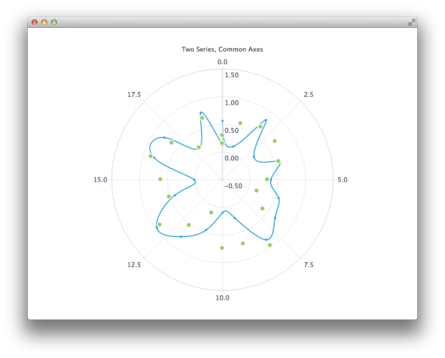
PolarChartView {
title: "Two Series, Common Axes"
anchors.fill: parent
legend.visible: false
antialiasing: true
ValueAxis {
id: axisAngular
min: 0
max: 20
tickCount: 9
}
ValueAxis {
id: axisRadial
min: -0.5
max: 1.5
}
SplineSeries {
id: series1
axisAngular: axisAngular
axisRadial: axisRadial
pointsVisible: true
}
ScatterSeries {
id: series2
axisAngular: axisAngular
axisRadial: axisRadial
markerSize: 10
}
}
Component.onCompleted: {
for (var i = 0; i <= 20; i++) {
series1.append(i, Math.random());
series2.append(i, Math.random());
}
}
The next example shows a chart with some accurate historical data for which we need to use a DateTimeAxis and a AreaSeries.
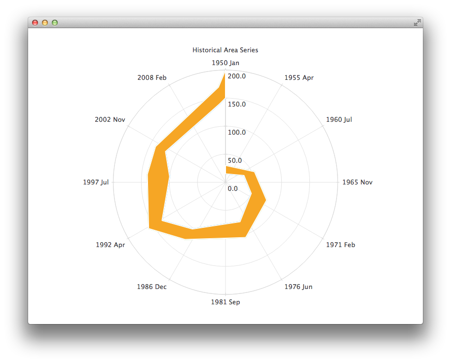
PolarChartView {
title: "Historical Area Series"
anchors.fill: parent
legend.visible: false
antialiasing: true
DateTimeAxis {
id: axis1
format: "yyyy MMM"
tickCount: 13
}
ValueAxis {
id: axis2
}
LineSeries {
id: lowerLine
axisAngular: axis1
axisRadial: axis2
XYPoint { x: toMsecsSinceEpoch(new Date(1950, 0, 1)); y: 15 }
XYPoint { x: toMsecsSinceEpoch(new Date(1962, 4, 1)); y: 35 }
XYPoint { x: toMsecsSinceEpoch(new Date(1970, 0, 1)); y: 50 }
XYPoint { x: toMsecsSinceEpoch(new Date(1978, 2, 1)); y: 75 }
XYPoint { x: toMsecsSinceEpoch(new Date(1987, 11, 1)); y: 102 }
XYPoint { x: toMsecsSinceEpoch(new Date(1992, 1, 1)); y: 132 }
XYPoint { x: toMsecsSinceEpoch(new Date(1998, 7, 1)); y: 100 }
XYPoint { x: toMsecsSinceEpoch(new Date(2002, 4, 1)); y: 120 }
XYPoint { x: toMsecsSinceEpoch(new Date(2012, 8, 1)); y: 140 }
XYPoint { x: toMsecsSinceEpoch(new Date(2013, 5, 1)); y: 150 }
}
LineSeries {
id: upperLine
axisAngular: axis1
axisRadial: axis2
XYPoint { x: toMsecsSinceEpoch(new Date(1950, 0, 1)); y: 30 }
XYPoint { x: toMsecsSinceEpoch(new Date(1962, 4, 1)); y: 55 }
XYPoint { x: toMsecsSinceEpoch(new Date(1970, 0, 1)); y: 80 }
XYPoint { x: toMsecsSinceEpoch(new Date(1978, 2, 1)); y: 105 }
XYPoint { x: toMsecsSinceEpoch(new Date(1987, 11, 1)); y: 125 }
XYPoint { x: toMsecsSinceEpoch(new Date(1992, 1, 1)); y: 160 }
XYPoint { x: toMsecsSinceEpoch(new Date(1998, 7, 1)); y: 140 }
XYPoint { x: toMsecsSinceEpoch(new Date(2002, 4, 1)); y: 140 }
XYPoint { x: toMsecsSinceEpoch(new Date(2012, 8, 1)); y: 170 }
XYPoint { x: toMsecsSinceEpoch(new Date(2013, 5, 1)); y: 200 }
}
AreaSeries {
axisAngular: axis1
axisRadial: axis2
lowerSeries: lowerLine
upperSeries: upperLine
}
}
function toMsecsSinceEpoch(date) {
var msecs = date.getTime();
return msecs;
}
And the final example with a chart that uses a CategoryAxis to make the data easier to understand.
PolarChartView {
    title: "Numerical Data for Dummies"
    anchors.fill: parent
    legend.visible: false
    antialiasing: true

    LineSeries {
        axisRadial: CategoryAxis {
            min: 0
            max: 30
            CategoryRange {
                label: "critical"
                endValue: 2
            }
            CategoryRange {
                label: "low"
                endValue: 7
            }
            CategoryRange {
                label: "normal"
                endValue: 12
            }
            CategoryRange {
                label: "high"
                endValue: 18
            }
            CategoryRange {
                label: "extremely high"
                endValue: 30
            }
        }

        axisAngular: ValueAxis {
            tickCount: 13
        }

        XYPoint { x: 0; y: 4.3 }
        XYPoint { x: 1; y: 4.1 }
        XYPoint { x: 2; y: 4.7 }
        XYPoint { x: 3; y: 3.9 }
        XYPoint { x: 4; y: 5.2 }
        XYPoint { x: 5; y: 5.3 }
        XYPoint { x: 6; y: 6.1 }
        XYPoint { x: 7; y: 7.7 }
        XYPoint { x: 8; y: 12.9 }
        XYPoint { x: 9; y: 19.2 }
    }
}
Example project @ code.qt.io


