
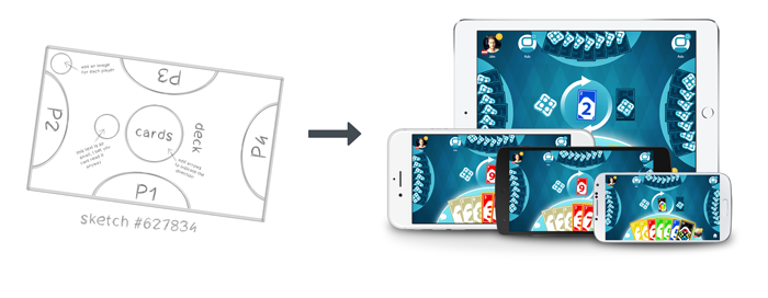
With all the different device form factors today, cross-platform developers are facing the challenge of delivering an equal user experience to every user. This includes different resolutions as well as different aspect ratios, especially when it comes to the countless Android phone manufacturers.
The main questions to take care of are:
I will show you how to master this challenge with ease, using Felgo. The theory behind the solutions I present might also be useful if you are using any other framework, so I suggest you read through this guide anyway!
Let's have a closer look at the questions above, one by one.
Our first question was how to make sure the game logic and mechanics are equal and fair on any device.
Well, we could re-write our code from scratch for any different screen sizes. Or we could re-calculate any x, y, width, height, velocity etc. values depending on the screen size at runtime.

Yeah this does sound like a lot of work. We want to have a single code-base, that is easy to read and maintain. Thus instead we can make use of a neat principle called Content Scaling.
It pretty much means that you design your game once for the lowest resolution that you want to support (called the logical resolution), and just scale it up as a whole on larger resolutions, to offer an equal gaming experience. With Felgo, the default logical resolution is 480x320 (for landscape mode). E.g. an iPhone 4 has a resolution of 960x640, that's exactly double the resolution, so it's easy to scale the game up and it will perfectly fit in the device screen.
With Felgo, the Scene component takes care of that scaling mechanism automatically.
 import Felgo 4.0
 import QtQuick 2.0

 GameWindow {
   // The size of the GameWindow will match the physical size of the device, e.g. 960x640

   Scene {
     // The Scene and all it's content will automatically be scaled up if needed
     // You can access the scale factor with xScaleForScene and yScaleForScene, just in case you need it

     // This is the logical size you use to design your game, setting this is optional
     // Depending on the orientation, the scene size defaults to 480x320 or 320x480
     //width: 480
     //height: 320

     Image {
       anchors.centerIn: parent
       width: 50
       height: 50
       source: "https://felgo.com/web-assets/balloon.png"
     }
   }
 }
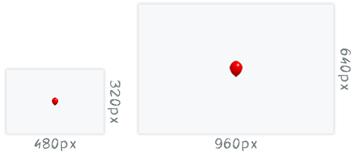
Alright, that one was easy. However what happens if you take an image with 40x40 and scale it up to e.g. double its size? Right, it will get blurry. The next chapter deals with this issue (don't worry, it's easy as well).
We want to avoid images getting blurry when scaling up the scene. An easy solution would be to use a really big image, so effectively it will be scaled down on lower resolution devices. E.g. for our 40x40 image in the game, we use a 160x160 source image, then we can easily scale up the scene to 4 times its logical size. But is this solution ideal? Of course not, this chapter would be way too short that way!
What happens with using only big images, is that we might run out of memory very fast, especially on lower-end devices. We are loading all those big images, even though we are displaying them very small, that is a huge waste of precious memory. A really good solution is to load a different version of your image, depending on the size it is needed on the current device. This technique is very common in mobile development, and Felgo supports this in an elegant way, with the MultiResolutionImage component.
 import Felgo 4.0
 import QtQuick 2.0

 GameWindow {
   // The size of the GameWindow will match the physical size of the device, e.g. 960x640

   Scene {
     // The Scene and all it's content will automatically be scaled up if needed
     // You can access the scale factor with xScaleForScene and yScaleForScene, just in case you need it

     //width: 480
     //height: 320

     Row {
       spacing: 10
       anchors.centerIn: parent

       Image {
         width: 50
         height: 50
         source: "https://felgo.com/web-assets/balloon.png"
       }
       // The MultiResolutionImage will automatically select the ideal image size depending on the device
       MultiResolutionImage {
         width: 50
         height: 50
         source: "https://felgo.com/web-assets/balloon-multi.png"
       }
     }
   }
 }
All that is left for you to do is to provide images with different sizes to select from, typically 3 versions, for SD, HD and HD2 resolutions.
In your assets folder, next to your normal (SD) images, you can make a +hd folder and a +hd2 folder, and put your images there, so the MultiResolutionImage can find them.

If you do not provide an asset in hd or hd2 resolution, the next folder is chosen automatically. So you can start prototyping during development with just a single image version and create the other resolutions later.
To summarize this, Felgo adds support for dynamic image switching based on the screen density and size. This allows you to:
So far so good, now let's move on to devices with different aspect ratios, as so far we only had a look at 3:2 (480x320, 960x640, ...).
Today, especially on Android, we have a huge variety of device ratios, from 4:3 to 16:9 and anything in between. Here are some examples:
| Aspect ratio | Resolutions | Example Devices |
|---|---|---|
| 4:3 | 1024x768 | iPad 1, iPad 2 |
| 2048x1536 | iPad 3 | |
| 3:2 | 480x320 | iPhone 3GS and lower, Android devices |
| 960x640 | iPhone 4, iPhone 4S | |
| 16:10 | 800x480 | Android devices, WindowsPhone7 |
| 1280x800 | Android tablets like Google Nexus 7, Samsung Galaxy Tab 10.1, Motorola Xoom, Asus Eee Pad Transformer | |
| 17:10 | 1024x600 | Android tablets like Samsung Galaxy Tab 7 |
| 16:9 | 640x360 | Symbian3 devices like Nokia C7 |
| 854x480 | Android devices | |
| 1136x640 | iPhone 5 | |
| 1280x720 | HTC One Mini, Samsung Galaxy S3 | |
| 1334x750 | iPhone 6/6S, iPhone 7/7S | |
| 1920x1080 | iPhone 6 Plus, iPhone 7 Plus, Google Nexus 5, Samsung Galaxy S5 | |
| 2560x1440 | Samsung Galaxy S7 |
Your logical scene has a constant aspect ratio, which by default is 3:2 (480x320). Now first we have to decide how we want to fit this scene into another aspect ratio. There are different kind of scale modes that I want to show you, although there is only one which is of real interest to us.
This is the most common scaleMode. The content is scaled uniformly (i.e. with the same value for x and y scale) so the smaller side fits into the display. This setting results in remaining space on the borders, depending on the aspect ratio of the device. If the logical scene size is 480x320 for instance and the device resolution is 1024x640 (ratio 16:10), the used xScale and yScale is 2 and there are 1024 - (480 * 2) = 64 pixels of border on the left and right side together.
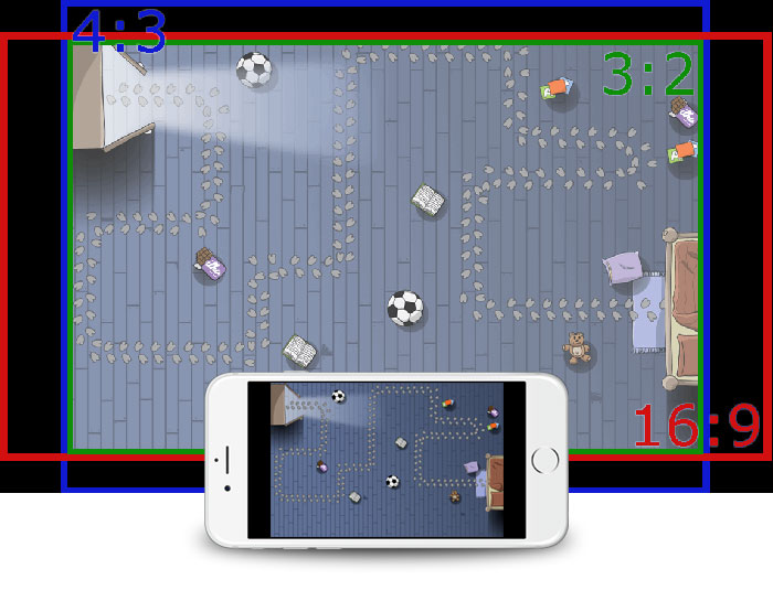
A background image with 3:2 ratio will have black borders on different ratios.
We can easily take care of the black borders, which I will show you in a minute. But let me just quickly mention the other possible scale modes, that we however don't recommend to use in most cases.
This mode scales uniformly to the bigger value of the calculated xScale and yScale settings. Parts of the logical scene will be outside of the screen when the device has a different aspect ratio than the logical scene. This is not suitable for games that require the whole logical scene to be on-screen like tower defense games, because then you would not be able to build towers on the edges and thus have an unfair situation for players with different aspect ratios! If the logical scene size is 480x320 for instance and the device resolution is 1024x640 (ratio 16:10), the used xScale and yScale is 2.13 because 1024 / 480 = 2.13 which is bigger than 640 / 320 = 2.
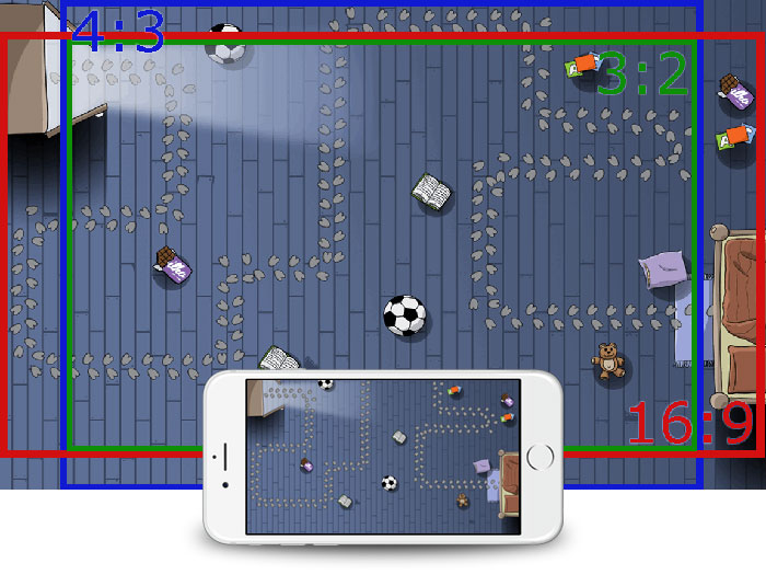
Parts of our logical scene are cropped (e.g. the path on the top), the game becomes unplayable.
With this scaleMode, your logical scene will be scaled to exactly match the screen, which leads to unequal scale factors for x and y if the screen has a different aspect ratio than the logical scene. The result is that the background image and the content get distorted which will be visually distracting. In some rare cases, the distortion is not obvious (e.g. when only a gradient image is used as the background), but most of the time you want to avoid this situation and rather use letterbox or zoomToBiggerSide scaleModes.
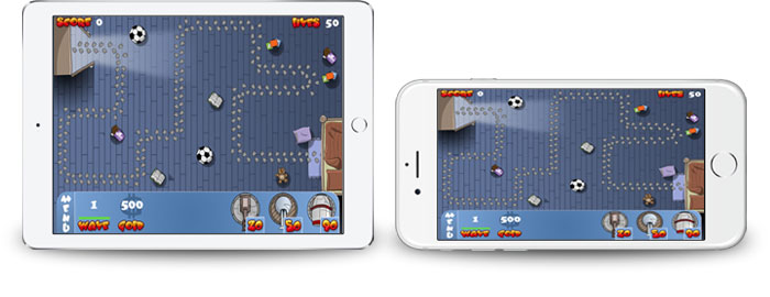
Visual distortions by streching the original 3:2 scene non-uniformly, to 4:3 or 16:9 aspect ratios.
This mode does not perform any content scaling. So the displayed images and fonts will always be the size of the logical scene and will not be scaled to the screen size. This can be used if you want to roll your own scale settings or load different layouts depending on the given screen size.
Alright, back to our scale mode of choice. As we remember, we make the whole scene fit in the device, with possible borders on different aspect ratios.

Instead of just letting this spare space black, it can be used for background images to display additional content that is outside of the logical scene and thus only visible on devices that have a different aspect ratio. Keep in mind to only put graphics in the spare space that are not game-relevant, because they might not be visible on devices with different ratios!
So instead of creating a background in 3:2 ratio, rather create one to fit all the "worst-case" ratios 4:3 and 16:9 as well.
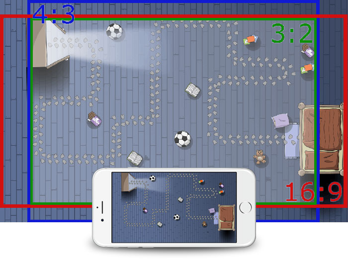
Modern devices with edge-to-edge screens even have a wider ratio than 16:9. For example, the iPhone X comes with a resolution of 2436x1125 pixels for landscape mode. This results in the following sizes for background images:
| Image type | Unmodified 3:2 ratio size | Suggested Background Size |
|---|---|---|
| sd | 480x320 | 694x360 |
| hd | 960x640 | 1388x720 |
| hd2 | 1920x1280 | 2776x1440 |
So with these background sizes, your game will work on all devices and all screen resolutions.
 import QtQuick 2.0
 import Felgo 4.0

 GameWindow {

   Scene {
     // The larger an image becomes, the more important it is to use asset selection for different resolutions!
     MultiResolutionImage {
       // Make sure to just center the image, and let its optimized source size fill the screen automatically
       anchors.centerIn: parent
       source: "https://felgo.com/web-assets/background-multi.jpg"
     }
   }
 }
If you are wondering how these magic numbers for the background images were calculated: Starting from a 3:2 ratio, the worst case for the horizontal stretch will be the 2436:1125 ratio of iPhone X. Thus the wide iPhone X ratio is 1.443555 times bigger than the 3:2 ratio for the xScale. A multiplication of 480x1.443555 equals 692.9 which is rounded up to 693px - however, to avoid 1px off calculations e.g. at centering the minimum size is 694px. The worst caste for the vertical stretch is the 4:3 ratio, which is 1.125 times bigger for the yScale and 320x1.125 equals 360 pixels. That is the starting point for the sd graphics, for the hd versions it is simply doubled each side and hd2 4 times the sd size. I recommend creating the game with a logical scene size with 3:2 ratio, because it is in the middle of the extremes. If we would start with a 16:9 logical scene size for instance, there would be a lot of wasted space for a 4:3 ratio, whereas with the suggested 3:2 ratio the remaining space is equally distributed for all other ratios.
Note: You can download a Photoshop template for your background and the safe zone here. This is how it looks like:
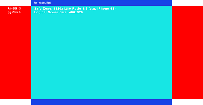
We also prepared a small code example to inspect the aspect ratio and borders on your mobile phone:
 import QtQuick 2.0
 import Felgo 4.0

 GameWindow {

   Scene {
     id: scene
     // the scene size defaults to 480x320 or 320x480 depending on the orientation

     //fills the width of the scene and the height of the whole screen with blue
     Rectangle {
       anchors.centerIn: scene
       width: scene.width
       height: scene.gameWindowAnchorItem.height
       color: "blue"
     }
     // fills the width of the whole screen and the height of the scene with red
     Rectangle {
       anchors.centerIn: scene
       width: scene.gameWindowAnchorItem.width
       height: scene.height
       color: "red"
     }
     // fills the scene with cyan
     Rectangle {
       anchors.fill: scene
       color: "cyan"
     }
   }
 }
Although the logical scene and all the entities should be positioned within the logical scene borders, you will want to place HUD elements containing labels or menus based on the absolute screen position and not relative to the logical scene. So for instance the score or lives text should always be on the edge of the screen and not anchored to the logical scene.
The following image show a bottom menu and score and lives label positioned (or anchored) relative to the logical scene (the bright area). The second image shows the same, but relative to the screen with a 4:3 ratio.
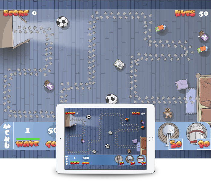
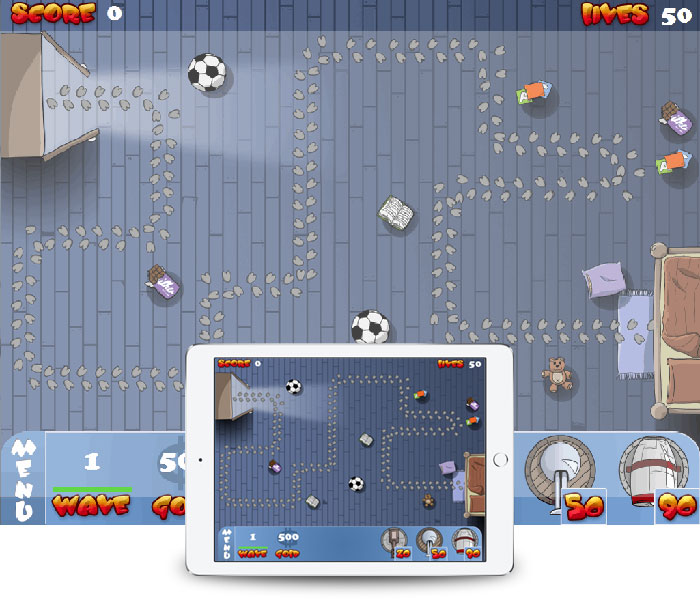
The bottom menu, score and lives label anchored relative to the screen which is the best approach for HUD elements.
Felgo offers the Scene::gameWindowAnchorItem property of the Scene to accomplish this. The following example shows how to use anchors with the gameWindowAnchorItem, to position your HUD along the screen edges.
The above example can be implemented with the following code in Felgo:
 import QtQuick 2.0
 import Felgo 4.0

 GameWindow {
   // this is the size when starting the game on the desktop
   // on mobile devices the size gets set to the full screen automatically
   screenWidth: 1024
   screenHeight: 768

   Scene {
     id: scene

     //width: 480
     //height: 320

     property int score: 0
     property int lives: 50

     Rectangle {
       anchors.fill: parent.gameWindowAnchorItem
       color: "white"
     }

     Text {
       text: "Score " + scene.score
       anchors {
         top: scene.gameWindowAnchorItem.top
         left: scene.gameWindowAnchorItem.left
         leftMargin: 5
       }
     }

     Text {
       text: "Lives " + scene.lives
       anchors {
         top: scene.gameWindowAnchorItem.top
         right: scene.gameWindowAnchorItem.right
         rightMargin: 5
       }
     }

     Rectangle {
       color: "grey"
       height: 40
       anchors {
         bottom: scene.gameWindowAnchorItem.bottom
         left: scene.gameWindowAnchorItem.left
         right: scene.gameWindowAnchorItem.right
       }
     }
   }
 }
By default, the logical scene is centered in the screen, distributing possible borders equal to the left and right, or top and bottom. However there are cases where you might want to change this, and e.g. align the scene to the bottom of the screen, having vertical borders at the top only.
For that cases, the scene alignment property can be used, both with the default value center:
sceneAlignmentX can have one of the values center, left or rightsceneAlignmentY can have one of the values center, top, or bottomThe following is a list of useful Felgo components for handling different screen sizes and a quick explanation of them.
The GameWindow component allows switching resolutions and aspect ratios while testing on the desktop during runtime. This makes it great for testing how the game will look like on
different devices. The various resolutions can be toggled by pressing the keyboard buttons ctrl(cmd)+1-7. Fullscreen can be changed by pressing the keyboard button ctrl(cmd)+F.
The Scene component represents the logical scene, which gets scaled to the screen based on the scaleMode (letterbox is the default setting).
For the MultiResolutionImage component, the correct Felgo File Selectors are automatically selected based on
the scene scale factor. It will either be the default folder, +hd or +hd2.
The components GameAnimatedSprite and GameSpriteSequence support using the correct Felgo File Selectors.
This topic has been covered by others as well, and I want to share some valuable references with you if you want to dig deeper into this topic:
http://developer.android.com/guide/practices/screens_support.html
http://developer.android.com/about/dashboards/index.html#Screens
You can put the learned concepts from this tutorial into action by making a real game.
See these tutorials to learn how to make a Felgo game:
For another tutorial on density independence & multi-screen support, see Supporting Multiple Screen Sizes & Screen Densities with Qt & Felgo.