The ItemEditor allows to modify properties at runtime that were marked with the EditableComponent. More...
| Import Statement: | import Felgo 3.0 |
The ItemEditor can modify all properties of an Item specified in an EditableComponent during runtime. This has the advantage that different settings can be tested immediately without restarting the application.
Following examples will demonstrate the correct usage of the ItemEditor.
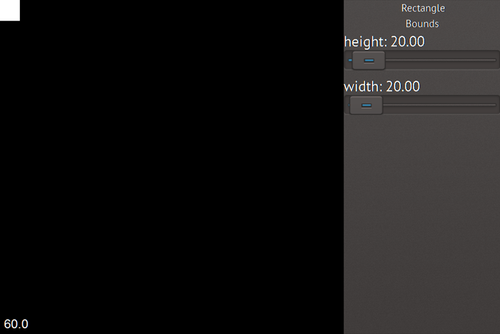
This example shows the most basic usage of ItemEditor. The ItemEditor is anchored to the right side and includes its id itemEditor, which is important that the EditableComponent can register itself correctly in the ItemEditor. The EditableComponent as child of the Rectangle offers the declared properties
width and height to the ItemEditor.
 import Felgo 3.0
 import QtQuick 2.0

 GameWindow {
   Scene {

     Rectangle {
       width: 20
       height: 20

       EditableComponent {
         editableType: "Rectangle"
         properties: {
           "Bounds": {
             "width": {"min": 0, "max": 480},
             "height": {"min": 0, "max": 320}
           }
         }
       }
     }

     ItemEditor {
       id: itemEditor // important to set the id to ItemEditor!
       anchors.right: parent.right
     }
   }
 }
This is how the the above ItemEditor example looks like:

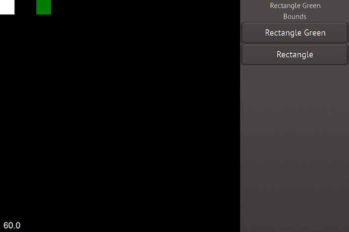
This example demonstrates how to use the editableType to distinguish between different types of items. To define the the type of an item you can set the EditableComponent::editableType to different values. To change the editableType displayed you can set currentEditableType of the ItemEditor to the type you want. Additionally you can simply change the currentEditableType by clicking on the header of the ItemEditor and select one from the list which appears. In the list all editableTypes of the whole application are listed.
 import Felgo 3.0
 import QtQuick 2.0

 GameWindow {
   Scene {

     Rectangle {
       width: 20
       height: 20

       EditableComponent {
         editableType: "Rectangle"
         properties: {
           "Bounds": {
             "width": {"min": 0, "max": 480},
             "height": {"min": 0, "max": 320}
           }
         }
       }
     }

     Rectangle {
       x: 50
       width: 20
       height: 20
       color: "green"

       EditableComponent {
         editableType: "Rectangle Green"
         properties: {
           "Bounds": {
             "width": {"min": 0, "max": 480},
             "height": {"min": 0, "max": 320}
           }
         }
       }
     }

     ItemEditor {
       id: itemEditor // important to set the id to ItemEditor!
       anchors.right: parent.right
     }
   }
 }
This image shows the list of editableTypes that appears after clicking on the ItemEditor header:

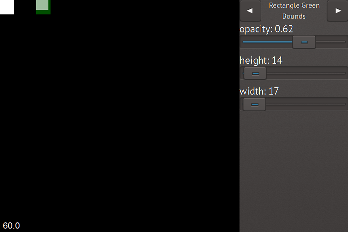
This example demonstrates how grouping works inside of an editableType. Two different editableTypes are given, same as the example before but the second Rectangle
contains another Rectangle. Each Item can have a different amount of EditableComponents. This allows to differentiate between logical elements, for example physics component and entity component. Each EditableComponent has its EditableComponent::defaultGroup set to its editableType by default. The defaultGroup is used by the
ItemEditor to add any property in this group which was stated without an extra group like the visible property of the inner rectangle. The Behavior group is only available for the inner Rectangle. The
properties of the Bounds groups of the Rectangle and inner Rectangle will be merged.
 import Felgo 3.0
 import QtQuick 2.0

 GameWindow {
   Scene {

     Rectangle {
       width: 20
       height: 20

       EditableComponent {
         editableType: "Rectangle"
         properties: {
           "Bounds": {
             "width": {"min": 0, "max": 480},
             "height": {"min": 0, "max": 320}
           }
         }
       }
     }

     Rectangle {
       x: 50
       width: 20
       height: 20
       color: "green"

       Rectangle {
         width: 5
         height: 5

         EditableComponent {
           editableType: "Rectangle Green"
           defaultGroup: "Inner Rect"
           properties: {
             "Bounds": {
               "width": {"min": 0, "max": 480},
               "height": {"min": 0, "max": 320}
             },
             "Behaviors": { // Properties Group names must not have the same name as a property. e.g. "Behavior" would cause and error, because there is a property called Behavior.
               "x": {"min": 0, "max": 20},
               "y": {"min": 0, "max": 20},
               "rotation": {"min": 0, "max": 360}
             },
             "visible": {}
           }
         }
       }

       EditableComponent {
         editableType: "Rectangle Green"
         properties: {
           "Bounds": {
             "opacity" : {"min": 0, "max": 1, "stepsize": 0.01}
           }
         }
       }
     }

     ItemEditor {
       id: itemEditor // important to set the id to ItemEditor!
       anchors.right: parent.right
     }
   }
 }
This is how the merged Bounds groups look like:

The ItemEditor supports following types as properties of the EditableComponent targets: Bool, Number, Point, Color, Url (textures), String and Array. Each of those types are represented by the according delegates. For more information which types are supported see EditableComponent::properties.
Loading GUI elements of editable components can be very performance intensive when a lot of objects get created at once. This blocks the main thread. Therefore, you can use signals to enable a loadscreen before the ItemEditor
starts working. Either you use the states of the ItemEditor itemEditor.state === "loading" to set your loadscreen visible or you use the signals handlers loading
and loaded to enable or disable your loadscreen. Following example shows how to use a Simple Rectangle with Text as loadscreen.
 import Felgo 3.0
 import QtQuick 2.0

 GameWindow {
   Scene {

     ItemEditor {
       id: itemEditor // important to set the id to ItemEditor!
       anchors.right: parent.right
     }

     Rectangle {
       width: parent.width
       height: parent.height
       visible: itemEditor.state === "loading"
       opacity: 0.5
       color: "black"

       Text {
         anchors.centerIn: parent
         text: "Loading..."
       }
     }
   }
 }
See also Particle Editor Demo, GUIElements Test, ItemEditor Test, and EditableComponent.
|
arrayDelegate : Component |
This property defines the array delegate which is used to handle array properties of the EditableComponent::target. If a custom array delegate should be used, the
custom component can be stated in this property. The default delegate is ArrayDelegate.qml
|
boolDelegate : Component |
This property defines the bool delegate which is used to handle bool properties of the EditableComponent::target. If a custom bool delegate should be used, the custom
component can be stated in this property. The default delegate is BoolDelegate.qml
|
buttonStyle : Component |
This property is used to define the button style of gui elements used in the ItemEditor. Only override if the engine style should not be used otherwise override the engine style. The
default value is settings.style.buttonStyle .
|
colorDelegate : Component |
This property defines the color delegate which is used to handle color properties of the EditableComponent::target. If a custom color delegate should be used, the
custom component can be stated in this property. The default delegate is ColorDelegate.qml
|
contentDelegate : Component |
This property defines the content delegate which is used to create the content area of the ItemEditor which defines the look and feel. If a custom content delegate should be used, the
custom component can be stated in this property. The default delegate is ContentDelegate.qml
|
contentDelegateObj : variant |
When the content delegate is created it is also stored in this property to hold a local reference to the object which can be accessed by the user to manually access function e.g. send next and prev. messages by key press.
|
currentEditableType : variant |
This property is used to select the current editable type dependent on the editableTypes. The editor loads the GUI elements for the selected editableType on change.
When the editableTypes where set to "fire","smoke","splatter" or "blood" a valid choice would be "fire", the editor loads GUI elements for all properties which are available for the Item. Which GUI elements are available is designed with the EditableComponent for the target item. The EditableComponent::editableType value is stored in the GUI elements during registration and when the currentEditableType is similar to the type the according GUI is loaded. The default value is set to the editableType of the first registered EditableComponent.
|
currentGroup : string |
This property holds the current group's name. The default value is the group name of the first group created.
|
currentMetaData : variant |
This property holds the meta data of the current editable group which changes when the currentEditableType has changed. The default value is set to the meta data of the first EditableComponent registered.
|
customTypes : variant |
This property defines custom types and their path to the delegate they use. By default no custom type element is stored.
Following example demonstrates the usage of a custom number datatype.
 import Felgo 3.0
 import QtQuick 2.0

 GameWindow {
   Scene {

     // ...

     EditableComponent {
       editableType: "CustomTypeTest"
       properties: {
         "y": {"propertyType" : "myNumberDelegate","min": 0, "max": 10}
       }
     }

     // ...

     ItemEditor {
       id: itemEditor

       customTypes: { "myNumberDelegate" : Qt.resolvedUrl("CustomNumberDelegate.qml")}
     }
   }
 }
See also ItemEditor Test.
|
defaultGroupName : string |
This property is used to define the default group name if no group name was defined in the EditableComponent. The default value is Properties .
|
editableTypes : variant |
This property is used to define which Items should be allowed to register in the ItemEditor. This property acts a as a filter, only stated elements are allowed. The properties of the current editable type, which is set with currentEditableType, define which GUI elements are loaded. The EditableComponent defines which properties of the target item will be available in the ItemEditor. The EditableComponent::editableType stores the editableType which is assigned to the GUI element during registration in the ItemEditor. By default all types are allowed.
Here is an example of available editableTypes, in combination with EditableComponent objects. Only cars are allowed, the rockets are ignored.
 import Felgo 3.0
 import QtQuick 2.0

 GameWindow {
   Scene {

     ItemEditor {
       id: itemEditor
       editableTypes: ["car"]
     }

     Rectangle {

       property int lives: 3
       property real acceleration: 15.5

       EditableComponent {
         editableType: "car"
         properties: {
           "lives":               {"min": 1, "max": 100, "label": "Lives"},
           "acceleration":        {"min": 0.1, "max": 50, "label": "Acceleration"}
         }
       }
     }

     Rectangle {

       property int lives: 3
       property real acceleration: 15.5

       EditableComponent {
         editableType: "rocket"
         properties: {
           "lives":               {"min": 1, "max": 100, "label": "Lives"},
           "acceleration":        {"min": 0.1, "max": 50, "label": "Acceleration"}
         }
       }
     }
   }
 }
|
groupDelegate : Component |
This property defines the group delegate which is used to create the content area of the single groups which define the look and feel. If a custom group delegate should be used, the custom component can be stated in this
property. The default delegate is GroupDelegate.qml
|
itemEditorStyle : ItemEditorStyle |
This property is used to define the item editor style. Only override if the engine style should not be used otherwise override the engine style. The default value is settings.style.buttonStyle .
|
numberDelegate : Component |
This property defines the number delegate which is used to handle number (real, int) properties of the EditableComponent::target. If a custom number delegate should
be used, the custom component can be stated in this property. The default delegate is NumberDelegate.qml
|
pointDelegate : Component |
This property defines the point delegate which is used to handle point properties of the EditableComponent::target. If a custom point delegate should be used, the
custom component can be stated in this property. The default delegate is PointDelegate.qml
|
scrollViewStyle : Component |
This property is used to define the scroll view style of gui elements used in the ItemEditor. Only override if the engine style should not be used otherwise override the engine style.
The default value is settings.style.buttonStyle .
|
sliderStyle : Component |
This property is used to define the slider style of gui elements used in the ItemEditor. Only override if the engine style should not be used otherwise override the engine style. The
default value is settings.style.buttonStyle .
|
stringDelegate : Component |
This property defines the string delegate which is used to handle string properties of the EditableComponent::target. If a custom string delegate should be used, the
custom component can be stated in this property. The default delegate is StringDelegate.qml
|
switchStyle : Component |
This property is used to define the switch style of gui elements used in the ItemEditor. Only override if the engine style should not be used otherwise override the engine style. The
default value is settings.style.buttonStyle .
|
textFieldStyle : Component |
This property is used to define the text field style of gui elements used in the ItemEditor. Only override if the engine style should not be used otherwise override the engine style.
The default value is settings.style.buttonStyle .
|
textureDelegate : Component |
This property defines the texture delegate which is used to handle texture properties of the EditableComponent::target. If a custom texture delegate should be used,
the custom component can be stated in this property. The default delegate is TextureDelegate.qml
This handler is called when the ItemEditor finished loading content and will not block anymore. At the same time the ItemEditor state is set to its default state.
Note: The corresponding handler is onLoaded.
See also loading.
This handler is called when the ItemEditor starts loading content and blocking the app. When finished the loaded handler will be
called. At the same time the ItemEditor state is set to loading state.
Note: The corresponding handler is onLoading.
See also loaded.
This handler is called when an ItemEditor delegate is pressed.
You can use this handler for example to fade out the ItemEditor while you are changing a value and pressing a Slider or a Switch. The propertyName contains the name of the property that is currently pressed.
Note: The corresponding handler is onPropertyDelegatePressed.
This signal was introduced in Felgo 2.5.0.
See also propertyDelegateReleased.
This handler is called when an ItemEditor delegate is released.
You can use this handler for example to fade out the ItemEditor while you are changing a value and pressing a Slider or a Switch. The propertyName contains the name of the property that is currently pressed.
Note: The corresponding handler is onPropertyDelegateReleased.
This signal was introduced in Felgo 2.5.0.
See also propertyDelegatePressed.
Adds any external Component as group element to the ItemEditor. this makes it possible to add any content as group to the ItemEditor. Which can be used to create menus or different things.
Example usage in Particle Editor Demo
menuItemEditor.addItemsToExternalGroupPanel("Particles", Qt.resolvedUrl("MainMenuContentParticles.qml"))
This method returns a list of all registered editableTypes.