
Javier did it again! Thank you very much for your NASA Astronomy Picture of the Day app tutorial. We at Felgo team enjoyed reading this easy-to-follow tutorial.
We hope Felgo users will find it useful and put it into practice. This is the original article that we fetched below:
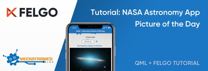
This is an introductory tutorial to getting started with Qt/QML and Felgo to design multi-platform apps for desktop (Linux, Window & macOS) and mobile devices (iOS & Android). A complete app is developed in this tutorial: NASA Astronomy Picture of the Day app. This tutorial also describes how to create custom QML components and how to perform HTTP requests by accessing one of the NASA Open APIs.
Have a look at the following video to see the app in action! This app works on Linux, Window, macOS, Android and iOS, all from the same code. Isn’t it cool? But there is more, Felgo roadmap includes building apps for different platforms in the cloud, support for embedded and IoT devices and publishing apps to the web.
Background
If you are not familiar with the Qt framework or Felgo, I recommend first having a look at Qt 5 framework technology and tools: QML, Qt Quick, Qt Creator and Felgo.
Outline
- Astronomy Picture of the Day (APoD) app
- NASA APoD open API
- Performing an HTTP Request
- Creating Custom QML Components
- How can I execute the app? How about live reloading in my mobile phone?
- What can I do to learn and improve the app?
Astronomy Picture of the Day (APoD) app
Let’s see how we can design a QML app for accessing NASA Astronomy Picture of the Day open API and test it in our mobile phone or tablet using live code reloading. The cool thing is that you can use any combination of desktop operating system (Linux, Windows and macOS) and mobile device (Android or iOS).
The code of the APoD app is open source and available at our APoDapp repository hosted on GitHub.

The first thing to do is to download and install Felgo. It integrates everything needed. Felgo includes the Qt framework and the Qt Creator IDE. Once installed, execute Felgo and you should see Qt Creator. Have a look at the Example section to see what can be done with this Software Development Kit (SDK).

The next step is to create a new app, click on File -> New File or Project, and then select Felgo Apps, Single-Page Application. Give it a name “APoDapp” and select the destination folder. In the kit selection, choose only Felgo desktop, click next, again next and finish.
The QML code in Main.qml is a hierarchical tree of QML objects. The import statements define the modules and versions we want to use. We can set an alias if needed (such as Quick2) in case there are components with the same name in different modules.
The general structure of our app is shown below. The App component in the main node. The NavigationStack component adds a navigation bar that shows the page title and is used to navigate between pages. A Page is a container for components.
import QtQuick 2.11
import QtQuick.Controls 2.4 as Quick2
import QtMultimedia 5.8
import Felgo 3.0

App {
    id: app

    NavigationStack {

        Page {
            id: page
            title: qsTr("NASA - Astronomy Picture of the Day")
            .....
            .....
        }
    }
}
Each QML object has a different set of properties, but some of them are common to all of them, for instance the id property. Each QML object can be referenced by the name given in its id property. The title property in the Page object defines the text shown in the navigation bar. The qsTr function is a helper function for translating your app to different languages.
Inside the assets folder in your app main folder you can place the assets (images, videos, documents, etc.) you want to distribute with your app.
The app appearance can be customized implementing a handler (onInitTheme) for the App initTheme signal. This code set a new tintColor (app-wide default main color), and the background and text colors of the navigation bar.
App {
    id: app

    onInitTheme: {
      Theme.colors.tintColor = "#1e73be"
      Theme.navigationBar.backgroundColor = Theme.colors.tintColor
      Theme.navigationBar.titleColor = "white"
    }

    property bool isVideo: false
    .....
    .....
}
In the App object, a variable (property in QML) is declared to store if the media from the NASA open API is a video (isVideo), because the requested media can be an image or a video link as we will see later.
In page, we define a background image and a set of QML components inside a Column object which is nested with a Flickable object.
.....
.....
Page {
     .....
     .....
     Image{
         anchors.fill: parent
         source: "../assets/MTB_background.jpg"
         fillMode: Image.PreserveAspectCrop
         opacity: 0.5
     }

     Flickable{
         anchors.fill: parent
         contentWidth: column.width
         contentHeight: column.height
         flickableDirection: Flickable.VerticalFlick
         interactive: !dateControl.isDialogOpenend

         Column{
             id: column
             width: page.width
             spacing: dp(10)
             topPadding: dp(10)
             bottomPadding: dp(30)
             .....
             .....
         }
     }
}
.....
.....
The first component inside page is the page background Image. Qt Quick provides a way to layout components using the concept of anchors. In this case, the background image is filling the whole area of its parent (page object). Besides the image source, the fillMode and opacity properties are also set.
The Flickable object places its nested objects on a surface that can be dragged and flicked, causing the view onto the nested objects to scroll. Inside the flickable, objects are organized following a Colum layout. The flickable object properties contentWidth and contentHeight are therefore set to the width and height of the column. The flickable direction is also set to be only in the vertical axis (VerticalFlick). Additionally, we disable the flicking when the calendar is opened (interactive = false), more about this later.
QML components can be organized considering different layouts (column, row, grid, etc). In the column object, we set the width, which corresponds to the page width, and also the top and bottom paddings (topPadding and bottomPadding) and the spacing between the QML objects inside the column layout. The dp method provides a density-independent unit for the value passed as an argument, that must be specified in pixels.
The QML objects inside the Column layout are given below.
Column{
    .....
    .....
    Image            // Logo
    AppText          // Text: "Choose date"
    DateControl      // Date control (custom QML object)
    AppText          // Picture title
    AppText          // Picture author
    ProgressBar      // Loading image progress bar
    Image            // Media - Image
    YouTubeWebPlayer // Media - Video
    Rectangle        // Black rectangle
    DescriptionBlock // Description of media (custom QML object)
}
The following QML components are the logo and the text “Choose date”, both are horizontally centered. We also set the image width with respect to its parent width. The image height is implicitly calculated by setting the preserve aspect fit mode.
Image{
    source: "../assets/MTB_logo.png"
    fillMode: Image.PreserveAspectFit
    anchors.horizontalCenter: parent.horizontalCenter
    width: parent.width - dp(40)
}

AppText{
    anchors.horizontalCenter: parent.horizontalCenter
    text: qsTr("Choose date")
}
There isn’t a stock date picker or control in QML, but we can create our own component. This component is described later in this tutorial. Our date control trigger an signal when a date is selected accepted, and we can implement a handler of such signal (onAccepted) where we call a JavaScript function (request_nasa_image_QML). This function is also described later. Our date control also implement two additional handlers: onOpened and onCanceled.
DateControl{
     id: dateControl
     onAccepted: request_nasa_image_QML(dateStr)
     onOpened: hideVideo(isVideo)
     onCancelled: showVideo(isVideo)
}
The video component (nasaVideo) is tricky since we need to hide it to show the date dialog over it, so we call JavaScript functions to show (showVideo) or hide (hideVideo) it. When we hide the video component, we show a black rectangle (rectangle) with its same size. Also, we have to hide this rectangle when the video container is shown.
function hideVideo(isVideo)
{
   if (isVideo)
   {
      nasaVideo.stop()
      rectangle.width   = nasaVideo.width
      rectangle.height  = nasaVideo.height
      nasaVideo.visible = false
      rectangle.visible = true
    }
}

function showVideo(isVideo)
{
   if (isVideo)
   {
      rectangle.visible = false
      nasaVideo.visible = true
    }
}
Next, we have two AppText components that show the title and author of the retrieved media. Some configuration is done in both components, such as: width minus some spacing, center horizontal alignment, bold font and word warp mode.
AppText{
     id: message
     horizontalAlignment: AppText.AlignHCenter
     font.bold: true
     wrapMode: AppText.WordWrap
     width: parent.width - 2*dp(10)
}

AppText{
    id: author
    horizontalAlignment: AppText.AlignHCenter
    wrapMode: AppText.WordWrap
    font.pixelSize: sp(12)
    font.bold: true
    width: parent.width - 2*dp(10)
}
A progress bar shows the loading progress when the retrieved media is an image, hence it is only visible when an image is loading (nasaImage.status === Image.Loading). The loading progress is obtained from the image progress property (nasaImage.progress). This value is between [0,1], so we set accordingly the progress bar interval (from and to properties).
Quick2.ProgressBar{
    anchors.horizontalCenter: parent.horizontalCenter
    visible: nasaImage.status === Image.Loading
    value: nasaImage.progress
    from: 0
    to: 1
}
If the retrieved media type is an image, we show it in the nasaImage component. If we click or touch this image (MouseArea component), the image URL is opened in the default browser (onClicked handler) thanks to the functionality provided by the Felgo nativeUtils object.
Image {
     id: nasaImage
     anchors.horizontalCenter: parent.horizontalCenter
     visible: nasaImage.status === Image.Ready
     fillMode: Image.PreserveAspectFit
     width: parent.width - 2*dp(10)
     MouseArea{
          anchors.fill: parent
          onClicked: nativeUtils.openUrl(nasaImage.source)
     }
}
It may happen that the media retrieved from the API REST call is a link to a YouTube video instead of a link to an image. In this case, we use the Felgo YouTubeWebPlayer QML component (nasaVideo) to load the video.
We also have a Rectangle component (rectangle) that is shown when the YouTubeWebPlayer component is hidden.
YouTubeWebPlayer{
     id: nasaVideo
     anchors.horizontalCenter: parent.horizontalCenter
     width: parent.width - 2*dp(10)
     visible: false
}

Rectangle{
     id: rectangle
     color: "black"
     anchors.horizontalCenter: parent.horizontalCenter
     visible: false
}
Finally, we include another custom QML object (DescriptionBlock) to customize the appearance of the media text description obtained from the API REST call. This custom QML object is described later in this tutorial.
DescriptionBlock{
    id: descriptionBlock
}
NASA APoD open API
One of the NASA Open APIs is Astronomy Picture of the Day (APoD) API. To get access to this API we have to perform a GET request to the following URL.
GET https://api.nasa.gov/planetary/apodThree parameter can be provided as shown below. We don’t need a key for testing but it is required for expanded usage, we can easily apply for one here.
| Parameter | Type | Default | Description |
|---|---|---|---|
| date | YYYY-MM-DD | Today | The date of the APoD image or video |
| hd | bool | False | High resolution image |
| api_key | string | DEMO_KEY | Key for expanded usage |
A successful request returns a JSON object with the following structure.
{
    "title",             // Media title
    "copyright",         // Author/s
    "explanation",       // Media description
    "media_type",        // "image" or "video"
    "url"                // Media URL (image or YouTube link)
    "hdurl",             // High-definition media URL
    "service_version"    // "v1"
}
Performing an HTTP Request
We have different ways to perform a GET request to the NASA APoD API in our QML app. We can use pure JavaScript or a Felgo QML object. Let’s have a look at both.
XMLHttpRequest JavaScript object
The get_request function is a general function that performs an asynchronous GET request using the XMLHttpRequest JavaScript object. This function has three arguments: url, parameters and a callback function that is called when the request is finished.
function get_request(url,params,callback)
{
     var http = new XMLHttpRequest()

     http.onreadystatechange = function(myhttp)
     {
          return function() {
               if (myhttp.readyState === XMLHttpRequest.DONE)
                    callback(myhttp)
          }
     }(http)
     http.open("GET", url + "?" + params, true)
     http.send()
}
The request_nasa_image_JS function uses the get_request function. It receives as an argument (dateStr) a date in string format (yyyy-mm-dd).
The first thing done in this function is to clear the GUI (clearInfo). Then, the request is performed. Inside the callback function, we check that the status is OK (Http_OK = 200). Then, the responseText is parsed to a JSON object (res_json). If everything went well, the requestSuccess function is called, otherwise requestError is executed.
function request_nasa_image_JS(dateStr)
{
     const url_base = "https://api.nasa.gov/planetary/apod"
     const apiKey   = "DEMO_KEY"
     const Http_OK  = 200

     var params = "date=" + dateStr + "&api_key=" + apiKey

     clearInfo()
     get_request(url_base,params,
                 function(http)
                 {
                   if (http.status === Http_OK)
                   {
                     var res_json = JSON.parse(http.responseText)
                     if (requestSuccess(res_json)) return
                   }
                 requestError()
                 })
}
The clearInfo function simply clears all the previously shown information in the GUI.
function clearInfo()
{
     message.text           = ""
     nasaImage.source       = ""
     nasaVideo.visible      = false
     isVideo                = false
     rectangle.visible      = false
     author.text            = ""
     descriptionBlock.text  = ""
}
The requestError function just sets an error message and the text color to red.
function requestError()
{
     message.color = "red"
     message.text  = qsTr("No data found")
}
The requestSuccess function checks that the JSON object (res_json) is not empty. Then, it sets the title (res_json.title) and description (res_json.description).
After that, it checks if media is an image or a video, and set accordingly the image source or open the YouTube video. We use the youtube_parser function to obtain the YouTube video id from the URL, since the NASA APoD API provides a URL but the YouTubeWebPlayer object asks for the YouTube video id.
It may happen that there is not author information in our JSON (res_json.copyright), in this case the author QML component is hiden.
function requestSuccess(res_json)
{
    if (res_json && res_json !== {})
    {
        message.color         = Theme.tintColor
        message.text          = res_json.title
        descriptionBlock.text = res_json.explanation

        if (res_json.media_type === "image")
            nasaImage.source = res_json.url
        else if (res_json.media_type === "video")
        {
             nasaVideo.loadVideo(youtube_parser(res_json.url),true)
             nasaVideo.visible = true
        }

        if (res_json.copyright !== undefined)
        {
            author.visible = true
            author.text = "Copyright " + res_json.copyright
        }
        else
            author.visible = false

         return true
    }
    return false
}
HttpRequest QML Component
Another way to perform an HTTP request is to use the Felgo HttpRequest QML object. The following JavaScript function makes use of it. Notice that we are also using here the clearInfo, requestError and requestSuccess JavaScript functions previously introduced.
function request_nasa_image_QML(dateStr)
{
    const url_base   = "https://api.nasa.gov/planetary/apod"
    const apiKey     = "DEMO_KEY"
    const Http_OK    = 200
    const timeout_ms = 5000

    var params = "date=" + dateStr + "&api_key=" + apiKey
    var url    = url_base + "?" + params

    clearInfo()
    HttpRequest
        .get(url)
        .timeout(timeout_ms)
        .then(function(res)
        {
            if (res.status === Http_OK)
                if (requestSuccess(res.body)) return
            requestError()
        })
        .catch(function(err)
        {
            requestError()
        });
 }
Creating Custom QML Components
To create a new QML component, go to File -> New File or Project, then in File and Classes, select Felgo Apps and then choose Item (this is the base class of our custom component, it can be changed if needed). The name of our QML custom component will be the same as the given filename, also make sure that you create this file inside the qml folder.
DateControl QML Component
Our DateControl component has a row layout (Row) and a custom Felgo Dialog.

Item{
    id: item
    width: parent.width
    height: row.height
    property date selectedDate: new Date()
    property alias isDialogOpenend: dateDialog.isOpen

    signal accepted(string dateStr)
    signal cancelled()
    signal opened()

    Row {
        id: row
        anchors.horizontalCenter: parent.horizontalCenter
        property date selectedDate: new Date()
        signal accepted(string dateStr)

        .....
        .....
    }

    Dialog{
        .....
        .....
    }
}
The components inside the row layout will be horizontally centered. A property (variable) is defined to store the chosen date (selectedDay), its default value is today (new Date()). Another property tracks when the dialog is opened (isDialogOpened).
We also define signals that will be emitted when a date is chosen by the user (accepted), the dialog is opened (opened) or the selection of a date cancelled (cancelled).
DateControl has three additional components: a read-only (enabled: false) text field (textDate), an icon button and a calendar (calendar). The calendar is inside a custom dialog (dateDialog).
Below, you can see the text field and its custom property values.
AppTextField{
    id: textDate
    anchors.verticalCenter: parent.verticalCenter
    width: dp(120)
    height: dp(30)
    borderWidth: dp(2)
    borderColor: Theme.tintColor
    radius: dp(20)
    placeholderText: "yyyy-mm-dd"
    horizontalAlignment: TextInput.AlignHCenter
    enabled: false
}
When the icon button is clicked (onClicked) the calendar dialog is shown (dateDialog.open()) and the opened signal is emitted. The Felgo IconType object provides a set of cool icons to use in our apps.
IconButton{
    anchors.verticalCenter: parent.verticalCenter
    icon: IconType.calendar
    onClicked: {
        item.opened()
        dateDialog.open()
    }
}
The calendar dialog is a custom dialog that includes only one QML component, a calendar. A dialog has two buttons by default, “Cancel” and “OK”.
In the calendar component, the default date is given by the selectedDate property in the row component. A locale can be set if needed.
When “OK” is pressed, the onAccepted signal is emitted in dateDialog. The same happens if the date is double clicked. On the other hand, when “Cancel” is pressed the onCanceled signal is emitted.
We intercept the onAccepted signal to format the selectedDate in textDate (Qt.formatDateTime), close the dateDialog and also emit the accepted signal in the row component.
For the onCanceled signal, we close the dateDialog and emit the cancelled signal to the dialog parent object (row).
Dialog{
    id: dateDialog
    title: "Choose a date"
    autoSize: true
    outsideTouchable: false

    onAccepted:{
        textDate.text =
            Qt.formatDateTime(calendar.selectedDate,"yyyy-MM-dd")
        dateDialog.close()
        parent.accepted(textDate.text)
    }

    onCanceled: {
        dateDialog.close()
        parent.cancelled()
    }

    Calendar{
        id: calendar
        width: parent.width
        locale: Qt.locale("en_EN")
        selectedDate: parent.selectedDate
        onDoubleClicked: dateDialog.accepted()
    }
}
DescriptionBlock QML Component
This QML object is used to define the style of the description block in the app. We use two Rectangle components. One of them defines a border around the description text and the other sets a semi transparent background. The column object has two nested AppText components: the text “Description” and the media description itself obtained from the APoD API call.

Rectangle{
    id: root
    anchors.horizontalCenter: parent.horizontalCenter
    width: parent.width - 2*dp(10)
    height: columnDescription.height
    border.width: dp(2)
    border.color: Theme.tintColor
    radius: dp(20)
    visible: text
    color: "transparent"

    property string text

    Rectangle{
        anchors.fill: parent
        opacity: 0.2
        color: Theme.tintColor
        radius: parent.radius
    }

    Column{
        id: columnDescription
        width: parent.width
        topPadding: dp(15)
        bottomPadding: dp(20)
        spacing: dp(10)

        AppText{
            anchors.horizontalCenter: parent.horizontalCenter
            text: qsTr("Description")
            color: Theme.tintColor
            font.bold: true
            font.pixelSize: sp(18)
        }

        AppText{
            id: description
            anchors.horizontalCenter: parent.horizontalCenter
            width: parent.width
            leftPadding: dp(15)
            rightPadding: dp(15)
            wrapMode: AppText.WordWrap
            font.pixelSize: sp(14)
            horizontalAlignment: AppText.AlignJustify
            text: root.text
        }
    }
}
How can I execute the app? How about live reloading in my mobile phone?
Let’s see the functionality of each one of the buttons placed in the bottom-left corner of Qt Creator.

- Live Reloading – Start the live server.
- Run – Run your app locally in your computer
- Debug – Debug your app locally in your computer
- Build – Build your app
The live reloading button opens a new window (Felgo live server) and starts the live server. Now, you can connect to it from your desktop client by hitting start, see the figure below, or in your mobile device. In both cases, the app will be automatically updated when you save new changes in your code.

For live code reloading in your mobile device, you have to keep the Felgo Live Server window opened and use the Felgo & QML Live Scripting App in your mobile device to connect to the live server. Download and follow the instructions given in the app (we have to press the Connect Desktop option in the app to connect to our desktop live server). Felgo & QML Live Scripting app download links for Android and iOS are below.


Check Felgo Live Server documentation for detailed information.
Note: if your app includes custom C++ code (not considered in this tutorial), you have to turn out your own application in a Felgo Live Client Module and deploy it conventionally to your mobile device. After that, you will be able to connect to it and use live code reloading for your QML and JavaScript code.
For deploying your apps conventionally to mobile devices (Android and iOS), follow this guide.
What can I do to learn further and improve the app?
The APoD app is nice but there is room for improvement for sure. Some ideas are listed below.
- Editable date component (introducing text).
- Automatically load the astronomy picture (media) of the day when the app is loaded.
- Change the month and year easily and directly in the date dialog.
- Share a link to the media of the day (copy to clipboard or post in social networks).
We hope you enjoyed this tutorial and find it helpful for learning Qt, QML and Felgo! Feel free to share it on Facebook or Twitter.
More Relevant App Development Resources
- Qt AR: Why and How to Add Augmented Reality to Your Mobile App
- Handle Safe Area Insets, Notch & Display Cutout for iPhone X, iPad X and Android P
The Best App Development Tutorials & Free App Templates
All of these tutorials come with full source code of the mobile apps! You can copy the code to make your own apps for free!
- How to create a mobile app for iOS & Android with a single code base
- How to support multiple languages and internationalization in your mobile app
- Common Widgets & Controls in a cross-platform App
- How to support multiple screen sizes & screen densities – Responsive App Guide
- Guide for App Layout
- Guide for App Navigation
- How to add native code to your mobile App
- How to easily style your App with Themes
- How to add Animations to your App
- How to add a Chat to your Mobile App
- How to make a Weather App accessing a REST weather service
- Conference App Template
- Widget Gallery App Template
- Twitter App Template
- Messenger App Template
- Property Finder App Template
App Development Video Tutorials
Make Cross-Platform Apps with Qt: Felgo Apps
How to Add In-App Chat or Gamification Features to Your Mobile App
How to Make a Mobile App with Qt Quick Designer (QML Designer) & Felgo


