Felgo 3.3.0 adds support for Qt 5.13.2 and Qt Creator 4.10.2, which brings many features and improvements and fixes. On top of that, you get access to a lot of new APIs and theming options on all supported platforms. Check out a new Jira time tracker demo application, that shows how to use several of the new APIs.
Migration Hints (Android Platform)
The new Qt version 5.13.2 requires an increase of the minimum SDK version to 21. Google requires the target SDK version set to 28 for submission to the Play Store. The new versions required in the AndroidManifest.xml file of your projects are:
- android:minSdkVersion=”21“
- android:targetSdkVersion=”28“
If you are interested, you can check out the full Qt changelog of this new version in the official Qt docs.
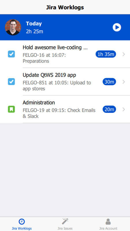
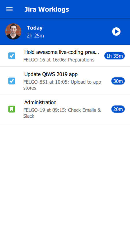
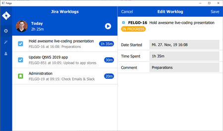
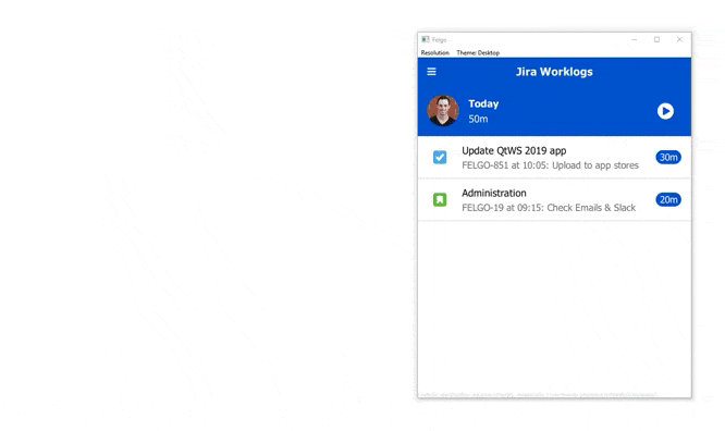
New Jira Tima Mini Demo App
This new demo shows best practices for UI design with a shared code-base across Android, iOS and desktop. It works with dummy data based on the Jira time tracking software. It uses several of the latest APIs released with Felgo 3.3.0.
It is based on the official Jira Tima mobile app developed by Felgo.
| iOS | Android | Desktop |
|---|---|---|
 |
 |
 |
New Features and APIs with Felgo 3.3.0
Improvements to Desktop Hover effects and Responsiveness
The desktop theme now features hover effects and uses the mouse pointer cursor for all input elements as well as the RippleMouseArea. You also have new styling options for the main navigation on desktop, which are listed in the “New Features” section of this release.
Improved AppTextField with New APIs
AppTextField is now based on Qt Quick Controls 2 and offers several new APIs.
With the new AppTextField::inputMode property, you can use a set of predefined input modes for different types of text fields:
- inputModeDefault: Default text input without any special features.
- inputModeUsername: Displays a clear button by default if the field is not empty and has focus, which can be changed with AppTextField::showClearButton.
- inputModeEmail: Only accepts characters allowed in Emails using the TextField::validator property. Displays a clear button by default if the field is not empty and has focus, which can be changed with AppTextField::showClearButton.
- inputModeUrl: Only accepts characters allowed in URLs using the TextField::validator property. Displays a clear button by default if the field is not empty and has focus, which can be changed with AppTextField::showClearButton.
- inputModePassword: Hides the input using disc characters instead using the TextField::echoMode property. Shows a button to display the password by default, which can be changed using AppTextField::showPasswordVisibleButton. The password can also be displayed using the AppTextField::passwordVisible property.
import QtQuick 2.0
import Felgo 3.0

App {
  NavigationStack {
    Page {
      title: "AppTextField::inputMode"

      AppTextField {
        width: parent.width
        inputMode: inputModeEmail
      }
    }
  }
}
You can find details on other new properties like AppTextField::passwordVisible and AppTextField::showPasswordVisibleButton in the associated documentation.
Note: This also applies to SearchBar which uses an AppTextField internally.
The AppTextField::clickEnabled property is used for text fields without manual input. When the user selects this text field, the AppTextField::clicked signal is fired instead of setting focus to the text field. This makes sense e.g. for date input fields, where you can show a date picker when the field is selected.
import QtQuick 2.0
import Felgo 3.0

App {
  NavigationStack {
    Page {
      title: "AppTextField::clickEnabled"

      AppTextField {
        id: textField
        width: parent.width
        placeholderText: "Select date"
        clickEnabled: true
        onClicked: {
          nativeUtils.displayDatePicker()
        }

        Connections {
          target: nativeUtils
          onDatePickerFinished: {
            if(accepted) textField.text = date
          }
        }
      }
    }
  }
}
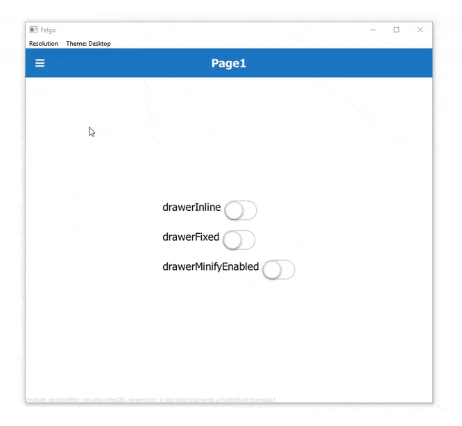
Display Options of Navigation Drawer and Sidebar Option on Desktop
You can use the new property Navigation::drawerInline to display the navigation drawer inline with the content and not as an overlay. With Navigation::drawerFixed you can also disable collapsing and expanding of the drawer, resulting in a fixed navigation sidebar. This is ideal for big tablets or desktops.
Additionally you can display the drawer in a minified sidebar version containing only icons, with Navigation::drawerMinifyEnabled.
You can add your logo to the navigation drawer now, with the Navigation::drawerLogoSource, Navigation::drawerLogoBackgroundColor and Navigation::drawerLogoHeight properties.
An AppDrawer can now be minified using AppDrawer::minifyEnabled. This will cause the drawer to appear as small sidebar with only icons displayed, while the labels are hidden.
This example lets you play around with the new display options:
import QtQuick 2.0
import Felgo 3.0

App {
  Navigation {
    id: navigation

    NavigationItem {
      title: "Item1"
      icon: IconType.heart

      NavigationStack {
        Page {
          title: "Page1"

          Column {
            anchors.centerIn: parent
            spacing: dp(15)

            Row {
              AppText {
                text: "drawerInline "
              }

              AppSwitch {
                checked: navigation.drawerInline
                updateChecked: false
                onToggled: navigation.drawerInline = !navigation.drawerInline
              }
            }

            Row {
              AppText {
                text: "drawerFixed "
              }

              AppSwitch {
                checked: navigation.drawerFixed
                updateChecked: false
                onToggled: navigation.drawerFixed = !navigation.drawerFixed
              }
            }

            Row {
              AppText {
                text: "drawerMinifyEnabled "
              }

              AppSwitch {
                checked: navigation.drawerMinifyEnabled
                updateChecked: false
                onToggled: navigation.drawerMinifyEnabled = !navigation.drawerMinifyEnabled
              }
            }
          }
        }
      }
    }
    NavigationItem {
      title: "Item2"
      icon: IconType.star

      NavigationStack {
        Page {
          title: "Page2"
        }
      }
    }
  }
}
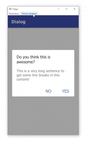
Better Theming Support for Dialogs
The Dialog and InputDialog components now have a new material style on Android. They can also be further customized with the new ThemeDialog properties.
You can now also access the title item with Dialog::titleItem alias as well as manually set Dialog::titleDividerVisible.
import QtQuick 2.0
import Felgo 3.0

App {

  onInitTheme: {
    // You can add custom styles for dialogs now
    //Theme.dialog.backgroundColor = "yellow"
    dialog.open()
  }

  NavigationStack {
    Page {
      title: "Dialog"
    }
  }

  Dialog {
    id: dialog
    title: "Do you think this is awesome?"
    autoSize: true
    positiveActionLabel: "Yes"
    negativeActionLabel: "No"
    onCanceled: title = "Think again!"
    onAccepted: close()

    // You can use Theme.dialog.defaultContentPadding to align your
    // custom content with the rest of the dialog UI.
    AppText {
      padding: dp(Theme.dialog.defaultContentPadding)
      wrapMode: Text.WordWrap
      width: parent.width
      text: "This is a very long sentence to get some line breaks in this content!"
      // Colors and alignment are platform depending for the best appearance
      color: Theme.isIos ? Theme.colors.textColor : Theme.colors.secondaryTextColor
      horizontalAlignment: Theme.isIos ? Text.AlignHCenter : Text.AlignLeft
    }
  }
}
New TextFieldRow Component for Basic Input Forms
Use the new TextFieldRow component to construct basic input forms on pages. It displays a label based on AppText together with a text field based on AppTextField.
import QtQuick 2.0
import Felgo 3.0

App {
  NavigationStack {
    Page {
      title: "TextFieldRow"

      Column {
        id: column
        width: parent.width

        TextFieldRow {
          width: parent.width
          label: "Text"
          placeHolder: "Add some text"
        }

        TextFieldRow {
          id: dateRow
          width: parent.width
          label: "Date"
          placeHolder: "Select date"
          clickEnabled: true
          onClicked: {
            nativeUtils.displayDatePicker()
          }

          Connections {
            target: nativeUtils
            onDatePickerFinished: {
              if(accepted) dateRow.value = date
            }
          }
        }
      }
    }
  }
}
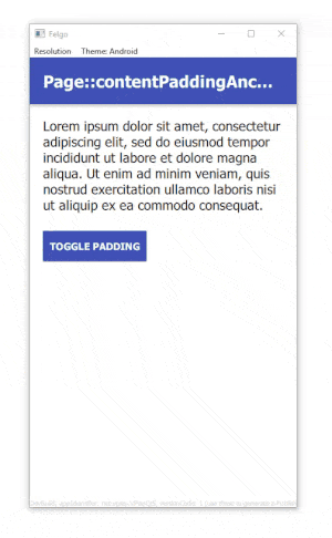
Content Padding Theming Property and Helper for Cleaner Layouts
The new Theme::contentPadding property helps you streamline your layouts easier and match your content paddings with the overall app layout.
The Page offers a new Page::contentPaddingAnchorItem item that can be used to add default padding to your page content. You can anchor to it or just use its properties like margins or width for your layouts.
import QtQuick 2.0
import Felgo 3.0

App {
  NavigationStack {
    Page {
      id: page
      title: "Page::contentPaddingAnchorItem"

      Column {
        id: column
        spacing: dp(Theme.contentPadding)
        anchors.fill: parent.contentPaddingAnchorItem

        AppText {
          width: parent.width
          text: "Lorem ipsum dolor sit amet, consectetur adipiscing elit, sed do eiusmod tempor incididunt ut labore et dolore magna aliqua. Ut enim ad minim veniam, quis nostrud exercitation ullamco laboris nisi ut aliquip ex ea commodo consequat."
        }

        // Toggle the padding with this button
        AppButton {
          text: "Toggle padding"
          horizontalMargin: 0
          property bool toggle: true
          onClicked: {
            column.anchors.fill = toggle ? column.parent : column.parent.contentPaddingAnchorItem
            toggle = !toggle
          }
        }
      }
    }
  }
}
More Features, Improvements and Fixes
Felgo 3.3.0 includes many more features, for example:
- Page and ListPage components will now remove focus of any input element if the background is clicked.
- You can now change the app or game’s soft input behavior on Android with the new property NativeUtils::softInputMode.
- The RippleMouseArea now offers and hover effect on desktop, and uses the mouse pointer cursor on hover, with the new properties RippleMouseArea::hoverEffectEnabled and RippleMouseArea::hoverEffectRadius. This is enabled by default on desktop.
- The AppListView now allows you to easily display a SearchBar in the header, with the AppListView::showSearch property. Any search will trigger the AppListView::search signal.
- Same as with the AppListView, you can also display the SearchBar within a ListPage now. Additionally the ListPage will fire the signal ListPage::clickedBackground now when the background is clicked. It will also remove focus from any input element if the background is clicked.
- Show or hide a divider for the SearchBar with SearchBar::showDivider.
- Add new property SwipeOptionsContainer::overshoot and new methods SwipeOptionsContainer::showRightOption() and SwipeOptionsContainer::showLeftOption() to SwipeOptionsContainer.
- New convenience properties SimpleRow::badgeColor and SimpleRow::showDisclosure to customize a SimpleRow easier.
- The new option Theme.colors.statusBarStyleSystem allows you to display a default system themed status bar on Android. With this the system does not show the app in fullscreen mode. This can be useful for some native features. You can use this style like the following:
App {
  onInitTheme: Theme.colors.statusBarStyle = Theme.colors.statusBarStyleSystem
} - The signal Store::storePurchased() now contains additional information about the payment transaction on iOS.
- The Facebook Plugin now uses the newest Facebook SDK v5.3.0 on iOS and Facebook SDK v5.5.0 on Android.
- Added property OneSignal::shareLocationEnabled to the OneSignal Plugin.
- The images returned from NativeUtils::displayImagePicker() and NativeUtils::displayCameraPicker() are now stored in a persistent location. Thus mobile operating systems do not delete them automatically.
Note: For this to work on Android, add the following line to android/res/xml/file_paths.xml:<files-path name="files" path="."/> - The Wikitude Plugin requires an update to your build.gradle file if you use Cloud Builds to distribute a 64-bit Android app. For that, have a look at the Android Integration Steps on how to set the new abiFilters definition.
- Fixes an issue of TexturePackerSpriteSequence that resulted in an endless loop of the first TexturePackerSprite within the sequence.
- Fixes a potential crash when deleting a physics Body with an attached MouseJoint.
- Fixes for FelgoMultiplayer logic involving triggerPreviousTurn() method and playerCount property.
For all relevant changes, features and fixes of recent Felgo updates, please check out the changelog.
How to Update Felgo
Test out these new features by following these steps:
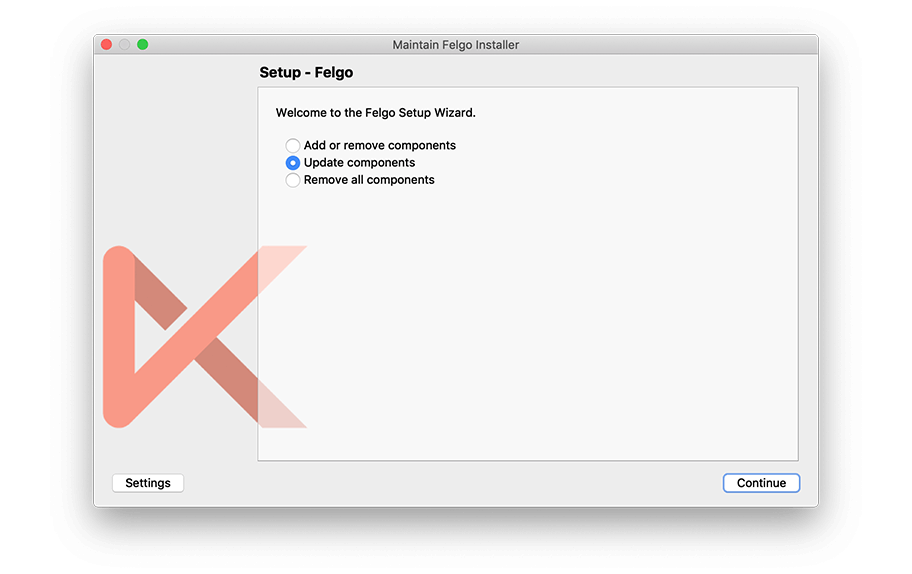
- Open the Felgo SDK Maintenance Tool in your Felgo SDK directory.
- Choose “Update components” and finish the update process to get this release as described in the Felgo Update Guide.
If you haven’t installed Felgo yet, you can do so now with the latest installer from here. Now you can explore all of the new features included in this release!
For a full list of improvements and fixes to Felgo in this update, please check out the change log!
More Posts Like This
Release 3.1.0: New Felgo Plugins Version, Unified App Configuration and FlickablePage