Navigation
A navigation control for using platform-specific navigation modes. More...
| Import Statement: |
import Felgo 4.0 |
| Inherits: |
Item
|
Properties
Methods
Detailed Description
The Navigation can be used to automatically use different navigation modes depending on the used platform. It supports navigation by TabControl on top or on bottom of the screen, by
AppDrawer, or both.
By default TabControl is used on iOS and AppDrawer with an AppListView as content item on Android. You can change
the styling of the AppDrawer's AppListView by overriding values from Theme::navigationAppDrawer.
Note: Navigation uses a lazy-loading mechanism for the contents of each NavigationItem element. This means, that the items within a NavigationItem are created when it is selected for the first time. You can disable the lazy-loading manually. To do so, set NavigationItem::lazyLoadContent to false.
Example Usage
The following code demonstrates how easy it is to add a navigation to your app. By default, it will be displayed as tab navigation on iOS and as navigation drawer on Android:
 import Felgo
 import QtQuick

 App {
   Navigation {

     NavigationItem {
       title: "Navigation"
       iconType: IconType.calculator

       NavigationStack {
         AppPage {
           title: "Navigation Switch"
         }
       }
     }

     NavigationItem {
       title: "List"
       iconType: IconType.list

       NavigationStack {
         AppPage { title: "List Page" }
       }
     }

     NavigationItem {
       title: "Dialogs"
       iconType: IconType.square

       NavigationStack {
         AppPage { title: "Dialogs Page" }
       }
     }

     NavigationItem {
       title: "Settings"
       iconType: IconType.cogs

       NavigationStack {
         AppPage { title: "Settings Page" }
       }
     }
   }
 }
How do I navigate between pages?
Apart from the app Navigation, which provides the main menu for your app, the NavigationStack is the main component for navigating back and forth
between different pages.
For passing data between pages, the easiest solution is to make relevant settings or properties available in a common parent scope. Public properties, functions, and signals of an ancestor in the QML tree are available for
direct access:
import Felgo
import QtQuick
App {
id: app
property int count: 0
NavigationStack {
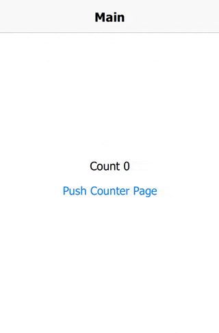
AppPage {
id: mainPage
title: "Main"
Column {
anchors.centerIn: parent
AppText {
anchors.horizontalCenter: parent.horizontalCenter
text: "Count " + app.count
}
AppButton {
text: "Push Counter Page"
onClicked: mainPage.navigationStack.push(counterPageComponent)
}
}
}
}
Component {
id: counterPageComponent
AppPage {
title: "Change Count"
property AppPage target: null
Column {
anchors.centerIn: parent
AppButton {
text: "Count ++"
onClicked: {
app.count++
}
}
AppButton {
text: "Count --"
onClicked: {
app.count--
}
}
}
}
}
}
More Frequently Asked Development Questions
Find more examples for frequently asked development questions and important concepts in the following guides:
Property Documentation
The AppDrawer object, which is used if drawer navigation is enabled.
This property is intended to use with Navigation::drawerInline. If set to true the drawer will always be visible and the cannot be collapsed or expanded. The default
value is true for desktop theme in landscape mode, and false for all other themes.
See also drawerInline.
Displays the drawer inline with the content, and not as overlay. This can be used on desktops or tablets, where more space is available. The default value is true for desktop theme in landscape mode, and false for all
other themes.
See also drawerFixed.
Alias to the internal ListView that displays the content of the drawer.
The background color of your logo in the drawer, if drawerLogoSource is set.
The default value is Theme.navigationAppDrawer.desktopBaseColor on desktop and Theme.colors.tintColor on all other platforms.
This property was introduced in Felgo 3.3.0.
The height of your logo in the drawer, if drawerLogoSource is set.
The default value is dp(80).
This property was introduced in Felgo 3.3.0.
This convenience property can be used to add your logo to the navigation drawer. It will be displayed with the defined drawerLogoHeight and drawerLogoBackgroundColor.
It uses the headerView to add a colored rectangle with your logo in it. You can overwrite the headerView to add a
custom header component in the navigation drawer.
This property was introduced in Felgo 3.3.0.
|
drawerMinifyEnabled : bool
|
Displays the navigation drawer as a minfied sidebar, only containing the icons without labels. The drawer can be expanded unless drawerFixed is set to true.
This property sets the AppDrawer::minifyEnabled property of the internal drawer. For tab navigation, this property is ignored.
This property was introduced in Felgo 3.3.0.
Component for an Item to appear in the AppDrawer, above the NavigationItem entries. Per default, this is an invisible item that adds as a padding
for the device status bar.
This property defines an item that is shown to toggle the navigation drawer state of the Navigation's AppDrawer item.
By default a toggle AppIcon is provided, which is sufficient in most cases. If you want to customize that icon you can make use of navigationDrawerItemPressed property to define a custom style for the pressed state.
Here is an example of providing your custom item:
 import Felgo
 import QtQuick

 App{
   Navigation {
     id: navigation
     navigationMode: navigationModeDrawer

     navigationDrawerItem: Text {
       text: "Open"
       anchors.centerIn: parent
       color: navigation.navigationDrawerItemPressed ? "red" : "green"
     }

     NavigationItem {
       title: "Main"
       iconType: IconType.heart

       NavigationStack {
         AppPage { title: "Main Page" }
       }
     }
   }
 }
See also navigationDrawerItemPressed.
|
navigationDrawerItemPressed : bool
|
Possible values are:
navigationModeDefault: Platform-specific default value (drawer for Android, tabs everywhere else)-
navigationModeTabs: Use only TabControl
-
navigationModeDrawer: Use only AppDrawer
-
navigationModeTabsAndDrawer: Use TabControl and AppDrawer at the same time
-
navigationModeNone: Completely hide the Navigation. No TabControl or AppDrawer will be visible.
Sets the vertical tab position. Tabs can appear on top or bottom of the user interface.
The corresponding values for this are TabBar.Header and TabBar.Footer. This property sets the internal TabBar::position proeprty.
Note: This property used to have different values in Felgo 3.0. The corresponding values have changed from Qt.TopEdge and Qt.BottomEdge. This change reflects the upgrade from Qt Quick Controls 1 TabView to version 2's TabBar.
This property was introduced in Felgo 4.0.0.
The TabControl object, which is used if tab navigation is enabled.
This property was introduced in Felgo 2.12.0.
Method Documentation
|
void moveNavigationItem(int from, int to)
|
|
void removeNavigationItem(int index)
|


