SearchBar
A search bar with native styling for iOS and Android based on the Theme settings. More...
| Import Statement: |
import Felgo 4.0 |
| Since: |
Felgo 2.9.2 |
| Inherits: |
Item
|
Properties
Signals
Methods
Detailed Description
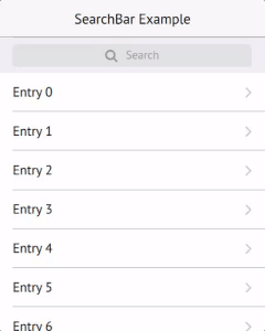
The SearchBar control provides a native-looking search input field for Android and iOS based on the Theme settings.
| iOS |
Android |
|

|

|
Note: The item offers two different styles for the search bar on iOS. To switch to the second style, which is used in the image above, set iosAlternateStyle
to true.
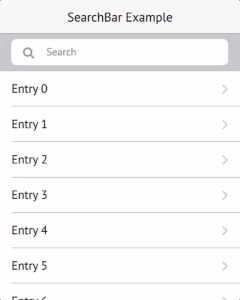
Example Usage
Simple Example
import Felgo
App {
NavigationStack {
AppPage {
title: "SearchBar Example"
SearchBar {
id: searchBar
onAccepted: {
console.log("search accepted: "+text)
listView.model = 2
}
}
AppListView {
id: listView
anchors.top: searchBar.bottom
model: 50
delegate: SimpleRow { text: "Entry "+index }
}
}
}
}
Pull-To-Search Example
The SearchBar can also be combined with a ListView to hide the bar by default and only show it after pulling down the list. To use this feature,
activate pullEnabled and specify the target ListView.
import Felgo
App {
NavigationStack {
AppPage {
title: "SearchBar Example"
SearchBar {
id: searchBar
target: listView
pullEnabled: true
onAccepted: {
console.log("search accepted: "+text)
if(text !== "") {
searchBar.keepVisible = true
listView.model = 2
}
else {
searchBar.keepVisible = false
listView.model = 50
}
}
}
AppListView {
id: listView
height: parent.height - y
model: 50
delegate: SimpleRow { text: "Entry "+index }
}
}
}
}
Note: The pullEnabled setting modifies the y-position of the ListView, so we
decrease its height in the example to always exactly fill the page.
Property Documentation
|
barBackgroundColor : color
|
The background color of the search bar. Matches platform-specific values by default.
The size of the clear button. The default value matches Theme::defaultIconSize.
This property was introduced in Felgo 3.9.1.
The padding to the left of the search icon. The default value is 0 on iOS, else 7 dp.
The padding to the right of the clear icon. The default value is 0 on iOS, else -5 dp.
This property was introduced in Felgo 3.9.1.
The size of the search icon. The default value matches Theme::defaultIconSize.
This property was introduced in Felgo 3.9.1.
The spacing to the right of the search icon. The default value is 10 dp.
The search icon, matches IconType.search by default.
|
inputBackgroundColor : color
|
The background color of the input field. Matches platform-specific values by default.
Set this property to true to use select an alternate search-bar style on iOS.
| Default Style |
Alternate Style |
|
|
|
If pullEnabled is activated and the search bar is linked with a ListView target, the search bar will stay visible as long as this property is true. The default is false, which hides the search bar if
the list is scrolled down again.
See also target and pullEnabled.
The placeholder text of the search input field. The default value is Search.
If set to true and the search bar is linked with a ListView target, the search will become visible by dragging down the list while it is on top position.
Note: The target ListView's y-position will be set to match the search bar height (to show the search) or zero (to hide the
search).
See also target and keepVisible.
If set to true, a clear button is displayed at the right side of the search bar as soon as the text field has content, as a way for the user to remove the current text.
The default value is true.
This property was introduced in Felgo 2.10.0.
Shows a divider at the bottom of the search bar. The default value is false.
This property was introduced in Felgo 3.3.0.
If pullEnabled is set to true, the search bar will be linked to the target ListView to
only become visible when pulling down the list.
Note: The target ListView's y-position will be set to match the search bar height (to show the search) or zero (to hide the search).
Please do not anchor the list-view or set a custom y-position if you want to use this feature.
See also pullEnabled and keepVisible.
The text of the search input field.
The color of entered text in the search input field. The default value matches Theme::textColor.
Use this property to access the internal AppTextField item of the search bar.
This property was introduced in Felgo 2.16.1.
Signal Documentation
This signal is emitted when the Return or Enter key is pressed by the user to trigger the search.
Note: The corresponding handler is onAccepted.
This signal is emitted when the Return or Enter key is pressed or the text field loses focus.
Note: The corresponding handler is onEditingFinished.
Method Documentation


