Felgo Update Guide
After installing the Felgo SDK, you can receive updates with the Maintenance Tool. The Maintenance Tool is located at the installation directory of your Felgo SDK and is called
MaintenanceTool.
Run this application and select Update components to check if any updates are available for the Felgo SDK.
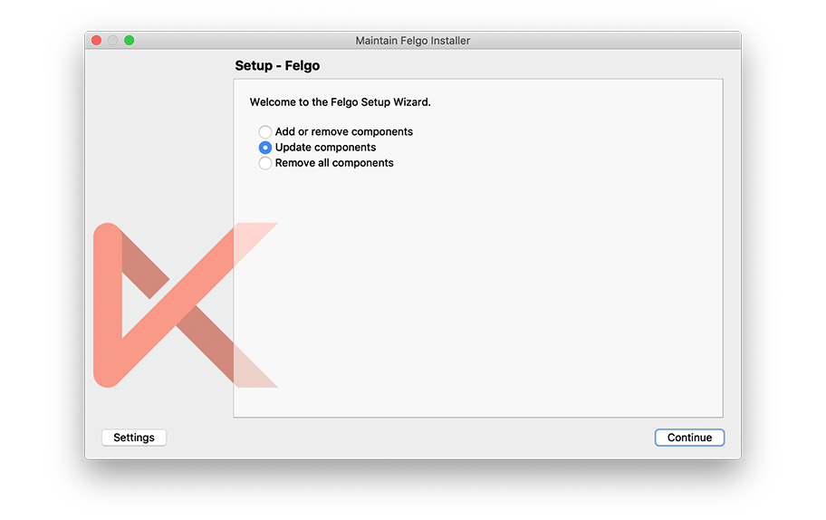
You then see a list of packages for which an update is available. To update the packages, click Continue and then Update on the following screen. After all packages
were downloaded and installed, you can close the Maintenance Tool by clicking the Done button.
Note: After you updated the SDK, you need to Clean your project so the updated Felgo version is used. To clean your project, open Qt Creator and select Clean Project from the
Build menu. Afterwards you can run your project and the updated Felgo version is used.
With your Felgo signup, you get access to all Felgo updates for free. Some of the components are available exclusively for Felgo customers - to upgrade to a Felgo license click
here.
Latest Felgo Release
v 4.3.1 (2025-11-17)
Highlights Blog Post: Release 4.3.1: Android 16KB Page Size Support for Google Play with Felgo & Qt
Felgo 4.3.1 adds Android 16KB page size support
Felgo 4.3.1 comes as a free update for all Felgo developers.
Highlights
Fixes
- Fixes an issue that the iOS back swipe gesture sometimes got stuck in between the animation.
- Fixes incorrect return value of NativeUtils::displayAlertDialog() when custom buttons titles are in use.
Older Felgo Releases
v 4.3.0 (2025-10-23)
Highlights Blog Post: Release 4.3.0: Felgo QML Hot Reload, Android 15, Qt 6.8 & Qt Creator 17
Felgo 4.3.0 adds Qt 6.8.3 Support
Felgo 4.3.0 comes as a free update for all Felgo developers.
Highlights
New Features
- Updates to Qt Creator 17.0.1 with many improvements and better stability, for a better development experience.
-
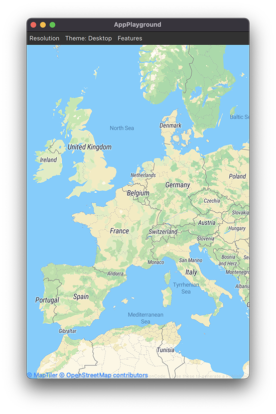
AppMap is now updated to use the Map type of the new Qt 6 Location module. This changes the way how gestures
work. AppMap now includes custom handlers for dragging, flicking, pinching and tapping the map, as well as support for the mouse wheel. To control which gestures are enabled, you can use the
new properties pinchEnabled, wheelEnabled, dragEnabled and tapEnabled.
The Qt Location Maplibre Plugin updates to the latest version and now has a different name. Update the plugin name to maplibre (from maplibregl) and make sure to use the updated plugin parameters, like:
AppMap {
plugin: Plugin {
name: "maplibre"
parameters: [
PluginParameter {
name: "maplibre.map.styles"
value: "https://api.maptiler.com/maps/streets/style.json?key=get_your_own_abc"
}
]
}
}
See the documentation page for more details.
Improvements
Fixes
Other Changes
v 4.2.0 (2024-08-19)
Highlights Blog Post: Release 4.2.0: New Felgo Hot Reload, OAuth 2.0 Plugin, Universal Links, Android 14 & Qt
Creator 14
Felgo 4.2.0 adds Felgo Hot Reload, Android 14 support, updated Qt Creator 14, a new OAuth 2.0 Plugin and Universal App Link Handling.
Felgo 4.2.0 comes as a free update for all Felgo developers.
Highlights
New Features
- The AppListItem now supports a new inset list style to match the look of modern list layouts on iOS. Use the AppListItem::insetStyle property to switch to the new style. You can also customize the look with the new AppListItem::leftMargin, AppListItem::rightMargin, AppListItem::backgroundRadius and AppListItem::firstInSection properties.
 import Felgo

 App {
   ListPage {
     model: [
       { name: "Apple", type: "Fruits" },
       { name: "Banana", type: "Fruits" },
       { name: "Potato", type: "Vegetables"}
     ]
     delegate: AppListItem {
       text: modelData.name
       insetStyle: Theme.isIos
     }
     section.property: "type"
     section.delegate: SimpleSection {
       style.showDividers: false
     }
   }
 }
- You can now read file data in Base64 encoding with FileUtils::readFileBase64. This is useful to upload encoded file data to a backend database or for custom
processing in your application.
- Use the IconButton::activeIconType and IconButton::activeColor to customize the button active state when
IconButton::toggle is set to
true.
 import Felgo
 import QtQuick

 App {
   IconButton {
     toggle: true
     iconType: IconType.staro
     selectedIconType: IconType.starhalffull
     activeIconType: IconType.star
     activeColor: "green"
   }
 }
- Felgo Hot Reload: Search the Felgo Hot Reload log output with a search string to find specific log messages. You can search case-sensitive, case-insensitive, or use regular expressions. Click the search icon or press
CTRL-F (or CMD-F on macOS) to open the search panel.
Improvements
- Felgo 4.2.0 updates third-party plugin libraries to add the latest features and be compliant with app stores. As usual, please update our iOS frameworks according to the latest releases from the integration guides.
- The NativeDialog type now supports opening all dialog types that are already available via the NativeUtils API. You can specify all of the
dialog properties and add a callback function that will be executed when the corresponding finished signal of the dialog is emitted. Use the new NativeDialog features if you prefer
working with callback functions:
- Updates HttpRequest to return an object with error information in case the request fails. It provides the following new properties:
info,
ok, clientError, serverError, error, accepted, noContent, badRequest, unauthorized, notAcceptable, notFound, forbidden, fromCache, status, statusType, text, charset,
body and header.
Fixes
- Fixes potential crashes when using the Native Code Components.
This also changes how the lifetime of JS functions wrapped as native objects is handled. The native wrapper object is no longer retained automatically for the application lifetime. Instead use the new NativeObjectUtils::wrap() method to obtain a strong reference. This way the wrapper is retained as long as the QML engine keeps its reference in memory.
Note: This may cause a breaking change in existing Felgo applications on iOS.
It is advisable to store a strong reference when using JavaScript functions as native callbacks. For example, if you set a map of functions for a native delegate property like this:
Item {
property NativeObject scrollView
property NativeObject scrollViewDelegate: {
"scrollViewWillBeginDragging:": function(scrollView) {
console.log("begin dragging")
},
}
function initScrollView() {
scrollView.setProperty("delegate", scrollViewDelegate)
}
}
Add a call to NativeObjectUtils::wrap() like this:
Item {
property NativeObject scrollView
property NativeObject scrollViewDelegate: NativeObjectUtils.wrap({
"scrollViewWillBeginDragging:": function(scrollView) {
console.log("begin dragging")
},
})
function initScrollView() {
scrollView.setProperty("delegate", scrollViewDelegate)
}
}
Without the wrap() call, the native wrapper object for the delegate is deallocated immediately. This is because delegate properties in Objective C usually do not
retain their values automatically.
See the section about iOS: Object Lifetime for more information.
- Fixes the AdMobInterstitial and AdMobRewardedVideo on Android. Ads can now properly be loaded and shown more than once.
- Fixes the NativeUtils::galleryPhotos when targeting Android 13+ (SDK 33). This also fixes the ImagePicker not showing any
pictures.
- Fixes the OneSignal Plugin on Android 13+. A new runtime permission called
android.permission.POST_NOTIFICATIONS is required on those devices. The plugin
now automatically request the permission from the user.
- Increases the App::tablet screen diameter threshold from
6.7 to 6.9 inches to account for smartphones with bigger screens.
- Fixes initialization issues when customizing AppListItem slots with own content items.
- To match the default mouse behavior of Desktop applications, Felgo controls no longer switch to a pointer mouse cursor.
- Fixes sharing files with the NativeUtils::share() method on Android.
- Fixes the GameParticle component.
- Fixes translucent bottom tab bar background when AppPage::navigationBarTranslucency is used.
- Fixes NativeUtils::preferredScreenOrientation and AppPage::preferredScreenOrientation
on devices running iOS 16+.
- Fixes NativeView's touch handling on Android. Touch points forwarded to the native view now correctly consider the Screen::devicePixelRatio.
- Fixes a potentially broken UI layout after a screen orientation change on Android 10 to Android 12.
Other Changes
- Removes the Flurry plugin with this release, as Flurry stopped operations mid of March 2024. If you are using the Flurry Plugin, consider migrating to Amplitude Plugin or Firebase Plugin for analytics.
v 4.1.0 (2023-06-22)
Highlights Blog Post: Release 4.1.0: Build Qt 6 Apps for WebAssembly, Integrate Firebase Analytics, Gaming Components and
SpeechToText
Felgo 4.1.0 adds support for WebAssembly, Firebase Analytics, Felgo Gaming Components, SpeechToText functionality and an improved Felgo Hot Reload connection process.
Felgo 4.1.0 comes as a free update for all Felgo developers.
Highlights
- You can now build your Qt and Felgo 4 project for WebAssembly and run your application on the web.
The WebAssembly Kit in Qt 6 and Felgo 4 integrates perfectly with Qt Creator. Similar to building for Desktop, you can build and run the application by pressing the Run button in Qt Creator. Qt Creator will compile the
project, start a local web server, deploy your app, and open the the browser to run it.
You can also use the Felgo Hot Reload GUI to start a Web Client and directly run your Qt Quick project in the browser. All changes to the code are reloaded on the fly - without the need for compilation and deployment to
a local web server.
- The AppMap component now uses new input handlers. These include: DragHandler(handler for dragging),
PinchHandler(handler for pinch gestures), TapHandler(handler for taps and clicks) and WheelHandler(handler for the mouse wheel). Thanks to the new features you can mix, lock
and unlock different handles. These variables are: pinchEnabled, wheelEnabled, dragEnabled and tapEnabled. Previous gestures have been removed.
- The Felgo Games components are now migrated to Qt 6 and ready to take your 2D games to the next level.
The update includes all the core gaming modules. The following features are currently only available in Felgo 3:
There are also number of API changes due to underlying changes in Qt 6:
- The property
GameSoundEffect.category no longer exists.
- The property
BackgroundMusic.availability no longer exists.
- The property
BackgroundMusic.autoLoad no longer exists. To delay loading the media file, set the BackgroundMusic::source property only
before calling BackgroundMusic::play().
Lastly, some Felgo Games components used a name that also exists in QtQuick modules. To avoid conflicts due to the identical name, the Felgo
types are now renamed with the Game-prefix. The affected Felgo QML types and existing QtQuick types are:
Note: For more information about migrating projects from Felgo 3 to 4, see the migration guide.
- The Firebase Plugin now includes a new FirebaseAnalytics type, a cross-platform integration of Google’s Firebase Analytics service. This
plugin type uses Google Analytics 4 instead of the outdated Universal Analytics and replaces the Google Analytics Plugin.
import Felgo
import QtQuick
App {
FirebaseAnalytics {
id: analytics
measurementId: "G-GB8PY1E0JT"
userId: "USER15"
}
NavigationStack {
AppPage {
title: "Firebase Analytics"
Row {
AppButton {
text: "logEvent"
onClicked: analytics.logEvent("ButtonClicked", { "type": "logEvent" })
}
AppButton {
text: "logScreen"
onClicked: analytics.logScreen("Firebase Analytics")
}
}
}
}
}
New Features
- You can now use new SpeechToText item to record and transcribe spoken text online or on-device on Android and iOS.
 import Felgo
 import QtQuick

 App {
   NavigationStack {
     AppPage {
       title: "Speech to Text"

       AppButton {
         id: button
         anchors.horizontalCenter: parent.horizontalCenter
         flat: false
         enabled: SpeechToText.recognitionAvailable
         text: !SpeechToText.recognitionActive ? "Start" : "Stop"
         onClicked: {
           if(!SpeechToText.recognitionActive)
             SpeechToText.startSpeechToText("en-US")
           else
             SpeechToText.stopSpeechToText()
         }
       }

       Connections {
         target: SpeechToText
         enabled: SpeechToText.recognitionAvailable
         onSpeechToTextResult: (result, isFinal) => {
                                 recognized.text = result
                               }
       }

       AppText {
         id: recognized
         width: parent.width
         anchors.top: button.bottom
         anchors.bottom: parent.bottom
         verticalAlignment: Text.AlignTop
         padding: 10
       }
     }
   }
 }
Using this functionality requires some additional project configuration. See the SpeechToText documentation for more information.
Note: To use speech-to-text on your Android device, make sure that you have Google Search und Google SpeechServices installed.
Improvements
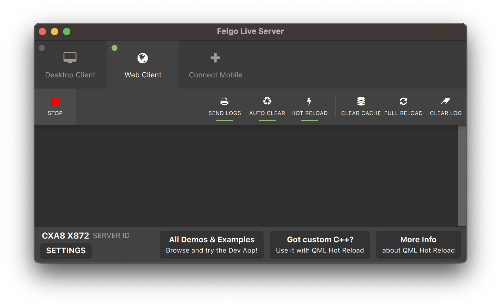
- Enhanced Connection Process for Felgo QML Hot Reload: Previously, the Felgo Hot Reload Client relied on UDP broadcasts within the local network to discover the Felgo Hot Reload
server application. However, UDP broadcasts are limited in iOS 16+ and may even be blocked in certain networks. These limitations resulted in occasional connection issues and inconveniences during development, impacting the
overall workflow.
The new solution eliminates UDP broadcasts and enables direct client-to-server connections. Here's how it works:
-
Unique Server Identifier: Each Felgo Hot Reload instance now has a unique server identifier, displayed prominently in the Felgo Hot Reload server application.
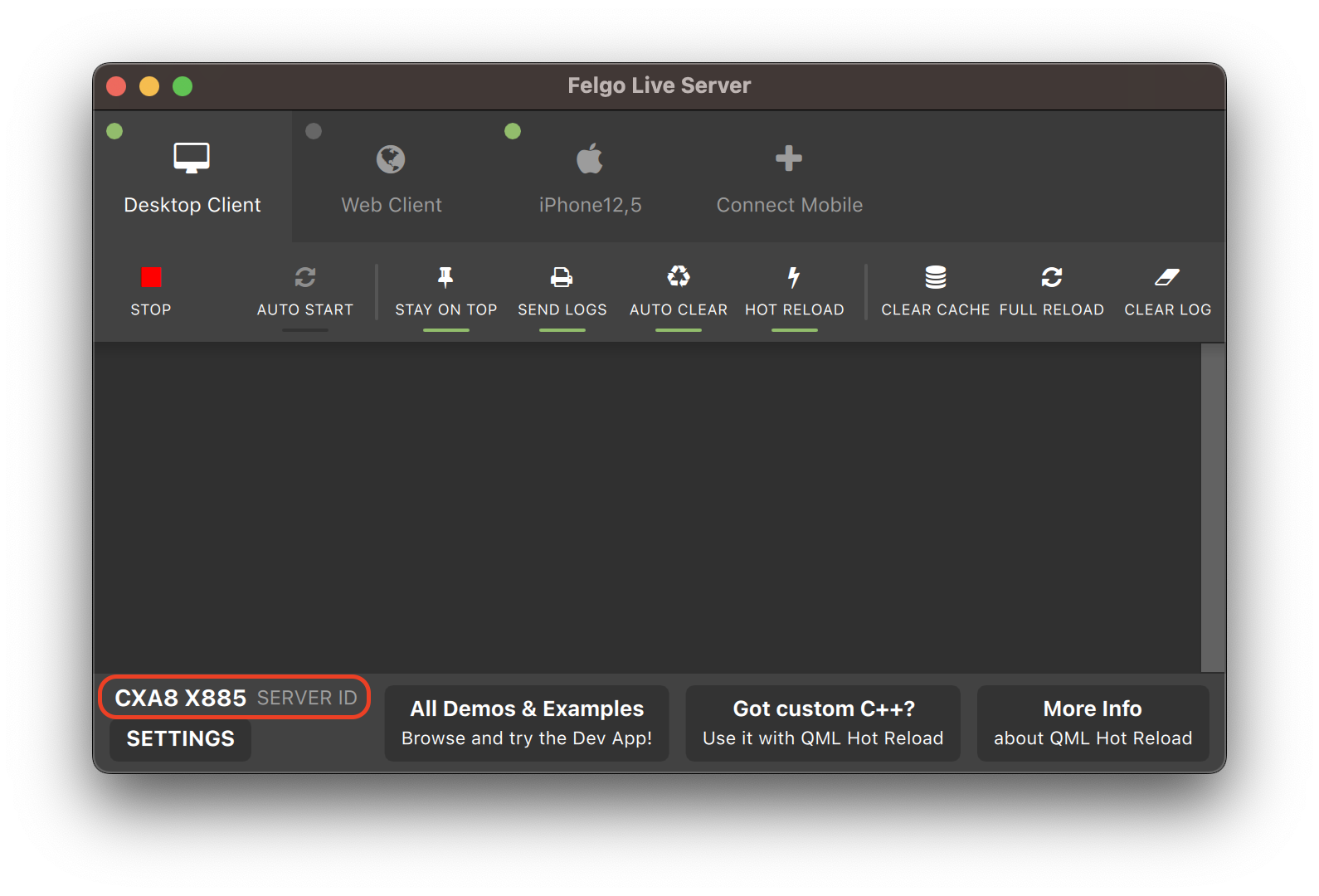
-
Direct Connection: In the mobile client app, you can manually enter the server ID of your development computer. This allows the client to directly connect to the specified server without relying on UDP
broadcasts.
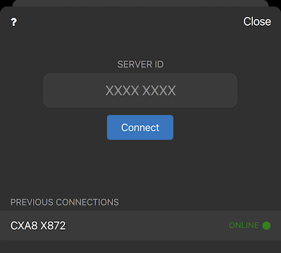
- Improved Connection Management: The Felgo Hot Reload Client now remembers previous connections, creating a list of hosts that you can easily choose from for subsequent connections. This eliminates the need to
enter the server ID every time and simplifies the process of reconnecting to a known host.
These changes address the drawbacks of the previous approach while introducing a more reliable and efficient connection method.
- The SwipeOptionsContainer now provides a better user experience when when opening or closing the swipe options.
- Adds a new option for NativeUtils::setStatusBarStyle() and Theme::statusBarStyle. Use
statusBarStyleCustom to have control over the status bar via native code.
- The Felgo application does no longer apply a custom font by default. If you are already using native platform fonts in your application, you can thus remove the setting from the main.cpp:
felgo.setPreservePlatformFonts(true);
Fixes
-
NativeUtils::displayTextInput falls back to default values for the
ok and cancel button if no custom text
is passed on Desktop platforms.
- The AppItem::keyboardHeight property is now in window coordinates instead of physical pixels on iOS. This now matches the behavior on Android.
- Minor fixes and improvements for the Bonjour/ZeroConf network service discovery.
Known Issues
- The Qt Multimedia backend for Qt 6.4.1 WebAssembly is not fully supported yet. It is currently not possible to play audio or video with the MediaPlayer type. Playing raw audio with the SoundEffect type works as expected.
- Qt Multimedia Audio Output is not working on Windows. See QTBUG-108383 for a workaround that can be applied globally on your system or locally for the project.
The issue has been fixed already. With the next Qt version update of the Felgo SDK, the workaround will not be required anymore.
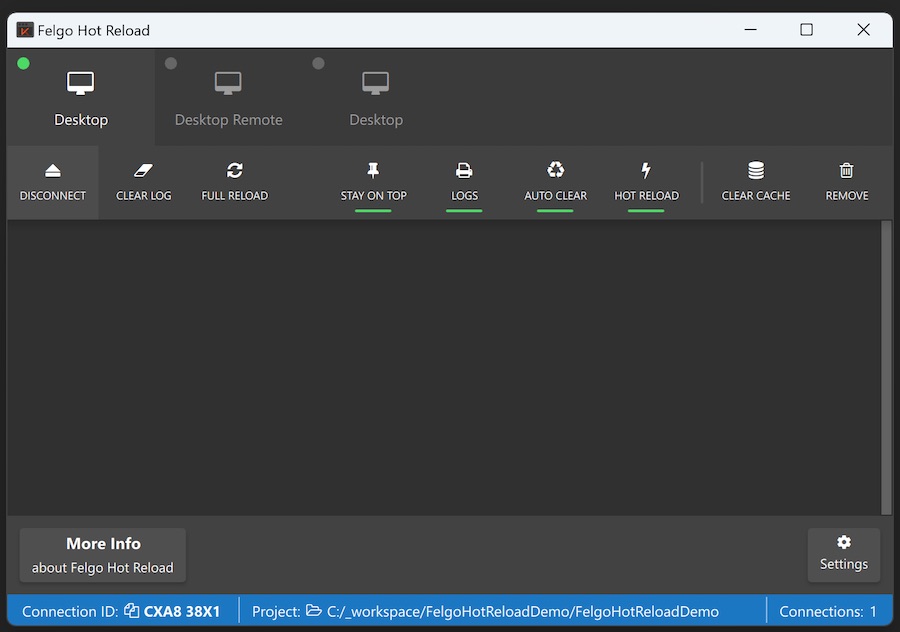
Felgo Hot Reload
Felgo Live is now Felgo Hot Reload. To migrate, make the following changes in your CMakeLists.txt and main.cpp files:
 find_package(FelgoHotReload REQUIRED)
 target_link_libraries(app PRIVATE FelgoHotReload)
As well as in the cpp FelgoLiveClient is renamed to FelgoHotReload:
#include <FelgoHotReload>
v 4.0.1 (2023-03-15)
Highlights Blog Post: Release 4.0.1: Support for Apple Sign In and Android Content URI, Improved Felgo Live Permissions on
macOS
Felgo 4.0.1 adds support for the Apple Sign In Plugin, allows you to use content:// URIs on Android in Qt Quick, and includes better app permission handling for Felgo Hot Reload on macOS.
Felgo 4.0.1 comes as a free update for all Felgo developers.
New Features
- The Apple Sign In Plugin with the AppleSignIn and AppleSignInButton QML types is now available on
iOS.
 import QtQuick
 import Felgo

 App {
   AppPage {
     Column {
       AppleSignInButton {
         id: appleSignInButton
       }

       AppText {
         text: !appleSignInButton.visible
               ? "Apple Sign-in unavailable."
               : appleSignInButton.appleSignIn.isLoggedIn
                 ? "Signed in with Apple user: " + appleSignInButton.appleSignIn.userName
                 : "Click above button to sign in with Apple user"
       }
     }
   }
 }
- The AdMobBannerNative type is now available to display ad banners inline. To use the type on iOS, it is required to change the graphics API to OpenGL:
#include <QQuickWindow>
int main(int argc, char *argv[])
{
QQuickWindow::setGraphicsApi(QSGRendererInterface::OpenGLRhi);
QApplication app(argc, argv);
…
}
Improvements
- You can now use Android content:// URIs as source for an AppImage, for example when accessing and showing the NativeUtils::galleryPhotos or using the ImagePicker.
import Felgo
import QtQuick
App {
NavigationStack {
AppPage {
id: page
title: qsTr("Choose Photos")
rightBarItem: TextButtonBarItem {
text: "Next"
enabled: imagePicker.selectedCount > 0
onClicked: console.debug("SELECTED:", JSON.stringify(imagePicker.selection))
}
ImagePicker {
id: imagePicker
anchors.fill: parent
}
}
}
}
- The Felgo Hot Reload Client now better handles app permissions on macOS Monterey and later.
Fixes
- The Qt Bluetooth APIs do no longer require the Qt Location permission on Android 12 or later.
- Stability improvements for Felgo Hot Reload.
v 4.0.0 (2023-02-09)
Highlights Blog Post: Release 4.0: Create Beautiful Cross-Platform Apps with Qt 6

Felgo 4.0.0 makes it possible to develop Felgo apps with all the latest features of Qt 6.4.1. The release also brings support for the CMake build system, includes a custom build of the Qt Location module
and updates Felgo controls to use Qt Quick Controls 2.
Felgo 4.0.0 comes as a free update for all Felgo developers and can be installed side-by-side to Felgo 3.
You can download the Felgo 4 installer here.
Highlights
The switch to Felgo 4 and Qt 6 comes with many different changes for various Qt Modules and Felgo components. The following list summarizes the most important topics:
For detailed information on all the changes and how to migrate your Felgo 3 project, see the Felgo 4 update guide: Felgo 4 Update Guide and Project Migration for Qt
6.
Apart from the necessary changes for migration to Qt 6, the Felgo 4 release also includes new features, improvements and fixes for the Felgo SDK, which are listed in the sections below.
New Features
Improvements
- The AppButton now allows setting the (background, border & text) color for the hovered state.
Fixes
- Fixes incorrect AppToolTip position when using long bubble texts.
- Fixes missing placeholder text when canceling AppTextEdit input on iOS with an empty field.
- The Notification Plugin now supports Android 12+ (API level 31+) devices and build targets.
- The NativeUtils::share functionality for iOS and Android is updated to properly support sharing text, web links or files with the native share dialog of the latest OS
versions.
- Fixes behavior problems when combining the PullToRefreshHandler with a ListView that has
additional top spacing from a header item or top margin configuration.
- Fixes the App::tablet property to already deliver a correct value when used in the
Component.onCompleted handler of the app window.
Older Felgo Releases
Felgo 3 (Qt 5.15) Releases
See the Felgo 3 Releases for more information on the currently available version of Felgo 3.
Felgo 3 with Qt 5.15 can still be used independent from Felgo 4. It is possible to install Felgo 3 side-by-side with Felgo 4 or other Qt installations.
You can thus keep your Felgo 3 project until you are ready to migrate to Qt 6 and Felgo 4.
