Display an Image using AppImage
This first example fills the whole page with an AppImage. Since the image does not match the page aspect ratio, it will be distorted.
import Felgo
import QtQuick
App {
NavigationStack {
AppPage {
title: "Hello Felgo"
AppImage {
anchors.fill: parent
source: "https://felgo.com/web-assets/girl.jpg"
}
}
}
}
In the next example, we chose another fillMode to avoid distortion.
import Felgo
import QtQuick
App {
NavigationStack {
AppPage {
title: "Hello Felgo"
AppImage {
anchors.fill: parent
fillMode: Image.PreserveAspectFit
source: "https://felgo.com/web-assets/girl.jpg"
}
}
}
}
Display a RoundedImage
Rounded images are very common in apps, this is why Felgo offers the RoundedImage type, that lets you add a radius to an image.
import Felgo
import QtQuick
App {
NavigationStack {
AppPage {
title: "Hello Felgo"
RoundedImage {
anchors.centerIn: parent
width: dp(200)
height: dp(200)
fillMode: Image.PreserveAspectCrop
source: "https://felgo.com/web-assets/girl.jpg"
radius: width/2
}
}
}
}
Display Fullscreen Image Preview
You can also use a basic fullscreen image preview component, the PictureViewer.
import Felgo
import QtQuick
App {
id: app
NavigationStack {
AppPage {
title: "Hello Felgo"
AppButton {
text: "Show Photo"
onClicked: {
PictureViewer.show(app, "https://felgo.com/web-assets/girl.jpg")
}
}
}
}
}
Selecting multiple Photos from the Gallery, or Display an Inline Image Picker
ImagePicker is a custom QML GridView, which accesses photos from the device gallery or camera roll. It supports selecting
multiple images.
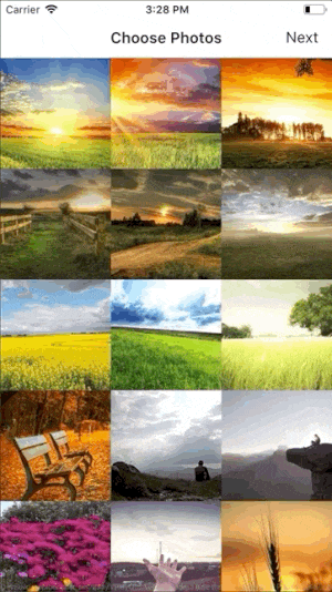
The following example shows how you can use the ImagePicker in one of your app pages.
import Felgo
import QtQuick
App {
NavigationStack {
AppPage {
id: page
title: qsTr("Choose Photos")
rightBarItem: TextButtonBarItem {
text: "Next"
enabled: imagePicker.selectedCount > 0
onClicked: console.debug("SELECTED:", JSON.stringify(imagePicker.selection))
}
ImagePicker {
id: imagePicker
anchors.fill: parent
}
}
}
}
Selecting a Photo from the Gallery
You can use the NativeUtils::displayImagePicker function to open the native image gallery select dialog.
import Felgo
import QtQuick
App {
id: app
NavigationStack {
AppPage {
AppImage {
id: image
anchors.fill: parent
autoTransform: true
fillMode: Image.PreserveAspectFit
}
AppButton {
anchors.centerIn: parent
text: "Display CameraPicker"
onClicked: {
NativeUtils.displayImagePicker("test")
}
}
Connections {
target: NativeUtils
onImagePickerFinished: (accepted, path) => {
if(accepted) image.source = path
}
}
}
}
}
How do I use a Canvas to draw/paint?
The Canvas item allows to draw straight and curved lines, simple and complex shapes, graphs, and referenced graphic images. It can also add text, colors,
shadows, gradients, and patterns, and do low-level pixel operations.
The width and height properties of the Canvas item define the drawing area. If it requires rendering, the paint signal fires. When handling the
signal, you can draw to the Canvas using a Context2D object:
 import Felgo
 import QtQuick

 App {
   AppPage {
     Canvas {
       id: mycanvas
       width: 100
       height: 200
       onPaint: {
         var ctx = getContext("2d");
         ctx.fillStyle = Qt.rgba(1, 0, 0, 1);
         ctx.fillRect(0, 0, width, height);
       }
     }
   }
 }
How to display an SVG Image?
To use SVG images in your project, add the Qt SVG module to the CMakeLists.txt project configuration file. You can then use the AppImage component to display SVG images.
Note: If the SVG module is not linked, you see errors like QML AppImage: Error decoding URL in your app's log output.
 find_package(Felgo REQUIRED)
 find_package(Qt6 REQUIRED COMPONENTS Svg)
 ...
 target_link_libraries(appExample PRIVATE Felgo)
 target_link_libraries(appExample PRIVATE Qt6::Svg)
More Frequently Asked Development Questions
Find more examples for frequently asked development questions and important concepts in the following guides:


