Learn what Felgo offers to help your business succeed. Start your free evaluation today! Felgo for Your Business

NavigationBar

A navigation control for displaying a header, back navigation and optional items. More...

Import Statement: import Felgo 4.0
Inherits:

Item

Properties

Detailed Description

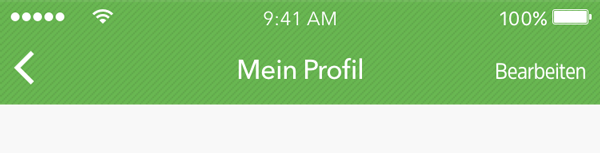
NavigationBar shows a page title, a back button on the left side and optional NavigationBarItem slots.

This component is automatically instantiated inside NavigationStack, for back navigation.

Property Documentation

backButtonItem : Component

This property defines an item that is shown as back bar button item.

By default a back arrow AppIcon is provided, which is sufficient in most cases. If you want to customize that icon you can make use of backButtonItemPressed property to define a custom style for the pressed state.

Here is an example of providing your custom item within a NavigationStack:

 NavigationStack {
  id: stack

   navigationBar.backButtonItem: Text {
     text: "Back"
     anchors.centerIn: parent
     color: stack.navigationBar.backButtonItemPressed ? "red" : "green"
   }
 }

See also backButtonItemPressed.


[read-only] backButtonItemPressed : bool

Use this readonly property to customize the pressed state of a custom provided backButtonItem.

See also backButtonItem.


backButtonVisible : bool

Holds whether the back button is shown or not. If false, the leftBarItem will appear in the left item slot, if set. If true, the backButton will appear in the left item slot.


[since Felgo 2.14.2] backgroundColor : color

The background color fills the NavigationBar's background.

By default the globally set value from ThemeNavigationBar::backgroundColor is used, which is chosen to match the target platform.

Note: You should only overwrite this value if you want to provide a NavigationStack or NavigationBar in your app that needs a different style than your default one. Otherwise you should use ThemeNavigationBar::backgroundColor for customization.

This property was introduced in Felgo 2.14.2.


[since Felgo 2.14.2] backgroundImageFillMode : int

The fillMode to use for the NavigationBar's background if the backgroundImageSource is set.

If no value is set, the globally set value from ThemeNavigationBar::fillMode is used, which defaults to Image.Tile.

Setting this property to another value might be useful of you don't provide a pattern image as backgroundImageSource.

Note: You should only overwrite this value if you want to add a NavigationStack or NavigationBar in your app that needs a different style than your default one. Otherwise you should use ThemeNavigationBar::backgroundImageFillMode for customization.

This property was introduced in Felgo 2.14.2.


[since Felgo 2.14.2] backgroundImageSource : url

An image source URL to fill the NavigationBar's background, like a pattern image.

If no value is set, the globally set value from ThemeNavigationBar::backgroundImageSource is used, which defaults to an empty image and the NavigationBar only fills with the provided backgroundColor then.

This property is useful if you want to provide a background image like a background pattern for the NavigationBar.

Note: You should only overwrite this value if you want to add a NavigationStack or NavigationBar in your app that needs a different style than your default one. Otherwise you should use ThemeNavigationBar::backgroundImageSource for customization.

This property was introduced in Felgo 2.14.2.


[since Felgo 3.7.0] defaultBarItemPadding : real

Sets the default left and right padding in pixels for items based on the NavigationBarItem type. By default, this is equal to ThemeNavigationBar::defaultBarItemPadding.

This property was introduced in Felgo 3.7.0.


[since Felgo 3.7.0] dividerColor : color

The divider is displayed as a thin line at the very bottom of the navigation bar. Override the divider color to customize the look of the divider. By default, this is equal to ThemeNavigationBar::dividerColor.

This property was introduced in Felgo 3.7.0.


[since Felgo 2.14.2] fillMode : enumeration

The fillMode to use for the NavigationBar's background if the backgroundImageSource is set.

If no value is set, the globally set value from ThemeNavigationBar::fillMode is used, which defaults to Image.Tile.

Setting this property to another value might be useful of you don't provide a pattern image as backgroundImageSource.

Note: You should only overwrite this value if you want to add a NavigationStack or NavigationBar in your app that needs a different style than your default one. Otherwise you should use ThemeNavigationBar::backgroundImageFillMode for customization.

This property was introduced in Felgo 2.14.2.


[since Felgo 3.7.0] itemColor : color

The item color defines the NavigationBar's left and right item color. By default, this is equal to ThemeNavigationBar::itemColor.

This property was introduced in Felgo 3.7.0.


leftBarItem : Item

An Item derived from NavigationBarItem to appear in the left item slot. This is only used, when the back button is not shown.


rightBarItem : Item

An Item derived from NavigationBarItem to appear in the right item slot.


[since Felgo 3.7.0] shadowHeight : real

Defines the height of the shadow beneath the navigation bar in pixels. By default, this is equal to ThemeNavigationBar::shadowHeight.

This property was introduced in Felgo 3.7.0.


[since Felgo 3.7.0] titleAlignBottom : int

Whether the title should be bottom aligned. By default, this is equal to ThemeNavigationBar::titleAlignBottom.

This property was introduced in Felgo 3.7.0.


[since Felgo 3.7.0] titleAlignLeft : bool

Whether the title should be left aligned. By default, this is equal to ThemeNavigationBar::titleAlignLeft.

This property was introduced in Felgo 3.7.0.


[since Felgo 3.7.0] titleBottomMargin : real

Adds an additional margin to the bottom of the navigationBar's title item if it is bottom-aligned, in pixels. By default, this is equal to ThemeNavigationBar::titleBottomMargin.

This property was introduced in Felgo 3.7.0.


[since Felgo 3.7.0] titleColor : color

The title color defines the font color of the displayed title label. By default, this is equal to ThemeNavigationBar::titleColor.

This property was introduced in Felgo 3.7.0.


[since Felgo 2.6.2] titleItem : Item

An Item derived from NavigationBarItem to appear in the title slot of the navigation bar.

This property was introduced in Felgo 2.6.2.


[since Felgo 3.7.0] titleLeftMargin : real

Adds an additional margin to the left of the navigationBar's title item if it is left-aligned, in pixels. By default, this is equal to ThemeNavigationBar::titleLeftMargin.

This property was introduced in Felgo 3.7.0.


[since Felgo 3.7.0] titleTextBold : bool

Whether the title text is displayed bold. By default, this is equal to ThemeNavigationBar::titleTextBold.

This property was introduced in Felgo 3.7.0.


[since Felgo 3.7.0] titleTextFont : string

Specifies the font for the NavigationBar's title text. By default, this is equal to ThemeNavigationBar::titleTextFont.

This property was introduced in Felgo 3.7.0.


[since Felgo 3.7.0] titleTextSize : int

Size of the title text, in pixels. By default, this is equal to ThemeNavigationBar::titleTextFont.

This property was introduced in Felgo 3.7.0.


Qt_Technology_Partner_RGB_475 Qt_Service_Partner_RGB_475_padded