Touch and gestures is the most important form of user input for Apps. Felgo offers multiple components to help you working with touch input.
Process a Single Touch Point
For simple touches, that involve only a single finger, the MouseArea is the perfect component. You can define the touchable area by setting the
size of the MouseArea.
import Felgo
import QtQuick
App {
NavigationStack {
AppPage {
title: "Hello Felgo"
AppText {
id: touchLog
font.pixelSize: sp(8)
}
MouseArea {
anchors.fill: parent
onPressed: touchLog.text += "\nPressed"
onReleased: touchLog.text += "\nReleased"
onPositionChanged: touchLog.text += "\nPosition Changed " + mouseX + " + " + mouseY
onClicked: touchLog.text += "\nClicked"
}
AppButton {
anchors.right: parent.right
text: "Clear"
onClicked: touchLog.text = ""
}
}
}
}
You can also create custom gesture detection with this component if needed.
Process Multiple Touch Points
For multiple touch points you should have a look at the MultiPointTouchArea component. The following example shows how you can track
2 or more touch points.
 import Felgo
 import QtQuick

 App {

   NavigationStack {

     AppPage {
       title: "Multi Touch"

       MultiPointTouchArea {
         anchors.fill: parent
         touchPoints: [
           TouchPoint { id: point1 },
           TouchPoint { id: point2 }
         ]
       }

       Rectangle {
         width: dp(80)
         height: dp(80)
         color: "green"
         x: point1.x
         y: point1.y
       }

       Rectangle {
         width: dp(80)
         height: dp(80)
         color: "red"
         x: point2.x
         y: point2.y
       }
     }
   }
 }
Detect Gestures
Detecting gestures using the touch points of MouseArea or MultiPointTouchArea is pretty straightforward. For distinct use cases, you can also use additional components, like the Pincharea for
example.
You can also use the various point handler types to detect gesture, e.g. TapHandler, PinchHandler or DragHandler.
As an alternative to MouseArea, you can also use Input
Handlers to handle touches and gestures.
Input Handlers simplify the creation of complex touch interactions, that used to be difficult to do with MouseArea and TouchArea alone. They
can detect events even in cases of deep nesting.
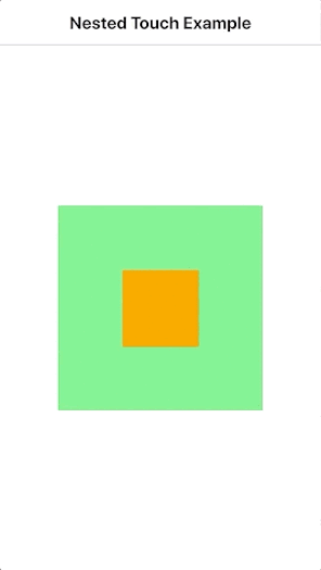
For example, you can use the TapHandler to react to taps and touch gestures. Unlike MouseArea, it can handle events in multiple nested Items at the same time:
import QtQuick
import Felgo
App {
NavigationStack {
AppPage {
title: "Nested Touch Example"
Rectangle {
anchors.centerIn: parent
id: outerRect
width: dp(200)
height: dp(200)
color: tapHandler.pressed ? "lightyellow" : "lightgreen"
TapHandler {
id: tapHandler
}
Rectangle {
id: innerRect
anchors.centerIn: parent
width: dp(75)
height: dp(75)
color: tapHandler2.pressed ? "lightblue" : "orange"
TapHandler {
id: tapHandler2
}
}
}
}
}
}
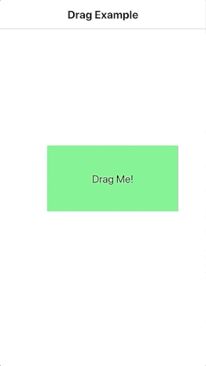
It is also easy to make an Item draggable with the DragHandler.
import QtQuick
import Felgo
App {
NavigationStack {
AppPage {
title: "Drag Example"
Rectangle {
x: (parent.width - width) / 2
y: (parent.height - height) / 2
width: dp(200)
height: dp(100)
color: dragHandler.active ? "lightyellow" : "lightgreen"
AppText {
id: text
text: "Drag Me!"
anchors.centerIn: parent
}
DragHandler { id: dragHandler }
}
}
}
}
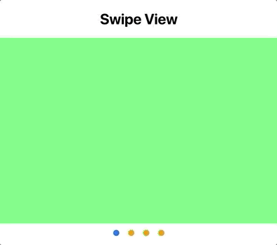
Swipe View with Page Indicator
The SwipeView type makes it easy to swipe between several UI items. It also integrates well with the PageControl to add indicators.
 import Felgo
 import QtQuick
 import QtQuick.Controls as Quick2

 App {
   NavigationStack {
     AppPage {
       title: "Swipe View"

       Quick2.SwipeView {
         id: swipeView
         width: parent.width
         height: width / 1.5
         Rectangle { color: "lightgreen"  }
         Rectangle { color: "red"  }
         Rectangle { color: "cyan"  }
         Rectangle { color: "yellow"  }
       }

       PageControl {
         height: implicitHeight + dp(5)
         anchors.top: swipeView.bottom
         pages: swipeView.count
         currentPage: swipeView.currentIndex
         clickableIndicator: true
         spacing: dp(10)
         onPageSelected: index => swipeView.currentIndex = index
         tintColor: "orange"
       }
     }
   }
 }
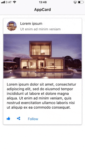
Tinder Swipe Gesture and Cards
Create material design cards with the AppCard. You can also use Tinder-like swipe gestures with cards. For this, use the additional AppPaper and AppCardSwipeArea components. You can create fully custom card-like UI elements, that can be swiped in a Tinder-like fashion.
import Felgo
import QtQuick
App {
AppPage {
AppCard {
id: card
width: parent.width
margin: dp(15)
paper.radius: dp(5)
swipeEnabled: true
cardSwipeArea.rotationFactor: 0.05
cardSwipeArea.onSwipedOut: {
console.debug("card swiped out: " + direction)
}
header: SimpleRow {
imageSource: "https://cdn.pixabay.com/photo/2016/06/24/10/47/architecture-1477041_960_720.jpg"
text: "Lorem ipsum"
detailText: "Ut enim ad minim veniam"
enabled: false
image.radius: image.width/2
image.fillMode: Image.PreserveAspectCrop
style: StyleSimpleRow {
showDisclosure: false
backgroundColor: "transparent"
}
}
media: AppImage {
width: parent.width
fillMode: Image.PreserveAspectFit
source: "https://cdn.pixabay.com/photo/2016/06/24/10/47/architecture-1477041_960_720.jpg"
}
content: AppText{
width: parent.width
padding: dp(15)
text: "Lorem ipsum dolor sit amet, consectetur adipiscing elit, sed do eiusmod tempor incididunt ut labore et dolore magna aliqua. Ut enim ad minim veniam, quis nostrud exercitation ullamco laboris nisi ut aliquip ex ea commodo consequat."
}
actions: Row {
IconButton {
iconType: IconType.thumbsup
}
IconButton {
iconType: IconType.sharealt
}
AppButton {
text: "Follow"
flat: true
}
}
}
}
}
How do I add an onClick listener to an item in Felgo?
If an item already supports user interaction, you can directly handle the events in your code. The following example adds an AppButton and handles the clicked
signal:
 import Felgo

 App {

   AppButton {
     text: "Click Me!"
     anchors.centerIn: parent
     onClicked: text = "Thanks!"
   }

 }
You can also add such a clicked signal to your own components.
How do I build custom QML Items?
Each .qml file of your project is an own reusable QML Component. The specified root QML Item determines the base component, which your new item extends. The new QML type can then add properties,
signals and functions, which form the public interface of the component.
To define the layout for the item, add some child elements and position them in the view. Each child element may also be extended with new features and properties directly where it is used. You do not require to create an
own QML Item to make small additions to a single item instance in your UI.
The following example shows a clickable CustomButton.qml component with a background and text. Once imported, you can use the new type in your app:
import Felgo
import "relative-path-to-directory-of-custom-button"
App {
CustomButton {
anchors.centerIn: parent
property int count: 0
text: "You clicked "+count+" times."
backgroundColor: "yellow"
onClicked: count++
}
}
import QtQuick
Item {
implicitWidth: textItem.implicitWidth
implicitHeight: textItem.implicitHeight
property color backgroundColor: "green"
property string text: "Click Me!"
signal clicked()
Rectangle {
anchors.fill: parent
color: parent.backgroundColor
}
Text {
id: textItem
text: parent.text
anchors.centerIn: parent
}
MouseArea {
anchors.fill: parent
onClicked: parent.clicked()
}
}
More Frequently Asked Development Questions
Find more examples for frequently asked development questions and important concepts in the following guides:


