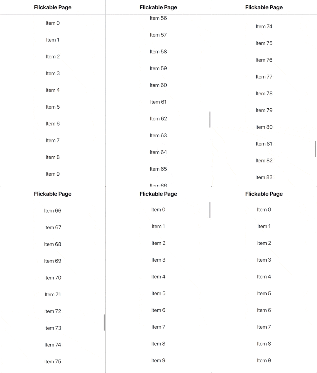
A Page with included AppFlickable and AppScrollIndicator. More...
| Import Statement: | import Felgo 4.0 |
| Since: | Felgo 3.1.0 |
| Inherits: |
Many app pages with custom content require an AppFlickable to make the content scrollable. The FlickablePage component is a convenience item wrapping a single AppFlickable component into a AppPage object. You can access and control the internal AppFlickable item with the flickable property.
It also contains an AppScrollIndicator, which you can access with the scrollIndicator property. It is enabled by default. The FlickablePage can thus help to save some boilerplate code for pages with flickable content.
The easiest way to make content flickable is to use the FlickablePage type. It internally uses an AppFlickable with an AppScrollIndicator.

 import Felgo
 import QtQuick


 App {
   NavigationStack {

     FlickablePage {
       title: "Flickable Page"

       // set contentHeight of flickable to allow scrolling
       flickable.contentHeight: column.height

       // set false to hide the scroll indicator, it is visible by default
       scrollIndicator.visible: true

       // page content
       Column {
         id: column
         width: parent.width

         // fill column with 100 AppText items using Repeater
         Repeater {
           model: 100
           delegate: Rectangle {
             width: parent.width
             height: dp(50)
             AppText {
               anchors.centerIn: parent
               text: qsTr("Item") + " " + index
             }
           }
         }
       } // Column

     } // FlickablePage

   }
 }
Find more examples for frequently asked development questions and important concepts in the following guides:
|
flickable : AppFlickable |
An alias to access the AppFlickable within the page.
|
scrollIndicator : AppScrollIndicator |
An alias to the AppScrollIndicator item of the page. You can hide the indicator by setting scrollIndicator.visible to false.

As part of the free Business evaluation, we offer a free welcome call for companies, to talk about your requirements, and how the Felgo SDK & Services can help you. Just sign up and schedule your call.
Sign up now to start your free Business evaluation:

