This guide is about how to design your app to support multiple screen sizes and screen densities with the help of Felgo.
Felgo offers different solutions depending on whether you are creating a game or an app. If you want to make games or are interested in a general introduction about the basic principles behind the approaches, have a look
here.
Before we go into the details, you can have a look at the following checklist. It outlines the most important principles for creating responsive apps with Felgo.
Responsive Apps - Best Practices
In fact, with only a few features you are ready to create apps that support multiple devices with different screen sizes and densities:
- Instead of pixel values, use density independent units with the app.dp() function to set the desired physical size of your elements.
- Try to use the available App Components like ListPage and Navigation, or use features like NavigationStack::splitView or the Theming options. They already follow a responsive and density-independent approach.
- If you want, you can also set a dynamic size for some items based on the window size. For example, a custom sidebar that always uses 30% of the screen. Just be aware that this results in different values depending on the
screen size, and may not work well for some devices or interface orientations.
- Use app.sp() for setting
font.pixelSize values of Text elements. You may then use App::spScale to change the size of all texts.
- Always use MultiResolutionImage to get sharp images whenever you use density-independent values for the image size. Create at least three images: the normal sd version in
your root image folder, and two additional versions in a +hd and +hd2 subfolder with double and quadruple the size.
- The recommended height of touchable items is 48dp. Keep that in mind when designing your UI.
Another great resource for learning these concepts are the app demos we provide with the Felgo SDK. You can find them after downloading Felgo here: <Path to your
Felgo SDK>/examples/Felgo/appdemos.
How to Create Felgo Apps for Multiple Devices
Apps are usually data and UI driven. Thus, it is important to take advantage of all the available screen size on every device. If we display a page with a list, we want to be able to see more list items if our device is
bigger. The user of the app should also be able to choose whether to use the app in portrait or landscape mode. So it is important to have a responsive design that utilizes the available space in an intelligent way.
You might think: No problem! Just let the page use the whole screen and give each list item a fixed height. Obviously, more items will fit into the page if the screen is bigger. But that is only one part of the solution. One
problem still exits: When we set a fixed pixel height for our UI elements, they will look smaller on devices with a higher screen density.
That's why we want to be able to specify the physical size of our elements, not the pixel size. Regardless of the screen density, all list items should have the same physical height on any device. That's where
density-independent units come into play.
When using the Felgo App components, all the necessary functions for using such units are part of the App item, which is also the base item of your Felgo application:
-
dp() – Specifies a density-independent pixel; 160 dp at a 160 dpi screen equals 1 inch.
-
sp() – The same as dp(), but use it only for Text elements to set the
font.pixelSize. This allows to
dynamically change the size of all the text in your app with the App::spScale property.
-
pixelToInches() – Converts the pixel value to inches.
In addition to these functions, you may also choose to adapt your layout based on the actual screen size or depending on the interface orientation:
Using these features, you can already create responsive layouts for your app. But as the Felgo App SDK already comes with some ready-to-use components it gets even easier:
- By using the Navigation item, you instantly get a tab bar on iOS or a navigation drawer on Android to handle your apps main navigation. All density-independent of course.
- The NavigationStack item allows to quickly add or remove additional pages from your view. In addition, the NavigationStack::splitView property may be used to divide your view in a main-area and a detail-area.
- The ListPage comes with predefined settings for showing a list of items, without worrying about how to display them.
- The Theme class allows to easily change sizes, paddings or colors of the default UI elements.
So by relying on these already available components, you don't even need to think about density independence. And whenever you create your own app pages or components, simply use the previously mentioned functions to specify
the desired physical size.
The following example uses all of the mentioned features:
import Felgo
import QtQuick
App {
onInitTheme: {
Theme.listItem.spacing = 20
}
Navigation {
NavigationItem {
title: "Main Page"
iconType: IconType.home
NavigationStack {
splitView: false
AppPage {
title: "Main Page"
Image {
source: "../assets/felgo-logo.png"
anchors.centerIn: parent
width: dp(160)
fillMode: Image.PreserveAspectFit
}
}
}
}
NavigationItem {
title: "List Page"
iconType: IconType.list
NavigationStack {
splitView: tablet
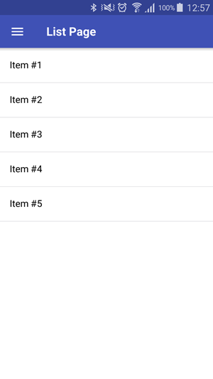
ListPage {
title: "List Page"
model: [{ text: "Item #1" },
{ text: "Item #2" },
{ text: "Item #3" },
{ text: "Item #4" },
{ text: "Item #5" }]
onItemSelected: (index, item) => navigationStack.popAllExceptFirstAndPush(detailPageComponent, { title: "Detail of #" + (index + 1) })
}
}
}
}
Component {
id: detailPageComponent
AppPage {
AppText {
text: title
font.pixelSize: sp(20)
anchors.centerIn: parent
}
}
}
}
This is what the result looks like:
| Android Phone |
iOS Tablet |
|
|
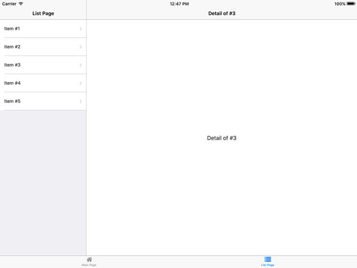
|
As you can see, with just a little bit of code, we created a responsive app with two pages that has a native look and feel and even splits the view of our list page if run on a tablet. Of course, both landscape and portrait
interface orientation are supported.
But the code above still has one minor problem. We set the Image to always use a width of 160 dp. Let's say the image has an actual width of 160 px. Everything
will be ok on devices with 160 dpi, where the resulting image size will also be 160 px. But on higher resolution screens, the image will be scaled up to reach the desired physical size (1 inch in our case). So what quality
should your image have to look good? This problem can be solved with Dynamic Image Switching.
Dynamic Image Switching alias Retina Image Support
There are devices with very different screen resolutions ranging from 480×320 pixels up to 2048×1536 or even more pixels. What quality shall your images have to look good on all of these devices?
If you make your graphics for a very high resolution, the performance will be bad on low-end devices, as more memory than necessary is needed to display these graphics. And if you choose a low resolution, your image will
look blurry on the high-resolution devices.
The solution for this problem is to provide multiple versions of the same image. That means, you create 2 or 3 different versions of your image. Apple uses a file suffix to identify such retina images – so if you have
an image called standard.png with the resolution of 100×50 px, you would also create a 200x100px image and name it standard@2x.png. The same applies for a @3x image. Qt is supporting this
on iOS & Mac platforms beginning with Qt 5.4.
However, the Apple approach has its disadvantages if you want to go cross-platform. First, it is not supported on Android. Second, for the wide range of Android devices & available displays, this separation is often not
enough.
In most cases, you’d like to choose the retina images if the device has an almost retina like display.
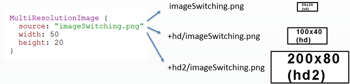
In Felgo, you can do that with the MultiResolutionImage component! We already added the screen detection to Felgo and automatically choose the best image version for each
screen.
In order for this to work, provide three different images:
- imageSwitching.png (e.g. 50×20 px)
- +hd/imageSwitching.png (e.g. 100×40 px)
- +hd2/imageSwitching.png (e.g. 200×80 px)
You can use this MultiResolutionImage like a normal Image component in QML. The code snippet below selects the best image automatically, and it will always have a reported
(logical) size of 50 x 20 with the image from the example above:
This approach is similar to Android, where you can add different images per density bucket ldpi (ld), mdpi (sd), hdpi (hd) and xhdpi (hd2) in separate directories. The + in front of the directory name allows us to use the Qt
File Selectors internally, which are implemented in C++ and thus really fast.
In addition, you can customize the file selectors to match your app requirements best. For example, if you target a lot of low-end devices: simply add a +ld directory and put the image with 75% of the standard size there.
You can then set your custom scale sizes with the FelgoApplication::setContentScaleThresholds() method.
To summarize, you get the following benefits with dynamic image switching:
- Save graphics memory: based on the screen size, the best matching image is selected to avoid upscaled and blurry images, and to save memory compared to an approach where always the highest resolution images are
used.
- Improve loading times: as the best-sized image is selected, you get an ideal loading time of the used image.
- Specify a density-independent image size to have the same physical image size, although a high resolution image version is used on high resolution displays.
Note: The disadvantage of this approach is that your app size gets bigger, because your app package contains each image multiple times (with different resolutions). If you have a strong concern about app size, you
could provide a normal version of your app with only the sd images. And additionally a "Pro", "Tablet" or "Retina" version of your app binary including the hd and hd2 images.
How to Test Your Application on Multiple Screens
With Felgo, you can easily test how your app will look like on multiple devices:
Just press Ctrl (or Cmd on Mac) + the number keys 1-7 to switch between the most used resolutions for devices, including iPhone 4, iPhone 5, iPad and Android’s Nexus device resolutions. This allows
you to quickly test how your app looks like on different aspect ratios! You can also manually change the window size on the desktop to see how the responsive layout adapts.
For testing the real physical sizes, deploy your app to a phone as early as possible. Ideally to a phone and a tablet, so you get the best feel for the user experience.
For quick testing how your Felgo app will look on iOS or Android without deploying to a real device or a simulator, you can use the following code snippet. It changes the app Theme to a
certain platform.
App {
id: app
onInitTheme: {
if(system.desktopPlatform) {
Theme.platform = "ios"
app.uiScale = 2
}
}
}
Density Independence References
Here are some interesting articles about this topic:


