AppToolTip
Shows a tool tip overlay for a target item. More...
| Import Statement: |
import Felgo 4.0 |
| Since: |
Felgo 3.9.0 |
| Inherits: |
AppOverlay
|
Properties
Detailed Description
The AppToolTip item displays a tool tip bubble for a specified target QML item. The default configuration displays the specified text within the tool tip. Changing the target of a tool tip while it is open will close the bubble and automatically open another bubble for
the new target.
AppToolTip extends the AppOverlay type and includes a custom AppOverlay::backgroundItem that highlights the target by darkening the
screen around it. The tool tip bubble is defined as AppOverlay::sourceItem, and should not be overwritten. To show custom content within the bubble, use the dedicated contentComponent property instead.
Usage Examples
Set the target and text property to configure a simple tool tip. Then call the open() function to display the tool tip:
import Felgo
import QtQuick
App {
NavigationStack {
AppPage {
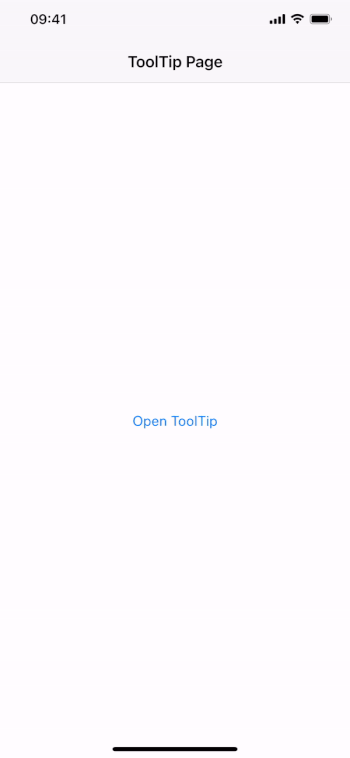
title: "ToolTip Page"
AppButton {
id: myButton
text: "Open ToolTip"
anchors.centerIn: parent
onClicked: myToolTip.open()
}
AppToolTip {
id: myToolTip
target: myButton
text: "This button opens a tool tip."
}
}
}
}
To modify the highlight effect that is added by the default backgroundItem, use the highlightSpread, highlightGradient or backgroundColor property. You can also change the bubble color and radius, and even replace the contentComponent
with a fully custom item:
import Felgo
import QtQuick
App {
NavigationStack {
AppPage {
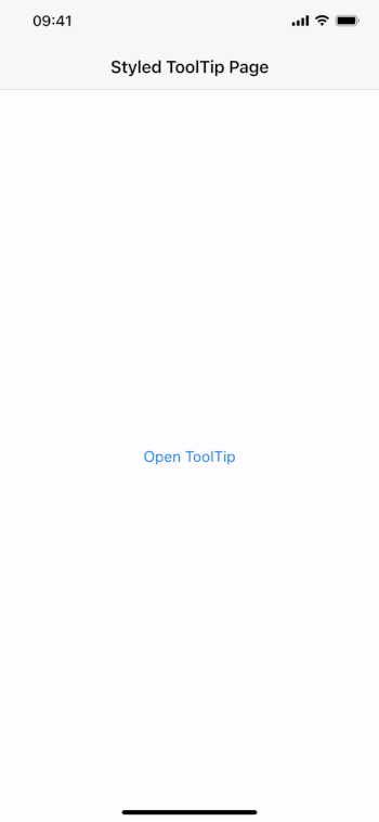
title: "Styled ToolTip Page"
AppButton {
id: myButton
text: "Open ToolTip"
anchors.centerIn: parent
onClicked: myToolTip.open()
}
AppToolTip {
id: myToolTip
target: myButton
text: "Shows a customized tool tip."
color: "black"
textColor: "white"
textSize: sp(16)
arrowSize: dp(12)
radius: 0
backgroundColor: Qt.rgba(0,0,0,0.5)
highlightSpread: 3
highlightGradient: Gradient {
GradientStop { position: 0; color: "black" }
GradientStop { position: 0.12; color: "black" }
GradientStop { position: 0.18; color: Qt.rgba(0,0,0,0.6) }
GradientStop { position: 0.5; color: "transparent" }
}
contentComponent: Row {
anchors.centerIn: parent
height: textItem.implicitHeight
spacing: myToolTip.horizontalPadding
AppIcon {
id: iconItem
iconType: IconType.info
color: textItem.color
anchors.verticalCenter: parent.verticalCenter
}
AppText {
id: textItem
width: Math.min(implicitWidth, myToolTip.maximumContentWidth - iconItem.width - parent.spacing)
anchors.bottom: parent.bottom
color: myToolTip.textColor
fontSize: myToolTip.textSize
Component.onCompleted: textItem.text = myToolTip.text
}
}
}
}
}
}
Tutorial Sequences with Multiple Targets
The AppToolTip also supports the creation of tool tip sequences, for example to give a short introduction tour. Simply change the target to automatically close the current tool
tip and open it for another item:
import QtQuick
import Felgo
App {
id: app
Navigation {
id: navigation
navigationMode: navigationModeTabs
NavigationItem {
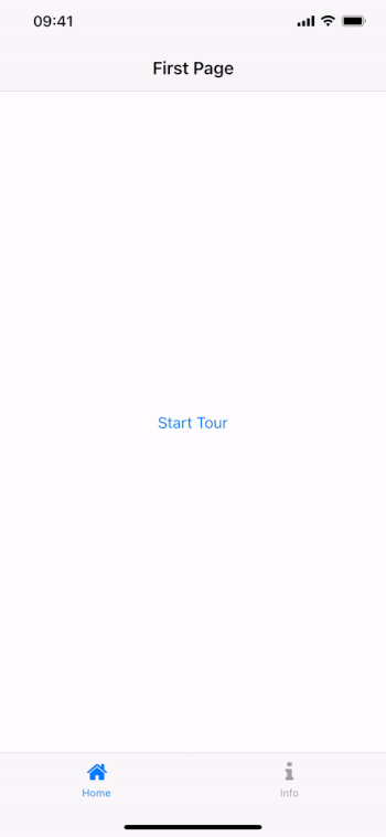
title: "Home"
iconType: IconType.home
NavigationStack {
AppPage {
title: "First Page"
AppButton {
text: "Start Tour"
anchors.centerIn: parent
onClicked: tutorialToolTip.open()
}
}
}
}
NavigationItem {
title: "Info"
iconType: IconType.info
NavigationStack {
AppPage {
title: "Second Page"
}
}
}
}
AppToolTip {
id: tutorialToolTip
target: firstTabPlaceholder
text: target.toolTipText
closeOnBackgroundClick: false
onBackgroundClicked: {
if(tutorialToolTip.isOpen && !tutorialToolTip.isAnimating)
tutorialToolTip.next()
}
function next() {
if(target !== secondTabPlaceholder) {
target = secondTabPlaceholder
}
else {
tutorialToolTip.close()
tutorialToolTip.target = firstTabPlaceholder
}
}
}
property real tabWidth: width / navigation.count
property real tabHeight: dp(Theme.navigationTabBar.height)
Item {
id: firstTabPlaceholder
width: tabWidth
height: tabHeight
anchors.bottom: parent.bottom
anchors.bottomMargin: NativeUtils.safeAreaInsets.bottom
property string toolTipText: "The first page of the app."
}
Item {
id: secondTabPlaceholder
x: tabWidth
width: tabWidth
height: tabHeight
anchors.bottom: parent.bottom
anchors.bottomMargin: NativeUtils.safeAreaInsets.bottom
property string toolTipText: "Go here to see the second page."
}
}
Note: The tool tip requires a valid item reference to the target item for the tool tip. This example uses placeholder items for positioning the tool tips correctly, as the navigation does not offer a simple way to
access the actual UI element of each tab.
Property Documentation
The component used for the content within the tool tip bubble. The default component shows an AppText that centers within the bubble and relies on maximumContentWidth to wrap the text if needed:
import Felgo
import QtQuick
App {
NavigationStack {
AppPage {
title: "ToolTip Page"
AppButton {
id: myButton
text: "Open ToolTip"
anchors.centerIn: parent
onClicked: myToolTip.open()
}
AppToolTip {
id: myToolTip
target: myButton
text: "This button opens a tool tip."
contentComponent: Component {
AppText {
width: implicitWidth < myToolTip.maximumContentWidth ? implicitWidth : myToolTip.maximumContentWidth
height: implicitHeight
anchors.centerIn: parent
verticalAlignment: Text.AlignVCenter
font.pixelSize: myToolTip.textSize
color: myToolTip.textColor
Component.onCompleted: text = myToolTip.text
}
}
}
}
}
}
See also maximumContentWidth, textSize, and textColor.
Allows to configure the gradient property of the RadialGradient that is used to produce the highlight effect. The default
configuration is:
import Felgo
import QtQuick
App {
NavigationStack {
AppPage {
title: "ToolTip Page"
AppButton {
id: myButton
text: "Open ToolTip"
anchors.centerIn: parent
onClicked: myToolTip.open()
}
AppToolTip {
id: myToolTip
target: myButton
text: "This button opens a tool tip."
highlightGradient: Gradient {
GradientStop { position: 0; color: "black" }
GradientStop { position: 0.1; color: "black" }
GradientStop { position: 0.15; color: Qt.rgba(0,0,0,0.6) }
GradientStop { position: 0.5; color: "transparent" }
}
}
}
}
}
Specifies the strength of the highlight effect. The default value is 6. Lowering the value highlights a smaller area around the target item, a higher value increases the target area.
|
maximumContentWidth : real
|
Specifies the target item for the tool tip. When opening the AppToolTip, it darkens screen around the target and a tool tip bubble appears.


