This guide is about how to design your Qt app or game to support multiple screen sizes and screen densities with the help of Felgo. This also includes how to write your application to support multiple aspect ratios. There is little information about this topic online yet, so let’s summarize why it is important…
To create a game or app for smartphones, tablets and desktop with a single code base, you probably ask yourself these questions:
In the next sections we’ll give an answer to all these questions, so read on. :)
Note: Scroll down to download the slides of our presentation at Qt Developer Days Europe in October 2014, which had a similar topic: How to Develop with Qt for Multiple Screen Resolutions and Increase Your User Retention (of Cross-Platform Apps and Games)
Let’s start with answering the question: How big shall I make buttons and other UI elements so they look good on all devices?
The simplest approach is to just set the size of elements based on the ApplicationWindow or GameWindow size. For example this code:
 ApplicationWindow {
   width: 800
   height: 600


   Rectangle {
     height: parent.height*0.2
     width: parent.width
     color: "blue"
   }

   Rectangle {
     anchors.bottom: parent.bottom
     height: parent.height*0.3
     width: parent.width
     color: "lightgrey"

     Image {
       source: "../assets/qt-partner-logo.png"
       height: parent.height * 0.8
       anchors.centerIn: parent
       fillMode: Image.PreserveAspectFit
     }
   }

   Text {
     anchors.right: parent.right
     anchors.rightMargin: parent.width*0.05
     text: "Scaled Text"
     font.pixelSize: parent.height*0.1
   }

 }
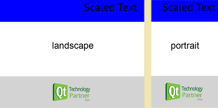
Looks like that in landscape mode (left) and in portrait mode (right):

This can be sufficient for most use cases. But for devices that have a more "square" aspect ratio, like the iPad with 1024×768 pixels (a 4:3 ratio), the elements will appear higher than for example on a 16:9 device. It gets even more extreme in a portrait resolution (most of the screen is covered with the header and footer not with the white content area).
Probably not what you want, right? And definitely not the best use for the available screen space. Also, the image in the bottom and Text on the top will be much bigger on an iPad in physical size.
If you run the previous code on an iPad, the physical size of the blue rectangle and the image will be much bigger than on an iPhone 4. The reason is that the physical dimensions (in millimeters or inches) of the whole screen is much bigger on the tablet than on phone. so you get a height of about 3cm for the blue rectangle on iPad, versus only 2cm on the phone.
In most UI driven apps or games, you’d like to have exact same physical size for UI elements. So a button should be as big that it is touchable with a finger. Not bigger to waste space, and definitely not smaller that makes it untouchable on smaller devices.
That’s why we added support for density independence in Qt to Felgo update 2.2.0!
With the new properties, you can define the physical size of buttons, Rectangles or any QML Items.
You can use these new Felgo properties & methods for both GameWindow and Scene:
As you can see on this image, the physical size of one element in the ListView is the same across devices, although they have different screen resolutions, aspect ratios and screen densities!
So on tablets, there are more rows shown than on the phone.
In contrast, with the fixed percentage approach, the same amount of rows would be shown and it gets scaled to fit the screen:
This makes the elements quite big on tablets. It is up to the requirements of your app or game, if this is still okay.
You can have a look at the code of this app here. It is also part of the Felgo SDK, available in the folder <QtSDK>/Examples/Felgo/examples/densityIndependence.
A responsive app makes best use of the available screen size. So on a large display like tablets, more information can be displayed than on smartphones.
You can achieve that by using the adaptive layout functions provided by Felgo. For example dp() to get density-independent units. In addition, you can control what to show on different screens to make the best use of the available screen space. For example:
You can implement that example with a Loader component and the properties provided by Felgo tablet, portrait and landscape:
 import Felgo 4.0
 import QtQuick 2.0

 GameWindow {
   id: gameWindow

   Scene {
     id: scene

     Loader {
       id: sideBarLoader
       // only show in landscape mode
       active: gameWindow.landscape
       sourceComponent: sideBarComponent

       // hide the loader if not in landscape
       width: gameWindow.landscape ? scene.dp(120) : 0
       // fill the whole screen height
       anchors.top: scene.gameWindowAnchorItem.top
       height: scene.gameWindowAnchorItem.height
       anchors.left: scene.gameWindowAnchorItem.left
     }// SideBarLoader

     Component {
       id: sideBarComponent
       Rectangle {
         color: "blue"
         // ... content of SideBar here ...
       }
     }// SideBarComponent

     ListView {
       anchors.left: sideBarLoader.right
       anchors.right: scene.gameWindowAnchorItem.right
       height: scene.gameWindowAnchorItem.height
       delegate: listViewDelegate
       spacing: scene.dp(2)
       model: [ "", "", "", ] // some test data to display the rows
     }// ContentListView

     Component {
       id: listViewDelegate

       Rectangle {
         // make a row bigger if the device is a tablet
         height: gameWindow.tablet ? scene.dp(80) : scene.dp(48)
         width: parent.width

         color: "grey"
         // ... content of ListView row here ...
       }

     }// ListViewDelegate

   }
 }
In contrast to apps, games are rarely data and UI driven. So having different physical sizes for UI elements is not that much of an issue. You just want your game to be equally playable fullscreen on all devices. Furthermore, you often want to avoid showing more of the game screen on bigger devices, e.g. showing more of the current level just because a tablet is used instead of a phone.
So we prefer a scalable layout over density-independent sizes in that case. However, using multiplications with parent.height or parent.width like explained in the
Scalable Layout in Qt section messes up the code and can break your layout.
That’s why we added a concept called Content Scaling, also called Virtual Sizes, to Felgo. It works like this:
This is how the code looks like:
 import Felgo 4.0
 import QtQuick 2.0

 GameWindow {
   id: gameWindow
   // the default Window size at app start on Desktop
   // change it to your preferred start size during development
   // on mobile devices, the app is shown fullscreen
   screenWidth: 960
   screenHeight: 640

   Scene {
     id: scene
     // the default logical size is 480x320
     // use 320x480 for portrait apps & games

     Rectangle {
       width: 48
       height: 32

       Text {
         font.pixelSize: 14
         text: "14px content-scaled"
       }
     }// Rectangle

     Rectangle {
       // like that you can anchor to the GameWindow (the screen)
       anchors.bottom: scene.gameWindowAnchorItem.bottom
       anchors.left: scene.gameWindowAnchorItem.left
     }
   }// Scene
 }
Internally, we then calculate the scale factor based on the GameWindow size and the Scene size. For example a 960x640px screen like the iPhone 4S, has a xScale and yScale factor set to 2. Based on the scaleMode, you can adjust what happens if the xScale and yScale is not be the same (a non-uniform scale), like with an iPad with 1024x736px resolution.
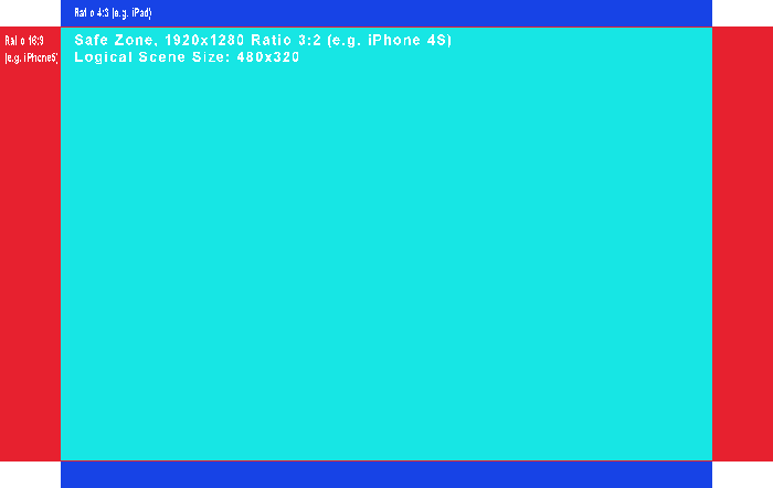
The default setting is letterbox, which guarantees your Scene is always visible on all devices. If the device then has an aspect ratio of 4:3 like the iPad for example, you have additional space on the top and bottom which you can fill with a bigger background to make it look good.
You can download a Photoshop template for your background and the safe zone here. This is how it looks like:

Having the same virtual size has a couple of advantages, especially for games:
Content scaling can be used with the MultiResolutionImage, GameAnimatedSprite and GameSpriteSequence components. For a tutorial & more information, see How to create mobile games for different screen sizes and resolutions.
With Felgo, you can easily test how your app will look like on multiple devices:
Just press Ctrl (or Cmd on Mac) + the number keys 1-7 to switch between the most used resolutions for devices, including iPhone 4, iPhone 5, iPad and Android’s Nexus
device resolutions. That allows you to quickly test how your app looks like on different aspect ratios!
For testing the real physical sizes, deploy your app to a phone as early as possible. Ideally to a phone and a tablet, so you get the best feel for the user experience.
So, the initial question was: How big shall I make my images? Well, let’s see…
There are devices with very different screen resolutions ranging from 480×320 pixels up to 2048×1536 or even more pixels. What quality shall your images have to look good on all of these devices?
If you make your graphics for a very high resolution, the performance will be bad on low-end devices. And if you choose a low resolution, your image will look blurry on the high-resolution devices.
The solution for this problem, is to provide multiple versions of the same image. That means, you create 2 or 3 different versions of your image. Apple uses a file suffix to identify such retina images – so if you
have an image called standard.png with the resolution of 100×50 px, you would create a 200x100px and name it standard@2x.png. The same applies for a @3x image. Qt is supporting this on iOS & Mac platforms beginning with Qt 5.4.
However, the Apple approach has its disadvantages if you want to go cross-platform. First, it is not supported on Android. Second, for the wide range of Android devices & available displays, this separation is often not enough.
In most cases, you’d like to choose the retina images if the device has an almost retina like display.
In Felgo, you can do that with the MultiResolutionImage component! We already added the screen detection to Felgo and automatically choose the best image version for each screen.
In order for this to work, provide three different images:
You can use this MultiResolutionImage like a normal Image component in QML. The code snippet below selects the best image automatically, and it will always have a reported (logical) size of 50 x 20 with the image from the example above:

This approach is similar to Android, where you can add different images per density bucket ldpi (ld), mdpi (sd), hdpi (hd) and xhdpi (hd2) in separate directories. The + in front of the directory name allows us to use the Qt File Selectors internally, which are implemented in C++ and thus really fast.
In addition, you can customize the file selectors to match your game requirements best. For example, if you target a lot of low-end devices: simply add a +ld directory and put the image with 75% of the standard size there.
You can then set your custom scale sizes with the FelgoApplication::setContentScaleThresholds() method.
To summarize, you get the following benefits with dynamic image switching:
For more information on Dynamic Image Switching and Felgo File Selectors, see here.
Note: The disadvantage of this approach is that your app size gets bigger, because you add each image multiple times (with different resolution). If you have a strong concern about app size, you could provide a normal version of your app with only the sd images. And additionally a "Pro", "Tablet" or "Retina" version of your app binary including the hd and hd2 images.
In 2014, we did a 1-hour presentation at Qt Developer Days Europe 2014 about this topic. You can view & download the slides from Slideshare here.
Was this a bit overwhelming? And do you ask yourself "So when should I use which of these techniques?"
We recommend the following:
font.pixelSize for Text elements and put them as children or sub-children of a Scene with the content scaling approach. If you use the adaptive layout approach, use scene.sp() for font.pixelSize values of Text
elements.
Another great resource for learning these concepts are the sample games we provide with the Felgo SDK. You can find them after downloading Felgo here: <QtSDK>/examples/Felgo/demos. For a
summary of these published sample games, see here.
Here is a list of interesting articles about this topic on the web: