TabControl
A tabbed navigation control. More...
| Import Statement: |
import Felgo 4.0 |
| Inherits: |
Item
|
Properties
Signals
Detailed Description
This control can be used for a navigation based on tabs. It is based on the Qt Quick TabBar and StackLayout. It has a default a platform-specific look. You can use the properties tabBar.background, NavigationItem::contentItem and
others to customize the tabs' appearances.
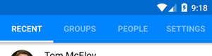
Children of TabControl should be NavigationItem objects.
To implement a platform dependent navigation, Navigation can be used instead of TabControl.
TabControl internally uses a TabBar to display the navigation items. It shows the navigation item content in a StackLayout.
Note: TabControl uses a lazy-loading mechanism for the contents of each tab. This means, that the tab contents within each NavigationItem element are created when the tab is
opened for the first time. You can disable the lazy-loading manually. To do so, set NavigationItem::lazyLoadContent to false.
Example Code
To use tabbed control in your application, the following code can be used:
 AppPage {
   TabControl {
     NavigationItem {
       title: "Tab #1"
       iconType: IconType.arrowleft

       FirstPage { }
     }
     NavigationItem {
       title: "Tab #2"
       iconType: IconType.arrowright

       SecondPage { }
     }
   }
 }
Property Documentation
The height of the tab bar in pixel. The default value matches Theme.tabBar.height
This property was introduced in Felgo 3.7.0.
The number of tabs that are visible in the control.
This property was introduced in Felgo 4.0.0.
See also tabBar and count.
The current tab's index. You can also change this property to change the currently active tab.
This property sets the internal tabBar's currentIndex property.
This property was introduced in Felgo 4.0.0.
See also tabBar, stackLayout, and tabWidth.
The color of the upper divider. The default value matches Theme.tabBar.dividerColor
This property was introduced in Felgo 3.7.0.
Whether the tab text label is displayed in bold. The default value matches Theme.tabBar.fontBold
This property was introduced in Felgo 3.7.0.
|
fontCapitalization : real
|
The size of the tab icon in pixel. The default value matches Theme.tabBar.iconSize
This property was introduced in Felgo 3.7.0.
The color of the bottom marker which shows the selected tab.
The default value matches Theme.tabBar.markerColor
This property was introduced in Felgo 3.7.0.
|
showOnlySelectedLabel : bool
|
The color of icon and text for the pressed item. The default value is false.
This property was introduced in Felgo 3.7.0.
The internally used StackLayout for layouting the tab content.
This property was introduced in Felgo 4.0.0.
See also tabBar.
The internally used TabBar for showing the tab buttons.
This property was introduced in Felgo 4.0.0.
See also stackLayout.
Sets the vertical tab position. Tabs can appear on top or bottom of the user interface.
The corresponding values for this are TabBar.Header and TabBar.Footer. This property sets the internal TabBar::position proeprty.
This property was introduced in Felgo 4.0.0.
Sets whether the tab bar is visible.
This property sets the internal tabBar's visible property.
This property was introduced in Felgo 4.0.0.
This property gives full access to all font settings of the title text within the tabs.
This property was introduced in Felgo 2.12.0.
|
textMaximumLineCount : int
|
The font size of the tab text label. The default value matches Theme.tabBar.textSize
This property was introduced in Felgo 3.7.0.
The default color of icon and text for each tab. The default value matches Theme.tabBar.titleColor
This property was introduced in Felgo 3.7.0.
|
titleDisabledColor : color
|
The color of icon and text for not selected tabs. The default value matches Theme.tabBar.titleOffColor
This property was introduced in Felgo 3.7.0.
|
titlePressedColor : color
|
The color of icon and text for the pressed item. The default value matches Theme.tabBar.titlePressedColor
This property was introduced in Felgo 3.7.0.
Signal Documentation
Called when a tab has been clicked, and its content page will be displayed.
Note: The corresponding handler is onTabClicked.