This time, I’ll show you how to create a game for multiple resolutions and different devices like phones, tablets or desktop PCs, without having to write your code more than once!
Lesson 2 - How to create a game for multiple resolutions
As a developer, you do not want to rewrite your code for different screen sizes, but would want to implement the game code once and then give the users an equal gaming experience.
A major problem you will encounter is the variety of devices with a wide range of screen sizes and aspect ratio. The solution to this problem that I will now show you, is a technique called content scaling.
You will write your code once for a "logical" scene size and all the images & fonts are scaled to the different device resolutions.
The benefits of this concept are the following:
- Save a lot of time by writing your code only once.
- It is equally fair for players of all devices, also tablets vs. mobiles (this is especially important for competitive games with leaderboards).
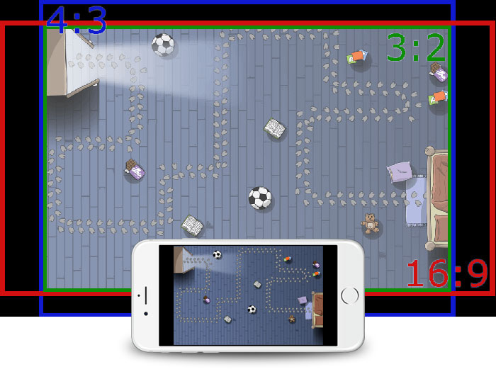
To fit the logical scene size into the display resolution, you can set different scale modes. I will explain letterbox now, the most important and default setting.
Letterbox Scale Mode
This scale mode scales content uniformly so the smaller side fits into the display. This means the whole logical scene is visible on every device.
The downside is, that you will have black borders around the logical scene on different aspect ratios, as shown in this image:
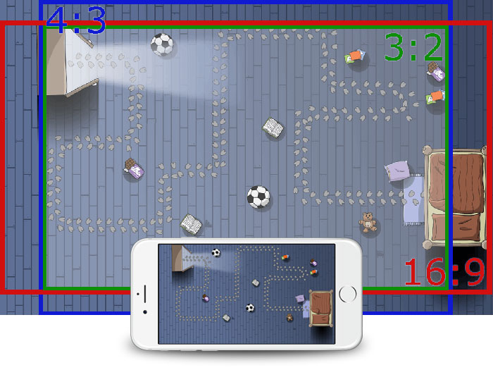
To solve this issue, you can increase the size of your background image to fill those borders. So instead of creating a background in 3:2 ratio, rather create one to also fit the "worst-case" ratios 4:3 and 16:9.
When you have a look at the following image, you will see that for example on the iPad which has a 4:3 ratio, more of the background to the top and bottom is visible, whereas on a Nexus 7 tablet with 16:9 ratio the bed to
the right and more of the background to the left is visible.
To make it easier for you, we have already done the calculations which size your background images should have to support all devices:
Device type Logical Scene Size Suggested Background Size sd 480x320 570x360 hd 960x640 1140x720 hd2 1920x1280 2280x1440
So to summarize, it is best to design your background for a size of 2280x1440 pixels where the inner area with a size of 1920x1280 is the safe zone, visible on all devices. Luckily, I have prepared a
Photoshop Template which you can use to design your background images to work on all screen sizes and aspect ratios! You can download it here.
Sprites & Dynamic Image Switching
Based on the background image and the logical size of 1920x1280, you can then create your other high-resolution game images based on this size. If your entity shall cover 10% of the screen width for example, make it 192 px
wide and display it with the MultiResolutionImage component. If you have an animated sprite where one frame should be 10% of the screen, make each frame of the sprite animation 192
px wide and put the frames next to each other into a single image and use the GameAnimatedSprite component. If you have multiple animation states for one entity like walking, jumping
or idle, use the GameSpriteSequence component and also put all frames into one image.
As using this high-resolution image would be inefficient on lower-end devices, make sure to scale your images down to half and quarter of the size. Felgo then takes care of loading the best-fitting image based on the device
resolution. To use this feature, create a +hd2 and +hd subfolder in your assets folder. Then move the highest-resolution file (the one for the 1920x1280 scene size) to the
+hd2 folder, the half size to +hd and the quarter size to the parent folder. For more information about this feature and for a script to automatically scale down your
sprite animations, read Dynamic Image Switching and see the Felgo Demo Games.
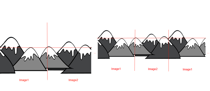
For side-scroller games, the ParallaxScrollingBackground component might come handy. It uses 1 or 2 different images and puts them next to each other over and over while
moving, also with the possibility of mirroring, to achieve a continuous background like shown in the image below. Also use the suggested background sizes from the table above here to avoid black borders.
How to Make Games Fair
Another mechanism to guarantee your game is equally fair for players across different devices is the scene alignment: Imagine a side-scroller game, scrolling from left to
right. If your logical scene is centered in the display, players with different aspect ratios could see a little bit more at the right side. That would mean they could see obstacles approaching them earlier and thus have an
unfair advantage!
To avoid this, you can set the sceneAlignmentX property to right. Now the logical scene is always aligned to the right edge of the display, which makes it equally fair for
all players.
If you want to have more information about this topic, you can read the tutorial How to create mobile games for different screen sizes and resolutions.
Advanced Topics
In some cases, you want to have different UIs and layouts for tablets, mobiles or PCs. Although this guarantees the best user experience, this means your highscores are not comparable any more, and you should create
different leaderboards based on the device your players are using. However, with Felgo you can also create different layouts for different devices – just reply to this email if you would like me to send you more details how to
do that.
Ready for Takeoff
Now it’s your turn to try this concept in action!
Either use your existing game, or create a new project in Qt Creator after downloading the Felgo SDK, and select one of the game templates, for example the tower defense sample game Squaby. You can find its full source code in your Qt installation folder and then browse to the Examples/Felgo/demos/Squaby folder to open the
Squaby.pro file.
Now hit [CTRL] + [1 - 7] while the game is running, and you will see the simulated resolution changes! This is great for testing how your game looks on different display resolutions of the most common devices. If your
game uses content scaling correctly, there are no black borders and the game UI adjusts to the different screen sizes, just like in the sample projects we provide. ;)
Do you need further help to support multi resolutions in your game? Just let me know and reply to this email.
Cheers, Chris from Felgo


