Getting Started with Felgo
We just opened a few windows for you, let me show you what they are good for.
Qt Creator
| You are reading this tutorial inside your development environment, which is called Qt Creator. Felgo is based on Qt and your main language will be QML & JavaScript. If you are searching for
questions online, adding this to your search term will lead to the best results, like "qt qml how to play a video". |
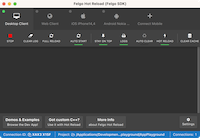
Felgo Hot Reload
|
|
Felgo Hot Reload applies your QML and JS code changes at runtime. This means that everytime you modify the code, your app updates instantly to show the latest changes. This will save a lot of your precious time,
you can read more about it here. The Felgo Hot Reload application monitors your source code, and transfers changes to all connected test devices.
|
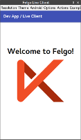
Felgo Developer App
|
|
The Felgo Developer App is the fastest option for development of your projects and to browse Felgo Demos & Examples. Use the Developer App's QML Hot Reload feature to see code changes instantly and develop your
application. Download the Felgo Developer App for iOS and Android. You can simultaneously connect multiple devices to the Felgo Hot Reload application on your
development system. This allows you to test your app on all your devices, without having to install any native mobile SDK or wasting time on compilation and deployment.
|
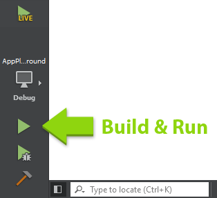
Build & Run
Before I show you the basics of making apps with Felgo, let's test if everything is set up correctly. Hit the green Play button in the lower left corner of Qt Creator. This will build and run your
app without QML Hot Reload. We just want to make sure that this works as well, you might need it later.
Did the app correctly build and start? If not, please immediately head over to our support forums or send us an e-mail so we
can help you fix your problem.
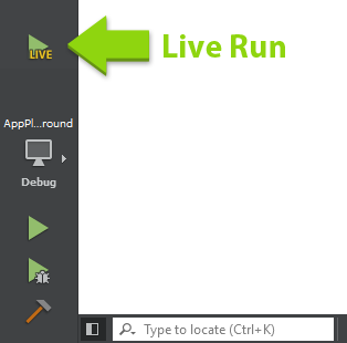
From now on, we will use Felgo Hot Reload. You can close the app that opened. If you already closed the Felgo Hot Reload application and the Developer App, hit the Run Hot Reload button to start developinng with code
reload.
Now, every time you save, your app updates to show the latest state. Make sure to save your code every time you change it like shown in this tutorial!
This guide shows you how to start your first Felgo app project. It will also make you familiar with all the tools and components you need to create your own apps.
On the left side you can see a code editor window, on the right side (this one) you get all the instructions you need for creating your first app.
If you experience any issues during these steps, please don't hesitate to contact us in our support forums.
Basic Structure
Congratulations on your first run. However all you saw was some simple text in the middle of the screen? Let's have a look and see how this is composed:
The left window shows the Main.qml file, the starting point of every project. Felgo apps consist of a set of components. In the editor you can see that this basic Felgo app consists of a root component called
App, a NavigationStack and a Page.
There's also an AppText item inside the Page, that includes some property declarations:
 AppText {
   text: "Welcome to Felgo"
   anchors.centerIn: parent
 }
The text property seems pretty obvious, you can assign any string to it and it will be shown in your app.
The anchors property declaration is worth another note: Every visual component used with Felgo supports a superior system for layouting. With anchors, it's possible to align items relatively to their parent items or
siblings. In the example above, we define that the Text component should be centered within its parent, the Page component. It's also possible to align the Text to the lower screen edge for example. To do that you replace the
centerIn definition with two new ones:
 AppText {
   text: "Welcome to Felgo"

   anchors.horizontalCenter: parent.horizontalCenter
   anchors.bottom: parent.bottom
 }
The NavigationStack is used to navigate forth and back through pages, you will learn how to use it in just a minute.
A Second Component
Everything looking good so far? Great, then let's go one step further and add a second component to your app page. In this step we want to add an image. As you might have already guessed Felgo has a component for that,
called Image. We want to display the image just on top of our Text component. Thanks to anchoring this is an easy task:
AppPage {
AppText {
id: myText
}
AppImage {
anchors.horizontalCenter: myText.horizontalCenter
anchors.bottom: myText.top
source: "../assets/felgo-logo.png"
}
}
We see two changes here:
- First of all we added the AppImage component. Its source property is pointing to an image file already available in your project directory (for your own projects you can add the images
with your file browser in the project's directory).
- The image's bottom edge anchors to the text's top edge. As we can't use the parent declaration for siblings we add a special property called id to the Text component. Id is a unique identifying label for a
specific component tree.
Note: You can always use an explicit id instead of the convenience parent declaration. As an example you can give your Page component an explicit id and anchor the Text item based on that id instead of
parent.
Beside the simple image component Felgo offers a lot more components, especially for making apps. For example, there are components for navigation, tabs, buttons and a lot more controls. You can find a link to all available
components (API reference) at the end of this tutorial.
Add Another Page
Almost every app consists of more than one screen, so it's time to have a look how to add another page.
Pages, like all other QML components can be defined either inline like in our "Main.qml" file or in a separate QML file that's loaded if referenced. For this step we choose the second approach. There are three main
steps:
First, we have to add another page component, usually you would create the new file beside the Main.qml file, for this tutorial we already added a second one. You can find it in the file browser to the very left, called
DetailPage.qml. Open it by double clicking it.
Now add a new AppText component to it, like we have on our main page, and change the text to be something different.
The second step is to add an id to your Page in the Main.qml file, so we can access it, like this:
AppPage {
id: page
title: "My First App"
}
The third and last step is to add a button to navigate to our second page. You can use the AppButton component for that. Open your Main.qml file and add the following code as child of the Page, next to the AppText and AppImage components:
 AppButton {
   anchors.horizontalCenter: parent.horizontalCenter
   text: "Second Page"

   onClicked: {
     page.navigationStack.push(Qt.resolvedUrl("DetailPage.qml"))
   }
 }
When running the app you see that the navigation stack pushed the second page after clicking the button, the title of the Navigationbar automatically changes to the title of the second page and you should see the text from
the Text component you added before.
How does this come? There are lot's of new things in here:
First, the onClicked: declaration within the AppButton. What looks like a property is a so-called signal handler from the clicked signal of the AppButton.
The code block after the signal handler is JavaScript code, that is executed every time the button gets clicked. In our case we reference our NavigationStack. navigationStack
is a convenience property of our Page that is automatically set whenever the Page is a direct child of a NavigationStack (don't forget to add the id to the Page component). Finally we
call the push() method (also called a function) of our NavigationStack. The parameter of our push method referenced our second page QML file.
Note: There are some more possibilities how you can push another page, but we stick with that one for now.
From now on you know that there are three things which make up a QML component: properties, signal handlers and methods.
Property Bindings
Beside the already mentioned signal handlers, QML offers another concept for reacting to changes: Property Bindings. Whenever a property changes its value, it can send a signal to notify others of this change. You can
listen to that change by adding an on<PropertyName>Changed signal handler. You can also bind a property to another property of the same or different component, so whenever a property changes all of its bound properties
change too.
Let's try this with the background color of the main page and our button. The AppButton item offers a property called pressed that's true whenever there is an active press within
it. We can bind this property to the backgroundColor property of our page like the following listing:
AppPage {
id: page
title: "My First App"
backgroundColor: appButton.pressed ? "lightblue" : "white"
AppButton {
id: appButton
anchors.centerIn: parent
text: "Second Page"
onClicked: {
}
}
}
Note: The "<bool condition> ? <first argument> : <second argument>" is just a short form of an if/else block, meaning that if the bool condition is true use the first argument, otherwise the
second one. This is normal JavaScript syntax by the way.
You can add property binding for almost all properties within your project.
Next Steps
Congratulations, you successfully started your first app with Felgo. Now it's time to get deeper into Felgo's concepts and app-related components. Please have a look at the following guides:
If you are interested in learning more about the basics of Qt & QML, consider looking at the following tutorials:
Finally, we provide you with a number of open-source demo apps and examples. You may use them as a starting point for your own app, or just copy parts of it to speed up your development.
Want to learn more about the AppButton component? Place your mouse cursor somewhere in the AppButton declaration and press F1 to open the integrated
help. The new page will replace this one, so bye bye for now! Or you can come back by navigating back with the yellow arrows at the top, or the backspace key, or using your extra mouse buttons, just like within a browser.


