Getting Started with Felgo
We just opened a few windows for you, let me show you what they are good for.
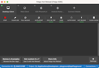
Qt Creator
| You are reading this tutorial inside your development environment, which is called Qt Creator. Felgo is based on Qt and your main language will be QML & JavaScript. If you are searching for
questions online, adding this to your search term will lead to the best results, like "qt qml how to play a video". |
Felgo Hot Reload
|
|
Felgo Hot Reload applies your QML and JS code changes at runtime. This means everytime you modify the code, your app updates instantly to show the latest changes. This will save a lot of your precious time, you can read more about it here. The Felgo Hot Reload application monitors your source code, and transfers changes to all connected test devices.
|
Felgo Developer App
|
|
The Felgo Developer App is the fastest option for development of your projects and to browse Felgo Demos & Examples. Use the Developer App's QML Hot Reload feature to see changes instantly and develop your application.
Download the Felgo Developer App for iOS and Android. You can simultaneously connect multiple devices to the Felgo Hot Reload application on your development
system. This allows you to test your app on all your devices, without having to install any native mobile SDK or wasting time on compilation and deployment.
|
Build & Run
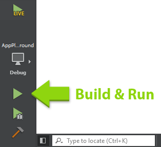
Before I show you the basics of making apps with Felgo, let's test if everything is set up correctly. Hit the green Play button in the lower left corner of Qt Creator. This will build and run your
app without QML Hot Reload. We just want to make sure that this works as well, you might need it later.
Did the app correctly build and start? If not, please immediately head over to our support forums or send us an e-mail so we
can help you fix your problem.
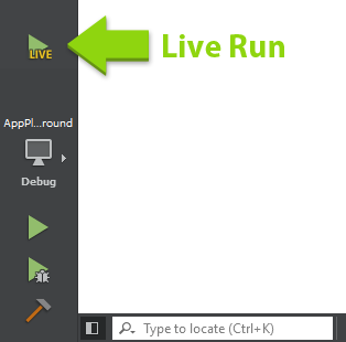
From now on, we will use Felgo Hot Reload. You can close the app that opened. If you already closed the Felgo Hot Reload application and the Deveveloper App, hit the Run Hot Reload button to start developing with code
reload.
Now, every time you save, your app updates to show the latest state. Make sure to save your code every time you change it like shown in this tutorial!
This guide will show you how to start your first Felgo game project. It will also make you familiar with all the tools and components you'll need to create your own games.
On the left side you can see a code editor window, on the right side (this one) you get all the instructions you need for creating your first game.
If you experience any issues during these steps, please don't hesitate to contact us in our support forums.
Basic Structure
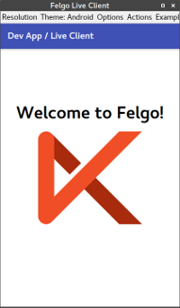
Congratulations on your first run. However all you saw was some simple text in the middle of the screen? Let's have a look and see how this is composed:
The left window shows the Main.qml file, the starting point of every project. Felgo games consist of a set of components. The most basic Felgo project consists of a root component called GameWindow and a
Scene, like you see in the editor. Your game will have multiple scenes later on but let's just stick with one for now.
There's one additional Text item inside the Scene, that includes some property declarations:
 Text {
   text: "Welcome to Felgo"

   font.pixelSize: 16
   anchors.centerIn: parent
 }
The text property seems pretty obvious, you can assign any string to it and it will be shown in your app. With the font.pixelSize property, you can control the size of the text.
The anchors property declaration is worth another note: Every visual component used with Felgo supports a superior system for layouting. With anchors, it's possible to align items relatively to their parent items or
siblings. In the example above, we define that the Text component should be centered within its parent, the Scene component. It's also possible to align the Text to the lower screen edge for example. To do that you replace the
centerIn definition with two new ones:
Text {
anchors.horizontalCenter: parent.horizontalCenter
anchors.bottom: parent.bottom
}
Your first component
Everything looking good so far? Great, then let's go one step further and add a second component to your game scene. In this step we want to add an image. As you might have already guessed Felgo has a component for that,
called Image. We want to display the image just on top of our Text component. Thanks to anchoring this is an easy task:
Scene {
Text {
id: myText
}
Image {
anchors.horizontalCenter: myText.horizontalCenter
anchors.bottom: myText.top
source: "../assets/felgo-logo.png"
}
}
We see two changes here:
- First of all we added the Image component. Its source property is pointing to an image file already available in your project directory (for your own projects you can add the images with your file browser in the project's
directory).
- The image's bottom edge anchors to the text's top edge. As we can't use the parent declaration for siblings we add a special property called id to the Text component. Id is a unique identifying label for a
specific component tree.
Note: You can always use an explicit id instead of the convenience parent declaration. As an example you can give your Scene component an explicit id and anchor the Text item based on that id instead of
parent.
Beside the simple image component Felgo offers a lot more components, especially for making games. For example, there are components for animated sprites, sound effects, physics and more. You can find a link to all available
components (API Reference) at the end of this tutorial.
Now it's time to make our first example interactive. We want to react to user taps by creating our very first custom component, a button item.
For that we introduce two new components, the Rectangle, a visual representation of a geometric rectangle, and a MouseArea, a component that
can react to user touches or clicks.
First of all we remove the Image again and wrap our existing Text item into a blue rectangle to make it look like a button:
 Scene {

   Rectangle {
     anchors.horizontalCenter: parent.horizontalCenter
     anchors.bottom: parent.bottom

     width: myText.width + 10
     height: myText.height + 10

     color: "blue"

     Text {
       id: myText

       text: "Button"
       color: "white"

       anchors.centerIn: parent
     }
   }

 }
You may have noticed that we moved the anchors declaration out from the Text to its parent item, the new Rectangle component and positioned the Text item again in the center of its parent. We also set the size of the
rectangle to wrap the entire Text element plus an additional padding of 10.
Looks like a button but it's still not acting like a button. This is because it's not responding to clicks. Let's change that by adding the second new component, called MouseArea, as a child of the rectangle:
 Rectangle {
   anchors.horizontalCenter: parent.horizontalCenter
   anchors.bottom: parent.bottom

   width: myText.width + 10
   height: myText.height + 10

   color: "blue"

   Text {
     id: myText

     text: "Button"
     color: "white"

     anchors.centerIn: parent
   }

   MouseArea {
     id: mouseArea

     anchors.fill: parent

     onClicked: {
       console.debug("Button clicked")
     }
   }
 }
The MouseArea fills its parent, meaning that the entire button is within the click range. There's one more new thing: the onClicked:
declaration. What looks like a property is a so-called signal handler from the clicked signal of the MouseArea. The signal gets
emitted every time a click happens within the MouseArea. The console.debug command therefore prints "Button clicked" to the log output pane
every time the signal handler fires.
Now that we've covered this information, let's give your example a try and watch at the "Application Output" pane below the editor.
That's your first custom component! Later on in your own projects, you can move that code into its own QML file that you can then just import and reuse across your project. We already prepared an example file for you: Open
the MyButton.qml qml file from the file tree in the left pane, copy your custom component from above and replace the empty Item {} component with your code(make sure to only keep the import
statements as they are).
You can now go back to your Main.qml file and replace the code block from above with this simple one:
MyButton {}
Just a small improvement: Since we want the button to be re-usable at different points of our project, it doesn't really make sense that we defined the default position of the button with anchors inside the component.
So go ahead and delete the 2 anchors definitions of the Rectangle in MyButton.qml and instead define them in your Main.qml file like this:
 MyButton {
   anchors.horizontalCenter: parent.horizontalCenter
   anchors.bottom: parent.bottom
 }
Property Bindings
Beside the already mentioned signal handlers, QML offers another concept for reacting to changes: Property Bindings. Whenever a property changes its value, it can send a signal to notify others of this change. You can
listen to that change by adding an on<PropertyName>Changed signal handler. You can also bind a property to another property of the same or different component, so whenever a property changes all of its bound properties
change too.
Let's try this with the background color of our custom button. The MouseArea item offers a property called pressed that's true whenever
there is an active press within the area. Change the implementation of MyButton.qml to match the following listing:
Rectangle {
width: myText.width + 10
height: myText.height + 10
color: mouseArea.pressed ? "lightblue" : "blue"
Text {
id: myText
text: "Button"
color: "white"
anchors.centerIn: parent
}
MouseArea {
id: mouseArea
anchors.fill: parent
onClicked: {
console.debug("Button clicked")
}
}
}
Whenever the pressed property of the MouseArea changes, the property binding on the color property of the rectangle gets re-evaluated.
Note: The "<bool condition> ? <first argument> : <second argument>" is just a short form of an if/else block, meaning that if the bool condition is true use the first argument, otherwise the
second one.
Now watch how the background color of your button changes when you press and hold the button.
You can add property binding for almost all properties within your project. As an example look at the width and height declaration of the rectangle. You actually used a property binding before, because it is bound the the
width and height of the text to match its size. We can change the text of the Text item as soon as the button gets clicked and see how the button resizes.
All we have to do is add another line of code to the onClicked handler within the MouseArea:
MouseArea {
id: mouseArea
anchors.fill: parent
onClicked: {
console.debug("Button clicked")
myText.text = "Clicked Button"
}
}
Note: You can change the text by referencing the property with the syntax itemId.property. Please also note the assignment operator is different from the property colon assignment in QML. The reason for the
changed syntax can be easily explained: You're writing JavaScript code within the { } declaration of a signal handler.
Next Steps
Congratulations, you successfully started your first game with Felgo. Now it's time to get deeper into Felgo's concepts and gaming-related components. Please have a look at the following guides:
If you are interested in learning more about the basics of Qt & QML, consider looking at the following tutorials:
Finally, we provide you with a number of open-source demo games and examples. You may use them as a starting point for your own game, or just copy parts of it to speed up your development.
Want to learn more about the MouseArea component? Place your mouse cursor somewhere in the MouseArea declaration and press F1 to open the integrated help. The new page will replace this one, so bye bye for now! Or you can come back by navigating
back with the yellow arrows at the top, or the backspace key, or using your extra mouse buttons, just like within a browser.


