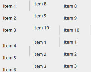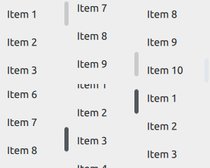
Scrollable view. More...
| Import Statement: | import QtQuick.Controls |
| Since: | Qt 5.9 |
| Inherits: |
ScrollView provides scrolling for user-defined content. It can be used to either replace a Flickable, or to decorate an existing one.

The first example demonstrates the simplest usage of ScrollView.
ScrollView {
    width: 200
    height: 200

    Label {
        text: "ABC"
        font.pixelSize: 224
    }
}
The second example illustrates using an existing Flickable, that is, a ListView.
ScrollView {
    width: 200
    height: 200

    ListView {
        model: 20
        delegate: ItemDelegate {
            text: "Item " + index

            required property int index
        }
    }
}
Note: As of Qt-6.0, ScrollView automatically clips its contents if you don't use a Flickable as a child. If this is not wanted, you can set your own Flickable as a child, and control the clip property on the Flickable explicitly.
As with Flickable, there are several things to keep in mind when using ScrollView:
The horizontal and vertical scroll bars can be accessed and customized using the ScrollBar.horizontal and ScrollBar.vertical attached properties. The following example adjusts the scroll bar policies so that the horizontal scroll bar is always off, and the vertical scroll bar is always on.
ScrollView {
    // ...
    ScrollBar.horizontal.policy: ScrollBar.AlwaysOff
    ScrollBar.vertical.policy: ScrollBar.AlwaysOn
}
On touch, ScrollView enables flicking and makes the scroll bars non-interactive.

When interacted with a mouse device, flicking is disabled and the scroll bars are interactive.

Scroll bars can be made interactive on touch, or non-interactive when interacted with a mouse device, by setting the interactive property explicitly to
true or false, respectively.
ScrollView {
    // ...
    ScrollBar.horizontal.interactive: true
    ScrollBar.vertical.interactive: true
}
See also ScrollBar, ScrollIndicator, Customizing ScrollView, Container Controls, and Focus Management in Qt Quick Controls.
This property holds the list of content children.
The list contains all items that have been declared in QML as children of the view.
Note: Unlike contentData, contentChildren does not include non-visual QML objects.
See also Item::children and contentData.
This property holds the list of content data.
The list contains all objects that have been declared in QML as children of the view.
Note: Unlike contentChildren, contentData does include non-visual QML objects.
See also Item::data and contentChildren.

As part of the free Business evaluation, we offer a free welcome call for companies, to talk about your requirements, and how the Felgo SDK & Services can help you. Just sign up and schedule your call.
Sign up now to start your free Business evaluation:

