TextArea
Multi-line text input area. More...
| Import Statement: |
import QtQuick.Controls |
| Since: |
Qt 5.7 |
| Inherits: |
TextEdit
|
Properties
Attached Properties
Signals
Detailed Description
TextArea is a multi-line text editor. TextArea extends TextEdit with a placeholder text functionality, and
adds decoration.

TextArea {
    placeholderText: qsTr("Enter description")
}
TextArea is not scrollable by itself. Especially on screen-size constrained platforms, it is often preferable to make entire application pages scrollable. On such a scrollable page, a non-scrollable TextArea might behave
better than nested scrollable controls. Notice, however, that in such a scenario, the background decoration of the TextArea scrolls together with the rest of the scrollable content.
Scrollable TextArea
If you want to make a TextArea scrollable, for example, when it covers an entire application page, it can be placed inside a ScrollView.
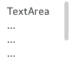
ScrollView {
    id: view
    anchors.fill: parent

    TextArea {
        text: "TextArea\n...\n...\n...\n...\n...\n...\n"
    }
}
A TextArea that is placed inside a ScrollView does the following:
- Sets the content size automatically
- Ensures that the background decoration stays in place
- Clips the content
Tab Focus
By default, pressing the tab key while TextArea has active focus results in a tab character being input into the control itself. To make tab pass active focus onto
another item, use the attached KeyNavigation properties:
TextField {
    id: textField
}

TextArea {
    KeyNavigation.priority: KeyNavigation.BeforeItem
    KeyNavigation.tab: textField
}
See also TextField, Customizing TextArea, and Input
Controls.
Property Documentation
This property holds the background item.
Note: If the background item has no explicit size specified, it automatically follows the control's size. In most cases, there is no need to specify width or height for a background item.
Note: Most controls use the implicit size of the background item to calculate the implicit size of the control itself. If you replace the background item with a custom one, you should also consider providing a
sensible implicit size for it (unless it is an item like Image which has its own implicit size).
See also Customizing TextArea.
This property holds the bottom inset for the background.
This property was introduced in QtQuick.Controls 2.5 (Qt 5.12).
See also Control Layout and topInset.
This property holds the reason of the last focus change.
Note: This property does not indicate whether the control has active focus, but the reason why the control either gained or lost focus.
| Constant |
Description |
Qt.MouseFocusReason |
A mouse action occurred. |
Qt.TabFocusReason |
The Tab key was pressed. |
Qt.BacktabFocusReason |
A Backtab occurred. The input for this may include the Shift or Control keys; e.g. Shift+Tab. |
Qt.ActiveWindowFocusReason |
The window system made this window either active or inactive. |
Qt.PopupFocusReason |
The application opened/closed a pop-up that grabbed/released the keyboard focus. |
Qt.ShortcutFocusReason |
The user typed a label's buddy shortcut |
Qt.MenuBarFocusReason |
The menu bar took focus. |
Qt.OtherFocusReason |
Another reason, usually application-specific. |
See also Item::activeFocus.
This property determines whether the text area accepts hover events. The default value is true.
This property was introduced in QtQuick.Controls 2.1 (Qt 5.8).
See also hovered.
This property holds whether the text area is hovered.
This property was introduced in QtQuick.Controls 2.1 (Qt 5.8).
See also hoverEnabled.
|
implicitBackgroundHeight : real
|
This property holds the implicit background height.
The value is equal to background ? background.implicitHeight : 0.
This property was introduced in QtQuick.Controls 2.5 (Qt 5.12).
See also implicitBackgroundWidth.
|
implicitBackgroundWidth : real
|
This property holds the implicit background width.
The value is equal to background ? background.implicitWidth : 0.
This property was introduced in QtQuick.Controls 2.5 (Qt 5.12).
See also implicitBackgroundHeight.
This property holds the left inset for the background.
This property was introduced in QtQuick.Controls 2.5 (Qt 5.12).
See also Control Layout and rightInset.
This property holds the short hint that is displayed in the text area before the user enters a value.
|
placeholderTextColor : color
|
This property holds the right inset for the background.
This property was introduced in QtQuick.Controls 2.5 (Qt 5.12).
See also Control Layout and leftInset.
This property holds the top inset for the background.
This property was introduced in QtQuick.Controls 2.5 (Qt 5.12).
See also Control Layout and bottomInset.
Attached Property Documentation
Signal Documentation
This signal is emitted when there is a long press (the delay depends on the platform plugin). The event parameter provides information about the press, including the x and y coordinates of the press, and which
button is pressed.
Note: The corresponding handler is onPressAndHold.
See also pressed and released.
|
[since QtQuick.Controls 2.1 (Qt 5.8)] pressed(MouseEvent event)
|
This signal is emitted when the text area is pressed by the user. The event parameter provides information about the press, including the x and y coordinates of the press, and which button is pressed.
Note: The corresponding handler is onPressed.
This signal was introduced in QtQuick.Controls 2.1 (Qt 5.8).
See also released and pressAndHold.
|
[since QtQuick.Controls 2.1 (Qt 5.8)] released(MouseEvent event)
|
This signal is emitted when the text area is released by the user. The event parameter provides information about the release, including the x and y coordinates of the press, and which button is pressed.
Note: The corresponding handler is onReleased.
This signal was introduced in QtQuick.Controls 2.1 (Qt 5.8).
See also pressed and pressAndHold.


