Identical to GridLayout, but having only one row. More...
| Import Statement: | import QtQuick.Layouts |
| Inherits: |
(since QtQuick.Layouts 1.1)(since QtQuick.Layouts 6.6)To be able to use this type more efficiently, it is recommended that you understand the general mechanism of the Qt Quick Layouts module. Refer to Qt Quick Layouts Overview for more information.
It is available as a convenience for developers, as it offers a cleaner API.
Items in a RowLayout support these attached properties:

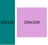
RowLayout {
    id: layout
    anchors.fill: parent
    spacing: 6
    Rectangle {
        color: 'teal'
        Layout.fillWidth: true
        Layout.minimumWidth: 50
        Layout.preferredWidth: 100
        Layout.maximumWidth: 300
        Layout.minimumHeight: 150
        Text {
            anchors.centerIn: parent
            text: parent.width + 'x' + parent.height
        }
    }
    Rectangle {
        color: 'plum'
        Layout.fillWidth: true
        Layout.minimumWidth: 100
        Layout.preferredWidth: 200
        Layout.preferredHeight: 100
        Text {
            anchors.centerIn: parent
            text: parent.width + 'x' + parent.height
        }
    }
}
Read more about attached properties here.
See also ColumnLayout, GridLayout, StackLayout, Row, and Qt Quick Layouts Overview.
|
layoutDirection : enumeration |
This property holds the layout direction of the row layout - it controls whether items are laid out from left to right or right to left. If Qt.RightToLeft is specified, left-aligned items will
be right-aligned and right-aligned items will be left-aligned.
Possible values:
| Constant | Description |
|---|---|
Qt.LeftToRight |
(default) Items are laid out from left to right. |
Qt.RightToLeft |
Items are laid out from right to left |
This property was introduced in QtQuick.Layouts 1.1.
See also GridLayout::layoutDirection and ColumnLayout::layoutDirection.
|
spacing : real |
This property holds the spacing between each cell. The default value is 5.
|
uniformCellSizes : bool |
If this property is set to true, the layout will force all cells to have a uniform size.
This property was introduced in QtQuick.Layouts 6.6.
See also GridLayout::uniformCellWidths, GridLayout::uniformCellHeights, and ColumnLayout::uniformCellSizes.