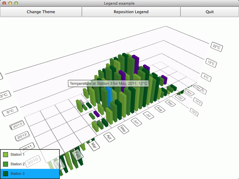
Showing graph legend in a QML application.
The Qt Quick 2 legend example shows how to make an interactive legend for a graph.

The interesting thing about this example is displaying the legend. We'll concentrate on that and skip explaining the basic functionality - for more detailed QML example documentation, see Qt Quick 2 Scatter Example.
To run the example from Qt Creator, open the Welcome mode and select the example from Examples. For more information, visit Building and Running an Example.
The legend is simply a column of custom LegendItem items inside a transparent rectangle. Each item is supplied with a series and the graph theme:
ColumnLayout {
    anchors.fill: parent
    anchors.margins: parent.border.width
    spacing: 0
    clip: true
    LegendItem {
        Layout.fillWidth: true
        Layout.fillHeight: true
        series: station1
        theme: barGraph.theme
    }
    LegendItem {
        Layout.fillWidth: true
        Layout.fillHeight: true
        series: station2
        theme: barGraph.theme
    }
    LegendItem {
        Layout.fillWidth: true
        Layout.fillHeight: true
        series: station3
        theme: barGraph.theme
    }
}
The legend items consist of a marker rectangle, which indicates the color of the series, and a text field, which shows the name of the series. The colors we get from the series and the theme supplied at legend item initialization:
property Theme3D theme
property Bar3DSeries series
    ...
RowLayout {
    anchors.fill: parent
    spacing: 0
    clip: true
    Item {
        id: markerSpace
        Layout.minimumWidth: 20
        Layout.minimumHeight: 20
        Layout.fillWidth: true
        Layout.fillHeight: true
        Layout.alignment: Qt.AlignVCenter
        Rectangle {
            x: parent.x + parent.width / 4
            y: parent.y + parent.height / 4
            width: parent.width / 2
            height: width
            border.color: "black"
            color: series.baseColor
        }
    }
    Item {
        height: markerSpace.height
        Layout.fillWidth: true
        Layout.fillHeight: true
        Layout.alignment: Qt.AlignVCenter
        Layout.minimumWidth: 100
        Text {
            anchors.fill: parent
            text: series.name
            verticalAlignment: Text.AlignVCenter
            clip: true
            color: theme.labelTextColor
            font: theme.font
        }
    }
}
We want the legend to be interactive, so we add additional logic to enable selection of a series by clicking on a legend item, as well as highlighting the legend item corresponding to the selected series.
The highlight depends on the selection state of the series, so we define two states, which follow the Bar3DSeries::selectedBar property and adjust
the legendItem color appropriately:
states: [
    State  {
        name: "selected"
        when: series.selectedBar != series.invalidSelectionPosition
        PropertyChanges {
            target: legendItem
            color: series.singleHighlightColor
        }
    },
    State  {
        name: "unselected"
        when: series.selectedBar == series.invalidSelectionPosition
        PropertyChanges {
            target: legendItem
            color: theme.labelBackgroundColor
        }
    }
]
To make the legend item interactive, we define a MouseArea to detect clicks on it and adjust the series selection accordingly:
MouseArea {
    id: mouseArea
    anchors.fill: legendItem
    onClicked: {
        if (legendItem.state === "selected") {
            series.selectedBar = series.invalidSelectionPosition
        } else {
            series.selectedBar = previousSelection
        }
    }
}
The previousSelection used above is another custom property of LegendItem, which we update whenever selection changes on the series. This way we remember the last selected bar of each series:
Connections {
    target: series
    function onSelectedBarChanged(position) {
        if (position !== series.invalidSelectionPosition) {
            previousSelection = position
        }
    }
}

As part of the free Business evaluation, we offer a free welcome call for companies, to talk about your requirements, and how the Felgo SDK & Services can help you. Just sign up and schedule your call.
Sign up now to start your free Business evaluation:

