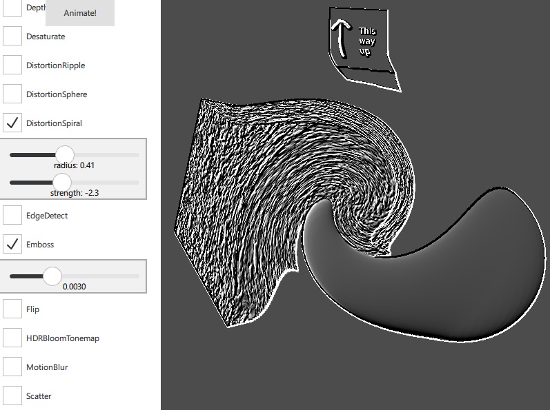
Demonstrates the built-in post-processing effects.

This example demonstrates all the pre-made post-processing effects that are available in the QtQuick3D.Effects module. It provides a user interface for changing the properties of each effect, and allows effects to be chained together.
When effects are combined, the result of one effect is used as input for the next. Note that chaining a large number of effects will incur a performance penalty. A custom effect may be more suitable in this case.
The example itself is relatively straightforward. It consists of a scene with two cubes and a sphere with different textures and materials chosen to show the results of each effect:
Node {
    id: scene

    Model {
        source: "#Cube"
        x: -100
        eulerRotation.y: 45
        eulerRotation.x: 30 + view3D.animationValue
        scale: Qt.vector3d(2, 2, 2)
        materials: DefaultMaterial {
            diffuseMap: corkTexture
        }
    }

    Model {
        source: "#Cube"
        x: 350 * Math.sin(view3D.fastAnimationValue/180 * Math.PI)
        y: 350 * Math.cos(view3D.fastAnimationValue/180 * Math.PI)
        z: -300
        eulerRotation.y: 5
        eulerRotation.x: 5
        scale: Qt.vector3d(1.2, 1.2, 1.2)
        materials: DefaultMaterial {
            diffuseMap: textTexture
        }
    }

    Model {
        source: "#Sphere"
        x: 80
        y: -40
        z: 200
        scale: Qt.vector3d(1.4, 1.4, 1.4)
        materials: PrincipledMaterial {
            baseColor: "#41cd52"
            metalness: 0.0
            roughness: 0.1
            opacity: 1.0
        }
    }
}
The bulk of the example is the code that sets up each effect and adds the user interface for its properties:
EffectBox {
    id: chromaticBox
    text: "ChromaticAberration"
    effect: ChromaticAberration {
        aberrationAmount: chromaticAmount.sliderValue
        focusDepth: chromaticDepth.sliderValue
    }
}
SettingsGroup {
    visible: chromaticBox.checked
    EffectSlider {
        id: chromaticAmount
        fromValue: -200.0
        toValue: 200.0
        sliderValue: 50
        precision: 0
        description: "aberration amount"
    }
    EffectSlider {
        id: chromaticDepth
        fromValue: 0.0
        toValue: 1000.0
        sliderValue: 600
        precision: 0
        description: "focus depth"
    }
}
The example defines a number of custom QML types for convenience. These are made for the needs of this specific example, and will not be described in detail.
EffectBox |
A CheckBox containing and enabling/disabling an effect |
EffectColor |
A very simple color picker consisting of three Slider items |
EffectSlider |
A Slider with a label showing the value, and an optional exponential mode |
SettingsGroup |
A Column with a frame around it and a background color. |
Files:
Images:

As part of the free Business evaluation, we offer a free welcome call for companies, to talk about your requirements, and how the Felgo SDK & Services can help you. Just sign up and schedule your call.
Sign up now to start your free Business evaluation:

