
Welcome to the world of QML, the declarative UI language. In this Getting Started guide, we will create a simple text editor application using QML. After reading this guide, you should be ready to develop your own applications using QML and Qt C++.
The application we are building is a simple text editor that will load, save, and perform some text manipulation. This guide will consist of two parts. The first part will involve designing the application layout and behaviors using declarative language in QML. For the second part, file loading and saving will be implemented using Qt C++. Using Qt's Meta-Object System, we can expose C++ functions as properties that QML object types can use. Utilizing QML and Qt C++, we can efficiently decouple the interface logic from the application logic.
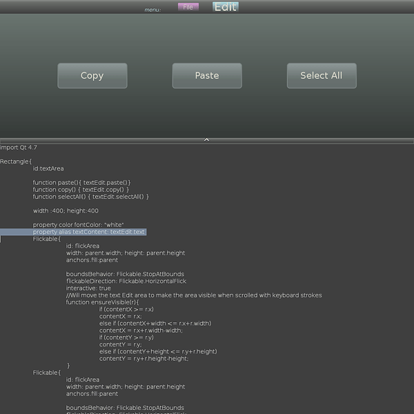
The complete source code is in the examples/quick/tutorials/gettingStartedQml directory. If you wish to see how the finalized application looks like, you can skip to chapter Running the Text Editor.
The C++ portion of this tutorial assumes that the reader possesses basic knowledge of Qt's compilation procedures.
Tutorial chapters:
Information about QML, such as syntax and features, is included in the The QML Reference.
We start our text editor by building a button. Functionally, a button has a mouse sensitive area and a label. Buttons perform actions when a user presses the button.
In QML, the basic visual item is the Rectangle type. The Rectangle QML object type has QML properties to control its appearance and location.
import QtQuick 2.3

Rectangle {
    id: simpleButton
    color: "grey"
    width: 150; height: 75

    Text {
        id: buttonLabel
        anchors.centerIn: parent
        text: "button label"
    }
}
First, the import QtQuick 2.3 statement allows the qmlscene tool to import the QML types we will later use. This line must exist for every QML file. Notice that the
version of Qt modules is included in the import statement.
This simple rectangle has a unique identifier, simpleButton, which is bound to the id property. The Rectangle object's properties are bound to values by listing the property, followed
by a colon, then the value. In the code sample, the color grey is bound to the Rectangle's color property. Similarly, we bind the width and height of the Rectangle.
The Text type is a non-editable text field. We name this object buttonLabel. To set the string content of the Text field, we bind a value to the text property.
The label is contained within the Rectangle and in order to center it in the middle, we assign the anchors of the Text object to its parent, which is called simpleButton. Anchors may bind to other
items' anchors, allowing layout assignments simpler.
We shall save this code as SimpleButton.qml. Running qmlscene with the file as the argument will display the grey rectangle with a text label.

To implement the button click functionality, we can use QML's event handling. QML's event handling is very similar to Qt's signal and slot mechanism. Signals are emitted and the connected slot is called.
Rectangle {
    id: simpleButton
    ...

    MouseArea {
        id: buttonMouseArea

        // Anchor all sides of the mouse area to the rectangle's anchors
        anchors.fill: parent
        // onClicked handles valid mouse button clicks
        onClicked: console.log(buttonLabel.text + " clicked")
    }
}
We include a MouseArea object in our simpleButton. MouseArea objects describe the interactive area where mouse movements are detected. For our button, we anchor the
whole MouseArea to its parent, which is simpleButton. The anchors.fill syntax is one way of accessing a specific property called fill inside a group of properties called
anchors. QML uses anchor-based layouts where items can anchor to another item, creating robust layouts.
The MouseArea has many signal handlers that are called during mouse movements within the specified MouseArea boundaries. One of them is onClicked and it is called whenever the
acceptable mouse button is clicked, the left click being the default. We can bind actions to the onClicked handler. In our example, console.log() outputs text whenever the mouse area is clicked. The function
console.log() is a useful tool for debugging purposes and for outputting text.
The code in SimpleButton.qml is sufficient to display a button on the screen and output text whenever it is clicked with a mouse.
Rectangle {
    id: button
    ...

    property color buttonColor: "lightblue"
    property color onHoverColor: "gold"
    property color borderColor: "white"

    signal buttonClick()

    onButtonClick: {
        console.log(buttonLabel.text + " clicked")
    }

    MouseArea{
        id: buttonMouseArea
        onClicked: buttonClick()
        hoverEnabled: true
        onEntered: parent.border.color = onHoverColor
        onExited:  parent.border.color = borderColor
    }

    // Determines the color of the button by using the conditional operator
    color: buttonMouseArea.pressed ? Qt.darker(buttonColor, 1.5) : buttonColor
}
A fully functioning button is in Button.qml. The code snippets in this article have some code omitted, denoted by ellipses because they were either introduced earlier in the previous sections or irrelevant to
the current code discussion.
Custom properties are declared using the property type name syntax. In the code, the property buttonColor, of type color, is declared and bound to the value "lightblue".
The buttonColor is later used in a conditional operation to determine the button's fill color. Note that property value assignment is possible using the = equals sign, in addition to value binding
using the : colon character. Custom properties allow internal items to be accessible outside of the Rectangle's scope. There are basic QML types such as
int, string, real, as well as a type called variant.
By binding the onEntered and onExited signal handlers to colors, the button's border will turn yellow when the mouse hovers above the button and reverts the color when the mouse exits the mouse
area.
A buttonClick() signal is declared in Button.qml by placing the signal keyword in front of the signal name. All signals have their handlers automatically created, their names starting
with on. As a result, the onButtonClick is buttonClick's handler. The onButtonClick is then assigned an action to perform. In our button example, the onClicked
mouse handler will simply call onButtonClick, which displays a text. The onButtonClick enables outside objects to access the Button's mouse area easily. For example, items may have more
than one MouseArea declarations and a buttonClick signal can make the distinction between the several MouseArea signal handlers better.
We now have the basic knowledge to implement items in QML that can handle basic mouse movements. We created a Text label inside a Rectangle, customized its properties, and implemented behaviors that
respond to mouse movements. This idea of creating QML objects within objects is repeated throughout the text editor application.
This button is not useful unless used as a component to perform an action. In the next section, we will soon create a menu containing several of these buttons.

Up to this stage, we covered how to create objects and assign behaviors inside a single QML file. In this section, we will cover how to import QML types and how to reuse some of the created components to build other components.
Menus display the contents of a list, each item having the ability to perform an action. In QML, we can create a menu in several ways. First, we will create a menu containing buttons which will eventually perform different
actions. The menu code is in FileMenu.qml.
import QtQuick 2.3             // Import the main Qt QML module
import "folderName"            // import the contents of a folder
import "script.js" as Script   // Import a Javascript file and name it as Script
The syntax shown above shows how to use the import keyword. This is required to use JavaScript files, or QML files that are not within the same directory. Since Button.qml is in the same directory
as FileMenu.qml, we do not need to import the Button.qml file to use it. We can directly create a Button object by declaring Button{}, similar to a Rectangle{}
declaration.
In FileMenu.qml:

    Row {
        anchors.centerIn: parent
        spacing: parent.width / 6

        Button {
            id: loadButton
            buttonColor: "lightgrey"
            label: "Load"
        }
        Button {
            buttonColor: "grey"
            id: saveButton
            label: "Save"
        }
        Button {
            id: exitButton
            label: "Exit"
            buttonColor: "darkgrey"

            onButtonClick: Qt.quit()
        }
    }
In FileMenu.qml, we declare three Button objects. They are declared inside a Row type, a positioner that will position its children along a vertical row. The
Button declaration resides in Button.qml, which is the same as the one we used in the previous section. New property bindings can be declared within the newly created buttons, effectively overwriting the properties
set in Button.qml. The button called exitButton will quit and close the window when it is clicked. Note that the signal handler onButtonClick in Button.qml will be called in
addition to the onButtonClick handler in exitButton.
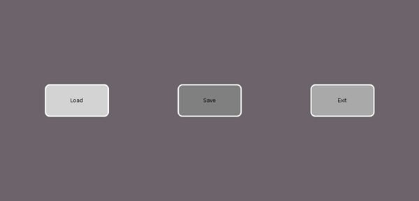
The Row declaration is declared in a Rectangle, creating a rectangle container for the row of buttons. This additional rectangle creates an indirect way of organizing the row of buttons inside a
menu.
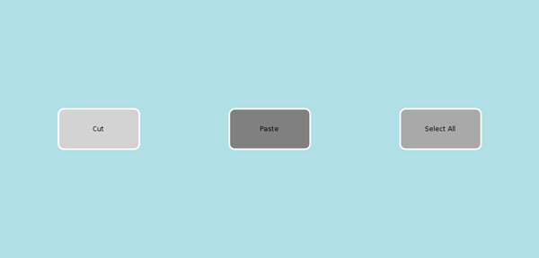
The declaration of the edit menu is very similar at this stage. The menu has buttons that have the labels: Copy, Paste, and Select All.
Armed with our knowledge of importing and customizing previously made components, we may now combine these menu pages to create a menu bar, consisting of buttons to select the menu, and look at how we may structure data using QML.
Our text editor application will need a way to display menus using a menu bar. The menu bar will switch the different menus and the user can choose which menu to display. Menu switching implies that the menus need more structure than merely displaying them in a row. QML uses models and views to structure data and display the structured data.
QML has different data views that display data models. Our menu bar will display
the menus in a list, with a header that displays a row of menu names. The list of menus are declared inside a ObjectModel. The ObjectModel type contains items
that already are displayable, such as Rectangle objects. Other model types, like the ListModel type, need a delegate to display their data.
We declare two visual items in the menuListModel, the FileMenu and the EditMenu. We customize the two menus and display them in a ListView.
The MenuBar.qml file contains the QML declarations and a simple edit menu is defined in EditMenu.qml.
ObjectModel {
    id: menuListModel

    FileMenu {
        width: menuListView.width
        height: menuBar.height
        color: fileColor
    }

    EditMenu {
        color: editColor
        width: menuListView.width
        height: menuBar.height
    }
}
The ListView type will display a model according to a delegate. The delegate can display the model items in a Row object or in a grid. Our menuListModel
already has visible items, therefore, we do not need to declare a delegate.
ListView {
    id: menuListView

    // Anchors are set to react to window anchors
    anchors.fill: parent
    anchors.bottom: parent.bottom
    width: parent.width
    height: parent.height

    // The model contains the data
    model: menuListModel

    // Control the movement of the menu switching
    snapMode: ListView.SnapOneItem
    orientation: ListView.Horizontal
    boundsBehavior: Flickable.StopAtBounds
    flickDeceleration: 5000
    highlightFollowsCurrentItem: true
    highlightMoveDuration: 240
    highlightRangeMode: ListView.StrictlyEnforceRange
}
Additionally, ListView inherits from Flickable, making the list respond to mouse drags and other gestures. The last portion of the code above sets
Flickable properties to create the desired flicking movement to our view. In particular, the property highlightMoveDuration changes the duration of the flick transition. A higher
highlightMoveDuration value results in slower menu switching.
The ListView maintains the model items through an index and each visual item in the model is accessible through the index, in the order of the declaration. Changing the
currentIndex effectively changes the highlighted item in the ListView. The header of our menu bar exemplifies this effect. There are two buttons in a row, both changing the current menu when clicked.
The fileButton changes the current menu to the file menu when clicked, the index being 0 because FileMenu is declared first in the menuListModel. Similarly, the
editButton will change the current menu to the EditMenu when clicked.
The labelList rectangle has z value of 1, denoting that it is displayed at the front of the menu bar. Items with higher z values are displayed in front of items with lower
z values. The default z value is 0.
Rectangle {
    id: labelList
    ...
    z: 1

    Row {
        anchors.centerIn: parent
        spacing: 40

        Button {
            label: "File"
            id: fileButton
            ...
            onButtonClick: menuListView.currentIndex = 0
        }

        Button {
            id: editButton
            label: "Edit"
            ...
            onButtonClick: menuListView.currentIndex = 1
        }
    }
}
The menu bar we just created can be flicked to access the menus or by clicking on the menu names at the top. Switching menu screens feel intuitive and responsive.

Our text editor is not a text editor if it didn't contain an editable text area. QML's TextEdit type allows the declaration of a multi-line editable text area.
TextEdit is different from the Text type, which doesn't allow the user to directly edit the text.
TextEdit {
    id: textEditor
    anchors.fill: parent
    width: parent.width
    height: parent.height
    color: "midnightblue"
    focus: true

    wrapMode: TextEdit.Wrap

    onCursorRectangleChanged: flickArea.ensureVisible(cursorRectangle)
}
The editor has its font color property set and wrapMode set to wrap the text. The TextEdit area is inside a flickable item that will scroll the text if the text cursor is outside the
visible area. The function ensureVisible() will check if the cursor rectangle is outside the visible boundaries and move the text area accordingly. QML uses Javascript syntax for its scripts, and as previously
mentioned, Javascript files can be imported and used within a QML file.
function ensureVisible(r) {
    if (contentX >= r.x)
        contentX = r.x;
    else if (contentX + width <= r.x + r.width)
        contentX = r.x + r.width - width;
    if (contentY >= r.y)
        contentY = r.y;
    else if (contentY + height <= r.y + r.height)
        contentY = r.y + r.height - height;
}
We are now ready to create the layout of our text editor using QML. The text editor has two components, the menu bar we created and the text area. QML allows us to reuse components, therefore making our code simpler, by importing components and customizing when necessary. Our text editor splits the window into two; one-third of the screen is dedicated to the menu bar and two-thirds of the screen displays the text area. The menu bar is displayed in front of any other objects.
Rectangle {
    id: screen
    width: 1000
    height: 1000

    // The screen is partitioned into the MenuBar and TextArea.
    // One-third of the screen is assigned to the MenuBar
    property int partition: height / 3

    MenuBar {
        id: menuBar
        height: partition
        width: parent.width
        z: 1
    }

    TextArea {
        id: textArea
        anchors.bottom: parent.bottom
        y: partition
        color: "white"
        width: parent.width
        height: partition * 2
    }
}
By importing reusable components, our TextEditor code looks much simpler. We can then customize the main application, without worrying about properties that already have defined behaviors. Using this approach,
application layouts and UI components can be created easily.
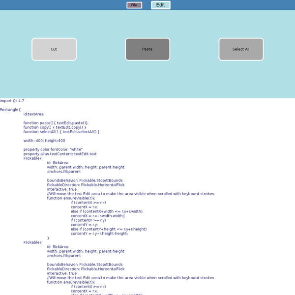
Our text editor looks simple and we need to decorate it. Using QML, we can declare transitions and animate our text editor. Our menu bar is occupying one-third of the screen and it would be nice to have it only appear when we want it.
We can add a drawer interface, that will contract or expand the menu bar when clicked. In our implementation, we have a thin rectangle that responds to mouse clicks. The drawer, as well as the application, has
two sates: the "drawer is open" state and the "drawer is closed" state. The drawer item is a strip of rectangle with a small height. There is a nested Image object declaring
that an arrow icon will be centered inside the drawer. The drawer assigns a state to the whole application, with the identifier screen, whenever a user clicks the mouse area.
Rectangle {
    id: drawer
    height: 15

    Image {
        id: arrowIcon
        source: "images/arrow.png"
        anchors.horizontalCenter: parent.horizontalCenter
    }

    MouseArea {
        id: drawerMouseArea
        anchors.fill: parent

        onClicked: {
            if (screen.state == "DRAWER_CLOSED")
                screen.state = "DRAWER_OPEN"
            else if (screen.state == "DRAWER_OPEN")
                screen.state = "DRAWER_CLOSED"
        }
        ...
    }
}
A state is simply a collection of configurations and it is declared with the State type. A list of states can be listed and bound to the states property. In
our application, the two states are called DRAWER_CLOSED and DRAWER_OPEN. Item configurations are declared in PropertyChanges objects. In the
DRAWER_OPEN state, there are four items that will receive property changes. The first target, menuBar, will change its y property to 0. Similarly, the textArea
will lower to a new position when the state is DRAWER_OPEN. The textArea, the drawer, and the drawer's icon will undergo property changes to meet the current state.
states:[
    State {
        name: "DRAWER_OPEN"
        PropertyChanges { target: menuBar; y: 0 }
        PropertyChanges { target: textArea; y: partition + drawer.height }
        PropertyChanges { target: drawer; y: partition }
        PropertyChanges { target: arrowIcon; rotation: 180 }
    },
    State {
        name: "DRAWER_CLOSED"
        PropertyChanges { target: menuBar; y: -height; }
        PropertyChanges { target: textArea; y: drawer.height; height: screen.height - drawer.height }
        PropertyChanges { target: drawer; y: 0 }
        PropertyChanges { target: arrowIcon; rotation: 0 }
    }
]
State changes are abrupt and needs smoother transitions. Transitions between states are defined using the Transition type, which can then bind to the item's
transitions property. Our text editor has a state transition whenever the state changes to either DRAWER_OPEN or DRAWER_CLOSED. Importantly, the transition needs a from and a
to state but for our transitions, we can use the wild card * symbol to denote that the transition applies to all state changes.
During transitions, we can assign animations to the property changes. Our menuBar switches position from y: 0 to y: -partition and we can animate this transition using the NumberAnimation type. We declare that the targets' properties will animate for a certain duration of time and using a certain easing curve. An easing curve controls the animation rates
and interpolation behavior during state transitions. The easing curve we chose is Easing.OutExpo, which slows the movement near the end of the
animation. For more information, see QML's animation article.
transitions: [
    Transition {
        to: "*"
        NumberAnimation { target: textArea; properties: "y, height"; duration: 100; easing.type:Easing.OutExpo }
        NumberAnimation { target: menuBar; properties: "y"; duration: 100; easing.type: Easing.OutExpo }
        NumberAnimation { target: drawer; properties: "y"; duration: 100; easing.type: Easing.OutExpo }
    }
]
Another way of animating property changes is by declaring a Behavior type. A transition only works during state changes and Behavior can set an animation for a general
property change. In the text editor, the arrow has a NumberAnimation animating its rotation property whenever the property changes.
In TextEditor.qml:
Behavior {
    NumberAnimation { property: "rotation"; easing.type: Easing.OutExpo }
}
Going back to our components with knowledge of states and animations, we can improve the appearances of the components. In Button.qml, we can add color and scale property changes when
the button is clicked. Color types are animated using ColorAnimation and numbers are animated using NumberAnimation. The on propertyName syntax displayed below is helpful when targeting a single property.
In Button.qml:
...

color: buttonMouseArea.pressed ? Qt.darker(buttonColor, 1.5) : buttonColor
Behavior on color { ColorAnimation{ duration: 55 } }

scale: buttonMouseArea.pressed ? 1.1 : 1.0
Behavior on scale { NumberAnimation{ duration: 55 } }
Additionally, we can enhance the appearances of our QML components by adding color effects such as gradients and opacity effects. Declaring a Gradient object will override the
color property. You may declare a color in the gradient using the GradientStop type. The gradient is positioned using a scale, between 0.0 and
1.0.
In MenuBar.qml:
gradient: Gradient {
    GradientStop { position: 0.0; color: "#8C8F8C" }
    GradientStop { position: 0.17; color: "#6A6D6A" }
    GradientStop { position: 0.98; color: "#3F3F3F" }
    GradientStop { position: 1.0; color: "#0e1B20" }
}
This gradient is used by the menu bar to display a gradient simulating depth. The first color starts at 0.0 and the last color is at 1.0.
We are finished building the user interface of a very simple text editor. Going forward, the user interface is complete, and we can implement the application logic using regular Qt and C++. QML works nicely as a prototyping tool, separating the application logic away from the UI design.
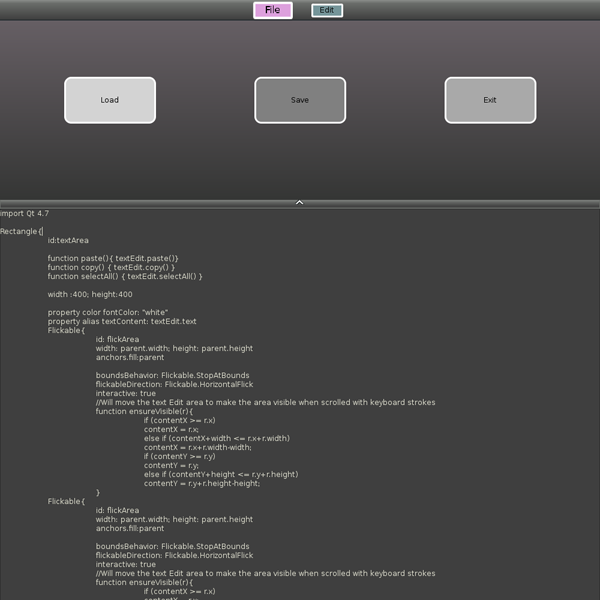
Now that we have our text editor layout, we may now implement the text editor functionalities in C++. Using QML with C++ enables us to create our application logic using Qt. We can create a QML context in a C++ application
using Qt's Quick classes and display the QML types using a QQuickView. Alternatively, we can export our C++ code into an extension plugin, and
make it accessible to QML as a new identified module. When launching QML files with qmlscene, we only need to ensure our module is
found under one of the import paths the QML engine searches for modules to import. For our application we shall the latter approach. This way, we can load the QML file
directly with qmlscene instead of running an executable.
We will be implementing file loading and saving using Qt and C++. C++ classes and functions can be used in QML by registering them. They also needs to be compiled as a Qt plugin and then exposed as a QML module.
For our application, we need to create the following items:
Directory class that will handle directory related operationsFile class which is a QObject, simulating the list of files in a directory
Note: Since Qt 5.1, Qt Quick Dialogs module provides a file dialog component that you can use for choosing files from the local file system. For illustrative purposes, we write our own in this tutorial.
To build a plugin, we need to set the following in a Qt project file. First, the necessary sources, headers, and Qt modules need to be added into our project file. All the C++ code and project files are in the
filedialog directory.
In filedialog.pro:
TEMPLATE = lib
CONFIG += qt plugin
QT += qml

DESTDIR +=  ../imports/FileDialog
OBJECTS_DIR = tmp
MOC_DIR = tmp

TARGET = filedialogplugin

HEADERS += \
        directory.h \
        file.h \
        dialogPlugin.h

SOURCES += \
        directory.cpp \
        file.cpp \
        dialogPlugin.cpp
In particular, we link the project with the qml module and configure it as a plugin, using a lib template. We shall put the compiled plugin into the parent's
imports/FileDialog directory.
In dialogPlugin.h:
#include <QtQml/QQmlExtensionPlugin>

class DialogPlugin : public QQmlExtensionPlugin
{
    Q_OBJECT
    Q_PLUGIN_METADATA(IID "org.qt-project.QmlExtensionPlugin.FileDialog")

public:
    // registerTypes is inherited from QQmlExtensionPlugin
    void registerTypes(const char *uri);
};
We need to export the plugin using the Q_PLUGIN_METADATA macro. Note that in our dialogPlugin.h file, we have the Q_OBJECT macro at
the top of our class. As well, we need to run qmake on the project file to generate the necessary meta-object code.
Our plugin class, DialogPlugin, is a subclass of QQmlExtensionPlugin. We need to implement the inherited function, registerTypes().
In DialogPlugin.cpp:
#include "dialogPlugin.h"
#include "directory.h"
#include "file.h"
#include <QtQml>

void DialogPlugin::registerTypes(const char *uri)
{
    // Register the class Directory into QML as a "Directory" type version 1.0
    // @uri FileDialog
    qmlRegisterType<Directory>(uri, 1, 0, "Directory");
    qmlRegisterType<File>(uri, 1, 0, "File");
}
The registerTypes() function registers our File and Directory classes into QML. This function needs the class name for its template, a major version number, a minor version number, and a name for our classes. A
// @uri <module identifier> comment allows Qt Creator to be aware of the registered types when editing QML files that import this module.
We can create QML types and properties using C++ and Qt's Meta-Object System. We can implement properties using slots and signals, making Qt aware of these properties. These properties can then be used in QML.
For the text editor, we need to be able to load and save files. Typically, these features are contained in a file dialog. Fortunately, we can use QDir, QFile, and QTextStream to implement directory reading and input/output streams.
class Directory : public QObject {
    Q_OBJECT

    Q_PROPERTY (int filesCount READ filesCount CONSTANT)
    Q_PROPERTY (QString filename READ filename WRITE setFilename NOTIFY filenameChanged)
    Q_PROPERTY (QString fileContent READ fileContent WRITE setFileContent NOTIFY fileContentChanged)
    Q_PROPERTY (QQmlListProperty<File> files READ files CONSTANT)
    ...
The Directory class uses Qt's Meta-Object System to register properties it needs to accomplish file handling. The Directory class is exported as a plugin and is useable in QML as the
Directory type. Each of the listed properties using the Q_PROPERTY() macro is a QML property.
The Q_PROPERTY declares a property as well as its read and write functions into Qt's Meta-Object System. For example, the filename property, of type QString, is readable using the filename() function and writable using the function setFilename(). Additionally, there is a signal associated to the filename property called
filenameChanged(), which is emitted whenever the property changes. The read and write functions are declared as public in the header file.
Similarly, we have the other properties declared according to their uses. The filesCount property indicates the number of files in a directory. The filename property is set to the currently selected file's name
and the loaded/saved file content is stored in fileContent property.
Q_PROPERTY(QQmlListProperty<File> files READ files CONSTANT)
The files list property is a list of all the filtered files in a directory. The Directory class is implemented to filter out invalid text files; only files with a .txt extension are
valid. Further, QLists can be used in QML files by declaring them as a QQmlListProperty in C++. The templated object needs to inherit from a QObject, therefore, the File class must also inherit from QObject. In the Directory class, the list of File objects is stored in a
QList called m_fileList.
class File : public QObject{

    Q_OBJECT
    Q_PROPERTY(QString name READ name WRITE setName NOTIFY nameChanged)

    ...
};
The properties can then be used in QML as part of the Directory object's properties. Note that we do not have to create an identifier id property in our C++ code.
Directory {
    id: directory

    filesCount
    filename
    fileContent
    files

    files[0].name
}
Because QML uses Javascript's syntax and structure, we can iterate through the list of files and retrieve its properties. To retrieve the first file's name property, we can call files[0].name.
Regular C++ functions are also accessible from QML. The file loading and saving functions are implemented in C++ and declared using the Q_INVOKABLE macro. Alternatively, we can
declare the functions as a slot and the functions will be accessible from QML.
In directory.h:
Q_INVOKABLE void saveFile();
Q_INVOKABLE void loadFile();
The Directory class also has to notify other objects whenever the directory contents change. This feature is performed using a signal. As previously mentioned, QML signals have a corresponding
handler with their names prepended with on. The signal is called directoryChanged and it is emitted whenever there is a directory refresh. The refresh simply reloads the directory contents and updates
the list of valid files in the directory. QML items can then be notified by attaching an action to the onDirectoryChanged signal handler.
The list properties need to be explored further. This is because list properties use callbacks to access and modify the list contents. The list property is of type QQmlListProperty<File>.
Whenever the list is accessed, the accessor function needs to return a QQmlListProperty<File>. The template type, File, needs to be a QObject derivative. Further, to create the
QQmlListProperty, the list's accessor and modifiers need to be passed to the constructor as function pointers. The list, a QList in our case, also needs to be a list of File pointers.
The constructor of QQmlListProperty is declared as follows:
QQmlListProperty (QObject *object, void *data, AppendFunction append,
                  CountFunction count = 0, AtFunction at = 0, ClearFunction clear = 0);
It takes pointers to functions that will append the list, count the list, retrieve the item using an index, and empty the list. Only the append function is mandatory. Note that the function pointers must match
the definition of AppendFunction, CountFunction, AtFunction, or ClearFunction.
The Directory class constructs a QQmlListProperty instance like this:
QQmlListProperty<File>(this, &m_fileList, &appendFiles, &filesSize, &fileAt, &clearFilesPtr);
Where the parameters are pointers to following functions:
void appendFiles(QQmlListProperty<File> *property, File *file);
File* fileAt(QQmlListProperty<File> *property, int index);
int filesSize(QQmlListProperty<File> *property);
void clearFilesPtr(QQmlListProperty<File> *property);
To simplify our file dialog, the Directory class filters out invalid text files, which are files that do not have a .txt extension. If a file name doesn't have the .txt extension, then
it won't be seen in our file dialog. Also, the implementation makes sure that saved files have a .txt extension in the file name. Directory uses QTextStream to read
the file and to output the file contents to a file.
With our Directory object, we can retrieve the files as a list, know how many text files is in the application directory, get the file's name and content as a string, and be notified whenever there are changes
in the directory contents.
To build the plugin, run qmake on the filedialog.pro project file, then run make to build and transfer the plugin to the plugins directory.
The qmlscene tool imports files that are in the same directory as the application. We can also create a qmldir file containing the locations of content we wish to import. In this case, there is only
the plugin, but other resources (QML types, JavaScript files) can be defined in a qmldir as well.
Contents of the qmldir file:
module FileDialog
plugin filedialogplugin
The module we just created is called FileDialog, and it makes available a plugin called filedialogplugin that matches the TARGET field in the project file. Because we did not specify a
path for the plugin, the QML engine expects to find it in the same directory as the qmldir file.
The QML types that are registered by our plugin can now be imported in QML:
import FileDialog 1.0

Directory {
    id: directory
}
...
Our FileMenu needs to display the FileDialog object, containing a list of the text files in a directory thus allowing the user to select the file by clicking on the list. We also need to assign the
save, load, and new buttons to their respective actions. The FileMenu contains an editable text input to allow the user to type a file name using the keyboard.
The Directory object is used in the FileMenu.qml file and it notifies the FileDialog object that the directory refreshed its contents. This notification is performed in the signal
handler, onDirectoryChanged.
In FileMenu.qml:
Directory {
    id: directory
    filename: textInput.text
    onDirectoryChanged: fileDialog.notifyRefresh()
}
Keeping with the simplicity of our application, the file dialog will always be visible and will not display invalid text files, which do not have a .txt extension to their filenames.
In FileDialog.qml:
signal notifyRefresh()
onNotifyRefresh: dirView.model = directory.files
The FileDialog object will display the contents of a directory by reading its list property called files. The files are used as the model of a GridView
object, which displays data items in a grid according to a delegate. The delegate handles the appearance of the model and our file dialog will simply create a grid with text centered in the middle. Clicking on the file name
will result in the appearance of a rectangle to highlight the file name. The FileDialog is notified whenever the notifyRefresh signal is emitted, reloading the files in the directory.
In FileMenu.qml:
Button {
    id: newButton
    label: "New"
    onButtonClick: {
        textArea.textContent = ""
    }
}
Button {
    id: loadButton
    label: "Load"
    onButtonClick: {
        directory.filename = textInput.text
        directory.loadFile()
        textArea.textContent = directory.fileContent
    }
}
Button {
    id: saveButton
    label: "Save"
    onButtonClick: {
        directory.fileContent = textArea.textContent
        directory.filename = textInput.text
        directory.saveFile()
    }
}
Button {
    id: exitButton
    label: "Exit"
    onButtonClick: {
        Qt.quit()
    }
}
Our FileMenu can now connect to their respective actions. The saveButton will transfer the text from the TextEdit onto the directory's fileContent property, then copy its
file name from the editable text input. Finally, the button calls the saveFile() function, saving the file. The loadButton has a similar execution. Also, the New action will empty the
contents of the TextEdit.
Further, the EditMenu buttons are connected to the TextEdit functions to copy, paste, and select all the text in the text editor.

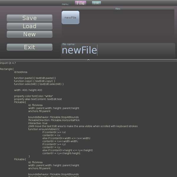
The application can function as a simple text editor, able to accept text and save it into a file. It can also load a file and perform text manipulation.
We need to build the file dialog C++ plugin before the text editor can run. To build it, enter the filedialog directory, then run qmake and compile using make or nmake,
depending on your platform.
Run the text editor with qmlscene, passing the imports directory as a parameter so that the QML engine knows where to look for the module that imports our file dialog plugin:
qmlscene -I ./imports texteditor.qml
The complete source code is in examples/quick/tutorials/gettingStartedQml directory.