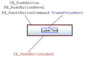
A push button with a text label. More...
| Import Statement: | import QtQuick.Controls 1.4 |
| Since: | Qt 5.1 |
| Inherits: | |
| Inherited By: |

The push button is perhaps the most commonly used widget in any graphical user interface. Pushing (or clicking) a button commands the computer to perform some action or answer a question. Common examples of buttons are OK, Apply, Cancel, Close, Yes, No, and Help buttons.
Button {
    text: "Button"
}
Button is similar to the QPushButton widget.
You can create a custom appearance for a Button by assigning a ButtonStyle.
|
action : Action |
This property holds the associated button action.
If a button has an action associated, the action defines the button's properties like checked, text, tooltip etc.
When an action is set, it's still possible to override the text, tooltip, iconSource, and iconName properties.
The default value is null.
|
activeFocusOnPress : bool |
This property specifies whether the button should gain active focus when pressed.
The default value is false.
|
checkable : bool |
This property holds whether the button is checkable.
The default value is false.
|
checked : bool |
This property holds whether the button is checked.
Only checkable buttons can be checked.
The default value is false.
|
exclusiveGroup : ExclusiveGroup |
This property holds the ExclusiveGroup that the button belongs to.
The default value is null.
|
[read-only] hovered : bool |
This property indicates whether the control is being hovered.
|
iconName : string |
The image label source as theme name. When an icon from the platform icon theme is found, this takes precedence over iconSource.
Note: This property requires QApplication.
|
iconSource : url |
This property holds the icon shown on the button. If the button has no icon, the iconSource property will be an empty string.
The default value is the empty string.
|
isDefault : bool |
This property holds whether the push button is the default button. Default buttons decide what happens when the user presses enter in a dialog without giving a button explicit focus.
Note: This property only changes the appearance of the button. The expected behavior needs to be implemented by the user.
The default value is false.
|
menu : Menu |
Assign a Menu to this property to get a pull-down menu button.
The default value is null.
|
[read-only] pressed : bool |
This property holds whether the button is being pressed.
|
style : Component |
The style Component for this control.
See also Qt Quick Controls Styles QML Types.
|
text : string |
This property holds the text shown on the button. If the button has no text, the text property will be an empty string.
The default value is the empty string.
|
tooltip : string |
This property holds the button tooltip.