ProgressBar
A progress indicator. More...
| Import Statement: |
import QtQuick.Controls 1.4 |
| Since: |
Qt 5.1 |
| Inherits: |
FocusScope
|
Properties
Detailed Description
The ProgressBar is used to give an indication of the progress of an operation. value is updated
regularly and must be between minimumValue and maximumValue.
Column {
    ProgressBar {
        value: 0.5
    }
    ProgressBar {
        indeterminate: true
    }
}
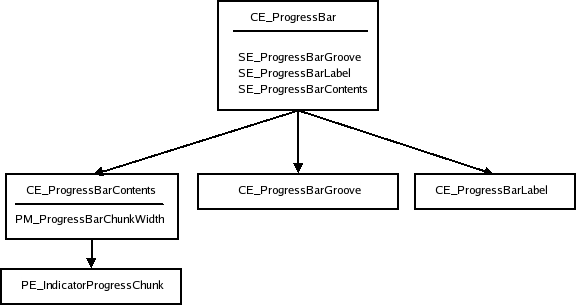
You can create a custom appearance for a ProgressBar by assigning a ProgressBarStyle.
Property Documentation
|
[read-only] hovered : bool
|
This property indicates whether the control is being hovered.
This property toggles indeterminate mode. When the actual progress is unknown, use this option. The progress bar will be animated as a busy indicator instead. The default value is false.
This property is the progress bar's maximum value. The value is clamped to this value. If maximumValue is smaller than minimumValue, minimumValue will be enforced. The default value is 1.
This property is the progress bar's minimum value. The value is clamped to this value. The default value is 0.
This property holds the orientation of the progress bar.
- Qt.Horizontal - Horizontal orientation. (Default)
- Qt.Vertical - Vertical orientation.
This property holds the progress bar's current value. Attempting to change the current value to one outside the minimum-maximum range has no effect on the current value.
The default value is 0.


