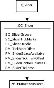
Provides a vertical or horizontal slider control. More...
| Import Statement: | import QtQuick.Controls 1.4 |
| Since: | Qt 5.1 |
| Inherits: |

The slider is the classic control for providing a bounded value. It lets the user move a slider handle along a horizontal or vertical groove and translates the handle's position into a value within the legal range.
Slider {
    value: 0.5
}
The slider value is by default in the range [0, 1]. If integer values are needed, you can set the stepSize.
You can create a custom appearance for a Slider by assigning a SliderStyle.
|
activeFocusOnPress : bool |
This property indicates whether the slider should receive active focus when pressed.
|
[read-only] hovered : bool |
This property indicates whether the slider handle is being hovered.
|
maximumValue : real |
This property holds the maximum value of the slider. The default value is 1.0.
|
minimumValue : real |
This property holds the minimum value of the slider. The default value is 0.0.
|
orientation : int |
This property holds the layout orientation of the slider. The default value is Qt.Horizontal.
|
[read-only] pressed : bool |
This property indicates whether the slider handle is being pressed.
|
stepSize : real |
This property indicates the slider step size.
A value of 0 indicates that the value of the slider operates in a continuous range between minimumValue and maximumValue.
Any non 0 value indicates a discrete stepSize. The following example will generate a slider with integer values in the range [0-5].
Slider {
    maximumValue: 5.0
    stepSize: 1.0
}
The default value is 0.0.
|
style : Component |
The style Component for this control.
See also Qt Quick Controls Styles QML Types.
|
tickmarksEnabled : bool |
This property indicates whether the slider should display tickmarks at step intervals. Tick mark spacing is calculated based on the stepSize property.
The default value is false.
Note: This property may be ignored on some platforms when using the native style (e.g. Android).
|
updateValueWhileDragging : bool |
This property indicates whether the current value should be updated while the user is moving the slider handle, or only when the button has been released. This property could for instance be modified if changing the slider value would turn out to be too time consuming.
The default value is true.
|
value : real |
This property holds the current value of the slider. The default value is 0.0.
|
wheelEnabled : bool |
This property determines whether the control handles wheel events. The default value is true.
This QML property was introduced in QtQuick.Controls 1.6.