Visual frame and title for a logical group of controls. More...
| Import Statement: | import QtQuick.Controls 2.4 |
| Since: | Qt 5.7 |
| Inherits: |
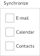
GroupBox is used to layout a logical group of controls together, within a titled visual frame. GroupBox does not provide a layout of its own, but requires you to position its contents, for instance by creating a RowLayout or a ColumnLayout.
Items declared as children of a GroupBox are automatically parented to the GroupBox's contentItem. Items created dynamically need to be explicitly parented to the contentItem.
If only a single item is used within a GroupBox, it will resize to fit the implicit size of its contained item. This makes it particularly suitable for use together with layouts.

GroupBox {
    title: qsTr("Synchronize")
    ColumnLayout {
        anchors.fill: parent
        CheckBox { text: qsTr("E-mail") }
        CheckBox { text: qsTr("Calendar") }
        CheckBox { text: qsTr("Contacts") }
    }
}
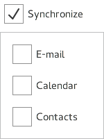
Even though GroupBox has no built-in check box, it is straightforward to create a checkable GroupBox by pairing it with a CheckBox.

It is a common pattern to enable or disable the groupbox's children when its checkbox is toggled on or off, but it is up to the application to decide on the behavior of the checkbox.
GroupBox {
    label: CheckBox {
        id: checkBox
        checked: true
        text: qsTr("Synchronize")
    }

    ColumnLayout {
        anchors.fill: parent
        enabled: checkBox.checked
        CheckBox { text: qsTr("E-mail") }
        CheckBox { text: qsTr("Calendar") }
        CheckBox { text: qsTr("Contacts") }
    }
}
See also CheckBox, Customizing GroupBox, and Container Controls.
|
label : Item |
This property holds the label item that visualizes title.
See also Customizing GroupBox.
|
title : string |
This property holds the title.
The title is typically displayed above the groupbox to summarize its contents.

As part of the free Business evaluation, we offer a free welcome call for companies, to talk about your requirements, and how the Felgo SDK & Services can help you. Just sign up and schedule your call.
Sign up now to start your free Business evaluation:

