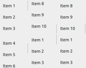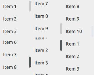
Scrollable view. More...
| Import Statement: | import QtQuick.Controls 2.4 |
| Since: | Qt 5.9 |
| Inherits: |
ScrollView provides scrolling for user-defined content. It can be used to either replace a Flickable, or to decorate an existing one.

The first example demonstrates the simplest usage of ScrollView.
ScrollView {
    width: 200
    height: 200
    clip: true

    Label {
        text: "ABC"
        font.pixelSize: 224
    }
}
Note: ScrollView does not automatically clip its contents. If it is not used as a full-screen item, you should consider setting the clip property to true, as shown above.
The second example illustrates using an existing Flickable, that is, a ListView.
ScrollView {
    width: 200
    height: 200

    ListView {
        model: 20
        delegate: ItemDelegate {
            text: "Item " + index
        }
    }
}
As with Flickable, there are several things to keep in mind when using ScrollView:
The horizontal and vertical scroll bars can be accessed and customized using the ScrollBar.horizontal and ScrollBar.vertical attached properties. The following example adjusts the scroll bar policies so that the horizontal scroll bar is always off, and the vertical scroll bar is always on.
ScrollView {
    // ...
    ScrollBar.horizontal.policy: ScrollBar.AlwaysOff
    ScrollBar.vertical.policy: ScrollBar.AlwaysOn
}
On touch, ScrollView enables flicking and makes the scroll bars non-interactive.

When interacted with a mouse device, flicking is disabled and the scroll bars are interactive.

Scroll bars can be made interactive on touch, or non-interactive when interacted with a mouse device, by setting the interactive property explicitly to
true or false, respectively.
ScrollView {
    // ...
    ScrollBar.horizontal.interactive: true
    ScrollBar.vertical.interactive: true
}
See also ScrollBar, ScrollIndicator, Customizing ScrollView, Container Controls, and Focus Management in Qt Quick Controls 2.
This property holds the list of content children.
The list contains all items that have been declared in QML as children of the view.
Note: Unlike contentData, contentChildren does not include non-visual QML objects.
See also Item::children and contentData.
|
[default] contentData : list<Object> |
This property holds the list of content data.
The list contains all objects that have been declared in QML as children of the view.
Note: Unlike contentChildren, contentData does include non-visual QML objects.
See also Item::data and contentChildren.
|
contentHeight : real |
This property holds the height of the scrollable content.
If only a single item is used within a ScrollView, the content size is automatically calculated based on the implicit size of its contained item.
See also contentWidth and Sizing.
|
contentWidth : real |
This property holds the width of the scrollable content.
If only a single item is used within a ScrollView, the content size is automatically calculated based on the implicit size of its contained item.
See also contentHeight and Sizing.