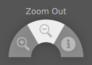
A popup menu that displays several menu items along an arc. More...
| Import Statement: | import QtQuick.Extras 1.4 |
| Since: | Qt 5.5 |

The PieMenu provides a radial context menu as an alternative to a traditional menu. All of the items in a PieMenu are an equal distance from the center of the control.
To create a menu, define at least one MenuItem as a child of it:
PieMenu {
    id: pieMenu

    MenuItem {
        text: "Action 1"
        onTriggered: print("Action 1")
    }
    MenuItem {
        text: "Action 2"
        onTriggered: print("Action 2")
    }
    MenuItem {
        text: "Action 3"
        onTriggered: print("Action 3")
    }
}
By default, only the currently selected item's text is displayed above the menu. To provide text that is always visible when there is no current item, set the title property.
The typical use case for a menu is to open at the point of the mouse cursor after a right click occurs. To do that, define a MouseArea that covers the region upon which clicks should open the menu. When the MouseArea is right-clicked, call the popup() function:
MouseArea {
    anchors.fill: parent
    acceptedButtons: Qt.RightButton

    onClicked: pieMenu.popup(mouseX, mouseY)
}
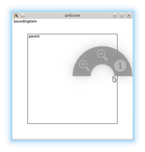
If the menu is opened in a position where some of its menu items would be outside of boundingItem, it is automatically moved to a position where they will not
be hidden. By default, the boundingItem is set to the parent of the menu. It can also be set to null to prevent this behavior.
PieMenu can be displayed at any position on the screen. With a traditional context menu, the menu would be positioned with its top left corner at the position of the right click, but since PieMenu is radial, we position it centered over the position of the right click.
To create a PieMenu that opens after a long press and selects items upon releasing, you can combine ActivationMode.ActivateOnRelease with a MouseArea using a Timer:
MouseArea {
    id: touchArea
    anchors.fill: parent

    Timer {
        id: pressAndHoldTimer
        interval: 300
        onTriggered: pieMenu.popup(touchArea.mouseX, touchArea.mouseY);
    }

    onPressed: pressAndHoldTimer.start()
    onReleased: pressAndHoldTimer.stop();
}

PieMenu {
    id: pieMenu

    triggerMode: TriggerMode.TriggerOnRelease

    MenuItem {
        text: "Action 1"
        onTriggered: print("Action 1")
    }
    MenuItem {
        text: "Action 2"
        onTriggered: print("Action 2")
    }
    MenuItem {
        text: "Action 3"
        onTriggered: print("Action 3")
    }
}
You can hide individual menu items by setting their visible property to false. Hiding items does not affect the startAngle or
endAngle; the remaining items will grow to consume the available space.
You can create a custom appearance for a PieMenu by assigning a PieMenuStyle
|
boundingItem : Item |
The item which the menu must stay within.
A typical use case for PieMenu involves:
Although they sound similar, they have different purposes. Consider the example below:

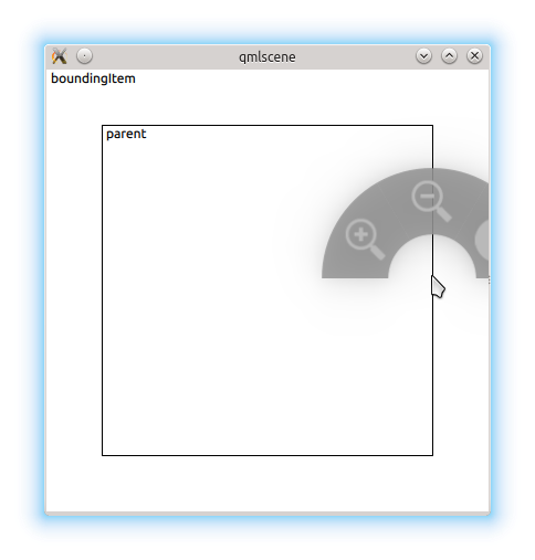
The user can only open the menu within the inner rectangle. In this case, they've opened the menu on the edge of the MouseArea, but there would not be enough room to display the entire menu centered at the cursor position, so it was moved to the left.
If for some reason we didn't want this restriction, we can set boundingItem to null:

By default, the menu's parent is the boundingItem.
|
[read-only] currentIndex : int |
The index of the the menu item that is currently under the mouse, or -1 if there is no such item.
|
[read-only] currentItem : int |
The menu item that is currently under the mouse, or null if there is no such item.
The list of menu items displayed by this menu.
You can assign menu items by declaring them as children of PieMenu:
PieMenu {
    MenuItem {
        text: "Action 1"
        onTriggered: function() { print("Action 1"); }
    }
    MenuItem {
        text: "Action 2"
        onTriggered: function() { print("Action 2"); }
    }
    MenuItem {
        text: "Action 3"
        onTriggered: function() { print("Action 3"); }
    }
}
|
[read-only] selectionAngle : real |
This property reflects the angle (in radians) created by the imaginary line from the center of the menu to the position of the cursor.
Its value is undefined when the menu is not visible.
|
style : Component |
|
title : string |
This property defines the text that is shown above the menu when there is no current menu item (currentIndex is -1).
The default value is "" (an empty string).
|
triggerMode : int |
This property determines the method for selecting items in the menu.
Warning: Changing the triggerMode while the menu is visible will result in undefined behavior.
|
void addItem(string text) |
Adds an item to the end of the menu items.
Equivalent to passing calling insertItem(menuItems.length, text).
Returns the newly added item.
Inserts a MenuItem with text before the index at before.
To insert an item at the end, pass menuItems.length.
Returns the newly inserted item, or null if before is invalid.