Qt Quick Controls 2 offers a variety of input controls for both numeric and textual input.
|
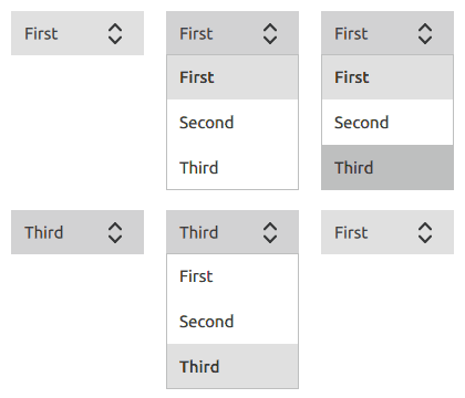
Combined button and popup list for selecting options |
|
|
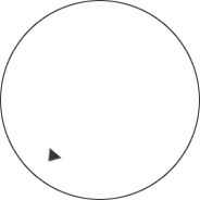
Circular dial that is rotated to set a value |
|
|
Used to select a range of values by sliding two handles along a track |
|
|
Used to select a value by sliding a handle along a track |
|
|
Multi-line text input area |
|
|
Single-line text input field |
|
|
Spinnable wheel of items that can be selected |
Each type of input control has its own specific target use case. The following sections offer guidelines for choosing the appropriate type of input control, depending on the use case.

ComboBox is used to select a value from a static multiple-line drop-down list. It is not possible to add new values, and only one option can be selected.
Recommendations:
See also CheckBox Control, Tumbler Control.

Dial is similar to a traditional dial knob that is found on devices such as stereos or industrial equipment.
The dial is rotated by clicking and dragging, with the handle indicating the value of the dial.
See also Tumbler Control.

TextArea is a multi-line text editor.

TextField is a single line text editor.
See also Tumbler Control.

Slider is used to select a value by sliding a handle along a track.

RangeSlider is used to select a range specified by two values, by sliding each handle along a track.
See also Slider Control.

Tumbler is a spinnable wheel of items that can be selected.
See also ComboBox Control.

As part of the free Business evaluation, we offer a free welcome call for companies, to talk about your requirements, and how the Felgo SDK & Services can help you. Just sign up and schedule your call.
Sign up now to start your free Business evaluation:

