|
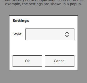
Popup dialog with standard buttons and a title, used for short-term interaction with the user |
|
|
Side panel that can be opened and closed using a swipe gesture |
|
|
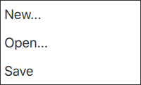
Popup that can be used as a context menu or popup menu |
|
|
Base type of popup-like user interface controls |
|
|
Provides tool tips for any control |
Each type of popup control has its own specific target use case. The following sections offer guidelines for choosing the appropriate type of popup control, depending on the use case.

Drawer provides a swipe-based side panel, similar to those often used in touch interfaces to provide a central location for navigation.
The drawer can be positioned at any of the four edges of the screen. It allows the user to add navigation without taking up valuable screen space. The user can show and hide the drawer at any time with a simple swipe movement.

The Menu control displays a vertical list of items that can be selected. It can be used for offering a list of actions that can be taken in a given context.
See also Drawer Control.

A Popup displays content over other application content. It prompts the user to make a decision or enter information.
Popups can be modal or non-modal. A modal popup blocks users from interacting with the application until they have made a choice and closed the popup.
A popup can be used for:

ToolTip shows a short piece of text that informs the user of a control's function. It is typically placed above or below the parent control.
Recommendations:

As part of the free Business evaluation, we offer a free welcome call for companies, to talk about your requirements, and how the Felgo SDK & Services can help you. Just sign up and schedule your call.
Sign up now to start your free Business evaluation:

