Learn what Felgo offers to help your business succeed. Start your free evaluation today! Felgo for Your Business

AppCheckBox

A checkbox with a platform-specific styling for iOS and Android. More...

Import Statement: import Felgo 4.0
Since: Felgo 2.7.1
Inherits:

CheckBox

Properties

Detailed Description

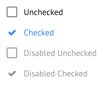
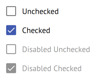
AppCheckboxes allow the user to select one or more options from a set. The AppCheckBox comes with a default look that matches platform-specific styles.

iOS Android

Property Documentation

borderColorOff : color

The color of the checkbox's border if it is unchecked. Matches Theme::appCheckBox.borderColorOff by default.


borderColorOffDisabled : color

The color of the checkbox's border if it is unchecked and disabled. Matches Theme::appCheckBox.borderColorOffDisabled by default.


borderColorOn : color

The color of the checkbox's border if it is checked. Matches Theme::appCheckBox.borderColorOn by default.


borderColorOnDisabled : color

The color of the checkbox's border if it is checked and disabled. Matches Theme::appCheckBox.borderColorOnDisabled by default.


borderWidth : real

The width of the checkbox's border. Matches Theme::appCheckBox.borderWidth by default.


checkBoxSize : real

The size for the checkbox rectangle of the control. Matches Theme::appCheckBox.checkBoxSize by default.


fillColorOff : color

The fill color of the checkbox if it is unchecked. Matches Theme::appCheckBox.fillColorOff by default.


fillColorOffDisabled : color

The fill color of the checkbox if it is unchecked and disabled. Matches Theme::appCheckBox.fillColorOffDisabled by default.


fillColorOn : color

The fill color of the checkbox if it is checked. Matches Theme::appCheckBox.fillColorOn by default.


fillColorOnDisabled : color

The fill color of the checkbox if it is checked and disabled. Matches Theme::appCheckBox.fillColorOnDisabled by default.


iconColorOff : color

The color of the checked icon if the checkbox is unchecked. Matches Theme::appCheckBox.iconColorOff by default.


iconColorOffDisabled : color

The color of the checked icon if the checkbox is disabled and unchecked. Matches Theme::appCheckBox.iconColorOffDisabled by default.


iconColorOn : color

The color of the checked icon if the checkbox is checked. Matches Theme::appCheckBox.iconColorOn by default.


iconColorOnDisabled : color

The color of the checked icon if the checkbox is disabled and checked. Matches Theme::appCheckBox.iconColorOnDisabled by default.


iconSize : real

The size for the checked icon within the checkbox. Matches Theme::appCheckBox.iconSize by default.


[since Felgo 4.0.0] iconType : string

The icon that is shown within the checkbox. Matches Theme::appCheckBox.iconType by default. If no icon is specified the standard icon is used.

Use one of the IconType constants with this property.

Note: This property was renamed from icon in Felgo 4.0.0. This is because the base type already has the property AbstractButton::icon in Qt Quick Controls 2.

This property was introduced in Felgo 4.0.0.


labelColorOff : color

The color of the label text if the checkbox is unchecked. Matches Theme::appCheckBox.labelColorOff by default.


labelColorOffDisabled : color

The color of the label text if the checkbox is disabled and unchecked. Matches Theme::appCheckBox.labelColorOffDisabled by default.


labelColorOn : color

The color of the label text if the checkbox is checked. Matches Theme::appCheckBox.labelColorOn by default.


labelColorOnDisabled : color

The color of the label text if the checkbox is disabled and checked. Matches Theme::appCheckBox.labelColorOnDisabled by default.


labelFontSize : real

The font size of the label text of the checkbox. The default value is sp(16).


radius : real

The border radius of the checkbox. Matches Theme::appCheckBox.radius by default.


updateChecked : bool

If set to false, the control does not change its checked property when it is clicked.

This might be useful if the property is bound to a value that should not be overwritten. The clicked signal is fired in any case and allows to react to user interactions.

The default value is true.


Qt_Technology_Partner_RGB_475 Qt_Service_Partner_RGB_475_padded