This page is a summary of common use-cases and shows how they are solved with the Felgo App Components.
Code Snippet Overview
Listview Code Snippets
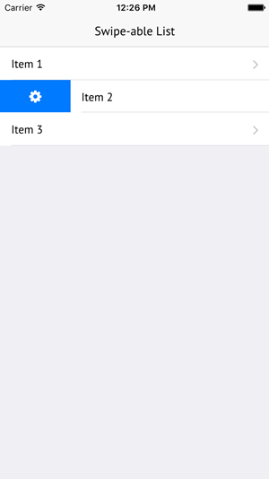
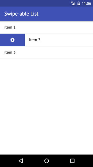
Make a ListView Cell Swipe-able
AppListViewSwipeOptionsContainer
Many apps allow to show additional options for list items by swiping them to the left or the right. Imagine a mail app that shows a list of mails. Clicking a mail will open it. But it's also possible to swipe it to the right
to show additional options like deleting the mail or forwarding it.
The solution to create a swipe-able ListView like that requires two components:
- The AppListView for showing the list items in a scroll-able view.
- The SwipeOptionsContainer for making the items swipe-able and displaying options when swiping to the left or the right.
The following example shows a simple swipe-able list within a Page. To display the list items and the swipe option the SimpleRow and SwipeButton
components are used. They are convenience types with a platform-specific look that can handle the most common use-cases:
| iOS |
Android |
|
|
|
import Felgo
App {
NavigationStack {
AppPage {
title: "Swipe-able List"
AppListView {
anchors.fill: parent
model: [
{ text: "Item 1" },
{ text: "Item 2" },
{ text: "Item 3" }
]
delegate: SwipeOptionsContainer {
id: container
height: listItem.height
SimpleRow { id: listItem }
leftOption: SwipeButton {
iconType: IconType.gear
height: parent.height
onClicked: {
listItem.text = "Option clicked"
container.hideOptions()
}
}
}
}
}
}
}
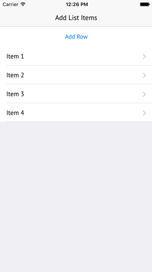
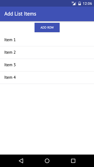
Add a New Row to a ListView Dynamically
AppListView
Each ListView displays its data based on a model. In the simplest case, this will be an array that holds data objects. Adding a row to the list
then means adding a data object to the array model.
The following example displays a list view and a button that allows to add rows:
| iOS |
Android |
|
|
|
import Felgo
App {
NavigationStack {
AppPage {
id: page
title: "Add List Items"
property var dataModel: [
{ text: "Item 1" },
{ text: "Item 2" },
{ text: "Item 3" }
]
AppButton {
id: button
anchors.horizontalCenter: parent.horizontalCenter
text: "Add Row"
onClicked: {
var itemNr = page.dataModel.length + 1
var newItem = { text: "Item "+itemNr }
page.dataModel.push(newItem)
page.dataModelChanged()
}
}
AppListView {
id: listView
anchors.top: button.bottom
anchors.bottom: parent.bottom
width: parent.width
model: page.dataModel
delegate: SimpleRow {}
}
}
}
}
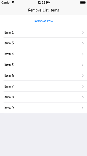
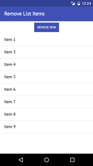
Remove a Row from a ListView Dynamically
AppListView
Like in the previous example, the way to remove a list item is by modifying the data model of the ListView. If the model data is an array, this means removing
data objects from the array.
The following example shows a ListView and a button that allows to remove a list item:
| iOS |
Android |
|
|
|
import Felgo
App {
NavigationStack {
AppPage {
id: page
title: "Remove List Items"
property var dataModel: [
{ text: "Item 1" },
{ text: "Item 2" },
{ text: "Item 3" },
{ text: "Item 4" },
{ text: "Item 5" },
{ text: "Item 6" },
{ text: "Item 7" },
{ text: "Item 8" },
{ text: "Item 9" }
]
AppButton {
id: button
anchors.horizontalCenter: parent.horizontalCenter
text: "Remove Row"
onClicked: {
page.dataModel.splice(1, 1)
page.dataModelChanged()
}
}
AppListView {
id: listView
anchors.top: button.bottom
anchors.bottom: parent.bottom
width: parent.width
model: page.dataModel
delegate: SimpleRow {}
}
}
}
}
Navigation Code Snippets
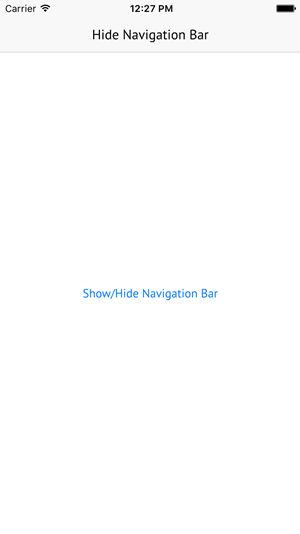
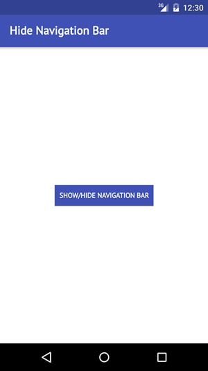
Hide the Navigation Bar on a Specific Page
AppPageNavigationStack
Each NavigationStack automatically adds a NavigationBar that shows the current page title and other NavigationBarItems. By setting the AppPage::navigationBarHidden property to true, the navigation bar won't be shown for
that page.
The following example shows a Page with a button that allows to show or hide the navigation bar:
| iOS |
Android |
|
|
|
import Felgo
App {
NavigationStack {
AppPage {
id: page
title: "Hide Navigation Bar"
navigationBarHidden: false
AppButton {
anchors.centerIn: parent
text: "Show/Hide Navigation Bar"
onClicked: page.navigationBarHidden = !page.navigationBarHidden
}
}
}
}
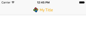
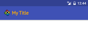
Add a Custom Title Item
AppPageNavigationStack
The NavigationStack shows the AppPage::titleItem of the currently active page in the navigation bar. This default title item is a
simple Text that shows the AppPage::title. By overwriting the AppPage::titleItem you can replace the item.
The following example replaces the default title item to show an image together with the page title:
| iOS |
Android |
|
|
|
import Felgo
import QtQuick
App {
NavigationStack {
AppPage {
id: page
title: "My Title"
titleItem: Row {
spacing: dp(6)
Image {
anchors.verticalCenter: parent.verticalCenter
height: titleText.height
fillMode: Image.PreserveAspectFit
source: "../assets/felgo-logo.png"
}
AppText {
id: titleText
anchors.verticalCenter: parent.verticalCenter
text: page.title
font.bold: true
font.family: Theme.boldFont.name
font.pixelSize: dp(Theme.navigationBar.titleTextSize)
color: "orange"
}
}
}
}
}
Logic Code Snippets
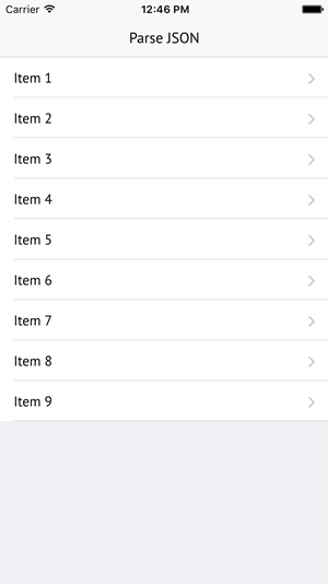
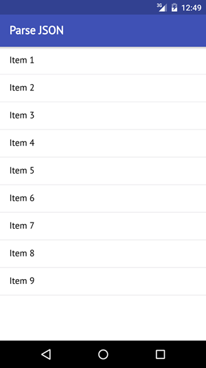
Read and Parse JSON
XMLHttpRequest Element
To implement logic in QML we can simply add JavaScript code to our QML items. JavaScript already comes with features to load and parse JSON data. With the XMLHttpRequest
Element we can load data from a file or web service. The JSON.parse function then allows us to convert the data to a JSON object.
The following example dynamically loads JSON data from a file and displays it in a list:
| iOS |
Android |
|
|
|
data.json
 [
   { "text": "Item 1" },
   { "text": "Item 2" },
   { "text": "Item 3" },
   { "text": "Item 4" },
   { "text": "Item 5" },
   { "text": "Item 6" },
   { "text": "Item 7" },
   { "text": "Item 8" },
   { "text": "Item 9" }
 ]
Main.qml
import Felgo
import QtQuick
App {
id: app
property var jsonData: null
Component.onCompleted: {
loadJsonData()
}
NavigationStack {
ListPage {
id: page
title: "Parse JSON"
model: app.jsonData
}
}
function loadJsonData() {
var xhr = new XMLHttpRequest
xhr.onreadystatechange = function() {
if (xhr.readyState === XMLHttpRequest.DONE) {
var dataString = xhr.responseText
app.jsonData = JSON.parse(dataString)
}
}
xhr.open("GET", Qt.resolvedUrl("data.json"))
xhr.send()
}
}
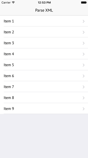
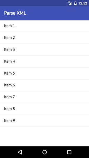
Read and Parse XML
XmlListModel
The easiest way to work with XML data is by using the XmlListModel type. After we set the XML source and add some queries to identify the items
and item attributes, we can directly use this model to display the items with components like AppListView or Repeater.
The following example sets up a XmlListModel to load data from a local XML file and displays the items in a ListPage:
| iOS |
Android |
|
|
|
data.xml
 <?xml version="1.0" encoding="UTF-8" ?>
 <data>
   <item>Item 1</item>
   <item>Item 2</item>
   <item>Item 3</item>
   <item>Item 4</item>
   <item>Item 5</item>
   <item>Item 6</item>
   <item>Item 7</item>
   <item>Item 8</item>
   <item>Item 9</item>
 </data>
Main.qml
import Felgo
import QtQuick.XmlListModel
App {
XmlListModel {
id: xmlModel
source: Qt.resolvedUrl("data.xml")
query: "/data/item"
XmlRole { name: "itemText"; query: "string()" }
}
NavigationStack {
ListPage {
id: page
title: "Parse XML"
model: xmlModel
delegate: SimpleRow { text: itemText }
}
}
}
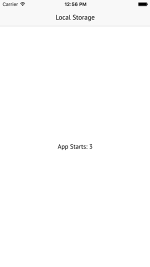
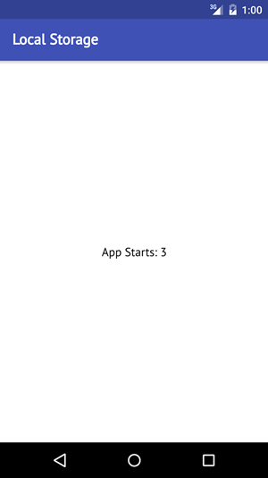
Save Things in a Local Database
Storage
Setting up a local database requires the Qt Quick Local Storage features. In many cases, it is enough to have a simple key-value store. For this
special use-case, Felgo offers the Storage type as a convenience wrapper around the Local Storage features. The stored values are also available after the user updated the app.
The following example stores the number of app starts in a local database and displays the current value:
| iOS |
Android |
|
|
|
import Felgo
import QtQuick
App {
Storage {
id: localStorage
property int appStarts: 0
Component.onCompleted: {
var nr = localStorage.getValue("appstarts")
if(nr === undefined)
nr = 0
nr++
localStorage.setValue("appstarts", nr)
appStarts = nr
}
}
NavigationStack {
AppPage {
id: page
title: "Local Storage"
AppText {
anchors.centerIn: parent
text: "App Starts: "+localStorage.appStarts
}
}
}
}
Maps Code Snippets
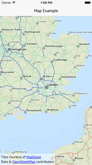
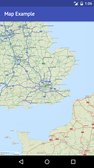
Display a Map
AppMapLocation Plugin
The AppMap component is an extension of the QML Map item and can display a map and optionally the user location. To actually
display the map, it is required to specify a Plugin that provides the map data. QML currently supports the following plugins:
Note: To use the map features, make sure that the Qt Location components are installed. In case you are missing the module, use the MaintenanceTool in you
Felgo installation folder to add it. Also include QT += positioning location to your project configuration in the *.pro file of your project.
The following example creates a Map that uses the Maplibre GL Map plugin:
| iOS |
Android |
|
|
|
import Felgo
import QtLocation
App {
NavigationStack {
AppPage {
title: "Map Example"
AppMap {
anchors.fill: parent
plugin: Plugin {
name: "maplibregl"
parameters: [
PluginParameter {
name: "maplibregl.mapping.additional_style_urls"
value: "https://api.maptiler.com/maps/streets/style.json?key=get_your_own_OpIi9ZULNHzrESv6T2vL"
}
]
}
}
}
}
}
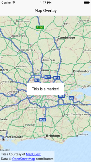
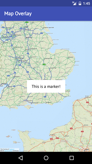
Show Markers on a Map
AppMapMapQuickItem
The AppMap component allows to show a map and optionally the user location. It is based on the QML Map item. There are several
overlay items that can be placed on a map, for a list of all possible overlay items see here. The MapQuickItem type allows to place custom QML items on the map, which is what we will use for this example.
Note: To use the map features, make sure that the Qt Location components are installed. In case you are missing the module, use the MaintenanceTool in you
Felgo installation folder to add it. Also include QT += positioning location to your project configuration in the *.pro file of your project.
The following QML code creates a map with a custom overlay at its center:
| iOS |
Android |
|
|
|
import Felgo
import QtLocation
import QtQuick
App {
NavigationStack {
AppPage {
title: "Map Overlay"
AppMap {
anchors.fill: parent
plugin: Plugin {
name: "maplibregl"
parameters: [
PluginParameter {
name: "maplibregl.mapping.additional_style_urls"
value: "https://api.maptiler.com/maps/streets/style.json?key=get_your_own_OpIi9ZULNHzrESv6T2vL"
}
]
}
MapQuickItem {
coordinate: parent.center
anchorPoint: Qt.point(sourceItem.width/2, sourceItem.height/2)
sourceItem: Rectangle {
width: dp(150)
height: dp(50)
color: "white"
AppText {
text: "This is a marker!"
anchors.centerIn: parent
}
}
}
}
}
}
}
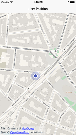
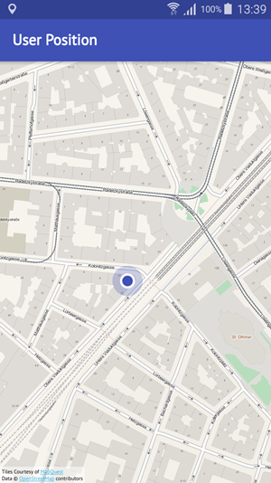
Show User Position
AppMap
The AppMap already comes with a built-in feature to detect and display the user location. Set the AppMap::showUserPosition property to
true to enable this feature. The app then tries to detect the user location and displays a marker on the map if possible. The position can only be displayed if the device is capable of getting a position from
either GPS or other position sources.
Note: To use the map features, make sure that the Qt Location components are installed. In case you are missing the module, use the MaintenanceTool in you
Felgo installation folder to add it. Also include QT += positioning location to your project configuration in the *.pro file of your project.
Note: Also make sure to add required configuration settings to AndroidManifest.xml on Android or the Project-Info.plist on iOS so your app may access gps location on the device.
The following example detects and displays the user location:
| iOS |
Android |
|
|
|
import Felgo
import QtLocation
import QtQuick
App {
NavigationStack {
AppPage {
title: "User Position"
AppMap {
anchors.fill: parent
plugin: Plugin {
name: "maplibregl"
parameters: [
PluginParameter {
name: "maplibregl.mapping.additional_style_urls"
value: "https://api.maptiler.com/maps/streets/style.json?key=get_your_own_OpIi9ZULNHzrESv6T2vL"
}
]
}
showUserPosition: true
zoomLevel: 13
Component.onCompleted: {
if(userPositionAvailable)
center = userPosition.coordinate
}
onUserPositionAvailableChanged: {
if(userPositionAvailable)
zoomToUserPosition()
}
}
}
}
}
Styling Code Snippets
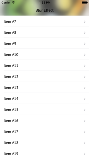
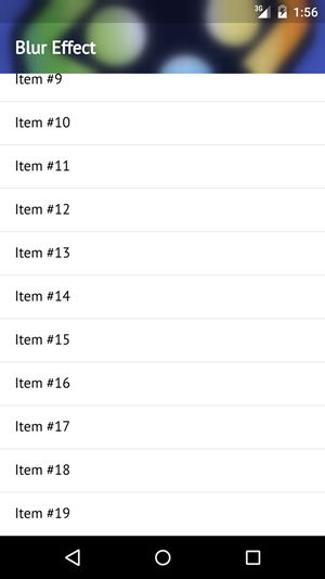
Add Blur Effect
FastBlur
Qt already provides several different QML types to create graphical effects like blur, drop shadow, opacity masks and more. See here for an overview of all effects: Graphical Effects
The following example creates a list page that uses a custom navigation bar background with an image. When the list is scrolled, the background image is blurred using the FastBlur effect:
| iOS |
Android |
|
|
|
import Felgo
import QtQuick
import Qt5Compat.GraphicalEffects
App {
NavigationStack {
ListPage {
id: page
title: "Blur Effect"
readonly property real barHeight: dp(Theme.navigationBar.height) + Theme.statusBarHeight
navigationBarTranslucency: 1.0
listView.anchors.topMargin: barHeight
model: 20
delegate: SimpleRow { text: "Item #"+index }
Rectangle {
id: background
width: parent.width
height: page.barHeight
color: Theme.navigationBar.backgroundColor
Image {
id: bgImage
source: "../assets/felgo-logo.png"
anchors.fill: parent
fillMode: Image.PreserveAspectCrop
visible: false
}
FastBlur {
id: blur
source: bgImage
anchors.fill: bgImage
radius: Math.max(0, Math.min(64, page.listView.contentY))
}
}
}
}
}


