AppCard
A material style card. More...
| Import Statement: |
import Felgo 4.0 |
| Inherits: |
Item
|
Properties
Detailed Description
The AppCard offers a material style card component. The card also includes an AppCardSwipeArea to create cards with a Tinder-like swipe gesture.
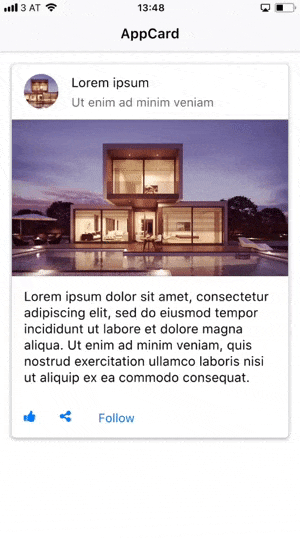
Example Usage: A Basic Card with Header, Banner, Content and Actions
This is an example for a basic card with a header, a banner image, some text content and action buttons.
import Felgo
import QtQuick
App {
AppPage {
AppCard {
id: card
width: parent.width
margin: dp(15)
paper.radius: dp(5)
header: SimpleRow {
imageSource: "https://cdn.pixabay.com/photo/2016/06/24/10/47/architecture-1477041_960_720.jpg"
text: "Lorem ipsum"
detailText: "Ut enim ad minim veniam"
enabled: false
image.radius: image.width/2
image.fillMode: Image.PreserveAspectCrop
style: StyleSimpleRow {
showDisclosure: false
backgroundColor: "transparent"
}
}
media: AppImage {
width: parent.width
fillMode: Image.PreserveAspectFit
source: "https://cdn.pixabay.com/photo/2016/06/24/10/47/architecture-1477041_960_720.jpg"
}
content: AppText{
width: parent.width
padding: dp(15)
text: "Lorem ipsum dolor sit amet, consectetur adipiscing elit, sed do eiusmod tempor incididunt ut labore et dolore magna aliqua. Ut enim ad minim veniam, quis nostrud exercitation ullamco laboris nisi ut aliquip ex ea commodo consequat."
}
actions: Row {
IconButton {
iconType: IconType.thumbsup
}
IconButton {
iconType: IconType.sharealt
}
AppButton {
text: "Follow"
flat: true
}
}
}
}
}
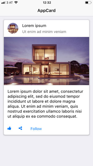
Example Usage: A Tinder-like Swipeable Card
This is basically the same example as above, with only the AppCard::swipeEnabled property set to true. This enables the internal AppCardSwipeArea and the card can be swiped. You can further customize the swipe, by changing the properties of the AppCard::cardSwipeArea,
in this example we decrease the AppCardSwipeArea::rotationFactor to 0.05.
import Felgo
import QtQuick
App {
AppPage {
AppCard {
id: card
width: parent.width
margin: dp(15)
paper.radius: dp(5)
swipeEnabled: true
cardSwipeArea.rotationFactor: 0.05
cardSwipeArea.onSwipedOut: {
console.debug("card swiped out: " + direction)
}
header: SimpleRow {
imageSource: "https://cdn.pixabay.com/photo/2016/06/24/10/47/architecture-1477041_960_720.jpg"
text: "Lorem ipsum"
detailText: "Ut enim ad minim veniam"
enabled: false
image.radius: image.width/2
image.fillMode: Image.PreserveAspectCrop
style: StyleSimpleRow {
showDisclosure: false
backgroundColor: "transparent"
}
}
media: AppImage {
width: parent.width
fillMode: Image.PreserveAspectFit
source: "https://cdn.pixabay.com/photo/2016/06/24/10/47/architecture-1477041_960_720.jpg"
}
content: AppText{
width: parent.width
padding: dp(15)
text: "Lorem ipsum dolor sit amet, consectetur adipiscing elit, sed do eiusmod tempor incididunt ut labore et dolore magna aliqua. Ut enim ad minim veniam, quis nostrud exercitation ullamco laboris nisi ut aliquip ex ea commodo consequat."
}
actions: Row {
IconButton {
iconType: IconType.thumbsup
}
IconButton {
iconType: IconType.sharealt
}
AppButton {
text: "Follow"
flat: true
}
}
}
}
}
Property Documentation
The QML item used for the actions cell of the card.
This property was introduced in Felgo 2.18.1.
Alias to the AppCardSwipeArea item used to create Tinder-like swipe gestures.
This property was introduced in Felgo 2.18.1.
The QML item used for the content cell of the card.
This property was introduced in Felgo 2.18.1.
The QML item used for the header cell of the card.
This property was introduced in Felgo 2.18.1.
The margin of the card container (paper) relative to the card width. You can also set the properties for top, bottom, left and right margin individually.
This property was introduced in Felgo 2.18.1.
See also topMargin, bottomMargin, leftMargin, and rightMargin.
The QML item used for the media cell of the card.
This property was introduced in Felgo 2.18.1.
Alias to the AppPaper item used to create the card container.
This property was introduced in Felgo 2.18.1.
Set this property to true to enable a Tinder-like swipe gesture for this card. The default value is false.
This property was introduced in Felgo 2.18.1.


