
Displays a custom component as a modal overlay. More...
| Import Statement: | import Felgo 4.0 |
| Since: | Felgo 3.9.0 |
| Inherits: | |
| Inherited By: |
The AppOverlay type allows to display any custom QML item or component as a fullscreen overlay. It automatically covers item creation, layouting and animations for opening and closing the overlay.
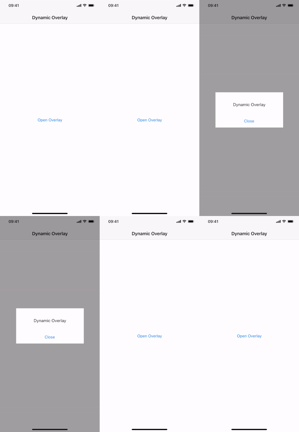
To show an overlay, specify the sourceItem or sourceUrl and call open().
Set the AppOverlay::sourceItem property to show the specified item or component as a fullscreen overlay:
 import Felgo
 import QtQuick

 App {
   NavigationStack {
     AppPage {
       title: "Dynamic Overlay"

       AppButton {
         text: "Open Overlay"
         anchors.centerIn: parent
         onClicked: myOverlay.open()
       }

       AppOverlay {
         id: myOverlay
         sourceItem: overlayComponent
         onOpening: item.closeClicked.connect(myOverlay.close)
       }

       Component {
         id: overlayComponent
         Rectangle {
           id: item
           anchors.centerIn: parent
           color: Theme.backgroundColor
           width: dp(250)
           height: dp(130)

           signal closeClicked

           AppText {
             text: "Dynamic Overlay"
             y: dp(36)
             anchors.horizontalCenter: parent.horizontalCenter
           }

           AppButton {
             text: "Close"
             anchors.horizontalCenter: parent.horizontalCenter
             anchors.bottom: parent.bottom
             flat: true
             onClicked: item.closeClicked()
           }
         }
       }
     }
   }
 }
Alternatively, you can also configure the AppOverlay::sourceUrl property to lazy-load a component via url. The overlay covers dynamic item creation and destruction, as well as animations. When the AppOverlay::opening() signal fires, the dynamic AppOverlay::item is available and the opening animation starts.
When closing the overlay, the itemWillDestroy() signal notifies about the item's destruction. This is only the case when using a component as overlay source.
The AppOverlay makes it easy to turn custom Dialog items into lazy-loaded dialogs. Define the overlay within the Page where you use the dialog, and create the object on-demand:
 import Felgo
 import QtQuick

 App {
   NavigationStack {
     AppPage {
       title: "On-Demand Dialog"

       AppButton {
         text: "Open"
         anchors.horizontalCenter: parent.horizontalCenter
         onClicked: myOverlay.open()
       }

       Component {
         id: dialogComponent
         Dialog {
           backgroundItem: null // no background, covered by overlay

           // custom Dialog configuration
           title: "Do you think this is awesome?"
           positiveActionLabel: "Yes"
           negativeActionLabel: "No"
           onCanceled: title = "Think again!"
           onAccepted: close()

           AppText {
             width: parent.width
             anchors.verticalCenter: parent.verticalCenter
             horizontalAlignment: Text.AlignHCenter
             text: "What do you say?"
           }
         }
       }

       AppOverlay {
         id: myOverlay
         sourceItem: dialogComponent
         useSafeArea: false // Dialog covers full screen

         // open/close the created Dialog item with the overlay
         openAnimation: ScriptAction { script: myOverlay.item.open() }
         closeAnimation: ScriptAction { script: myOverlay.item.close() }

         // close the overlay when the user closes the Dialog item
         onOpening: item.closing.connect(myOverlay.close)
         onItemWillDestroy: item.closing.disconnect(myOverlay.close)
       }
     }
   }
 }
Note: The Dialog::outsideTouchable property is still responsible for handling touch events on the background. The Dialog item covers the full screen even when removing the backgroundItem. AppOverlay::blockBackground or AppOverlay::closeOnBackgroundClick do not have any effect, as the the Dialog grabs all touch events.
To design a custom overlay you can specify your overlay content inline:
 import Felgo
 import QtQuick

 App {
   NavigationStack {
     AppPage {
       title: "Custom Overlay"

       AppButton {
         text: "Open Overlay"
         anchors.centerIn: parent
         onClicked: myOverlay.open()
       }

       AppOverlay {
         id: myOverlay

         Rectangle {
           anchors.centerIn: parent
           color: Theme.backgroundColor
           width: dp(250)
           height: dp(130)

           AppText {
             text: "Custom Overlay"
             y: dp(36)
             anchors.horizontalCenter: parent.horizontalCenter
           }

           AppButton {
             text: "Close"
             anchors.horizontalCenter: parent.horizontalCenter
             anchors.bottom: parent.bottom
             flat: true
             onClicked: myOverlay.close()
           }
         }
       }
     }
   }
 }
Similar to the sourceItem, all overlay children are placed within the AppOverlay::contentItem container. They are thus aligned and animated depending on the overlay settings, Using a sourceItem instead of nested items is only required if a single overlay is reused to display different sources. Changing the source allows to load a different item then. Inline children are never destroyed and always a part of the overlay.
The AppOverlay provides many properties to customize the background style and behavior, as well as animations. For example, you can hide the background and animate the content item's scale instead of the opacity:
 import Felgo
 import QtQuick

 App {
   NavigationStack {
     AppPage {
       title: "Customized Overlay"

       AppButton {
         text: "Open Overlay"
         anchors.centerIn: parent
         onClicked: myOverlay.open()
       }

       AppOverlay {
         id: myOverlay
         backgroundItem: null // remove background item

         // specify overlay content
         Rectangle {
           anchors.centerIn: parent
           color: "lightyellow"
           width: dp(250)
           height: dp(130)

           AppText {
             text: "Custom Overlay"
             y: dp(36)
             anchors.horizontalCenter: parent.horizontalCenter
           }

           AppButton {
             text: "Close"
             anchors.horizontalCenter: parent.horizontalCenter
             anchors.bottom: parent.bottom
             flat: true
             onClicked: myOverlay.close()
           }
         }

         // set custom animation
         animationDuration: 300
         openAnimation: NumberAnimation {
           duration: myOverlay.animationDuration
           property: "scale"
           from: 0
           to: 1
         }
         closeAnimation:  NumberAnimation {
           duration: myOverlay.animationDuration
           property: "scale"
           from: 1
           to: 0
         }
       }
     }
   }
 }
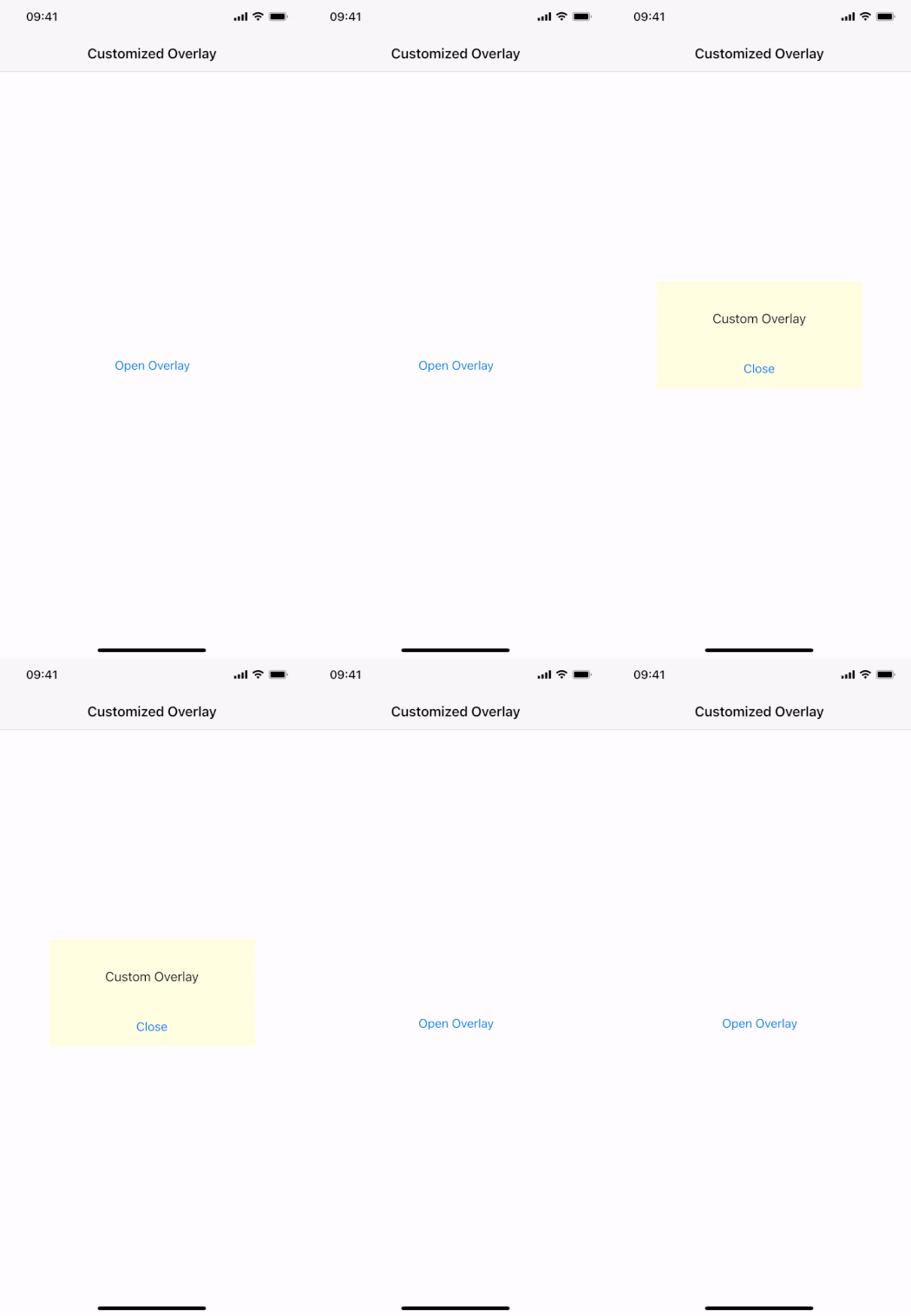
Apart from the backgroundItem slot that specifies the used background, you can also control the touch behavior when interacting with the background area. The AppOverlay::closeOnBackgroundClick setting decides whether touching the background automatically closes the overlay. To not handle touches and allow app interactions below the background, deactivate AppOverlay::blockBackground.
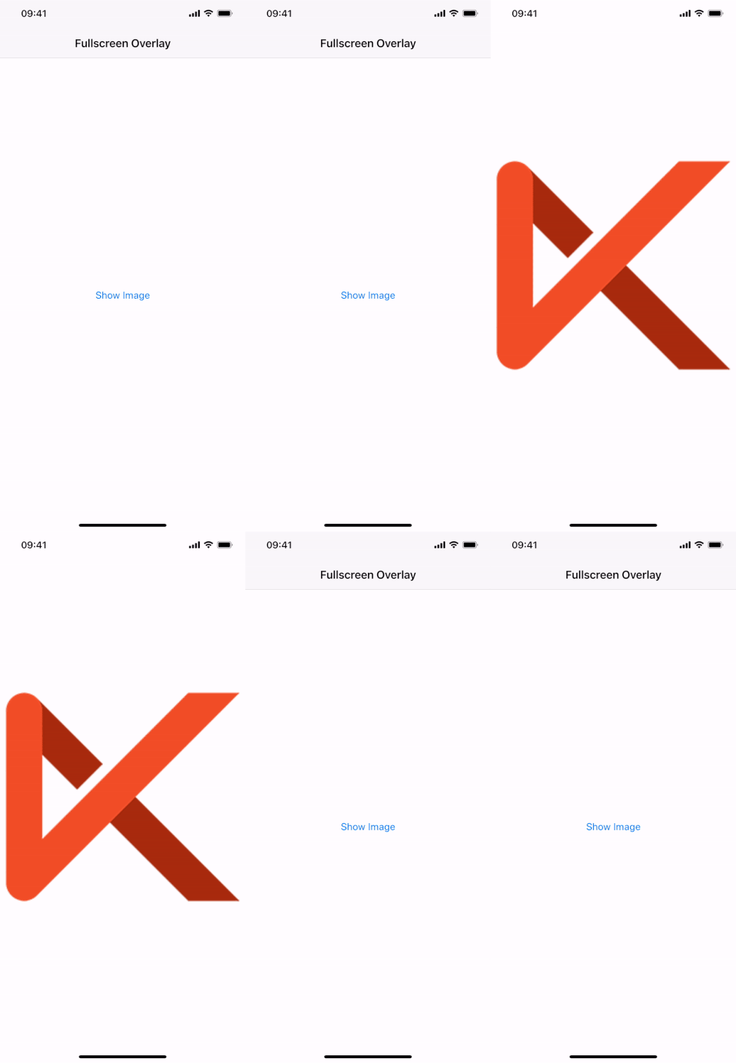
Display notches and cutouts can cover parts of your fullscreen content. The AppOverlay automatically handles this issue and only places your content within the safe area of the screen. Deactivate AppOverlay::useSafeArea to let your content cover the full screen:
 import Felgo
 import QtQuick

 App {
   NavigationStack {
     AppPage {
       title: "Fullscreen Overlay"

       AppButton {
         text: "Show Image"
         anchors.centerIn: parent
         onClicked: mediaOverlay.open()
       }

       AppOverlay {
         id: mediaOverlay
         useSafeArea: false // let image cover the full screen

         Rectangle {
           anchors.fill: parent
           color: "white"
           Image {
             anchors.fill: parent
             fillMode: Image.PreserveAspectFit
             source: "https://felgo.com/web-assets/felgo-logo.png"
           }
         }

         MouseArea {
           anchors.fill: parent
           onClicked: mediaOverlay.close()
         }
       }

     }
   }
 }
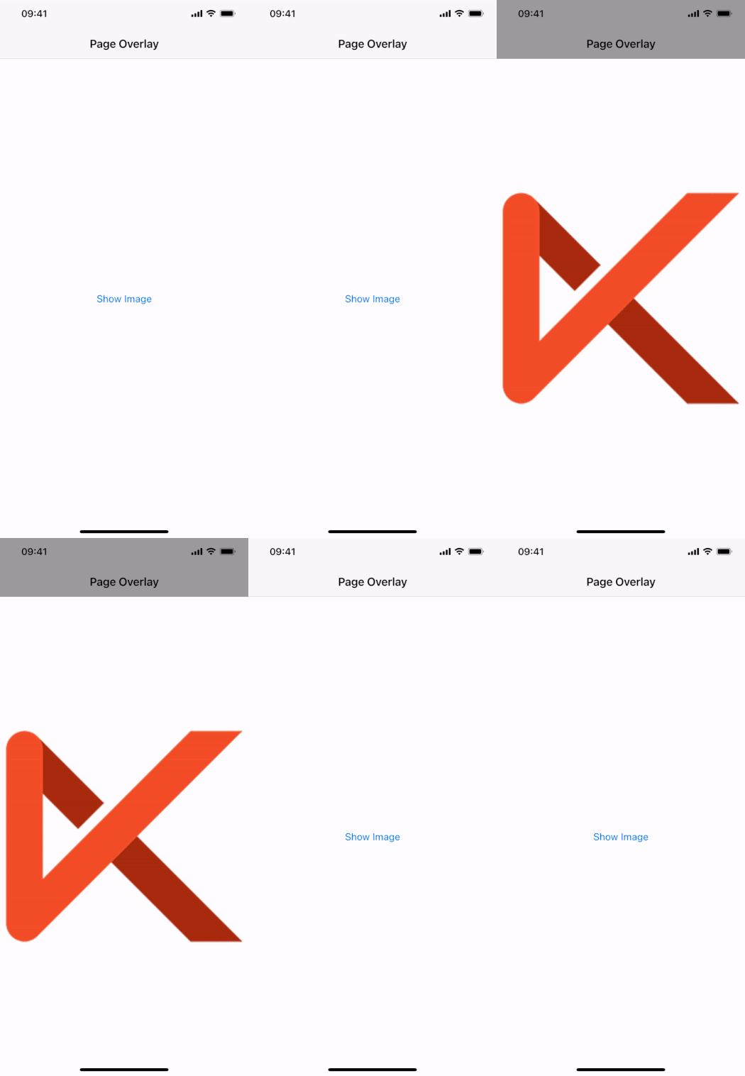
In addition to alignment with the safe area or the full screen, the overlay also supports to display content within the local item that surrounds the overlay. The following example overlays an Image within the Page boundaries. The backgroundItem still darkends the full screen:
 import Felgo
 import QtQuick

 App {
   NavigationStack {
     AppPage {
       title: "Page Overlay"

       AppButton {
         text: "Show Image"
         anchors.centerIn: parent
         onClicked: mediaOverlay.open()
       }

       AppOverlay {
         id: mediaOverlay
         // let image cover overlay parent, this is the page content in this example
         useLocalViewArea: true

         Rectangle {
           anchors.fill: parent
           color: "white"
           Image {
             anchors.fill: parent
             fillMode: Image.PreserveAspectFit
             source: "https://felgo.com/web-assets/felgo-logo.png"
           }
         }

         MouseArea {
           anchors.fill: parent
           onClicked: mediaOverlay.close()
         }
       }

     }
   }
 }
The keepBackgroundVisible property provides the possibility to only fade the content when switching between different overlay sources. This allows to show a sequence of overlays while keeping the background visible and the screen locked.
To fully close the overlay after such a sequence, deactivate keepBackgroundVisible before the final close() call:
 import Felgo
 import QtQuick

 App {
   NavigationStack {
     AppPage {
       title: "Overlay Sequence"

       AppButton {
         text: "Show Overlay Sequence"
         anchors.centerIn: parent
         onClicked: overlayGroup.open()
       }

       Component {
         id: firstMessage
         AppText {
           anchors.centerIn: parent
           text: "First Message"
         }
       }

       Component {
         id: secondMessage
         AppText {
           anchors.centerIn: parent
           text: "Second Message"
         }
       }

       Component {
         id: lastMessage
         AppText {
           anchors.centerIn: parent
           text: "Last Message"
         }
       }

       AppOverlay {
         id: overlayGroup

         property var messages: [firstMessage, secondMessage, lastMessage]
         property int currentIndex: 0

         sourceItem: messages[currentIndex]
         backgroundColor: "lightgrey"

         // the overlay does not hide the background by default
         keepBackgroundVisible: true

         // when opening the last message, configure the overlay to fully hide
         onOpening: {
           if(sourceItem === lastMessage) {
             keepBackgroundVisible = false
           }
         }

         // when a message is closed, open the next one
         onClosed: {
           // open next message if not the last one
           if(sourceItem !== lastMessage) {
             currentIndex++
             open()
           }
           // sequence done, reset the overlay to original
           else {
             currentIndex = 0
             keepBackgroundVisible = true
           }
         }
       } // AppOverlay
     }
   }
 }
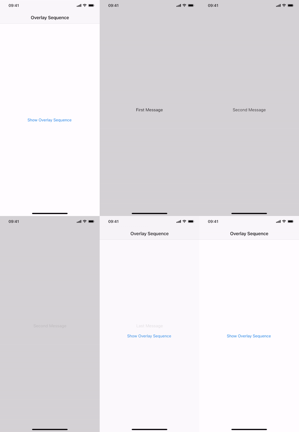
Alternatively, you can also overwrite the default close behavior to keep the background visible during the sequence:
 import Felgo
 import QtQuick

 App {
   NavigationStack {
     AppPage {
       title: "Overlay Sequence"

       AppButton {
         text: "Show Overlay Sequence"
         anchors.centerIn: parent
         onClicked: overlayGroup.open()
       }

       Component {
         id: firstMessage
         AppText {
           anchors.centerIn: parent
           text: "First Message"
         }
       }

       Component {
         id: secondMessage
         AppText {
           anchors.centerIn: parent
           text: "Second Message"
         }
       }

       Component {
         id: lastMessage
         AppText {
           anchors.centerIn: parent
           text: "Last Message"
         }
       }

       AppOverlay {
         id: overlayGroup

         property var messages: [firstMessage, secondMessage, lastMessage]
         property int currentIndex: 0

         sourceItem: messages[currentIndex]
         backgroundColor: "lightgrey"

         // do not automatically close the overlay when clicking the background
         closeOnBackgroundClick: false

         onBackgroundClicked: {
           // if its the last message, fully close the overlay, otherwise keep the background
           close(sourceItem !== lastMessage)
         }

         // when a message is closed, open the next one
         onClosed: {
           // open next message if not the last one
           if(sourceItem !== lastMessage) {
             currentIndex++
             open()
           }
           // sequence done, reset the overlay to original
           else {
             currentIndex = 0
           }
         }
       } // AppOverlay
     }
   }
 }
Deactivate the closeOnBackgroundClick property and use the backgroundClicked() signal to add custom
handler code. To keep the background while closing, pass true for the optional parameter of the close() function.
|
animationDuration : int |
Specifies the default animation duration when fading the contentItem in or out. It is set to 150 ms by default.
See also openAnimation and closeAnimation.
|
backgroundAnimationDuration : int |
Specifies the default animation duration when fading the backgroundItem in or out. It is set to 150 ms by default.
See also backgroundOpenAnimation and backgroundCloseAnimation.
|
backgroundCloseAnimation : Animation |
Specifies the backgroundItem animation when closing the overlay. A NumberAnimation on the background opacity is used by default.
See also closing(), backgroundOpenAnimation, and backgroundAnimationDuration.
|
backgroundColor : color |
Specifies the default background color used by the backgroundItem of the overlay.
See also backgroundItem, backgroundAnimationDuration, backgroundOpenAnimation, and backgroundCloseAnimation.
|
backgroundItem : Item |
Allows to overwite the default overlay background with a custom item. The default item specifies a Rectangle that fills the screen with the backgroundColor.
See also backgroundColor, blockBackground, closeOnBackgroundClick, keepBackgroundVisible, backgroundAnimationDuration, backgroundOpenAnimation, and backgroundCloseAnimation.
|
backgroundOpenAnimation : Animation |
Specifies the backgroundItem animation when opening the overlay. A NumberAnimation on the background opacity is used by default.
See also opening(), backgroundCloseAnimation, and backgroundAnimationDuration.
|
blockBackground : bool |
Whether the overlay should block interactions on the application user interface in the background. The default setting is true.
See also backgroundItem, closeOnBackgroundClick, and backgroundClicked().
|
closeAnimation : Animation |
Specifies the contentItem animation when closing the overlay. A NumberAnimation on the contentItem opacity is used by default.
See also closing(), openAnimation, and animationDuration.
|
closeOnBackgroundClick : bool |
Whether tapping the background outside of the overlay content automatically closes the overlay. True by default.
See also closeWithBackButton, backgroundItem, blockBackground, and backgroundClicked().
|
closeWithBackButton : bool |
If this property is set to true, pressing the back button on Android will close the overlay. This property does not have any effect on iOS.
The default value matches closeOnBackgroundClick.
See also closeOnBackgroundClick.
|
contentItem : alias |
A readonly reference to the container item that holds the item used by the overay. The contentItem automatically respects the safe area of screens with a cutout or notch. Different contentItem alignment options are available with the useSafeArea and useLocalViewArea settings.
See also item, sourceItem, sourceItems, and sourceUrl.
|
isAnimating : alias |
Returns true while the overlay is animating. This means either the openAnimation, closeAnimation, backgroundOpenAnimation or backgroundCloseAnimation is running.
See also isOpen, isOpening, isClosing, openAnimation, closeAnimation, backgroundOpenAnimation, and backgroundCloseAnimation.
|
isClosing : alias |
Returns true while the overlay is closing. This means either the closeAnimation or backgroundCloseAnimation is running.
See also isOpen, isAnimating, isOpening, closeAnimation, and backgroundCloseAnimation.
|
isOpen : alias |
Holds the open state of the overlay. The value stays unchanged while the overlay is animating. It reflects the open state after fully showing or hiding.
See also isAnimating, isOpening, and isClosing.
|
isOpening : alias |
Returns true while the overlay is opening. This means either the openAnimation or backgroundOpenAnimation is running.
See also isOpen, isAnimating, isClosing, openAnimation, and backgroundOpenAnimation.
|
item : alias |
References the item used by the overlay. It is either the specified sourceItem instance, or a dynamic item instance created from a Component sourceUrl or sourceItem. The overlay automatically places the item within its contentItem.
Note: Nested children that are added to the overlay are reflected by the sourceItems default property. The item instance stays null
in this case.
See also contentItem, sourceItem, sourceItems, and sourceUrl.
|
keepBackgroundVisible : bool |
Set this property to true to keep the background visible when closing the overlay. The user interface in the background stays darkened and locked, which makes it possible to show a sequence of
overlays. Change the sourceItem after closing and reopen the overlay with a different content.
The keepBackgroundVisible configuration acts as the default setting for AppOverlay::close(). Call close(false) to overwrite the default, or deactivate keepBackgroundVisible before finally closing the overlay.
See also close(), backgroundItem, and sourceItem.
|
openAnimation : Animation |
Specifies the contentItem animation when opening the overlay. A NumberAnimation on the contentItem opacity is used by default.
See also opening(), closeAnimation, and animationDuration.
|
sourceItem : var |
Specifies the source for the overlay, which can be either a Component or an Item. The overlay automatically places the item instance within the contentItem in both cases. When using a Component as the source, the item instance is created on demand when the overlay opens. The created item is available when the opening() signal fires and animation starts.
See also sourceUrl, sourceItems, item, and contentItem.
|
sourceItems : alias |
This default property is responsible for reparenting nested children of the overlay to the contentItem. This allows to define content items inline, without configuring a sourceItem or sourceUrl.
See also contentItem, sourceItem, sourceUrl, and item.
|
sourceUrl : url |
Allows to specify the overlay source as a Component url instead of a sourceItem. The overlay loads the specified component and creates an item instance when the overlay opens. The created item is available when the opening() signal fires and animation starts.
See also sourceItem, sourceItems, item, and contentItem.
|
useLocalViewArea : bool |
Activate this setting to let the overlay content align with the local view area that the overlay is placed in. For example: If the AppOverlay is placed within a Page the content will not exceed Page boundaries. Use this mode when correct alignment of the overlay content is easier in the local coordinate space.
See also contentItem and useSafeArea.
|
useSafeArea : bool |
By default, the overlay uses the safe area and aligns content to not touch unsafe areas covered by a notch or display cutout. Deactivate this setting to let the overlay content fill the full screen, regardless of cutouts. Changing this setting resizes the contentItem that holds the overlay's item instance or sourceItems.
See also contentItem and useLocalViewArea.
|
backgroundClicked() |
This signal fires when blockBackground is enabled and the area outside of the content item is clicked. If closeOnBackgroundClick is active, the overlay also closes automatically.
Note: The corresponding handler is onBackgroundClicked.
See also blockBackground and closeOnBackgroundClick.
|
closed() |
|
closing(bool keepBackground) |
This signal fires when the overlay begins closing and close animations are about to start. If the keepBackground flag is true, the overlay background stays visible after
closing.
Note: The corresponding handler is onClosing.
See also opening(), opened(), closed(), and keepBackgroundVisible.
|
itemWillDestroy() |
This signal fires when the overlay has fully closed and the overlay is about to destroy a dynamic item instance. Perform any clean up code to safely remove references to the ovleray item before it gets destroyed.
Note: The signal does not fire when a sourceItem instance or nested sourceItems are used instead of a source Component.
Note: The corresponding handler is onItemWillDestroy.
See also item, sourceUrl, and sourceItem.
|
opened() |
|
opening() |
|
void close(bool keepBackground) |
Call this function to close the overlay. The closing() signal fires before animation starts, followed by the closed() signal when the overlay is fully hidden.
The keepBackground parameter is optional and the animation behavior follows the keepBackgroundVisible default setting. Instead of
activating keepBackgroundVisible, you may also use close(true) to keep the backgroundItem visible for a single transition. When keepBackgroundVisible is active, call close(false) to completely hide the overlay when required.
|
void open() |
Sets the source to a certain url, item or component. The properties parameter is optional and may be used to pass custom properties for instantiation of the overlay item.
See also sourceUrl, sourceItem, and item.