Introduction
Hello and welcome to Felgo! This tutorial will help you take your first steps towards making awesome cross-platform games. We'll have a look at all the basics of developing with Felgo in just a few minutes.
There is also a video version of this tutorial available:
watch video tutorial
What is Felgo?
Felgo is a cross-platform development SDK based on the popular Qt framework used by more than 800,000 developers.
Qt (pronounced “cute”) is a well known C++ framework that simplifies cross-platform development because it abstracts platform differences like timers, threads, storage, networking, rendering, and multimedia. Traditionally,
Qt is more popular for native desktop applications. Some examples of applications that are built with Qt include VLC Media Player, Skype and Autodesk Maya.
Felgo enhances this solid core with components for game & app development, plugins for 3rd-party services like ads, in-app purchases, analytics and more. Felgo games are created within Qt Creator. The main language for
writing source code is a declarative language called QML, as well as with JavaScript.
Installing Felgo
Before we can start developing, please install the Felgo SDK. You can find a tutorial about installing Felgo here.
Getting Started Tutorials in Qt Creator
If you've already opened Qt Creator, the Felgo IDE (integrated development environment), you'll be familiar with our Getting Started page of the Welcome tab.
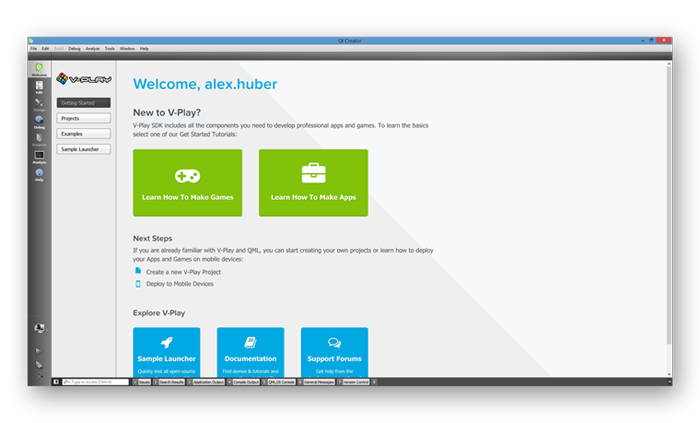
This page contains short 2-minute tutorials for a quick introduction to Felgo & QML. We recommend that you go through them, if you haven't done so already. However, this Getting Started tutorial covers everything that is
also shown in the Learn How To Make Games tutorial, and more.
Open Qt Creator
Windows
You can open Qt Creator from your start menu, or use the Explorer to navigate to your installation Folder.
Mac
You can use Spotlight Search (CMD + Spacebar by default) and type "Qt Creator" or use the Finder to navigate to your installation Folder.
Linux
You're using Linux, you know how to find Qt Creator, right? ;)
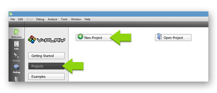
Create a New Project
To create a new project, select the Welcome tab, and the Projects sub-tab. Then click on the New Project button. Alternatively you could select File > New File or Project...
in the menu bar.
Now we'll have a quick look at the steps of the wizard that has just opened.
Templates
First of all we can choose which type of file or project we want to create. For Felgo projects, we offer a number of templates, which are mostly complete demo games, for different game genres.
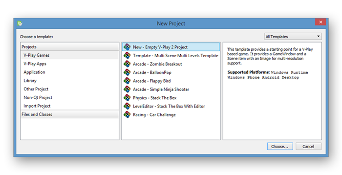
For this tutorial select the New – Empty Felgo 3 Project template and click Choose....
Note: You can also find Felgo Apps templates here. With Felgo, you can develop both games AND apps. If you're also interested in making apps, see the Getting Started with
Felgo Apps tutorial.
Project Location
Next we specify the project name and the location.
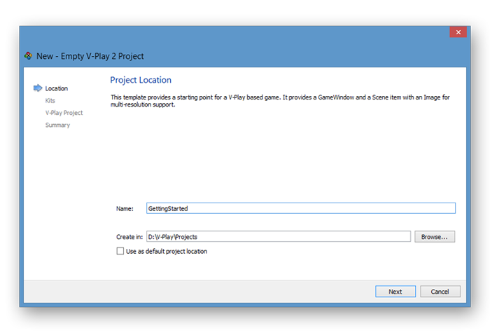
Press Next when you are done.
Kit Selection
Qt Creator groups settings used for building and running projects as so-called kits in order to make deployment to different platforms easier. These kits define environments like the target platform, compilers, Qt versions
and devices. The initial Felgo installation only includes the kit for your current Desktop system to make the download as small as possible.
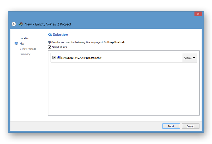
Make sure your desktop kit is selected and press Next to proceed.
Note: You can add other kits for deploying to Android, iOS or other platforms later on. You can find more information in our deployment guide.
Felgo Project Properties
Now we add some additional information about our game.
- App display name: Enter a name that should be displayed on the home-screen of your mobile game or as the title of your desktop game.
- App identifier: A unique name used for the bundle identifier on iOS and as package name on Android. It may contain uppercase or lowercase letters ('A' through 'Z'), numbers and periods ("."), however individual
identifier name parts may only start with letters. To avoid conflicts with other developers, you should use Internet domain ownership as the basis for your package names (in reverse; e.g. com.felgo.example.game).
- Interface orientation: Choose whether your game should be in landscape mode, portrait mode or should automatically rotate depending on the device orientation.
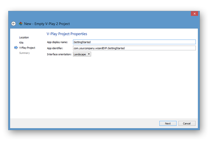
For this tutorial, we use the Landscape orientation. Press Next when you are done.
Project Management
In the last step of the wizard, you can see an overview of the files that will be created. Qt Creator is also compatible with different version control systems like Git or SVN that you can specify here.
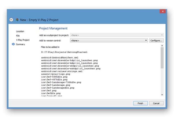
For this tutorial, we don't need to change anything in this step, just proceed with the Finish button.
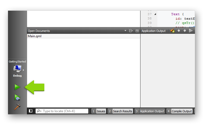
Run the Project
Let's see if everything was set up correctly by running the project. To do so, press the green play button in the lower left corner of Qt Creator.
After compilation has finished, the application window should open and look similar to this:
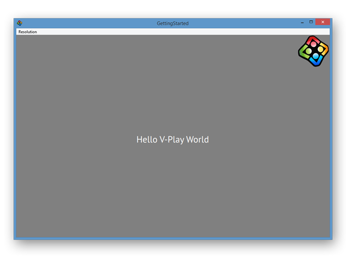
Congratulations, you just ran your first Felgo game. As you can see, there is already some stuff displayed like background color, text and an image that has its opacity animated. However, we want to add this on our
own step by step, so let's remove all this from the source file.
GameWindow and Scene
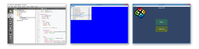
Close the application window and cut down the code of the active source file in the editor to a minimum like this:
 import Felgo 4.0
 import QtQuick 2.0

 GameWindow {
   id: gameWindow
   screenWidth: 960
   screenHeight: 640

   Scene {
     id: scene
     width: 480
     height: 320
   }
 }
The code that's left now is the most important key concept towards creating games for multiple screen sizes and resolutions. Felgo uses an approach which is called Content Scaling.
The Theory
The GameWindow is the root component of every Felgo game, and represents the actual physical device screen. Like every QML component, it has so-called properties (id, screenWidth,
screenHeight) that can be set. The screenWidth and screenHeight properties are used to simulate a device screen resolution on desktop. In this example, we simulate a screen resolution of
960 x 640 pixels, which is equal to an iPhone 4s screen. Since this resolution depends on the device that the game is running on, it is not fixed, and therefore it would be hard to use those values as a base to calculate the
position of elements in our game.
This is where the Scene comes into play. To be able to use the same game logic on any device, we need a component that has a fixed logical size. The size of this component is usually the size of the smallest
possible device that the game should be playable on, typically the size of the iPhone 3GS is used, which measures 480 x 320 pixels in landscape orientation. If a device has a higher resolution, this component is then simply
scaled up to fit the screen.
As this can be seen best with an example, let's go and create one.
The Example
We will add 2 colored rectangles, one filling the GameWindow and one filling the Scene, to see which parts of the screen are covered by which component.
Change the code to the following:
 import Felgo 4.0
 import QtQuick 2.0

 GameWindow {
   id: gameWindow
   screenWidth: 960
   screenHeight: 640

   Rectangle {
     width: gameWindow.width
     height: gameWindow.height
     color: "red"
   }

   Scene {
     id: scene
     width: 480
     height: 320

     Rectangle {
       anchors.fill: scene
       color: "blue"
     }
   }
 }
If you have a closer look at the second Rectangle component, we're not explicitly defining the width and height; instead we are using the anchors property. Every visual QML component has
anchors, which are helpers to align different components along their anchors lines. You can read more about anchors here.
Now if you run the project again, we can change the size of the application window to try how the game looks on different devices. For your convenience, you can select different common resolutions in the menu bar of the
application window.
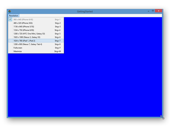
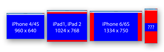
Change the resolution to e.g. 1024 x 768 (iPad 1, iPad 2). Now you will see red borders on top and bottom. Those areas are not filled by the Scene. You can also resize the application window by just
dragging the edges of the window and see how the Scene will be scaled and aligned to fit in the screen, but keep in mind that you'll possibly create resolutions which aren't in use on real devices.
Add the Background
In our game, we want a full-screen colored background. Games are usually made of different scenes, like a menu, the game, credits and so on. If each one has different backgrounds, using a Rectangle in the
GameWindow is not the most elegant solution, as you will need to change the color of this rectangle, depending on the active scene. Instead, each Scene has a helper component to access the full screen,
called gameWindowAnchorItem.
Change the code to this:
 import Felgo 4.0
 import QtQuick 2.0

 GameWindow {
   id: gameWindow
   screenWidth: 960
   screenHeight: 640

   Scene {
     id: scene
     width: 480
     height: 320

     Rectangle {
       anchors.fill: scene.gameWindowAnchorItem
       color: "#324566"
     }
   }
 }
If you run the project again, you will see that the whole screen is filled with a nice blue-ish color, in every possible resolution.
Add Text
In our game, we will have a score that needs to be displayed. We decided to display the score at the top of the screen. Let's add a Text component and for positioning it, we will again use anchors rather than x
and y values. Note that the code below now only refers to the changes that we make, not the full source code of the file.
Scene {
Text {
text: "Score"
color: "white"
anchors.horizontalCenter: scene.horizontalCenter
anchors.top: scene.top
}
}
Run the project again to see the score text displayed on the top center of the game. If you now switch the resolution to 1024 x 768 (iPad 1, iPad 2), you'll see that we're wasting some precious space on the top
of the screen.
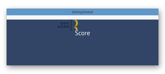
Oh boy, that's about 1.5 bananas of space wasted. As we remember from our example earlier, at this resolution the Scene does not fill the whole screen, but leaves a
border on the top and bottom instead. To make this look nicer, we can align the score text to the gameWindowAnchorItem instead.
Change the code to this:
Scene {
Text {
text: "Score"
color: "white"
anchors.horizontalCenter: scene.gameWindowAnchorItem.horizontalCenter
anchors.top: scene.gameWindowAnchorItem.top
}
}
Looks like supporting any kind of screen size and resolution may not be such a big deal after all. Components like the HUD of a game are most of the time a good match to align to the actual screen borders rather than the
logical scene. Keep this in mind when designing your game's UI. A more in-depth guide about supporting different screen sizes and resolutions can be found here.
Now it's time to add a button to make this game more interactive. We'll create this button from scratch, to show you the basics of touch input handling. To keep the code of our root file clean, we'll put the code of the
button in a distinct QML file. To do so, we need to create a new QML file.
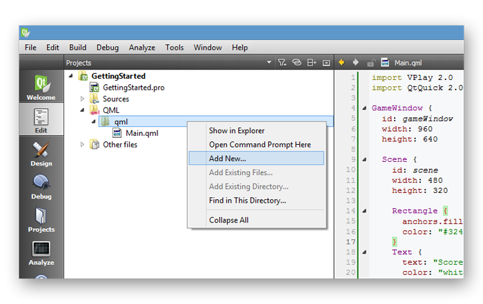
On the left-hand side of the editor window in Qt Creator, you'll see a project tree with your open project(s). Expand the QML folder as well as the qml folder inside. Yay, you found the
Main.qml which we have been working on so far! Right-click the qml folder and select Add New....
Now the New File wizard will open.
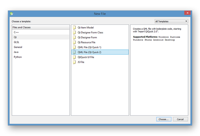
To create a new QML file select Qt and then QML File (Qt Quick 2) and press Choose....
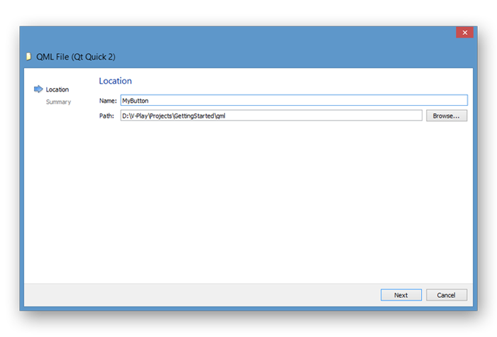
Add the name MyButton and press Next and in the following step press Finish. The name of the QML file will also be the name of the component when using it in the code. After you created the
new file, it will be opened in the editor window.
Change the content to this:
 import QtQuick 2.0

 Rectangle {
   width: 100
   height: 50
   color: "#32665a"
 }
You may notice that we only import QtQuick in this file, which is fine as long as we are not using any Felgo specific components. For a full list of all Felgo
components, see the the Felgo Games API Reference.
Before we add more functionality to the button, let's quickly add it to the Main.qml file:
Scene {
MyButton {
anchors.centerIn: scene
}
}
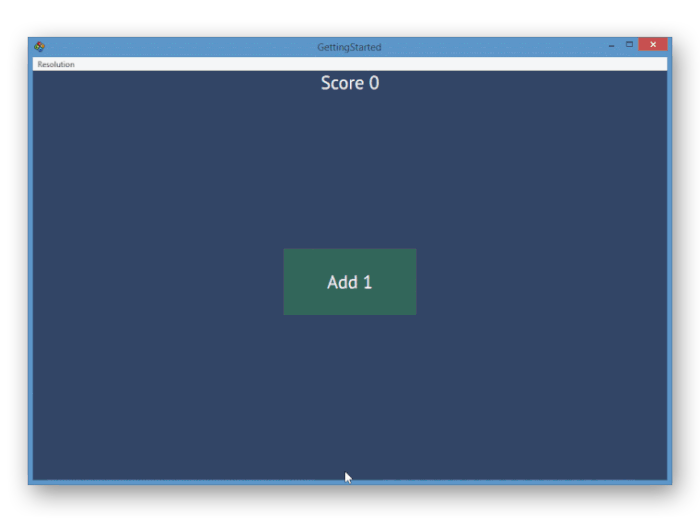
Run the project and admire the beautiful useless rectangle in the center of the screen!
Time to turn this rectangle into a button! We need a label and we need to check if the button has been pressed.
Change the content of MyButton.qml to this:
import QtQuick 2.0
Rectangle {
width: 100
height: 50
color: "#32665a"
Text {
text: "Add 1"
color: "white"
anchors.centerIn: parent
}
MouseArea {
anchors.fill: parent
onClicked: {
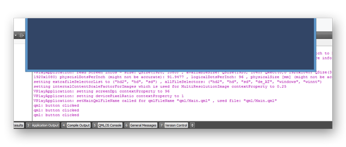
console.debug("button clicked")
}
}
}
There are 2 new interesting things here.
First we have the parent keyword. Earlier we used the id of a component to access it in our anchors declarations, but any component can use parent to access its parent
component.
The second one is the onClicked “property” of the MouseArea. It's actually a so-called signal handler. Some components have signals that are emitted if an action has happened. The
MouseArea for example emits the clicked signal when it has been pressed. To react to this signal, we can use the onClicked signal handler. The name of the handler is always starting with
on followed by the signal name with a capital first letter.
Also we used a debug message to print a string to the console whenever the button has been clicked. Inside a signal handler you can write standard JavaScript code. console is a so-called context property
and is available anywhere in your project.
If you want to find out more about the properties and signals of the MouseArea, you can open its documentation inside Qt Creator, by placing your text cursor somewhere inside the MouseArea component
name and pressing F1 on your keyboard.
Run the project and have a look at the application output at the bottom of Qt Creator when you click the button.
Increase the Score
"Add 1" is a great label, but what do we add 1 to? The answer is of course, to our score, so we need to have a property to store that score.
Declare a new property of our Scene in the Main.qml, like this:
Scene {
id: scene
width: 480
height: 320
property int score: 0
}
This is a property with integer data type and it belongs to the Scene, with 0 as default value.
We already have prepared the text to display the score, but up until now it's only a string. To display the actual score, we use an awesome feature called property binding. It looks like this:
Text {
text: "Score " + scene.score
color: "white"
anchors.horizontalCenter: scene.gameWindowAnchorItem.horizontalCenter
anchors.top: scene.gameWindowAnchorItem.top
}
The definition of the text property of the Text item is a JavaScript expression, concatenating the "Score " string and the scene.score property. The special thing about this is, every time the
scene.score property is updated, this expression will be re-evaluated and the text property will be updated accordingly. This is called property binding, and it's just plain awesome.
The only thing we're missing now is to actually increase our score with our button. Go to MyButton.qml and change the MouseArea like this:
 MouseArea {
   anchors.fill: parent
   onClicked: {
     scene.score++
   }
 }
When compiling the project, all components are organized in a so called scene-graph, more or less a tree with the GameWindow as the root. Since the Scene is somewhere along the path from
MouseArea to GameWindow, we can access it inside the MouseArea. In other words, the Scene is visible to its children and their children and so on, and is accessible via its
id "scene".
Run the project and watch the score text automatically get updated as soon as we increase the score with a button click, thanks to our property binding.
I Want More Property Bindings!
Yeah, you're right, let's see another simple example of a property binding. We add a visual feedback when the button is pressed.
Change the code of MyButton.qml like this:
import QtQuick 2.0
Rectangle {
width: 100
height: 50
color: mouseArea.pressed ? "#546632" : "#32665a"
MouseArea {
id: mouseArea
anchors.fill: parent
onClicked: {
scene.score++
}
}
}
First we added an id to the MouseArea in order to access it. Then we used its pressed property, which is true whenever the button is pressed, to change the color of the
button.
In case you are not familiar with the syntax we used to change the color, it is called ternary or conditional operator and its basic form is:
condition ? valueIfTrue : valueIfFalse
Now while this button works, it is not quite elegant to use the score property of the scene directly in a completely different place of the project. In larger projects it can become pretty hard to keep track of the score
value, if it's changed in several different files across the project.
Also if you want a similar button with some slightly different functionality, it would be nice to re-use some of its code.
Change MyButton.qml like this:
 import QtQuick 2.0

 Rectangle {
   id: myButton
   width: 100
   height: 50
   color: mouseArea.pressed ? "#546632" : "#32665a"

   property alias labelText: label.text
   signal clicked

   Text {
     id: label
     text: "Some Default Value If Needed"
     color: "white"
     anchors.centerIn: parent
   }

   MouseArea {
     id: mouseArea
     anchors.fill: parent
     onClicked: {
       myButton.clicked()
     }
   }
 }
First we add ids to the root component of the button (Rectangle) with id: myButton and the Text component with id: label in order to access them.
To be able to change the label of the button, we declared an alias, which can be used from outside to change a property of an internal component. We will see its use in just a moment.
And we also declared a signal clicked for our button, and we emit this signal when the MouseArea is clicked.
Before we can run the project again, we need to make use of the changes in our Main.qml. Change the button component like this:
 MyButton {
   anchors.centerIn: scene
   labelText: "Add 1"
   onClicked: {
     scene.score++
   }
 }
Now the button knows nothing about its use, we keep the logic inside the Main.qml file.
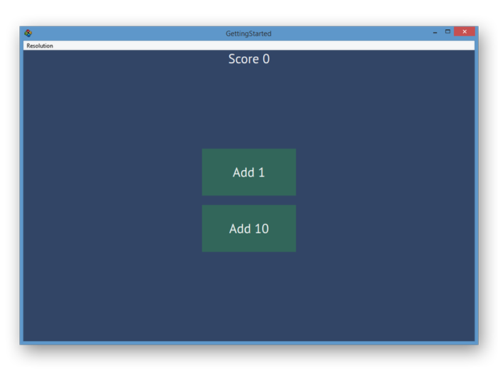
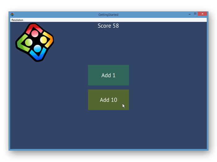
In order to celebrate the button re-usability, we add another one. To make positioning of the buttons easier, we use a layout component provided by QML. Replace the button in Main.qml like this:
Scene {
Column {
anchors.centerIn: scene
spacing: 10
MyButton {
labelText: "Add 1"
onClicked: {
scene.score++
}
}
MyButton {
labelText: "Add 10"
onClicked: {
scene.score += 10
}
}
}
}
The Column will automatically align all its children below each other, leaving 10 pixels of spacing in between them.
Use Functions
As another step towards a more elegant program, we will further improve how we use the score property, because it's still changed directly in multiple spots, which might cause a little shiver down the spine of
OOP programmers.
To find all the locations where the score property is used in our code, we can use a feature of Qt Creator. Right-click the score property declaration and select Find Usages.
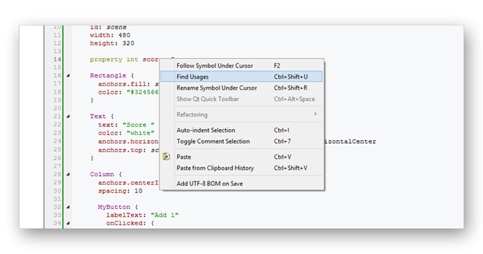
Qt Creator will now list every occurrence of the property in the widget on the bottom.
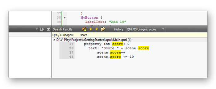
Okay, maybe I overstated this a little, score is only changed in 2 spots, but that's just the beginning!
We now introduce a function to change the score, update Main.qml like this:
Scene {
Column {
anchors.centerIn: scene
spacing: 10
MyButton {
labelText: "Add 1"
onClicked: {
scene.increaseScore(1)
}
}
MyButton {
labelText: "Add 10"
onClicked: {
scene.increaseScore(10)
}
}
}
function increaseScore(amount) {
scene.score += amount
}
}
Phew, disaster avoided! The function declaration and its content are again in standard JavaScript syntax.
Add a Timer
It's time for another useful QML component. To make this game a serious Cookie Clicker competitor, we will now increase the score every second.
Usually we try to structure all our QML files the following way, to have a consistent layout:
- Properties
- Signals
- Signal Handlers
- Components
- Functions
For this reason, we will add the Timer component just above the function declaration in Main.qml, like this:
Scene {
Timer {
interval: 1000
running: true
repeat: true
onTriggered: {
scene.increaseScore(1)
}
}
function increaseScore(amount) {
scene.score += amount
}
}
Well done, works like a charm!
Add an Image
Before we add an image, let's have a quick look at the project structure. Right-click the Main.qml file in the project tree in Qt Creator and select Show in Explorer.
Mac: Show in Finder, Linux: Show Containing Folder)
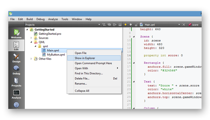
This will open your file browser at the location of the QML file. If you move back one folder, you'll see the following project structure:
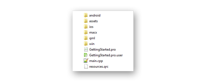
Let's have a quick look at the distinct folders and their use:
- android: This folder contains specific files needed for deployment on Android devices, like the configuration file and app icons. Also if you want to add platform specific code at some point, this would be a good
place, but that's outside the scope of this tutorial.
- assets: This folder contains images and other assets used by your game, we'll have a closer look in just a moment.
- ios: Like the android folder, just for iOS device deployment.
- macx, win: Files specific for running the game on Mac OSX and Windows desktop platforms.
- qml: This folder contains all our QML and JS source code files.
-
*.pro: The project file contains general configurations of your project. This will get interesting in the future if you want to use any Felgo Plugins for ads, in-app purchases and more, or if you want to protect your source code when publishing your game to the app stores. For now, we don't need to take a closer look at it.
- *pro.user: This file only stores settings of Qt Creator specific to your project, like which kits you have selected. This is of no interest to us at any point in development.
- main.cpp: The main entry point to your game. Under the hood, the Felgo SDK is running C++ for best performance. If you want to add custom C++ code or protect your source code when publishing your game to the app
stores, you'll do it with this file.
- resources.qrc: This file lists all directories and files that should be compiled with the Qt resource system when building your game. This is, among other things, also part of the source code protection for
published apps, we don't need to worry about it now.
If you now enter the assets folder, you will find an image of the Felgo logo, which we want to add to our game. If you feel like adding another image instead, paste it here now and use your image file name in the
following code examples.
Go back to Qt Creator, open Main.qml and add the following code, below the Timer component:
 Image {
   source: "../assets/vplay-logo.png"
   width: 100
   height: 100
   x: 0
   y: 0
 }
The source property of the Image component contains the path to the image. As we have seen in the project structure, we must leave the qml folder by moving back one folder with ../ and
then enter the assets folder to find the image. Since we've already made heavy use of the anchors feature in this tutorial, we use simple x & y positioning for this image now.
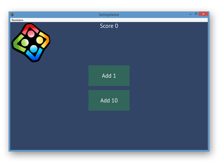
If you run the project, you'll see the image displayed in your game.
Use Animations
As a last step, we will add a simple animation to make this look more pretty. Whenever the score is increased, we want the image to bounce a little to the right. Add the following code, for example below the
Image component:
 NumberAnimation {
   id: imageAnimation
   target: image
   property: "x"
   from: 0
   to: 15
   duration: 150
 }
The target property of the animation defines the component which should be animated, property defines which property of this component should be animated.
To access the Image component with the animation, we need to add an id to it:
Image {
id: image
}
And the last thing we miss is to actually start the animation at some point, the increaseScore function is a good fit for this:
 function increaseScore(amount) {
   scene.score += amount
   imageAnimation.start()
 }
If you run the project, you'll see that the image will move from 0 to 15 pixels to the right whenever a score is added.
We still miss moving the image back to make it look like a bounce. This means the actual animation consists of 2 different animations, one executed after the other. For such a use-case, QML features components to group
animations and define the order of their execution.
Replace the whole NumberAnimation component with this code:
 SequentialAnimation {
   id: imageAnimation
   NumberAnimation {
     target: image
     property: "x"
     from: 0
     to: 15
     duration: 150
   }
   NumberAnimation {
     target: image
     property: "x"
     from: 15
     to: 0
     duration: 150
   }
 }
The SequentialAnimation component executes its child animations one after the other. We don't have to take care of starting the sub-animations ourselves at the right time.
Go run the project and bounce around!
We won't dig deeper into the powerful animation system in this tutorial; however you can read more about it here.
That's it for this tutorial, we hope you enjoyed it and got a little taste of how easy it is to create cross-platform games with Felgo.
Next Steps
As a next step, we highly suggest our Flappy Bird tutorial as it introduces you to the physics engine and again shows you how to support different screen sizes with the help of a
great demo game.
Full Source Code of this Tutorial
Main.qml
 import Felgo 4.0
 import QtQuick 2.0

 GameWindow {
   id: gameWindow
   screenWidth: 960
   screenHeight: 640

   Scene {
     id: scene
     width: 480
     height: 320

     property int score: 0

     Rectangle {
       anchors.fill: scene.gameWindowAnchorItem
       color: "#324566"
     }

     Text {
       text: "Score " + scene.score
       color: "white"
       anchors.horizontalCenter: scene.gameWindowAnchorItem.horizontalCenter
       anchors.top: scene.gameWindowAnchorItem.top
     }

     Column {
       anchors.centerIn: scene
       spacing: 10

       MyButton {
         labelText: "Add 1"
         onClicked: {
           scene.increaseScore(1)
         }
       }
       MyButton {
         labelText: "Add 10"
         onClicked: {
           scene.increaseScore(10)
         }
       }
     }

     Timer {
       interval: 1000
       running: true
       repeat: true
       onTriggered: {
         scene.increaseScore(1)
       }
     }

     Image {
       id: image
       source: "../assets/vplay-logo.png"
       width: 100
       height: 100
       x: 0
       y: 0
     }

     SequentialAnimation {
       id: imageAnimation
       NumberAnimation {
         target: image
         property: "x"
         from: 0
         to: 15
         duration: 150
       }
       NumberAnimation {
         target: image
         property: "x"
         from: 15
         to: 0
         duration: 150
       }
     }

     function increaseScore(amount) {
       scene.score += amount
       imageAnimation.start()
     }
   }
 }
Mybutton.qml
 import QtQuick 2.0

 Rectangle {
   id: myButton
   width: 100
   height: 50
   color: mouseArea.pressed ? "#546632" : "#32665a"

   property alias labelText: label.text
   signal clicked

   Text {
     id: label
     text: "Some Default Value If Needed"
     color: "white"
     anchors.centerIn: parent
   }

   MouseArea {
     id: mouseArea
     anchors.fill: parent
     onClicked: {
       myButton.clicked()
     }
   }
 }


