ImagePicker
A GridView to show and select multiple photos from the device. More...
| Import Statement: |
import Felgo 4.0 |
| Since: |
Felgo 3.2.0 |
| Inherits: |
GridView
|
Properties
Signals
Methods
Detailed Description
ImagePicker is a custom QML GridView, which accesses photos from the device gallery or camera roll. It supports selecting multiple images. The selection is
available with the selection property.
Note: For selecting a single image, you can also use the NativeUtils::displayImagePicker() function. It uses the image picker dialog of the native
platform instead of the custom QML view of ImagePicker.
Usage Examples
Image Picker Page
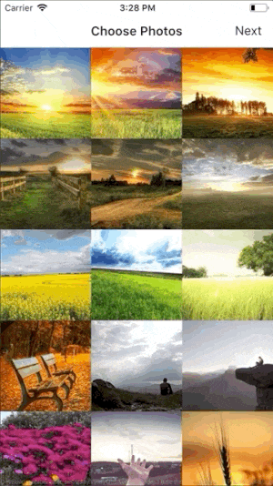
The following example shows how you can use the ImagePicker in one of your app pages.
import Felgo
import QtQuick
App {
NavigationStack {
AppPage {
id: page
title: qsTr("Choose Photos")
rightBarItem: TextButtonBarItem {
text: "Next"
enabled: imagePicker.selectedCount > 0
onClicked: console.debug("SELECTED:", JSON.stringify(imagePicker.selection))
}
ImagePicker {
id: imagePicker
anchors.fill: parent
}
}
}
}
By default, the ImagePicker layouts the items from left to right and allows to scroll vertically if there's not enough space. You can also use horizontal scrolling instead and layout items from top to bottom with the GridView::flow setting:
import Felgo
import QtQuick
App {
NavigationStack {
AppPage {
title: qsTr("Choose Photos")
ImagePicker {
id: imagePicker
anchors.fill: parent
flow: ImagePicker.FlowTopToBottom
}
}
}
}
Custom ImagePicker Selection Handling
When clicking a photo, the ImagePicker automatically selects or deselects the image. When the maximumNumberOfSelection is reached, no image can be selected.
To change the default selection behavior, disable the autoSelectClickedPhotos property and use the photoClicked() signal handler to add a custom solution.
This example does not block the image selection when the maximum number is reached and instead deselects the first photo to make space for the new one:
import Felgo
import QtQuick
App {
NavigationStack {
AppPage {
id: page
title: qsTr("Choose Photos")
ImagePicker {
anchors.fill: parent
maximumNumberOfSelection: 2
autoSelectClickedPhotos: false
onPhotoClicked: {
if(selectionIndices.indexOf(photoIndex) > -1) {
deselect(photoIndex)
}
else {
if(selectedCount == maximumNumberOfSelection) {
let firstPhotoIdx = selectionIndices[0]
deselect(firstPhotoIdx)
}
select(photoIndex)
}
}
}
}
}
}
More Frequently Asked Development Questions
Find more examples for frequently asked development questions and important concepts in the following guides:
Property Documentation
|
autoSelectClickedPhotos : bool
|
Whether to automatically select or deselect photos when they are clicked. Defaults to true. Deactivate this setting to intercept the default selection behavior and manage selected images manually.
This property was introduced in Felgo 3.9.2.
See also select, deselect, clearSelection, and
photoClicked.
By default, the view calculates the number of required columns based on the targetCellSize. You can modify the targetCellSize to adapt the responsive column count. Overwrite this property to use a custom column count.
See also targetCellSize.
|
maximumNumberOfSelection : int
|
The maximum number of selected photos. By default, up to 10 photos can be selected.
See also selection and selectedCount.
|
scrollIndicatorVisible : bool
|
Specifies an overlay item, which is shown for each selected photo in the view. Defaults to a transparent overlay with a small checked icon in the bottom right corner.
Set a custom delegate item to specify your own highlight effect:
import Felgo
import QtQuick
App {
AppPage {
ImagePicker {
id: imagePicker
anchors.fill: parent
selectionColor: "white"
selectionDelegate: Component {
Rectangle {
color: Qt.rgba(0, 0, 0, 0.5)
anchors.fill: parent
property int index: parent.selectionIndex
property bool selected: parent.isSelected
AppText {
visible: selected
text: index + 1
font.pixelSize: sp(36)
anchors.centerIn: parent
color: imagePicker.selectionColor
}
}
}
}
}
}
See also selectionColor and selectionTintColor.
Holds a list that contains the model index of each photo that's currently selected.
This property was introduced in Felgo 3.9.2.
See also selection and selectedCount.
|
selectionTintColor : color
|
The approximate target size of each photo in the grid. Based on the available width, the view calculates the number of columns required to fill the grid.
The default value is dp(100).
See also columns.
Signal Documentation
|
[since Felgo 3.9.2] photoClicked(int photoIndex)
|
This signal fires whenever the user clicks a photo.
Note: The corresponding handler is onPhotoClicked.
This signal was introduced in Felgo 3.9.2.
See also autoSelectClickedPhotos.
Method Documentation
|
[since Felgo 3.9.2] void deselect(int photoIndex)
|
|
[since Felgo 3.9.2] void select(int photoIndex)
|


