LevelSelectionList
Displays a list of available levels from the LevelEditor. More...
| Import Statement: |
import Felgo 3.0 |
| Inherits: |
Flickable
|
Properties
Signals
Detailed Description
The LevelSelectionList component can be used to display a list of levels loaded from the LevelEditor after a call of LevelEditor::loadAllLevelsFromStorageLocation(). Depending on the given level location, connect
either the LevelEditor::authorGeneratedLevels, LevelEditor::applicationJSONLevels or LevelEditor::applicationQMLLevels property with the levelMetaDataArray property so the levels are
displayed.
The levels are then shown in a vertically flickable list. If you prefer a grid of levels or a horizontally scrollable list, exchange the Column element of the
LevelSelectionList source code and create your own LevelSelectionRow or LevelSelectionGrid element.
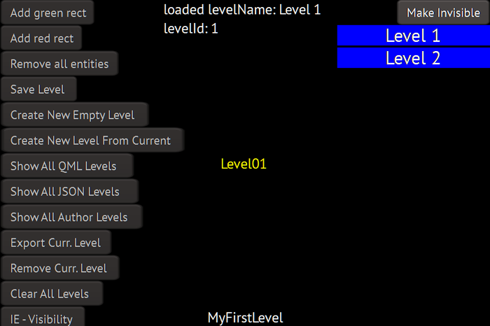
For a real game, you will want to change the default levelItemDelegate to something that matches the style of your game. By default, the levelItemDelegate is just a SimpleButton like shown in the right part of the following image taken from the LevelEditor Example. It displays 2 levels.
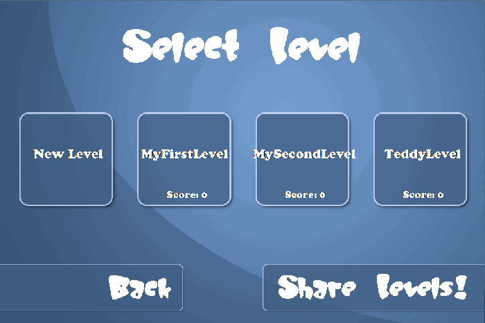
A custom levelItemDelegate can be seen in the Squaby Demo, which looks like the following image.
LevelSelectionList Example Usage
The following example shows how to display the LevelEditor::authorGeneratedLevels with a LevelSelectionList after loading them with LevelEditor::loadAllLevelsFromStorageLocation().
import Felgo 3.0
GameWindow {
LevelEditor {
id: levelEditor
Component.onCompleted: levelEditor.loadAllLevelsFromStorageLocation(authorGeneratedLevelsLocation)
}
Scene {
LevelSelectionList {
width: 150
levelMetaDataArray: levelEditor.authorGeneratedLevels
onLevelSelected: {
levelEditor.loadSingleLevel(levelData)
}
}
}
}
LevelSelectionList Source Code
The following code shows the source code of the LevelSelectionList. Exchange the Column element with a Grid or Row element if you prefer another view of levels.
import QtQuick 2.0
import Felgo 3.0
Flickable {
id: levelSelectionList
width: col.width
height: (col.height < parent.height) ? col.height : parent.height
contentWidth: col.width
contentHeight: col.height
flickableDirection: Flickable.VerticalFlick
property alias levelMetaDataArray: levelListRepeater.model
property alias levelColumn: col
property Component levelItemDelegate: Component{
 SimpleButton {
   height: 20
   width: levelSelectionList.width
   text: modelData.levelName
   onClicked: {
     levelSelectionList.levelSelected(modelData)
   }
 }
}
signal levelSelected(variant levelData)
Column {
id: col
spacing: 2
Repeater {
id: levelListRepeater
delegate: levelItemDelegate
}
}
}
Property Documentation
This property defines the delegate for a single level in the LevelSelectionList. You can access all of the LevelData::levelMetaData like the levelName with modelData.levelName.
By default, a SimpleButton is used for the delegate:
SimpleButton {
height: 20
width: levelSelectionList.width
text: modelData.levelName
onClicked: {
levelSelectionList.levelSelected(modelData)
}
}
Note: : It is required to set the height of the delegate so it can be displayed in the LevelSelectionList. The width of the delegate is set by default to the width you
set for the LevelSelectionList.
|
levelMetaDataArray : alias
|
Signal Documentation
|
levelSelected(variant = levelData)
|
This handler is called when a single level is clicked and should be loaded. You should call LevelEditor::loadSingleLevel() when this handler is called. See
Example Usage for an example.
Note: The corresponding handler is onLevelSelected.


