
Default UI for FelgoMultiplayer matchmaking, friend selection, chat and game invites. More...
| Import Statement: | import Felgo 3.0 |
| Inherits: |
This view is used together with FelgoMultiplayer and implements the standard user interface for all multiplayer screens like matchmaking, friend selection or game invites. Use this component to quickly add multiplayer features to your game. A simple customization of the screens is available by changing the tintColor to match the main color of your game. Starting with our Startup license you can also fully customize the screens for your games. Contact us at support@felgo.com to get the source code of the default UI and create your own MultiplayerView.
An introduction about Felgo Multiplayer and a simple usage example can be found in the FelgoMultiplayer documentation. For a more complex example of the multiplayer features, have a look at our Multiplayer Demo.
This is how the default screens of the MultiplayerView look like:
| Default Views | ||
|---|---|---|
MatchMakingView 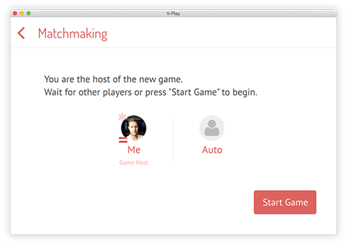 |
FriendsSelectorView 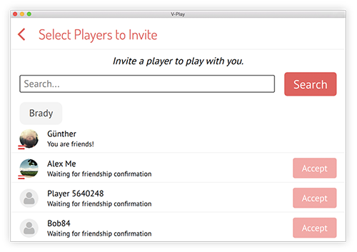 |
InvitesView 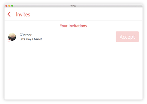 |
InboxView 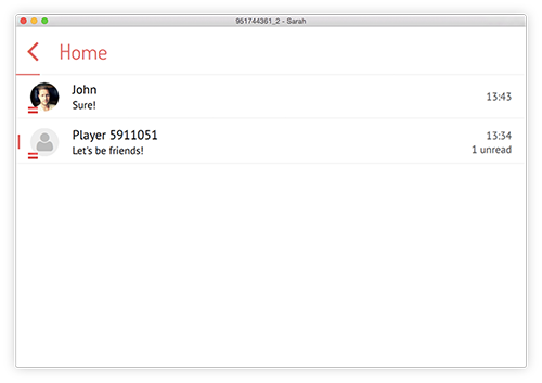 |
FriendsView 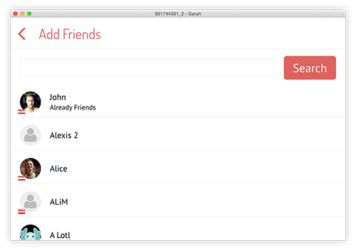 |
ChatView 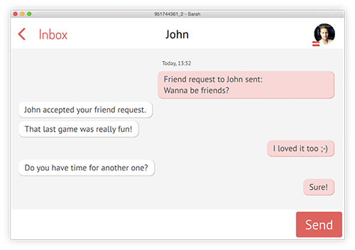 |
|
bodyColor : color |
Set this property to match the overall style with your game's text color. The default color is #484848 which is a dark grey color.
|
bodyLightColor : color |
Set this property to match the overall style with your game's color scheme. The default color is #9a9a9a which is a grey color.
|
gameNetworkItem : variant |
Set this property to the id of your FelgoGameNetwork item.
By default, it will be set to the item with id gameNetwork if one is found in the project, otherwise it is undefined.
This is an example how to use it:
 GameWindow {
   // ...

   FelgoGameNetwork {
     id: myGameNetwork
     // ...
     multiplayerItem: myMultiplayer
   }

   FelgoMultiplayer {
     id: myMultiplayer
     playerCount: 2
     appKey: 'your-multiplayer-app-key'
     gameNetworkItem: myGameNetwork
     multiplayerView: myMultiplayerView
   }

   Scene{
     // ...

     MultiplayerView{
       id: myMultiplayerView
       gameNetworkItem: myGameNetwork
     } // MultiplayerView

   } // Scene
 } // GameWindow
After setting gameNetworkItem the MultiplayerView also knows about the FelgoMultiplayer item by accessing the FelgoGameNetwork::multiplayerItem.
Note: You will usually create multiple scenes in separate QML files for each screen of your game and switch between these scenes. This is simply not done here to keep the example short. See here for a tutorial how to create a game with multiple scenes. This setup with scenes in dedicated QML files is also required for the MultiplayerView to correctly use density-independent sizes for the navigation header or its content items.
|
iconFontName : string |
Set this property to specify a custom icon font name. You can also use your own FontLoader object by setting iconFontSource to "" and then specifying the font name instead.
|
iconFontSource : string |
Set this property to a custom font to match your game style. The default font is fa.ttf.
|
separatorColor : color |
Set this property to match the overall style with your game's color scheme. The default color is #f4f4f4 which is a light grey color.
|
tintColor : color |
Set this property to match the overall style with your game's main tint color. The default color is #f05352 which is a red color.
|
tintContrastColor : color |
Set this color to a contrary color of your tintColor. By default, it is set to a strong green. It is used for example in the MatchMaking view for better highlighting connected players.
This property was introduced in Felgo 2.8.5.
|
tintLightColor : color |
Set this property to match the overall style with your game's main tint color. The default color is Qt.tint(Qt.lighter(tintColor, 1.2), "#50FFFFFF"), which is a lighter color than the tintColor.
|
tintTransparentColor : color |
Set this property to match the overall style with your game's main tint color. The default color is Qt.rgba(tintLightColor.r, tintLightColor.g, tintLightColor.b, 0.5), which is the tintLightColor with 50% transparency.
|
tintUltraLightColor : color |
Set this color to an even lighter version of the tintColor/tintLightColor. The default color is a lighter version of the tintLightColor. It is used as the background for user message bubbles in the multiplayer ChatView.
This property was introduced in Felgo 2.8.6.
|
viewHeight : int |
Height of the view.
|
viewWidth : int |
Width of the view.
This handler is called after the back button of the MultiplayerView has been clicked.
Note: The corresponding handler is onBackClicked.
This handler is called after show() was called or it was called from showMatchmaking, showInvitesList, showInbox or showFriends from the FelgoMultiplayer component.
Note: The corresponding handler is onShowCalled.
This function is used to create a human-readable representation of a date object. It takes the date in string representation as parameter and converts it to a human-readable format.
The returned object has two properties for the date and time part. This allows to decide at a later point whether to display the only the date, only the time or both. Example Result:
 {
   "time": "15:38"
   "date": "Yesterday" // (or "Tuesday", "May 21st 2015", ... depending on the current date)
 }
If newState is set, the internal state property changes to one of the possible newState values: "friendsSelector", "match", "randomMatch", "join",
"invites", "friends", "inbox", "chat" or "addFriends".
Afterwards onShowCalled() is called.
Note: The MultiplayerView does not get its visible property set to true in this function. This must be handled explicitly for example in onShowCalled.