AppListItem
The basic item for any type of lists, with text, images, icons etc. More...
| Import Statement: |
import Felgo 4.0 |
| Inherits: |
Item
|
Properties
Signals
Detailed Description
The AppListItem is intended for use with models within an AppListView as well as custom lists e.g. with a Column. Examples for both will be given in this document.
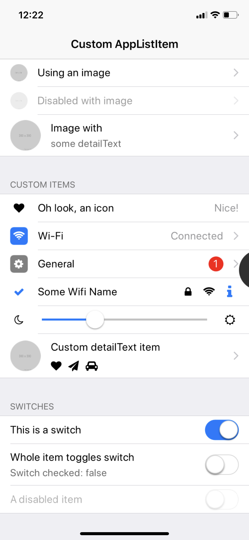
| iOS |
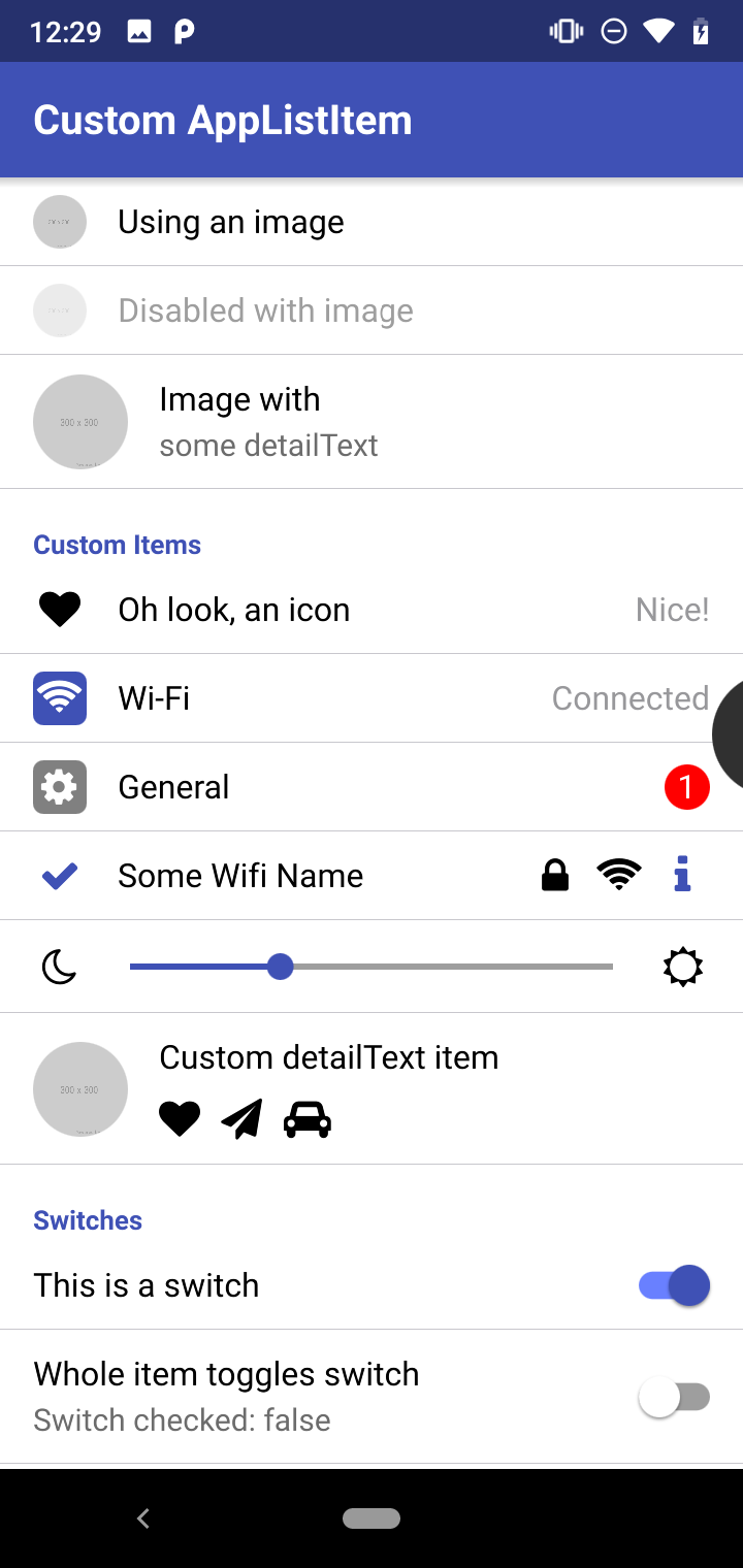
Android |
|
|
|
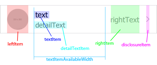
Anatomy of the AppListItem
This is a visible representation of the most important content and layout properties of the AppListItem:
Example Usage
Basic AppListItem Example
This is a very minimal example with just texts and listening to clicks on the item:
 import Felgo
 import QtQuick

 App {
   NavigationStack {
     AppPage {
       title: "AppListItem"

       AppListItem {
         text: "Hi"
         detailText: "You look great!"
         onSelected: {
           console.debug("AppListItem selected")
         }
       }
     }
   }
 }
Basic AppListItem Examples with Models
Here are 3 examples how to use an AppListItem with an AppListView, a Repeater and a completely custom list.
Use AppListItem with AppListView
This example shows a very basic usage if AppListItem within an AppListView to display data in a list:
 import Felgo
 import QtQuick

 App {
   id: app

   property var myModel: [
     {label: "Item 1", info: "Some more info"},
     {label: "Item 2", info: "Some more info"},
     {label: "Item 3", info: "Some more info"},
     {label: "Item 4", info: "Some more info"},
     {label: "Item 5", info: "Some more info"},
   ]

   NavigationStack {
     AppPage {
       title: "AppListView"

       AppListView {
         model: app.myModel

         delegate: AppListItem {
           text: modelData.label
           detailText: modelData.info
         }
       }
     }
   }
 }
Use AppListItem with Repeater
This example uses a Repeater with a Column inside an AppFlickable. In certain use-cases, this offers more flexibility than using an AppListView:
 import Felgo
 import QtQuick

 App {
   id: app

   property var myModel: [
     {label: "Item 1", info: "Some more info"},
     {label: "Item 2", info: "Some more info"},
     {label: "Item 3", info: "Some more info"},
     {label: "Item 4", info: "Some more info"},
     {label: "Item 5", info: "Some more info"},
   ]

   NavigationStack {
     AppPage {
       title: "Repeater"

       AppFlickable {
         anchors.fill: parent
         contentHeight: column.height

         Column {
           id: column
           width: parent.width

           Repeater {
             model: app.myModel

             delegate: AppListItem {
               text: modelData.label
               detailText: modelData.info
             }
           }
         }
       }
     }
   }
 }
Use AppListItem without any Model
This example simply puts custom list items in a column, without any model:
 import Felgo
 import QtQuick

 App {
   id: app

   NavigationStack {
     AppPage {
       title: "Repeater"

       AppFlickable {
         anchors.fill: parent
         contentHeight: column.height

         Column {
           id: column
           width: parent.width

           AppListItem {
             text: "Some text"
             detailText: "And some detailText"
           }
           AppListItem {
             text: "Some other text"
             detailText: "And some totally different detailText"
           }
         }
       }
     }
   }
 }
Advanced AppListItem Examples
Use AppListItem with AppListView and Sections
This example uses a SortFilterProxyModel to sort a JsonListModel by its sections and then display the resulting list with visible
sections:
import QtQuick
import Felgo
App {
id: app
property var jsonData: [
{id: 1, title: "Apple", type: "Fruit"},
{id: 2, title: "Ham", type: "Meat"},
{id: 3, title: "Bacon", type: "Meat"},
{id: 4, title: "Banana", type: "Fruit"},
{id: 5, title: "Strawberry", type: "Fruit"}
]
JsonListModel {
id: jsonModel
source: jsonData
keyField: "id"
fields: ["id","title","type"]
}
SortFilterProxyModel {
id: sortedModel
Component.onCompleted: sourceModel = jsonModel
sorters: LocaleAwareSorter { id: typeSorter; roleName: "type"; ascendingOrder: true }
}
NavigationStack {
AppPage {
title: "Sections"
AppListView {
model: sortedModel
section.property: "type"
section.delegate: SimpleSection { }
delegate: AppListItem {
text: model.title
detailText: model.type
}
}
}
}
}
Use custom Items within an AppListItem
You can also find a longer list of examples for customized list items here: Customize AppListItems for custom Lists.
This is a simple example where both leftItem and rightItem are replaced with custom QML items:
 import Felgo
 import QtQuick

 App {
   id: app

   NavigationStack {
     AppPage {
       title: "Repeater"

       AppListItem {
         text: "General"

         leftItem: Rectangle {
           color: "grey"
           radius: dp(5)
           width: dp(26)
           height: width
           anchors.verticalCenter: parent.verticalCenter

           AppIcon {
             iconType: IconType.cog
             anchors.centerIn: parent
             color: "white"
           }
         }

         rightItem: Rectangle {
           color: "red"
           radius: width/2
           width: dp(22)
           height: width
           anchors.verticalCenter: parent.verticalCenter

           AppText {
             anchors.centerIn: parent
             color: "white"
             text: "1"
           }
         }
       }
     }
   }
 }
More Frequently Asked Development Questions
Find more examples for frequently asked development questions and important concepts in the following guides:
Property Documentation
|
activeBackgroundColor : color
|
|
activeDetailTextColor : color
|
The color of the secondary text, if the list item is active.
The default value is Theme.listItem.activeDetailTextColor
See also detailText.
The color of the main text, if the list item is active.
The default value is Theme.listItem.tintColor
See also text.
The vertical padding added below the detailTextItem. Note that this is not used if the list item height would be lower than
dp(Theme.listItem.minimumHeight).
The default value is dp(10) on iOS and dp(12) on all other platforms.
The color of the secondary text, in default state.
The default value is Theme.listItem.detailTextColor
See also detailText.
|
detailTextFontSize : real
|
The size of the secondary text.
The default value is sp(Theme.listItem.fontSizeDetailText)
See also detailText.
Use this property to put a custom QML item in the detailText slot of the list item. This will overwrite the default text item created if the detailText property is set.
See also detailText.
|
detailTextMaximumLineCount : int
|
The maximum line count of the secondary text, before elide is applied.
The default value is 1000
See also detailText.
The color of the disclosure item.
The default value is Theme.listItem.disclosureColor
See also showDisclosure.
Use this property to put a custom QML item in the disclosure slot of the list item. This will overwrite the default icon item created if the showDisclosure property
is set.
See also showDisclosure.
The color of the bottom divider line.
The default valie is Theme.listItem.dividerColor
See also showDivider.
The height of the bottom divider line.
The default valie is px(Theme.listItem.dividerHeight)
See also showDivider.
|
dividerLeftSpacing : real
|
The left spacing of the bottom divider line.
By default, the divider will align with the left edge of the text in the list item on iOS. On all other platforms it will cover the full width of the list item.
If the list item is used within an AppListView, the last item in the list will also show a full-width divider. If the AppListView uses sections,
the last list item of every section will show a full-width divider.
You can also set lastInSection to true manually to use a full-width divider.
See also showDivider and lastInSection.
When the insetStyle is used, the first and last AppListItem within a list section show with rounded corners. The firstInSection
property decides whether rounded corners at the top are applied.
If the list item is used within an AppListView, the firstInSection property will be determined automatically. Otherwise the default value is false.
You can also set this property to true if you want to apply rounded corners when using the insetStyle in custom layouts.
See also insetStyle, leftMargin, rightMargin,
backgroundRadius, and lastInSection.
Provide the url of an image to display it in the row.
 AppListItem {
   text: "Item with Image"
   image: Qt.resolvedUrl("../assets/someImage.png")
 }
The default image item can be replaced if you provide a leftItem.
See also imageSize, imageRadius, and imageFillMode.
The fillMode of the image used in the list item.
The default value is Image.PreserveAspectCrop
The radius of the image used in the list item.
By default, the image is a circle, thus the radius is imageSize/2
The size of the image used in the list item.
The default sizes are:
Changes the style of the list item to appear with a horizontal inset and rounded corners. This matches the inset list style of native iOS apps. By default this property is false and the classic full-width
style is used.
To use the inset list style on iOS, set the property to Theme.isIos:
 import Felgo

 App {
   ListPage {
     model: [
       { name: "Apple", type: "Fruits" },
       { name: "Banana", type: "Fruits" },
       { name: "Potato", type: "Vegetables"}
     ]
     delegate: AppListItem {
       text: modelData.name
       insetStyle: Theme.isIos
     }
     section.property: "type"
     section.delegate: SimpleSection {
       style.showDividers: false
     }
   }
 }
If you use the AppListItem outside of a model-based list or repeater, you need to apply the rounded corners using the firstInSection and lastInSection properties:
import Felgo
import QtQuick
App {
NavigationStack {
AppPage {
title: qsTr("Inset Style")
backgroundColor: Theme.secondaryBackgroundColor
Column {
width: parent.width
SimpleSection {
title: "Section"
style.showDividers: false
}
AppListItem {
text: "First"
insetStyle: true
firstInSection: true
}
AppListItem {
text: "Second"
insetStyle: true
lastInSection: true
}
SimpleSection {
title: "Another Section"
style.showDividers: false
}
AppListItem {
text: "Single Item"
insetStyle: true
firstInSection: true
lastInSection: true
}
}
}
}
}
When the insetStyle is used, the first and last AppListItem within a list section show with rounded corners. The lastInSection
property decides whether rounded corners at the bottom are applied.
If the list item is used within an AppListView, the lastInSection property will be determined automatically. Otherwise the default value is false.
When not using the insetStyle, this property will cause the bottom divider on iOS to be drawn full-width. On other platforms it does not have any visual effect in this
case.
You can also set this property to true if you want to apply rounded corners when using the insetStyle in custom layouts.
See also insetStyle, leftMargin, rightMargin,
backgroundRadius, and firstInSection.
Use this property to put a custom QML item in the left slot of the list item. This will overwrite the default image item created if the image property is set.
See also image.
The horizontal padding in on the on the left side of the list item.
The default value is dp(Theme.contentPadding)
Alias to the internal RippleMouseArea. This can be used e.g. to disable the internal RippleMouseArea without disabling the whole list
item, for example to put a switch there:
 AppListItem {
   text: "This is a switch"
   showDisclosure: false
   mouseArea.enabled: false

   rightItem: AppSwitch {
     anchors.verticalCenter: parent.verticalCenter
     checked: true
   }
 }
Set this property to visually mute/disable the item, causing all content to be translucent using mutedOpacity.
Setting this property to true will also set enabled of the list item to false, so it will not react to any clicks.
If you just want to disable clicks on the list item without any visual effect, set enabled of the AppListItem to false. If you have controls inside the AppListItem that should stay enabled, while the rest of the list item should be disabled, you can use mouseArea.enabled: false to only disable the internal RippleMouseArea.
The default value is false
See also mutedOpacity and mouseArea.
The opacity applied to make the content translucent if muted is set.
The default value is 0.38, so the opacity will be set to 38%.
See also muted.
Use this property to put a custom QML item in the right slot of the list item. This will overwrite the default text item created if the rightText property is set.
See also rightText.
The horizontal padding in on the on the right side of the list item.
The default value is dp(Theme.contentPadding)
The color of the right text, in default state.
The default value is Theme.listItem.rightTextColor
See also rightText.
The size of the right text.
The default value is sp(Theme.listItem.fontSizeRightText)
See also rightText.
The maximum width of the right text, before elide is applied.
This is very important to set if the right text can be very long, else the text and detailText may be pushed out of the
list item.
The default value is 0 which means there is no limit on the max width. Set a value >1 here to apply a limit.
See also rightText.
|
selectedBackgroundColor : color
|
|
selectedDetailTextColor : color
|
The color of the secondary text, when selected.
The default value is Theme.listItem.selectedDetailTextColor
See also detailText.
|
selectedTextColor : color
|
The color of the main text, when selected.
The default value is Theme.listItem.selectedTextColor
See also text.
Set this to false to hide the disclosure icon of the row, which is displayed by default on iOS.
The default value is Theme.listItem.showDisclosure
See also disclosureColor and disclosureItem.
Set this to false to hide the bottom divider line of the row, which is displayed by default on all platforms.
The default value is Theme.listItem.showDivider
See also dividerColor, dividerHeight, and dividerLeftSpacing.
The color of the main text, in default state.
The default value is Theme.listItem.textColor
See also text.
The size of the main text.
The default value is sp(Theme.listItem.fontSizeText)
See also text.
Use this property to put a custom QML item in the text slot of the list item. This will overwrite the default text item created if the text property is set.
See also text.
|
textItemAvailableWidth : real
|
This is a readonly helper property, that provides the available width for the textItem and detailTextItem. It
can be used for custom QML items placed in those slots.
 AppListItem {
   id: listItem
   showDisclosure: false
   mouseArea.enabled: false
   topPadding: 0
   bottomPadding: 0

   leftItem: AppIcon {
     iconType: IconType.moono
     width: sp(26)
     height: width
     anchors.verticalCenter: parent.verticalCenter
   }

   textItem: AppSlider {
     height: dp(45)
     width: listItem.textItemAvailableWidth
     value: 0.3
   }

   rightItem: AppIcon {
     iconType: IconType.suno
     width: sp(26)
     height: width
     anchors.verticalCenter: parent.verticalCenter
   }
 }
The value will be calculated with respect to the leftItem, rightItem, disclosureItem width values and any paddings/spacings that are applied.
|
textMaximumLineCount : int
|
The maximum line count of the main text, before elide is applied.
The default value is 1000
See also text.
|
textVerticalSpacing : real
|
The vertical padding added above the textItem. Note that this is not used if the list item height would be lower than Theme.listItem.minimumHeight.
The default value is dp(10) on iOS and dp(12) on all other platforms.
Signal Documentation
Emitted when this list item has been clicked. If the list item is used within a Repeater or AppListView, the index of the item in the model will be passed as well.
Note: The corresponding handler is onSelected.


