AppModal
A modal dialog that covers the whole application. More...
| Import Statement: |
import Felgo 4.0 |
| Inherits: |
Item
|
Properties
Signals
Methods
Detailed Description
The AppModal can be used to display a modal sheet on top of your app. The AppModal can be used as a container for any custom content.
| iOS |
Android |
|
|
|
Note: This item is internally reparented to the root App item at runtime. Avoid referencing the parent of the AppModal directly, for example:
Item {
id: container
property int value: 1
AppModal {
id: modal
property int doThis: container.value
property int notThat: parent.value
}
}
Example Usage
Here are examples of how to use the AppModal item in your own apps.
Basic Blank AppModal
This example shows how to add a very basic fullscreen modal sheet. For a modal with custom height, refer to Partial modal with custom height.
import QtQuick
import Felgo
App {
color: "#000"
NavigationStack {
id: navigationStack
AppPage {
title: "Main Page"
AppButton {
text: "Open Modal"
anchors.centerIn: parent
onClicked: modal.open()
}
AppModal {
id: modal
pushBackContent: navigationStack
AppButton {
text: "Close"
anchors.centerIn: parent
onClicked: modal.close()
}
}
}
}
}
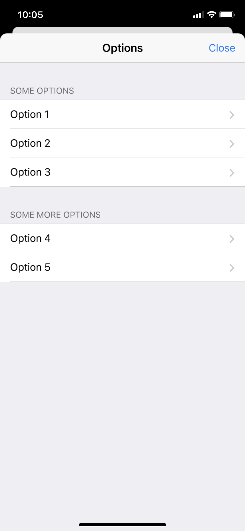
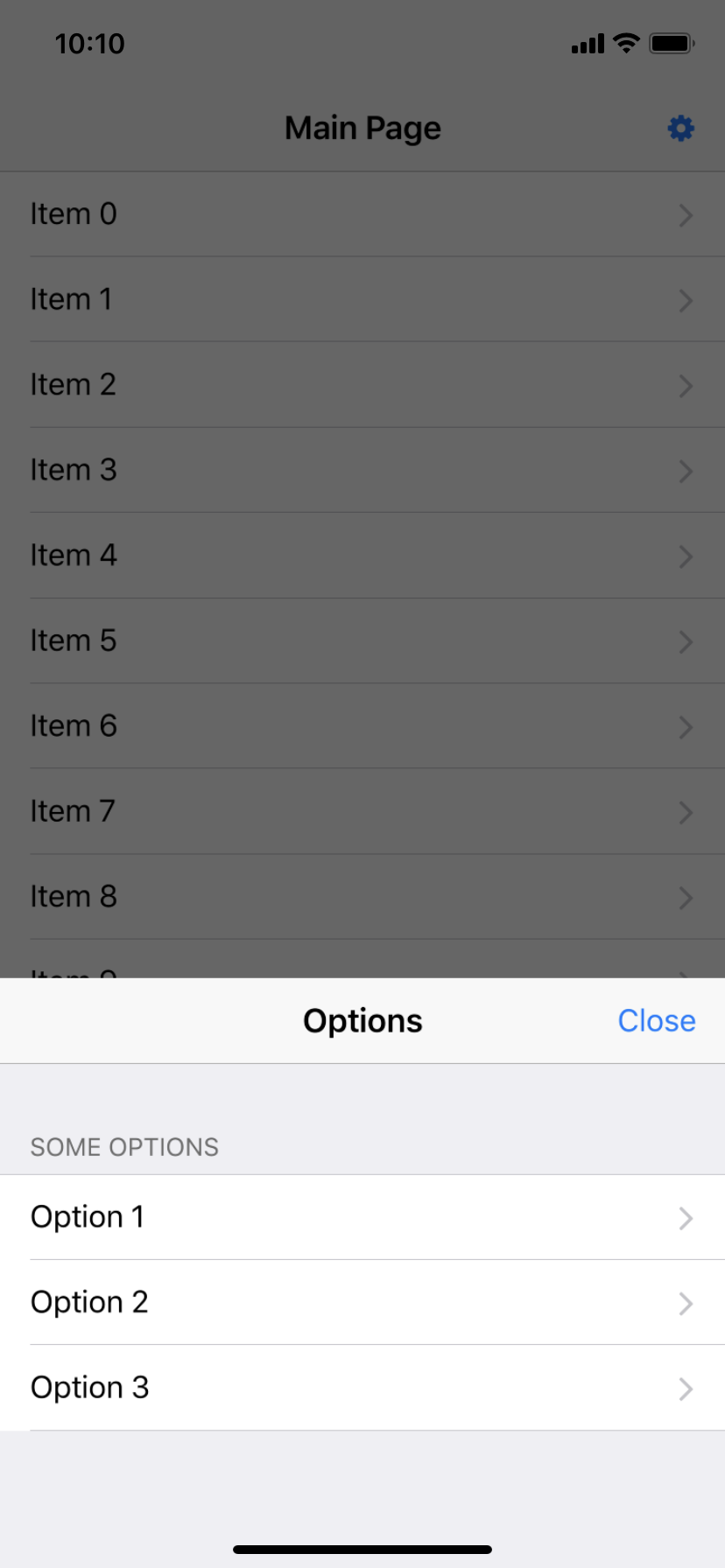
AppModal with Navigation Bar on iOS and Android
For fullscreen modals, it is common to display a navigation bar with title and options like close. This example shows how to do this, together with a platform switch to test both iOS and Android right on your mobile.
import QtQuick
import Felgo
App {
color: "#000"
NavigationStack {
id: navigationStack
AppPage {
title: "Main Page"
Column {
anchors.centerIn: parent
AppButton {
text: "Open Modal"
onClicked: modal.open()
}
AppButton {
text: "Platform: " + Theme.platform
onClicked: {
Theme.platform = Theme.platform == "ios" ? "android" : "ios"
Theme.colors.statusBarStyle = Theme.platform == "ios" ? Theme.colors.statusBarStyleBlack : Theme.colors.statusBarStyleWhite
}
}
}
AppModal {
id: modal
pushBackContent: navigationStack
NavigationStack {
AppPage {
title: "Modal"
rightBarItem: TextButtonBarItem {
text: "Close"
textItem.font.pixelSize: sp(16)
onClicked: modal.close()
}
}
}
}
}
}
}
Partial modal with custom height
You can also use the AppModal item to display a modal sheet with a custom height, that only partially covers the screen.
import QtQuick
import Felgo
App {
color: "#000"
NavigationStack {
id: navigationStack
AppPage {
title: "Main Page"
AppButton {
text: "Open Modal"
anchors.centerIn: parent
onClicked: modal.open()
}
AppModal {
id: modal
pushBackContent: navigationStack
fullscreen: false
modalHeight: dp(300)
AppButton {
text: "Close"
anchors.centerIn: parent
onClicked: modal.close()
}
}
}
}
}
Property Documentation
The background color of the modal.
The default value is "#fff".
|
closeOnBackgroundClick : bool
|
|
closeWithBackButton : bool
|
If this property is set to true, pressing the back button on Android will close the modal. This property does not have any effect on iOS.
The default value is true.
See also closeOnBackgroundClick.
This color is used to clip the corners of the modal and the pushed back content on iOS. It should match the color of the App item.
The default value is "#000".
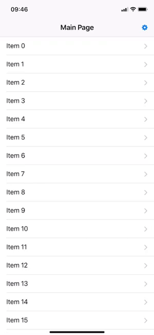
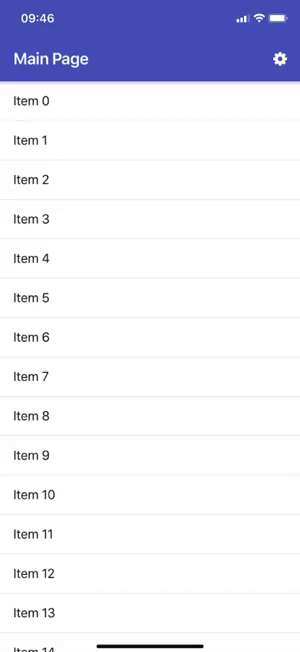
This property specifies if the modal is shown fullscreen or only partially covering the screen.
fullscreen true |
fullscreen false |
|
|
|
The default value is true.
Note: It is currently not supported to stack multiple fullscreen modals on top of each other. However you can stack non-fullscreen modals on top of fullscreen modals.
See also modalHeight.
Set the height of the modal if not shown as fullscreen modal.
This property does not have any effect if fullscreen is true.
The default value is dp(300).
See also fullscreen.
|
openedStatusBarStyle : int
|
This property is used to switch the status bar color, when opening the modal in fullscreen mode.
The default value is Theme.colors.statusBarStyleWhite.
This color is used to overlay the pushed back content on iOS.
The default value is "#000".
See also overlayOpacity.
This opacity is used to overlay the pushed back content on iOS.
The default value is 0.1, thus the content will be overlayed with 10% opacity, using the overlayColor.
See also overlayColor.
This property is required for the iOS push-back transition when opening the modal. Set this property to your root container item (usually Navigation or NavigationStack), that
contains your app content.
import Felgo
import QtQuick
App {
color: "#000"
Navigation {
id: navigation
NavigationItem {
NavigationStack {
AppPage {
AppModal {
id: modal
pushBackContent: navigation
}
}
}
}
}
}
Signal Documentation
This signal is fired when the modal is fully closed.
Note: The corresponding handler is onClosed.
This signal is fired when the modal is fully opened.
Note: The corresponding handler is onOpened.
|
[since Felgo 3.9.2] willClose(var event)
|
This signal triggers whenever the AppModal is about to be closed. If you want to stop the close from being executed, you can set event.accepted to false.
 onWillClose: {
   event.accepted = false
 }
This can be used to e.g. show a confirmation dialog if the user really wants to close the modal.
Note: The corresponding handler is onWillClose.
This signal was introduced in Felgo 3.9.2.
See also close and closed.
Method Documentation


