AppRadio
A radio with a platform-specific styling for iOS and Android. More...
| Import Statement: |
import Felgo 4.0 |
| Since: |
Felgo 2.7.1 |
| Inherits: |
RadioButton
|
Properties
Detailed Description
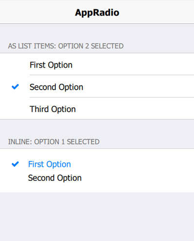
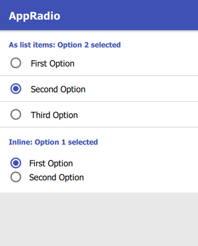
The AppRadio component allows the user to select one of many choices. The AppRadio comes with a default look that matches platform-specific styles.
| iOS |
Android |
|
|
|
Example Usage
Here is an example of how to use the new control, and how it can be combined with the AppListItem for a native UI/UX:
 import QtQuick
 import QtQuick.Controls as QC2
 import Felgo

 App {
   NavigationStack {
     AppPage {
       title: "AppRadio"
       backgroundColor: Theme.secondaryBackgroundColor

       Column {
         width: parent.width

         SimpleSection {
           title: "As list items: " + ratioButtonGroup1.checkedButton.value + " selected"
         }

         QC2.ButtonGroup {
           id: ratioButtonGroup1
           buttons: [radio1, radio2, radio3]
         }

         AppListItem {
           text: "First Option"
           showDisclosure: false

           leftItem: AppRadio {
             id: radio1
             checked: true
             value: "Option 1"
             anchors.verticalCenter: parent.verticalCenter
           }

           onSelected: {
             if(!radio1.checked) radio1.toggle()
           }
         }

         AppListItem {
           text: "Second Option"
           showDisclosure: false

           leftItem: AppRadio {
             id: radio2
             value: "Option 2"
             anchors.verticalCenter: parent.verticalCenter
           }

           onSelected: {
             if(!radio2.checked) radio2.toggle()
           }
         }

         AppListItem {
           text: "Third Option"
           showDisclosure: false
           lastInSection: true

           leftItem: AppRadio {
             id: radio3
             value: "Option 3"
             anchors.verticalCenter: parent.verticalCenter
           }

           onSelected: {
             if(!radio3.checked) radio3.toggle()
           }
         }

         SimpleSection {
           title: "Inline: " + ratioButtonGroup2.checkedButton.value + " selected"
         }

         QC2.ButtonGroup {
           id: ratioButtonGroup2
           buttons: [radio4, radio5]
         }

         Rectangle {
           width: parent.width
           height: contentCol.height

           Column {
             id: contentCol
             width: parent.width
             padding: dp(Theme.contentPadding)

             AppRadio {
               id: radio4
               value: "Option 1"
               text: "First Option"
               checked: true
             }

             AppRadio {
               id: radio5
               value: "Option 2"
               text: "Second Option"
             }
           }
         }
       }
     }
   }
 }
Property Documentation
|
borderColorOffDisabled : color
|
|
borderColorOnDisabled : color
|
The size for the checked circle within the radio, if useIcons is set to false. The default value is dp(Theme.appRadio.circleSize).
|
fillColorOffDisabled : color
|
|
fillColorOnDisabled : color
|
|
iconColorOffDisabled : color
|
|
iconColorOnDisabled : color
|
The icon that is shown within the radio in checked state. The default value is Theme.appRadio.iconOff
To hide the icon, set iconColorOn to "transparent".
The icon that is shown within the radio in unchecked state. The default value is Theme.appRadio.iconOn
To hide the icon, set iconColorOff to "transparent".
The height of the indicator of the radio. This refers to the rectangle that contains either the icon or the circle indicator, depending on useIcons. The default value is
dp(Theme.appRadio.indicatorHeight).
The width of the indicator of the radio. This refers to the rectangle that contains either the icon or the circle indicator, depending on useIcons. The default value is
dp(Theme.appRadio.indicatorWidth).
|
labelColorOffDisabled : color
|
|
labelColorOnDisabled : color
|
If set to false, the control does not change its checked property when it is clicked.
This might be useful if the property is bound to a value that should not be overwritten. The clicked signal is fired in any case and allows to react to user interactions.
The default value is true.
Set this property to true to show the radio state with an AppIcon. Set it to false to show the state with a filled or empty dot.
The default value uses the value of Theme.appRadio.useIcons.


