NavigationItem
Base type for items inside Navigation. More...
| Import Statement: |
import Felgo 4.0 |
| Inherits: |
TabButton
|
Properties
Signals
Detailed Description
NavigationItems are the base type for direct children of Navigation. They represent one entry in the used navigation type, a TabButton inside a TabControl or a list entry in an AppDrawer, or both. The default
behavior of Navigation is platform dependent, using AppDrawer on Android and TabControl on iOS.
A NavigationItem is directly derived from the Qt component TabButton. It is defined by a title text, a icon and its content.
The content of a NavigationItem is a Component, and can be any QML Item put directly as child item
inside NavigationItem.
Example Usage
NavigationItem should be used inside Navigation. Use the following code for a simple platform dependent navigation, where FirstPage and SecondPage are the content
pages of your app.
App {
Navigation {
NavigationItem {
title: "First Page"
iconType: IconType.calculator
FirstPage { }
}
NavigationItem {
title: "Second Page"
iconType: IconType.list
NavigationStack {
SecondPage { }
}
}
}
}
How do I navigate between pages?
Apart from the app Navigation, which provides the main menu for your app, the NavigationStack is the main component for navigating back and forth
between different pages.
For passing data between pages, the easiest solution is to make relevant settings or properties available in a common parent scope. Public properties, functions, and signals of an ancestor in the QML tree are available for
direct access:
import Felgo
import QtQuick
App {
id: app
property int count: 0
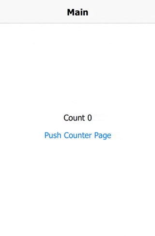
NavigationStack {
AppPage {
id: mainPage
title: "Main"
Column {
anchors.centerIn: parent
AppText {
anchors.horizontalCenter: parent.horizontalCenter
text: "Count " + app.count
}
AppButton {
text: "Push Counter Page"
onClicked: mainPage.navigationStack.push(counterPageComponent)
}
}
}
}
Component {
id: counterPageComponent
AppPage {
title: "Change Count"
property AppPage target: null
Column {
anchors.centerIn: parent
AppButton {
text: "Count ++"
onClicked: {
app.count++
}
}
AppButton {
text: "Count --"
onClicked: {
app.count--
}
}
}
}
}
}
More Frequently Asked Development Questions
Find more examples for frequently asked development questions and important concepts in the following guides:
Property Documentation
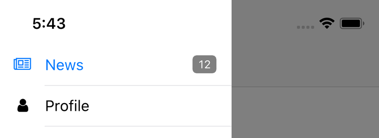
An optional value that's displayed as badge if the navigationitem is shown as drawer menu.
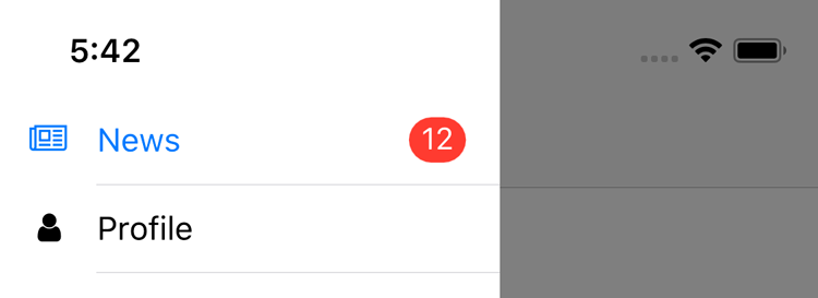
The appearance of badge can be styled with Theme::navigationAppDrawer properties:
import Felgo
App {
onInitTheme: {
Theme.navigationAppDrawer.badgeFontSize = 12
Theme.navigationAppDrawer.badgeTextColor = "white"
Theme.navigationAppDrawer.badgeBackgroundColor = "grey"
Theme.navigationAppDrawer.badgeRadius = 4
}
Navigation {
NavigationItem {
title: qsTr("News")
badgeValue: "1"
}
}
}
This property was introduced in Felgo 2.16.1.
Specifies the component for displaying the tab icon. If no custom component is set, the NavigationItem creates an AppIcon to show the NavigationItem::iconType of the NavigationItem::iconFont.
To set a custom icon, implement your own component for the NavigationItem. When instantiated, the component is parented to a container item that comes with three important
properties:
- The tabControl property is
true when the icon is used for tabs, false when it is used inside the app drawer menu.
- The navItem property holds a reference to the NavigationItem that uses the icon. It may be used to access other properties like the title.
- The selected property states whether the NavigationItem that uses the icon is currently active.
- The itemPressed property states whether the NavigationItem is currently being pressed.
The following example shows colored Rectangles for the icons of an app navigation.
import QtQuick
import Felgo
App {
Component {
id: iconComponent
Rectangle {
anchors.fill: parent
property color offColor: parent.tabControl ? Theme.tabBar.titleOffColor : Theme.navigationAppDrawer.textColor
color: parent.selected ? parent.navItem.title : offColor
}
}
Navigation {
NavigationItem {
title: "Red"
iconComponent: iconComponent
NavigationStack {
AppPage { title: "Red Page" }
}
}
NavigationItem {
title: "Green"
iconComponent: iconComponent
NavigationStack {
AppPage { title: "Green Page" }
}
}
}
}
This property was introduced in Felgo 2.8.2.
See also icon and iconFont.
Specifies the icon font used to display the tab icon. If no font is set, the default icon font is used.
Note: This property is only used by the default NavigationItem::iconComponent. If a custom component is specified, setting the icon font has no
effect.
This property was introduced in Felgo 2.8.2.
See also icon and iconComponent.
Icon to be used inside the representation for this NavigationItem.
Use one of the IconType constants with this property.
To see a categorized view of all available icons with interactive search, see here. You may also use the iconFont property
to set a custom icon font.
Note: This property is only used by the default NavigationItem::iconComponent. If a custom component is specified, setting iconType has no
effect.
This property was introduced in Felgo 4.0.0.
See also iconFont and iconComponent.
Contains true if this navigation item is the currently selected item.
This property was introduced in Felgo 4.0.0.
Set this property to true to lazy-load the tab content. This means the content is only instantiated when the navigation item is first selected. This can help improve the startup time of your app.
Set it to false to load the tab content on startup.
The default value of this property is true.
This property was introduced in Felgo 4.0.0.
Accessor property for the NavigationStack used for navigating to sub pages, if any.
Accessor property for the Page of the NavigationItem or the current main page if a NavigationStack is used.
Note: The content pages of navigation items are dynamically created and loaded at runtime. As long as the page has not been created, the page property remains null. During this time page properties
like AppPage::title cannot be accessed, even if the page is correctly set up in your Navigation structure.
Whether this navigation item is included in the AppDrawer of the Navigation. The default value is true.
Setting this property to false hides the NavigationItem list entry in the drawer menu. It is still part of the tab navigation, or can be opened with custom app
logic.
Navigation {
Component.onCompleted: currentIndex = 1
NavigationItem {
title: qsTr("First")
}
NavigationItem {
title: qStr("Second")
showInDrawer: false
}
}
This property was introduced in Felgo 2.16.0.
Whether the app Navigation should show this navigation item in the drawer and tab bar. The default value is true.
Setting this property to false completely removes the NavigationItem and its content from the app Navigation. This allows to dynamically make app features available. To
only show a navigation item when a certain condition is met you can use property bindings. The following example hides the item on non-iOS devices:
NavigationItem {
title: "Only on iOS"
iconType: IconType.apple
showItem: Theme.isIos
}
This property was introduced in Felgo 2.13.2.
The navigation item's title.
This title is displayed in the navigation drawer and/or tab bar.
This property was introduced in Felgo 4.0.0.
Signal Documentation
|
[since Felgo 3.9.2] willChange(var event, var tab, int index)
|
This signal triggers whenever the current NavigationItem is about to be changed. The tab and index parameters refer to the object and index of the NavigationItem that will be activated. If you want to stop the change from being executed, you can set event.accepted to false.
 onWillChange: {
   event.accepted = false
 }
This can be used to e.g. show a confirmation dialog if the user really wants to leave the NavigationItem.
Note: The corresponding handler is onWillChange.
This signal was introduced in Felgo 3.9.2.


