Create a ScrollView with AppFlickable or ListPage
A ScrollView is a scrollable container that holds content. The AppFlickable component is used to create such
a view:
import Felgo
import QtQuick
App {
NavigationStack {
AppPage {
id: page
title: "AppFlickable"
AppFlickable {
anchors.fill: parent
contentWidth: contentColumn.width
contentHeight: contentColumn.height
Column {
id: contentColumn
width: page.width
Repeater {
model: ["red","green","yellow","blue"]
Rectangle {
color: modelData
width: parent.width
height: dp(200)
}
}
}
}
}
}
}
You can freely configure the size and position of the view. The above AppFlickable is configured to fill the whole page. You can also use the FlickablePage for this use case. It already contains an AppFlickable and AppScrollIndicator:
import Felgo
import QtQuick
App {
NavigationStack {
FlickablePage {
id: page
title: "Flickable Page"
flickable.contentWidth: contentColumn.width
flickable.contentHeight: contentColumn.height
Column {
id: contentColumn
width: page.width
Repeater {
model: ["red","green","yellow","blue"]
Rectangle {
color: modelData
width: parent.width
height: dp(200)
}
}
}
}
}
}
Basically any time you have content that will exceed the screen size, you will need to make it scrollable. Depending on your type of content, you can then use an AppFlickable or check
out the next section about the ListView.
Create a ListView to Display Rows
A ListView is a scrollable container that displays rows defined by the model and
delegate properties. In Felgo, you can use the AppListView component to get a native scrolling behavior and
look-and-feel to display your content in lists.
Display Items in a List
The easiest way to to use the AppListView is by choosing the SimpleRow type as the ListView::delegate. If the model is an array, the SimpleRow properties are automatically initialized with the matching
array properties.
 import Felgo

 App {
   NavigationStack {
     AppPage {
       title: "Basic List Example"

       AppListView {
         model: [
           {
             text: "Apple",
             detailText: "A delicious fruit with round shape",
             iconType: IconType.apple
           },

           {
             text: "Beer",
             detailText: "A delicious drink",
             iconType: IconType.beer
           }
         ]

         delegate: SimpleRow {}
       }
     }
   }
 }
The SimpleRow is a convenience component to quickly display data from a model specified as a JSON array. It requires the model to have a property text, and can optionally also show other properties like detailText, icon. See here for all the properties it supports.
Customize AppListItems for custom Lists
AppListItems allow many customization options, and you can replace any content item with a custom QML item. Here are several examples how to create different common list item layouts
using the AppListItem component.
| iOS |
Android |
|
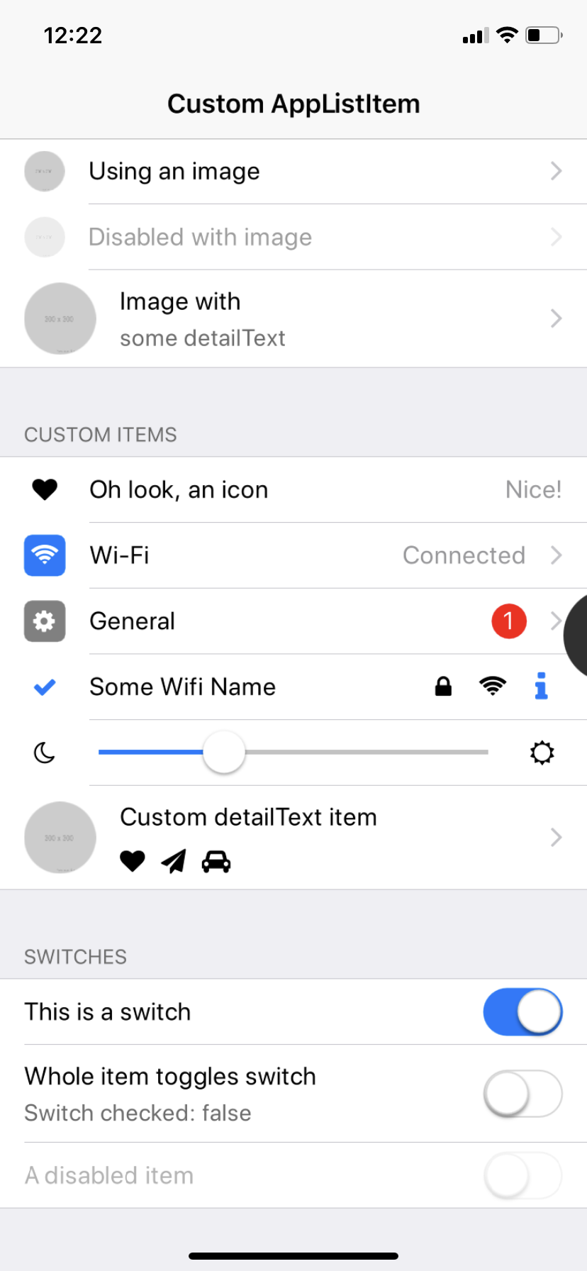
|
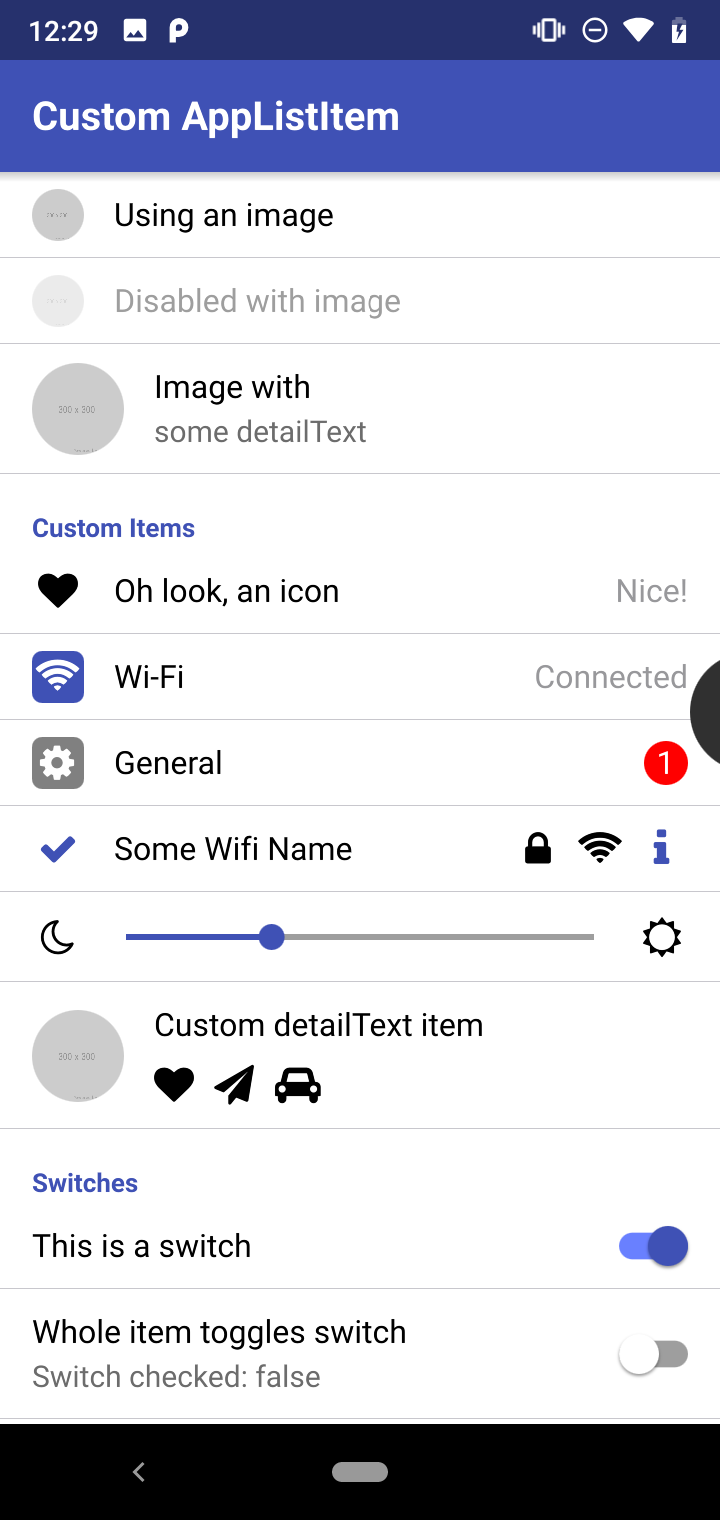
|
 import QtQuick
 import QtQuick.Controls as QC2
 import Felgo

 App {
   id: app

   NavigationStack {
     AppPage {
       title: "Custom AppListItem"
       backgroundColor: Theme.colors.secondaryBackgroundColor

       AppFlickable {
         anchors.fill: parent
         contentHeight: column.height

         Column {
           id: column
           width: parent.width

           bottomPadding: 2*dp(Theme.contentPadding)

           SimpleSection {
             title: "Standard Items"
           }

           AppListItem {
             text: "First"
             rightText: "Longer rightText, really long"
           }
           AppListItem {
             text: "Second with longer text"
             rightText: "Hi"
           }
           AppListItem {
             text: "An active item"
             detailText: "This is disabled so it cannot be clicked"
             active: true
             enabled: false
             lastInSection: true
           }

           SimpleSection {
             title: "Images"
           }

           AppListItem {
             text: "Using an image"
             image: "https://via.placeholder.com/300"
           }
           AppListItem {
             text: "Muted with image"
             image: "https://via.placeholder.com/300"
             muted: true
           }

           AppListItem {
             text: "Image with"
             detailText: "some detailText"
             image: "https://via.placeholder.com/300"
             lastInSection: true
           }

           SimpleSection {
             title: "Custom Items"
           }

           AppListItem {
             text: "Oh look, an icon"
             rightText: "Nice!"
             showDisclosure: false

             leftItem: AppIcon {
               iconType: IconType.heart
               anchors.verticalCenter: parent.verticalCenter
               width: dp(26)
             }
           }
           AppListItem {
             text: "Wi-Fi"
             rightText: "Connected"

             leftItem: Rectangle {
               color: Theme.colors.tintColor
               radius: dp(5)
               width: dp(26)
               height: width
               anchors.verticalCenter: parent.verticalCenter

               AppIcon {
                 iconType: IconType.wifi
                 anchors.centerIn: parent
                 color: "white"
               }
             }
           }
           AppListItem {
             text: "General"

             leftItem: Rectangle {
               color: "grey"
               radius: dp(5)
               width: dp(26)
               height: width
               anchors.verticalCenter: parent.verticalCenter

               AppIcon {
                 iconType: IconType.cog
                 anchors.centerIn: parent
                 color: "white"
               }
             }

             rightItem: Rectangle {
               color: "red"
               radius: width/2
               width: dp(22)
               height: width
               anchors.verticalCenter: parent.verticalCenter

               AppText {
                 anchors.centerIn: parent
                 color: "white"
                 text: "1"
               }
             }
           }
           AppListItem {
             text: "Some Wifi Name"
             showDisclosure: false

             leftItem: AppIcon {
               iconType: IconType.check
               color: Theme.colors.tintColor
               width: dp(26)
               anchors.verticalCenter: parent.verticalCenter
             }

             rightItem: Row {
               spacing: dp(5)
               anchors.verticalCenter: parent.verticalCenter

               AppIcon {
                 iconType: IconType.lock
                 width: sp(26)
                 height: width
                 anchors.verticalCenter: parent.verticalCenter
               }
               AppIcon {
                 iconType: IconType.wifi
                 width: sp(26)
                 height: width
                 anchors.verticalCenter: parent.verticalCenter
               }
               IconButton {
                 iconType: IconType.info
                 width: sp(26)
                 height: width
                 size: dp(22)
                 anchors.verticalCenter: parent.verticalCenter
               }
             }
           }
           AppListItem {
             id: listItem
             showDisclosure: false
             mouseArea.enabled: false
             topPadding: 0
             bottomPadding: 0

             leftItem: AppIcon {
               iconType: IconType.moono
               width: sp(26)
               height: width
               anchors.verticalCenter: parent.verticalCenter
             }

             textItem: AppSlider {
               height: dp(45)
               width: listItem.textItemAvailableWidth
               value: 0.3
             }

             rightItem: AppIcon {
               iconType: IconType.suno
               width: sp(26)
               height: width
               anchors.verticalCenter: parent.verticalCenter
             }
           }
           AppListItem {
             text: "Custom detailText item"
             image: "https://via.placeholder.com/300"
             textVerticalSpacing: dp(10)
             lastInSection: true

             detailTextItem: Row {
               spacing: dp(10)
               AppIcon {
                 iconType: IconType.heart
               }
               AppIcon {
                 iconType: IconType.paperplane
               }
               AppIcon {
                 iconType: IconType.automobile
               }
             }
           }

           SimpleSection {
             title: "Switches"
           }

           AppListItem {
             text: "This is a switch"
             showDisclosure: false
             mouseArea.enabled: false

             rightItem: AppSwitch {
               anchors.verticalCenter: parent.verticalCenter
               checked: true
             }
           }
           AppListItem {
             text: "Whole item toggles switch"
             detailText: "Switch checked: " + innerSwitch.checked
             showDisclosure: false

             rightItem: AppSwitch {
               id: innerSwitch
               anchors.verticalCenter: parent.verticalCenter
               enabled: false
             }

             onSelected: {
               innerSwitch.toggle()
             }
           }
           AppListItem {
             text: "A muted item"
             muted: true
             showDisclosure: false
             lastInSection: true

             rightItem: AppSwitch {
               anchors.verticalCenter: parent.verticalCenter
             }
           }

           SimpleSection {
             title: "Radio Button Selected: " + radioButtonGroup.checkedButton.value
           }

           QC2.ButtonGroup {
             id: radioButtonGroup
             buttons: [radio1, radio2, radio3]
           }

           AppListItem {
             text: "First Option"
             showDisclosure: false

             leftItem: AppRadio {
               id: radio1
               checked: true
               value: "Option 1"
               anchors.verticalCenter: parent.verticalCenter
             }

             onSelected: {
               if(!radio1.checked) radio1.toggle()
             }
           }

           AppListItem {
             text: "Second Option"
             showDisclosure: false

             leftItem: AppRadio {
               id: radio2
               value: "Option 2"
               anchors.verticalCenter: parent.verticalCenter
             }

             onSelected: {
               if(!radio2.checked) radio2.toggle()
             }
           }

           AppListItem {
             text: "Third Option"
             showDisclosure: false
             lastInSection: true

             leftItem: AppRadio {
               id: radio3
               value: "Option 3"
               anchors.verticalCenter: parent.verticalCenter
             }

             onSelected: {
               if(!radio3.checked) radio3.toggle()
             }
           }

           SimpleSection {
             title: "Checkboxes"
           }

           AppListItem {
             text: "First Option"
             showDisclosure: false

             rightItem: AppCheckBox {
               id: checkBox1
               anchors.verticalCenter: parent.verticalCenter
             }

             onSelected: {
               checkBox1.checked = !checkBox1.checked
             }
           }

           AppListItem {
             text: "Second Option"
             showDisclosure: false

             rightItem: AppCheckBox {
               id: checkBox2
               checked: true
               anchors.verticalCenter: parent.verticalCenter
             }

             onSelected: {
               checkBox2.checked = !checkBox2.checked
             }
           }

           AppListItem {
             text: "Third Option"
             showDisclosure: false
             lastInSection: true

             rightItem: AppCheckBox {
               id: checkBox3
               anchors.verticalCenter: parent.verticalCenter
             }

             onSelected: {
               checkBox3.checked = !checkBox3.checked
             }
           }
         }
       }
     }
   }
 }
Display Custom List Items
Although the SimpleRow is useful if you want to display native looking items in a list, you will want more control how your list items look. A list item is called AppListView::delegate in
QML & Felgo.
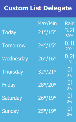
The following example shows:
- How to make a custom list delegate.
- How to query the current index of the list delegate in the model array: the first 2 items are set to
Today and Tomorrow in the list. Use the in a delegate to access the current
index number in the array model, starting with 0 for the first entry in the array.
- How to display data from the model by using the
modelData property. With modelData.<propertyName>, you can access any property from your model.
This is how the example looks like on Android (with a native title in Material design):
import Felgo
import QtQuick
App {
onInitTheme: {
Theme.colors.backgroundColor = "#51b4de"
Theme.colors.secondaryBackgroundColor = Theme.colors.backgroundColor
Theme.colors.textColor = "white"
}
NavigationStack {
AppPage {
title: "Custom List Delegate"
AppListView {
id: myListView
x: dp(10)
y: dp(10)
property real widthDay: dp(90)
property real widthTempMaxMin: dp(60)
property real widthRain: dp(40)
property real itemRowSpacing: dp(20)
spacing: dp(5)
model: [
{day: "Monday", tempMax: 21, tempMin: 15, rainProbability: 0.8, rainAmount: 3.153},
{day: "Tuesday", tempMax: 24, tempMin: 15, rainProbability: 0.2, rainAmount: 0.13},
{day: "Wednesday", tempMax: 26, tempMin: 16, rainProbability: 0.01, rainAmount: 0.21},
{day: "Thursday", tempMax: 32, tempMin: 21, rainProbability: 0, rainAmount: 0},
{day: "Friday", tempMax: 28, tempMin: 20, rainProbability: 0, rainAmount: 0},
{day: "Saturday", tempMax: 26, tempMin: 19, rainProbability: 0, rainAmount: 0},
{day: "Sunday", tempMax: 25, tempMin: 19, rainProbability: 0, rainAmount: 0}
]
header: Row {
spacing: myListView.itemRowSpacing
Item {
width: myListView.widthDay
height: 1
}
AppText {
id: maxMinTempHeader
text: "Max/Min"
horizontalAlignment: Text.AlignHCenter
width: myListView.widthTempMaxMin
}
AppText {
text: "Rain"
horizontalAlignment: Text.AlignHCenter
width: myListView.widthRain
}
}
delegate: Row {
id: dailyWeatherDelegate
spacing: myListView.itemRowSpacing
AppText {
text: index === 0 ? "Today" :
index === 1 ? "Tomorrow" :
modelData.day
width: myListView.widthDay
anchors.verticalCenter: parent.verticalCenter
}
AppText {
text: modelData.tempMax + "°/" + modelData.tempMin + "°"
horizontalAlignment: Text.AlignHCenter
width: myListView.widthTempMaxMin
anchors.verticalCenter: parent.verticalCenter
}
Column {
width: myListView.widthRain
anchors.verticalCenter: parent.verticalCenter
AppText {
text: Math.round(modelData.rainAmount*10)/10 + "l"
fontSize: 18
anchors.horizontalCenter: parent.horizontalCenter
}
AppText {
id: precipProbability
text: Math.round(modelData.rainProbability * 1000)/10 + "%"
fontSize: 12
anchors.horizontalCenter: parent.horizontalCenter
}
}
}
}
}
}
}
In a real world application, you will probably receive the data for the model from a web server with a REST interface. Please see Access a REST Service how to fetch data
from a server.
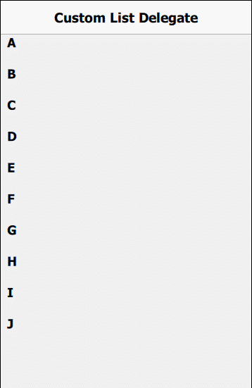
Create Foldable Sub-Sections in List Delegates
Another common use case is to fold/unfold subsections within a list if you press any of the list item. One solution how you can do this, is with a Repeater and
using positioning components like a Column, which is used to place objects below each other.
See this example how this looks like and the source code below:
import Felgo
import QtQuick
App {
NavigationStack {
AppPage {
title: "Custom List Delegate"
AppListView {
id: myListView
model: [
{letter: "A"},{letter: "B"},{letter: "C"},{letter: "D"},{letter: "E"},
{letter: "F"},{letter: "G"},{letter: "H"},{letter: "I"},{letter: "J"}
]
property var subsectionModel: [
[{word: "Apple"}, {word: "Ananas"}],
[{word: "Banana"}, {word: "Ball"}, {word: "Balloon"}],
[{word: "Clock"}],
[{word: "Dog"}, {word: "Donut"}, {word: "Dollar"}],
]
spacing: dp(20)
delegate: Item {
x: dp(10)
height: letterText.height +
(subsectionColumn.visible ? subsectionColumn.height : 0)
width: parent.width
AppText {
id: letterText
text: modelData.letter
font.bold: true
}
MouseArea {
anchors.fill: parent
onClicked: {
console.debug("letter clicked:", modelData.letter)
subsectionColumn.visible = !subsectionColumn.visible
}
}
Column {
id: subsectionColumn
anchors.top: letterText.bottom
anchors.topMargin: dp(10)
visible: false
spacing: dp(10)
Repeater {
model: myListView.subsectionModel[index]
delegate: AppText {
text: modelData.word
color: index%2 === 1 ? "red" : "blue"
}
}
}
}
}
}
}
}
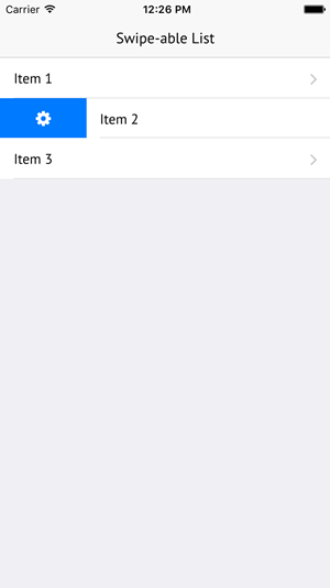
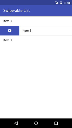
Make a ListView Row Swipe-able
Many apps allow to show additional options for list items by swiping them to the left or the right. Imagine a mail app that shows a list of mails. Clicking a mail will open it. But it's also possible to swipe it to the right
to show additional options like deleting the mail or forwarding it.
The solution to create a swipe-able ListView like that requires two components:
- The AppListView for showing the list items in a scroll-able view.
- The SwipeOptionsContainer for making the items swipe-able and displaying options when swiping to the left or the right.
The following example shows a simple swipe-able list within a Page. To display the list items and the swipe option the SimpleRow and SwipeButton
components are used. They are convenience types with a platform-specific look that can handle the most common use-cases:
| iOS |
Android |
|
|
|
import Felgo
App {
NavigationStack {
AppPage {
title: "Swipe-able List"
AppListView {
anchors.fill: parent
model: [
{ text: "Item 1" },
{ text: "Item 2" },
{ text: "Item 3" }
]
delegate: SwipeOptionsContainer {
id: container
height: listItem.height
SimpleRow { id: listItem }
leftOption: SwipeButton {
iconType: IconType.gear
height: parent.height
onClicked: {
listItem.text = "Option clicked"
container.hideOptions()
}
}
}
}
}
}
}
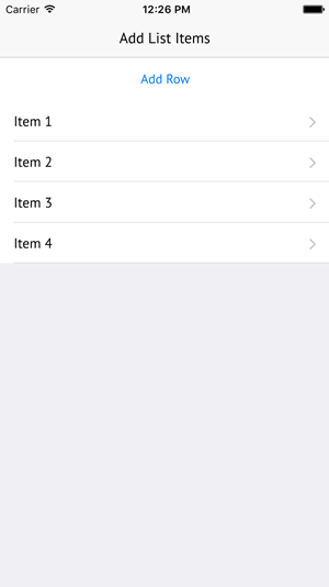
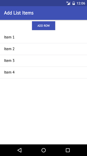
Add a New Row to a ListView Dynamically
Each ListView displays its data based on a model. In the simplest case, this will be an array that holds data objects. Adding a row to the list
then means adding a data object to the array model.
The following example displays a list view and a button that allows to add rows:
| iOS |
Android |
|
|
|
import Felgo
App {
NavigationStack {
AppPage {
id: page
title: "Add List Items"
property var dataModel: [
{ text: "Item 1" },
{ text: "Item 2" },
{ text: "Item 3" }
]
AppButton {
id: button
anchors.horizontalCenter: parent.horizontalCenter
text: "Add Row"
onClicked: {
var itemNr = page.dataModel.length + 1
var newItem = { text: "Item "+itemNr }
page.dataModel.push(newItem)
page.dataModelChanged()
}
}
AppListView {
id: listView
anchors.top: button.bottom
anchors.bottom: parent.bottom
width: parent.width
model: page.dataModel
delegate: SimpleRow {}
}
}
}
}
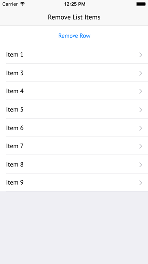
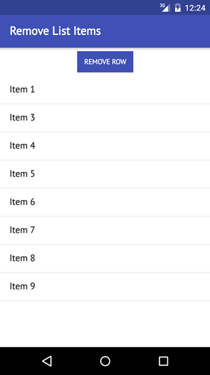
Remove a Row from a ListView Dynamically
Like in the previous example, the way to remove a list item is by modifying the data model of the ListView. If the model data is an array, this means removing
data objects from the array.
The following example shows a ListView and a button that allows to remove a list item:
| iOS |
Android |
|
|
|
import Felgo
App {
NavigationStack {
AppPage {
id: page
title: "Remove List Items"
property var dataModel: [
{ text: "Item 1" },
{ text: "Item 2" },
{ text: "Item 3" },
{ text: "Item 4" },
{ text: "Item 5" },
{ text: "Item 6" },
{ text: "Item 7" },
{ text: "Item 8" },
{ text: "Item 9" }
]
AppButton {
id: button
anchors.horizontalCenter: parent.horizontalCenter
text: "Remove Row"
onClicked: {
page.dataModel.splice(1, 1)
page.dataModelChanged()
}
}
AppListView {
id: listView
anchors.top: button.bottom
anchors.bottom: parent.bottom
width: parent.width
model: page.dataModel
delegate: SimpleRow {}
}
}
}
}
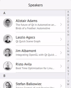
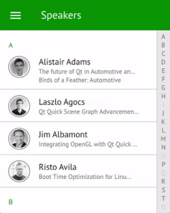
Use Sections and a SectionSelect
The SectionSelect control provides a side-bar that allows to alphabetically jump to the corresponding sections of a ListView. The side-bar has a native look on iOS & Android and takes the Theme colors into account.
| iOS |
Android |
|
|
|
The following example uses a ListPage instead of a normal AppPage, which is a page with a built-in AppListView.
import Felgo
App {
NavigationStack {
ListPage {
id: listPage
title: "SectionSelect Example"
model: {
var model = []
for(var i = 0; i < 26; i++) {
for(var j = 0; j < 5; j++) {
var entry = {
text: String.fromCharCode(65 + i) + " " + j,
section: "Section: "+String.fromCharCode(65 + i),
letter: String.fromCharCode(65 + i)
}
model.push(entry)
}
}
return model
}
delegate: SimpleRow { }
section.property: "section"
SectionSelect {
id: sectionSelect
anchors.right: parent.right
target: listPage.listView
sectionProperty: "letter"
}
}
}
}
Use JsonListModel as View Model
The JsonListModel allows to transform your JSON data into a QML ListModel for usage with e.g. an AppListView. This improves rendering performance
of the list and makes advanced features like list sections or transition animations available.
The following example shows how to use JsonListModel together with AppListView. When adding a new item to the JSON, the JsonListModel detects the change. The AppListView can thus use a transition animation when adding the entry. It is not required to fully redraw the list and
existing items in the view are not affected.
import Felgo
import QtQuick
App {
AppPage {
id: page
property var jsonData: [
{
"id": 1,
"title": "Entry 1"
},
{
"id": 2,
"title": "Entry 2"
},
{
"id": 3,
"title": "Entry 3"
}
]
JsonListModel {
id: jsonModel
source: page.jsonData
keyField: "id"
}
AppListView {
anchors.fill: parent
model: jsonModel
delegate: SimpleRow {
text: model.title
}
add: Transition {
NumberAnimation {
property: "opacity";
from: 0;
to: 1;
duration: 1000
easing.type: Easing.OutQuad;
}
}
}
AppButton {
anchors.horizontalCenter: parent.horizontalCenter
anchors.bottom: parent.bottom
text: "Add Entry"
onClicked: {
var newItem = {
"id": jsonModel.count + 1,
"title": "Entry "+(jsonModel.count + 1)
}
page.jsonData.push(newItem)
page.jsonDataChanged()
}
}
}
}
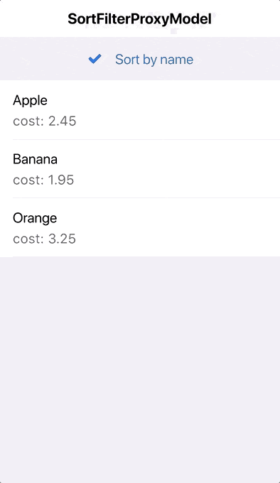
Apply Sorting and Filters to a List
The SortFilterProxyModel can dynamically apply sorting or filter settings to a given ListModel. For example to sort a list based on the name property of the model
data:
import Felgo
import QtQuick
App {
ListModel {
id: fruitModel
ListElement {
name: "Banana"
cost: 1.95
}
ListElement {
name: "Apple"
cost: 2.45
}
ListElement {
name: "Orange"
cost: 3.25
}
}
SortFilterProxyModel {
id: filteredFruitModel
sourceModel: fruitModel
sorters: [
LocaleAwareSorter {
id: nameSorter
roleName: "name"
}]
}
NavigationStack {
ListPage {
id: listPage
title: "SortFilterProxyModel"
model: filteredFruitModel
delegate: SimpleRow {
text: name
detailText: "cost: "+cost
style.showDisclosure: false
}
listView.header: AppCheckBox {
text: "Sort by name"
checked: nameSorter.enabled
updateChecked: false
onClicked: nameSorter.enabled = !nameSorter.enabled
anchors.horizontalCenter: parent.horizontalCenter
height: dp(48)
}
}
}
}
See the SortFilterProxyModel documentation for more information and other relevant components.
How do I know which list item is clicked on?
The SimpleRow::selected signal allows to handle click events on a list cell. For custom delegate items, you can add your own MouseArea for handling touch input.
 import Felgo

 App {
  NavigationStack {
    AppPage {
      title: "Clickable List Example"

      AppListView {
        delegate: SimpleRow {
          onSelected: index => console.log("Clicked Item #"+index+": "+JSON.stringify(modelData))
        }
        model: [
          {
            text: "Apple",
            detailText: "A delicious fruit with round shape",
            iconType: IconType.apple
          },

          {
            text: "Beer",
            detailText: "A delicious drink",
            iconType: IconType.beer
          }
        ]
      }
    }
  }
 }
How do I update ListViews dynamically?
The list view updates its UI automatically whenever the model changes - at least when you describe your model as a ListModel type.
For plain JSON-based models, the list is not notified when some data values within the JSON structure change. In this case, you can manually trigger a property-changed signal, which in turn updates the UI of the list:
import Felgo
App {
NavigationStack {
AppPage {
id: page
title: "Append List Item Example"
property var listData: [
{
text: "Apple",
detailText: "A delicious fruit with round shape",
iconType: IconType.apple
},
{
text: "Beer",
detailText: "A delicious drink",
iconType: IconType.beer
}
]
AppListView {
id: listView
model: page.listData
delegate: SimpleRow {
onSelected: {
page.listData.push(modelData)
page.listDataChanged()
}
}
}
}
}
}
More Frequently Asked Development Questions
Find more examples for frequently asked development questions and important concepts in the following guides:


