AppPage
A single page within an application. More...
Properties
Signals
Detailed Description
The Page type provides a container for the contents of a single page within an application. This type is designed to be used together with components like Navigation or NavigationStack to provide a native-looking UI and user experience.
Note: Due to Felgo internal mechanisms that provide the native look-and-feel, the AppPage type places its content inside of an additional container item. The AppPage type is thus not a direct parent of the items you
add to the Page. This is for example relevant when anchoring content items to the AppPage. As anchoring is only allowed between siblings or to the direct parent, it is not possible to anchor an item directly to the AppPage.
Please anchor your content items to their parent instead, which is the internal container item.
There are also some specialized AppPage types available for different use-cases:
Note: This QML type was renamed from Page in Felgo 4.0.0. This is because the name conflicted with the already existing Page type
from Qt Quick Controls 2.
Example Usage
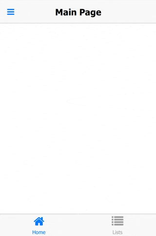
The NavigationStack component adds a navigation bar and is used to navigate between pages. The AppPage component is the container for a single page of
content.
import Felgo
import QtQuick
App {
NavigationStack {
AppPage {
title: "Hello Felgo"
AppText {
anchors.centerIn: parent
text: "Hi :)"
}
}
}
}
How do I navigate between pages?
You can rely on the Navigation Components to switch between different Pages in your app:
Apart from the app Navigation, which provides the main menu for your app, the NavigationStack is the main component for navigating back and forth
between different pages.
For passing data between pages, the easiest solution is to make relevant settings or properties available in a common parent scope. Public properties, functions, and signals of an ancestor in the QML tree are available for
direct access:
import Felgo
import QtQuick
App {
id: app
property int count: 0
NavigationStack {
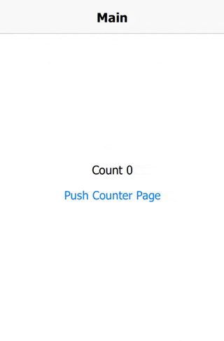
AppPage {
id: mainPage
title: "Main"
Column {
anchors.centerIn: parent
AppText {
anchors.horizontalCenter: parent.horizontalCenter
text: "Count " + app.count
}
AppButton {
text: "Push Counter Page"
onClicked: mainPage.navigationStack.push(counterPageComponent)
}
}
}
}
Component {
id: counterPageComponent
AppPage {
title: "Change Count"
property AppPage target: null
Column {
anchors.centerIn: parent
AppButton {
text: "Count ++"
onClicked: {
app.count++
}
}
AppButton {
text: "Count --"
onClicked: {
app.count--
}
}
}
}
}
}
More Frequently Asked Development Questions
Find more examples for frequently asked development questions and important concepts in the following guides:
Property Documentation
|
backNavigationEnabled : bool
|
Set this property to false to disable the back navigation within a page in a NavigationStack if previous pages exist on the stack.
Disabling the back navigation hides the "back" button within a NavigationBar, deactivates the iOS back swipe gesture and also disables the hardware back button on Android and Windows
Phone.
The default value is true.
Note: Setting this property only has an effect if the Page is used inside a NavigationStack.
See also backSwipeEnabled.
Set this property to false to only disable the swipe back gesture on iOS, while still allowing to navigate back using the default back button in the navigation bar.
The default value is true.
Note: Setting this property only has an effect if the Page is used inside a NavigationStack.
This property was introduced in Felgo 3.9.2.
See also backNavigationEnabled.
The background color of the Page which is displayed if no other items are placed within the page.
The default value is defined in the Theme::backgroundColor property and can be overridden.
Read-only property holds whether it is possible to actually navigate back within the current stack. The property is true if a previous page exists on the stack, otherwise false.
This property was introduced in Felgo 2.7.0.
|
contentPaddingAnchorItem : alias
|
This item can be used to add default padding to your page content.
The item applies the Theme::contentPadding on all sides. If useSafeArea is active, it also ensures a minimum bottom
spacing for the device safe area. This is because Page regularly doesn't add a bottom spacing, to let scrolling content fill the whole screen vertically.
 anchors.leftMargin: dp(Theme.contentPadding)
 anchors.rightMargin: dp(Theme.contentPadding)
 anchors.topMargin: dp(Theme.contentPadding)
 anchors.bottomMargin: useSafeArea ? Math.max(NativeUtils.safeAreaInsets.bottom, dp(Theme.contentPadding)) : dp(Theme.contentPadding)
Note: The item can also automatically add spacing for the device's safe area on the horizontal and top side. Set useSafeArea to true to enable this
behavior.
You can anchor to it or just use its properties like margins or width for your layouts.
import QtQuick
import Felgo
App {
NavigationStack {
AppPage {
id: page
title: "AppPage::contentPaddingAnchorItem"
Column {
id: column
spacing: dp(Theme.contentPadding)
anchors.fill: parent.contentPaddingAnchorItem
AppText {
width: parent.width
text: "Lorem ipsum dolor sit amet, consectetur adipiscing elit, sed do eiusmod tempor incididunt ut labore et dolore magna aliqua. Ut enim ad minim veniam, quis nostrud exercitation ullamco laboris nisi ut aliquip ex ea commodo consequat."
}
AppButton {
text: "Toggle padding"
horizontalMargin: 0
property bool toggle: true
onClicked: {
column.anchors.fill = toggle ? column.parent : column.parent.contentPaddingAnchorItem
toggle = !toggle
}
}
}
}
}
}
This property was introduced in Felgo 3.3.0.
|
isCurrentStackPage : bool
|
A custom navigation bar item displayed on the left of the navigation bar if the item is on top of a NavigationStack as a direct child of it.
By default this item displays a back navigation item if the current NavigationStack can navigate back. If setting the item to an explicit NavigationBarItem it replaces the back button with the custom item.
You can customize the item by using a IconButtonBarItem or TextButtonBarItem.
|
navigationBarHidden : bool
|
A boolean value indicating whether the navigation bar should be hidden for that specific Page if the item is presented within a NavigationStack item.
You can set this property to false to implement a custom styled full-screen page within a NavigationStack without the default navigation bar behavior (make sure to
implement a custom back navigation action in that case).
By default this property is false, meaning that the navigation bar is visible for that Page.
|
navigationBarTranslucency : real
|
Set this value to make the navigation bar translucent for that specific Page within a NavigationStack.
The allowed value range is 0.0 to 1.0. The default value is 0.0, meaning that the navigation bar is not translucent (fully opaque).
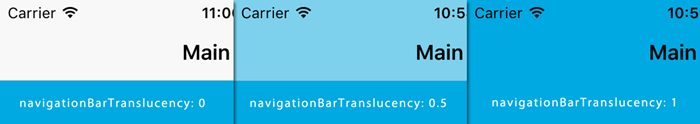
If using a translucent navigation bar, the page content will move beneath the navigation bar and you should add that extra spacing for your pages on your own (you can get the current height from ThemeNavigationBar::height).
This property was introduced in Felgo 2.7.0.
The nearest parent item in the QML hierarchy that is a NavigationStack item. (read-only)
If the current item or one of its parent items is a child of a NavigationStack item, this property contains the owning NavigationStack
item. This property is null if the Page is not embedded inside a NavigationStack item.
|
preferredScreenOrientation : int
|
Set this property to specify a preferred screen orientation for the page.
This overrides the NativeUtils::preferredScreenOrientation as long as this page is the current page in a NavigationStack (i.e. isCurrentStackPage is true).
This property makes it easy to have parts of your app in different screen orientations. E.g., use this code to push a page fixed in portrait mode:
 import Felgo
 import QtQuick

 App {
   id: app

   NavigationStack {
     id: stack

     AppPage {
       id: page
       title: "Screen orientation test"

       AppButton {
         text: "Push portrait page"
         onClicked: stack.push(portraitPage)
       }
     }
   }

   Component {
     id: portraitPage

     AppPage {
       id: page
       title: "Portrait page"
       preferredScreenOrientation: NativeUtils.ScreenOrientationPortrait
     }
   }
 }
After the user returns from the portrait page using the back button, the previous value of NativeUtils::preferredScreenOrientation gets restored.
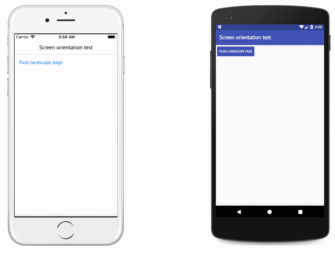
Note: This property only has an effect on mobile platforms.
You can use NativeUtils::screenOrientation to find out the current orientation of the screen.
The default value for this property is NativeUtils.ScreenOrientationUnspecified, indicating that this page does not override the app's global screen orientation.
This property was introduced in Felgo 2.16.0.
See also NativeUtils::preferredScreenOrientation and NativeUtils::screenOrientation.
A custom navigation bar item displayed on the right of the navigation bar if the item is on top of a NavigationStack as a direct child of it.
By default this item is empty.
You can customize the item by using a IconButtonBarItem or TextButtonBarItem.
On modern devices like the iPhone X, some parts of the screen are covered by native device overlays and buttons. Use this property to anchor and layout your items based on the safe area within the page:
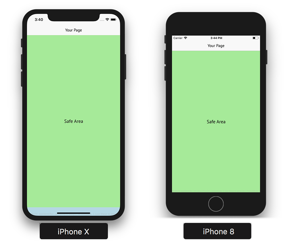
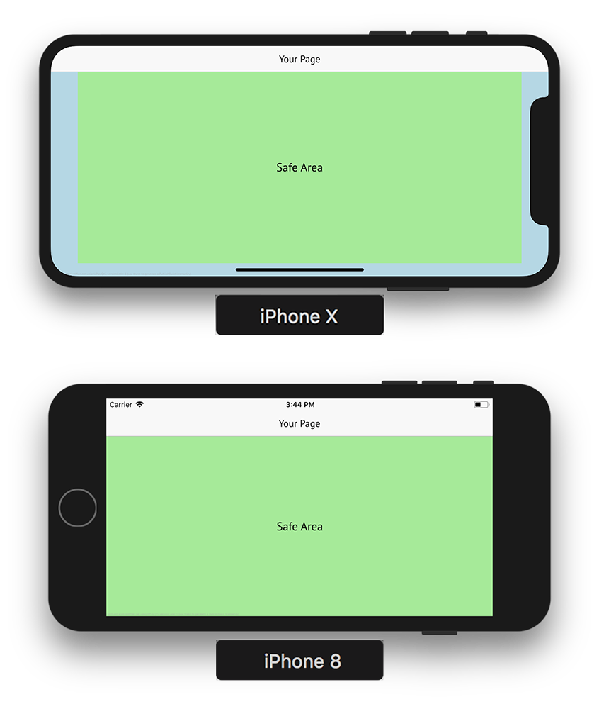
AppPage {
useSafeArea: false
Rectangle {
anchors.fill: parent.safeArea
color: "lightgreen"
}
}
Note: If useSafeArea is set to true, which is the default, all children of page are kept within the safe area automatically.
To access the applied safe area insets for the Page, you can use the insets property:
- safeArea.insets.left
- safeArea.insets.top
- safeArea.insets.right
- safeArea.insets.bottom
Depending on other used components, the given pixel values can differ from the actual NativeUtils::safeAreaInsets. For example, if the navigation bar of a parent
NavigationStack already covers the top inset. The Page itself does not require an additional inset in this case, so safeArea.insets.top will return 0.
This property was introduced in Felgo 2.16.0.
See also useSafeArea.
A boolean value indicating whether a tab bar should be hidden for that specific Page if the item is presented within a Navigation item showing tabs.
By default this property is false, meaning that the tab bar is visible for that Page.
This property was introduced in Felgo 2.7.0.
A localized, human-readable string that represents the the content of this page.
The title is used as string in a navigation bar if the Page item is a child of a NavigationStack.
A custom navigation bar item displayed at the title slot of the navigation bar if the item is on top of a NavigationStack as a direct child of it.
By default, the title of the page is displayed.
This property was introduced in Felgo 2.6.2.
On modern devices like the iPhone X, some parts of the screen are covered by native device overlays and buttons. This property handles whether the Page automatically places child items within the safe area, to not collide
with such interface elements.
Set this property to false to manually handle your page layout. You can anchor your items to the safe area with the parent.safeArea property. For instance, you can achieve a layout similar to the
safe area example above with:
import Felgo
import QtQuick
App {
NavigationStack {
AppPage {
id: myPage
title: "Your Page"
useSafeArea: false
Rectangle {
anchors.fill: parent
color: "lightblue"
}
Rectangle {
anchors.fill: parent.safeArea
color: "lightgreen"
AppText {
anchors.centerIn: parent
text: "Safe Area"
font.pixelSize: sp(20)
}
}
}
}
}
The NavigationBar is added by the NavigationStack in the above example. It automatically covers a bigger height and layouts correctly. Your
tab navigation or app drawer menu added by the Navigation component also automatically adapts to work with the safe area:
To manually work with the safe area insets of the screen, you can use the NativeUtils::safeAreaInsets property.
This property was introduced in Felgo 2.16.0.
See also safeArea.
Signal Documentation
|
[since Felgo 2.18.1] appeared()
|
This signal fires when AppPage::isCurrentStackPage changes to true. This is the case, whenever the page becomes the active page of a NavigationStack and thus appears on the stack. As long as a page is not popped from the stack, it will appear and disappear whenever the user
navigates back and forth between this page and other pages on the stack.
Note: The corresponding handler is onAppeared.
This signal was introduced in Felgo 2.18.1.
See also disappeared, pushed, and popped.
|
[since Felgo 2.18.1] disappeared()
|
This signal fires when AppPage::isCurrentStackPage changes to false. This is the case, when the page is popped or another page is pushed to the
NavigationStack, causing the page to disappear. As long as a page is not popped from the stack, it will appear and disappear whenever
the user navigates back and forth between this page and other pages on the stack.
Note: The corresponding handler is onDisappeared.
This signal was introduced in Felgo 2.18.1.
See also appeared, pushed, and popped.
|
[since Felgo 2.9.2] popped()
|
This signal triggers whenever the Page got popped from its NavigationStack. Popping the top-level page from the stack causes it to disappear, so the disappeared signal fires as well. As long as a page is not popped from the stack, it will appear and disappear whenever the user navigates back and forth between this page and
other pages on the stack.
Note: The corresponding handler is onPopped.
This signal was introduced in Felgo 2.9.2.
See also pushed, appeared, and disappeared.
|
[since Felgo 2.9.2] pushed()
|
This signal tiggers whenever the Page got pushed to a NavigationStack. Pushing a page causes it to appear at the top of the NavigationStack, so the appeared signal fires as well. As long as a page is not popped from
the stack, it will appear and disappear whenever the user navigates back and forth between this page and other pages on the stack.
Note: The corresponding handler is onPushed.
This signal was introduced in Felgo 2.9.2.
See also popped, appeared, and disappeared.
|
[since Felgo 3.9.2] willPop(var event)
|
This signal triggers whenever the Page is about to be popped from its NavigationStack. If you want to stop the pop from being executed, you can set event.accepted to
false.
 onWillPop: {
   event.accepted = false
 }
This can be used to e.g. show a confirmation dialog if the user really wants to leave the page.
Note: The corresponding handler is onWillPop.
This signal was introduced in Felgo 3.9.2.
See also popped, appeared, and disappeared.