NavigationStack
Provides a stack of Pages with navigation. More...
| Import Statement: |
import Felgo 4.0 |
| Inherits: |
Item
|
Properties
Signals
Methods
Detailed Description
The NavigationStack item manages the navigation of hierarchical content represented by a stack of Pages.
Example Usage
The NavigationStack component adds a navigation bar and is used to navigate between pages. The AppPage component is the container for a single page of
content.
import Felgo
import QtQuick
App {
NavigationStack {
AppPage {
title: "Hello Felgo"
AppText {
anchors.centerIn: parent
text: "Hi :)"
}
}
}
}
Stack-based Navigation
The pages presented by a NavigationStack item typically represent a hierarchical organization of the displayed data. At each level of the hierarchy, a custom Page component represents the content of the currently displayed
screen.
As an example a simple hierachical settings app can look like the following:
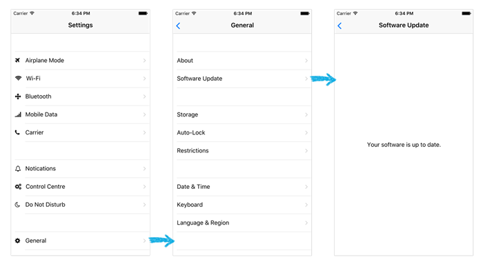
The first page (the root screen) displays a list of main setting groups. The individual detail pages with the settings for a setting group can be pushed by calling the push() method of the associated NavigationStack item.
As an example, to push the General page after selecting the according row you can call:
navigationStack.push(detailPage)
A third page in the stack and all other following can be pushed accordingly.
Note: If you plan to use the split view feature (which is enabled by default on tablets) you should use popAllExceptFirstAndPush() instead of
push() for the first level page pushes within your navigation stack:
navigationStack.popAllExceptFirstAndPush(detailPage)
Note: This only applies to the first pages right after the initial page, for all other pushes you still use push().
You can also set additional properties for a newly pushed page, like in the following example for which an additional boolean property of the pushed detail page is set:
navigationStack.push(detailPage, { showAdvancedSettings: true })
Note: As seen in the previous two examples every AppPage item has a convenience property called navigationStack which is set to
the parent NavigationStack item, if contained in any.
To navigate back to a previous page you can either use the provided back button in the NavigationBar. This back button is provided for all pages pushed to the stack except the root page.
As an alternative (e.g. when you decided to hide the navigation bar on a specific page) you can also implement your own interaction element and call pop() on the
NavigationStack item.
Split View on Tablets
The NavigationStack component supports a tablet optimized visualization that automatically uses a two pane layout on devices with a diameter of more than 5 inches. The previous settings example looks like the following on a
tablet:
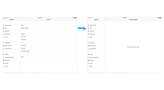
When splitView is enabled, the first page of your NavigationStack is shown in the left pane of the split layout, regardless of the currently pushed pages.
For more details on how to enable and disable the split view feature have a look at splitView.
How do I navigate between pages?
You can rely on the Navigation Components to switch between different Pages in your app:
Apart from the app Navigation, which provides the main menu for your app, the NavigationStack is the main component for navigating back and forth
between different pages.
For passing data between pages, the easiest solution is to make relevant settings or properties available in a common parent scope. Public properties, functions, and signals of an ancestor in the QML tree are available for
direct access:
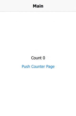
import Felgo
import QtQuick
App {
id: app
property int count: 0
NavigationStack {
AppPage {
id: mainPage
title: "Main"
Column {
anchors.centerIn: parent
AppText {
anchors.horizontalCenter: parent.horizontalCenter
text: "Count " + app.count
}
AppButton {
text: "Push Counter Page"
onClicked: mainPage.navigationStack.push(counterPageComponent)
}
}
}
}
Component {
id: counterPageComponent
AppPage {
title: "Change Count"
property AppPage target: null
Column {
anchors.centerIn: parent
AppButton {
text: "Count ++"
onClicked: {
app.count++
}
}
AppButton {
text: "Count --"
onClicked: {
app.count--
}
}
}
}
}
}
More Frequently Asked Development Questions
Find more examples for frequently asked development questions and important concepts in the following guides:
Property Documentation
The currently shown page on top of the navigation stack.
See also currentTitle.
The title of the currently displayed page on top of the stack.
See also currentPage.
Use this readonly property to get the number of items currently pushed onto the stack. This property is if there is only the initial page on the stack.
The first AppPage that is shown initially. Must be a QML item derived from AppPage.
If no initial page is set, the first Page item that is a child of the NavigationStack will be used as the initial page.
The following two definitions have the same effect:
NavigationStack {
AppPage { title: "initial page" }
}
NavigationStack {
initialPage: AppPage { title: "initial page" }
}
Use this readonly property to get a reference to the internal NavigationBar item for the left column when using splitView
mode.
This property was introduced in Felgo 2.6.2.
Usually the initial AppPage item within a NavigationStack is used as the left pane content when using the splitView layout.
There might be cases where you want to pin another page as the left content item. For that you can set this property to another index value of your page stack.
Note: This is an advanced setting, in most cases the default value of 0 is sufficient.
The currently displayed page in the left column if using the splitView layout.
Set this property to control the width of the left split view column when using the splitView layout.
By default this property is set to 300 dp or using at least one third of the width when below.
Use this readonly property to get a reference to the internal NavigationBar item used by this navigation stack.
|
navigationBarShadow : bool
|
Whether a drop shadow is shown below the NavigationBar of the navigation stack. The height of the shadow is customizable with the Theme.navigationBar.shadowHeight setting. By default, the shadow is automatically hidden if the currentPage contains a TabControl or AppTabBar, as they usually extend the top navigation and then
add their own shadow.
This property was introduced in Felgo 2.10.0.
Set this property to explicitly use or disable the split view feature of NavigationStack. In split view mode the
NavigationStack uses a two column layout.
By default the split view feature is deactivated. To use the split view only on devices with a diameter of equally or greater than 5 inches, simply set:
NavigationStack {
splitView: tablet
}
You can also enable it for all devices by setting the property to true or disable it with false. It's also possible to use more advanced settings like in the
following example:
NavigationStack {
splitView: tablet && landscape
}
See also splitViewActive and leftColumnWidth.
You can use this readonly property to determine if the pages are currently shown with a split view layout.
Use this property to configure the used stack transition when pushing or popping pages. By default, the NavigationStack uses transitionDelegateiOS on iOS and transitionDelegateAndroid on Android.
You can also specify a custom transition using StackViewDelegate:
import Felgo
import QtQuick
import QtQuick.Controls
App {
NavigationStack {
initialPage: pageComponent
transitionDelegate: StackViewDelegate {
id: delegate
property int duration: 300
pushEnter: Transition {
NumberAnimation {
property: "opacity"
from: 0
to: 1
duration: delegate.duration
}
}
pushExit: Transition {
NumberAnimation {
property: "xOffset"
from: 0
to: -delegate.exitItem.width
duration: delegate.duration
}
}
popEnter: Transition {
NumberAnimation {
property: "xOffset"
from: -delegate.exitItem.width
to: 0
duration: delegate.duration
}
}
popExit: Transition {
NumberAnimation {
property: "opacity"
from: 1
to: 0
duration: delegate.duration
}
}
}
}
Component {
id: pageComponent
AppPage {
id: page
title: "Page 1"
Rectangle {
anchors.centerIn: parent
color: Qt.rgba(Math.random(255), Math.random(255), Math.random(255))
width: parent.width / 2
height: parent.height / 2
}
AppButton {
anchors.horizontalCenter: parent.horizontalCenter
text: "Push"
onClicked: {
var properties = { title: "Page " + (page.navigationStack.depth + 1) }
page.navigationStack.push(pageComponent, properties)
}
}
}
}
}
This property was introduced in Felgo 2.18.3.
See also transitionDelegateiOS and transitionDelegateAndroid.
True, if a push or pop transition animation is currently running.
Signal Documentation
Emitted after a AppPage has been popped from the stack.
Note: The corresponding handler is onPopped.
Emitted after a AppPage has been pushed from the stack.
Note: The corresponding handler is onPushed.
Emitted after the push or pop transition animation have finished.
Note: The corresponding handler is onTransitionFinished.
Method Documentation
|
clearAndPush(source, options)
|
Clear the whole stack and show a new page.
Useful if a new top-level navigation is selected.
Return the AppPage at the specified index of the stack. The index must be between 0 and depth - 1.
dontLoad is an optional argument, passed to StackView::get.
Pop all pages except the first. Useful to remove all pages on the right side of a multi-column splitView layout.
Note: The page that at the position of the leftColumnIndex is considered the first page. Usually this is the page with index 0.
|
popAllExceptFirstAndPush(source, options)
|
Clears all pages except the first, then pushes a new one.
Note: The page that at the position of the leftColumnIndex is considered the first page. Usually this is the page with index 0.
Internally this function calls popAllExceptFirst() and then push(). This is useful if a navigation
happens from the left column of a multi-column layout, as it pushes a page as top-level item in the right column.
|
void push(var source, var options)
|
Push a AppPage onto the NavigationStack.
source can be either an URL to a QML file, a Component or a AppPage object. Note that
it is not advised to push objects that do not have a AppPage as base item.
options is any JS object used as properties for the created object, if source is an url or a Component.