
Use Felgo 3 to create cross-platform apps and games powered by Qt 5.15. You can find the installer for Felgo 3 in the archive section of the download page.
Note: Felgo 4 is already available and the recommended version for app development with all the latest feature of Qt 6. Future updates to Felgo will focus on Felgo 4. However, important features and fixes will also be made available for Felgo 3 to maintain support for Qt 5 and existing projects.
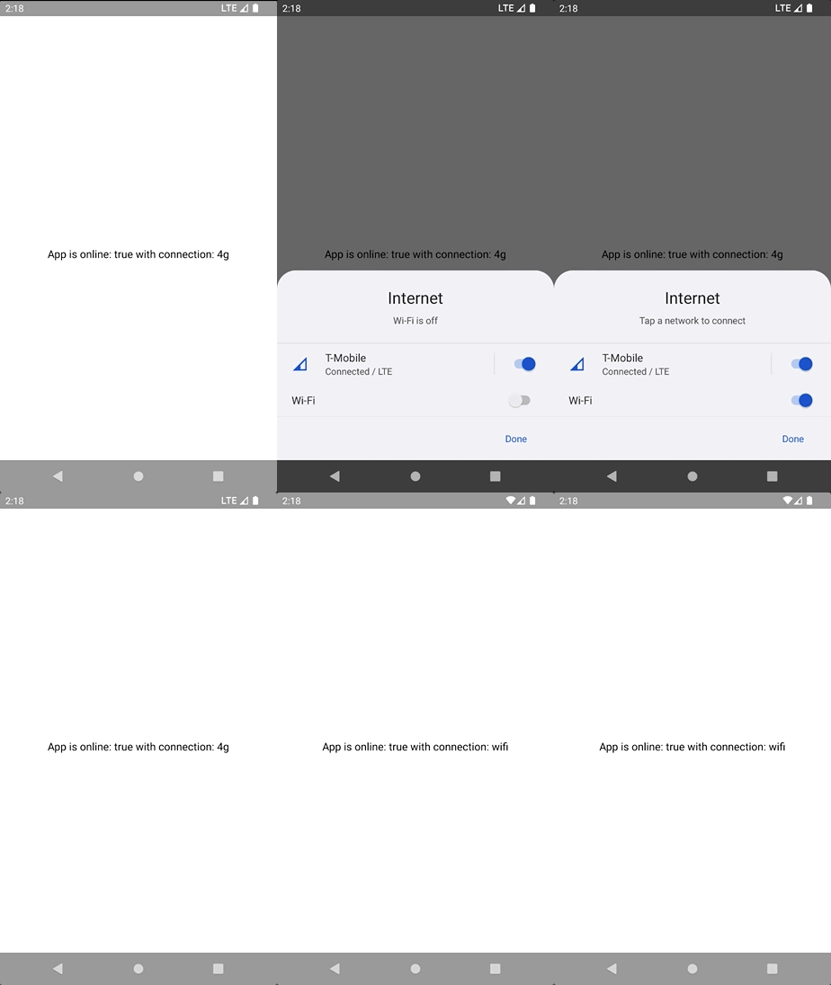
Highlights Blog Post: Release 3.11.0: Speech-to-Text, PDF Preview Images, Network Service Discovery and Felgo Live Server Search
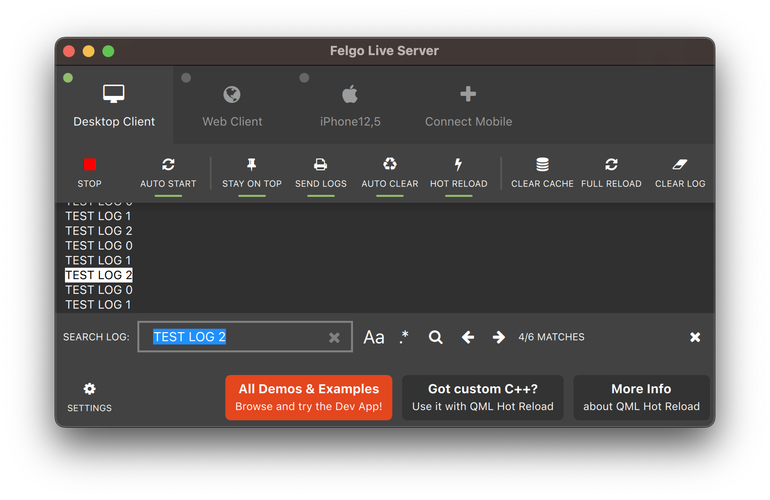
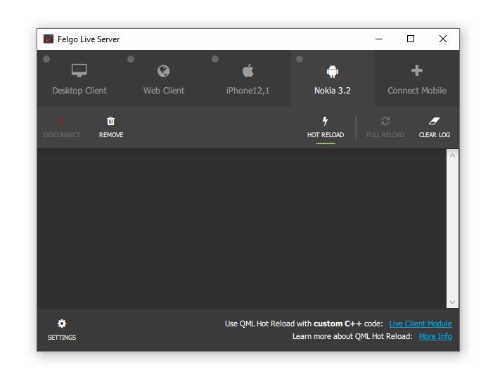
Felgo 3.11.0 adds Speech-to-Text capabilities, an image provider to preview PDFs, network service discovery with ZeroConf and the ability to search the Felgo Hot Reload log output.
Felgo 3.11.0 comes as a free update for all Felgo developers.
CTRL-F to open the
search panel.
PendingIntent flags. No code changes are
required for existing projects using the plugin.
android.permission.POST_NOTIFICATIONS is required. The plugin now automatically requests the permission from the user. The property OneSignal::inAppAlertNotification is now deprecated and has no effect any longer.
Note: The AdMobBanner::adLeftApplication() signal is no longer supported. The plugin will never call this handler. You can use AdMobBanner::adOpened() and AdMobBanner::adClosed() for ad flow handling instead. The AdMobBanner::designedForFamilies, AdMobInterstitial::designedForFamilies and AdMobRewardedVideo::designedForFamilies properties are now also deprecated and unused.
Highlights Blog Post: Release 3.10.0: Native Support for NFC Tags, Network Connection Type & Inline AdMob Banners, Qt Creator 7.0.2
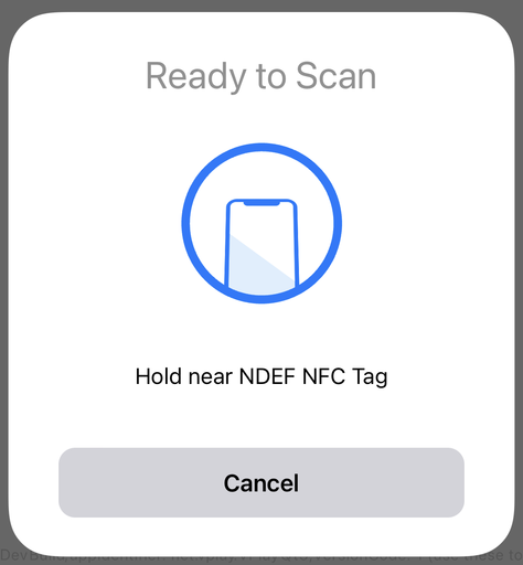
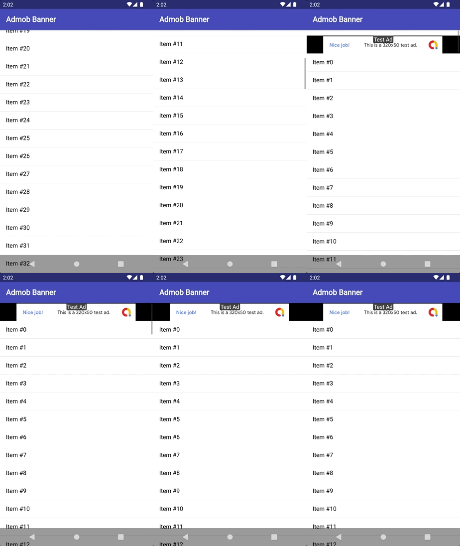
Felgo 3.10.0 adds new native features to read NFC messages in NDEF format, access the network connectivity type on iOS & Android or display a native file picker. It also includes a new AdMob type to show banner ads inline with other QML elements.
Felgo 3.10.0 comes as a free update for all Felgo developers.
Starting August 2022, API level 31 or above is required to publish applications on the Google Play Store. Make sure to update your Android build configuration to use the latest recommended settings and get support for Android 12 (API level 31). To do so, open the Qt Creator Android device settings and install all the suggested packages:
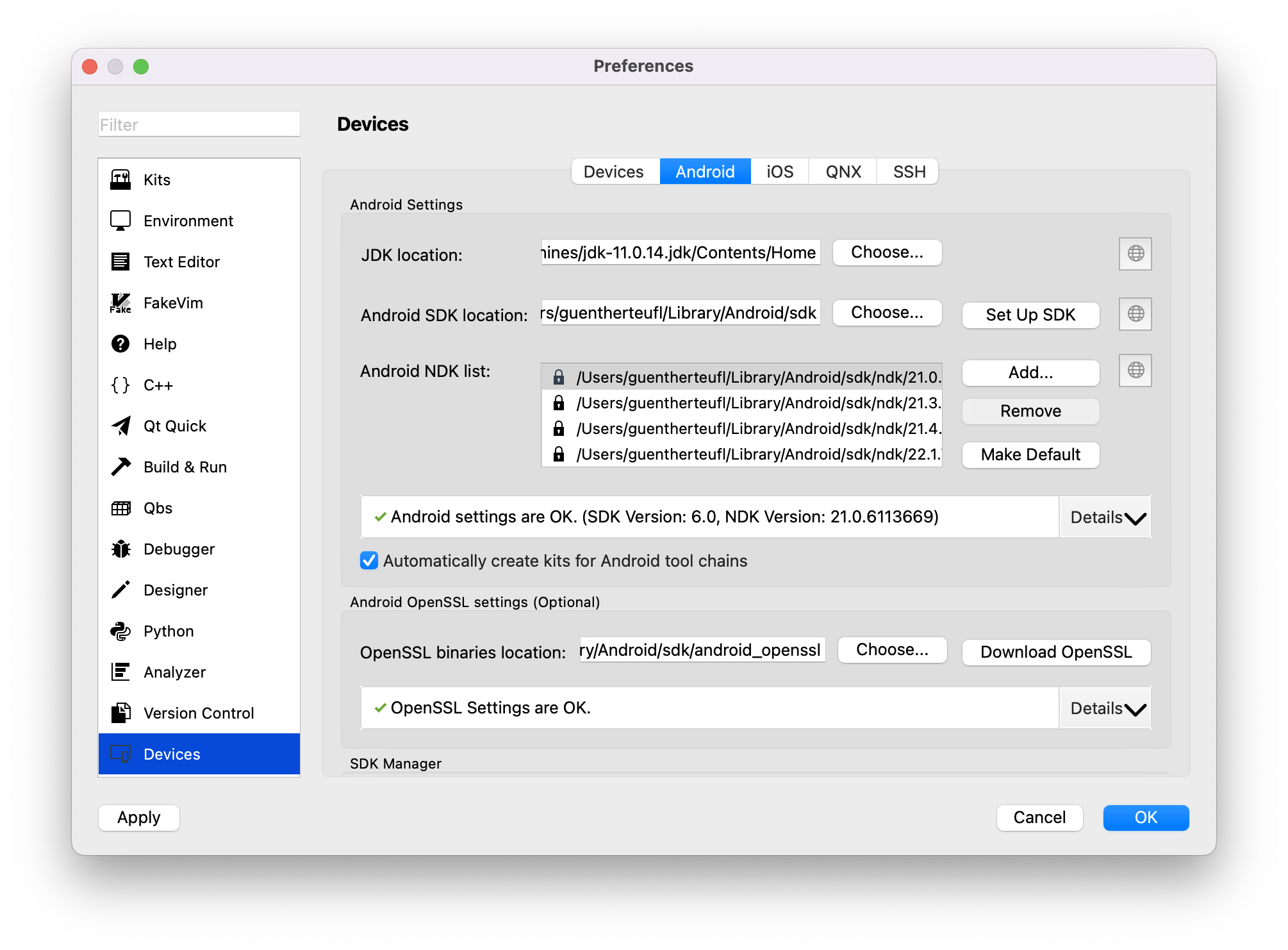
Qt Creator will ask you to add the necessary components and automatically download the required packages upon your approval. You can also manually install the packages with the Android SDK Manager. To support Android 12, install the Android SDK Platform 31, as well as Android build tools version 31.0.0. When you build a project, it will automatically default to the highest installed Android SDK and build tools version.
android/build.gradle configuration, update to Android Gradle plugin 7.2.0 or higher:
 buildscript {
     dependencies {
         // UPDATE THIS:
         classpath 'com.android.tools.build:gradle:7.2.0'
     }
 }
android/AndroidManifest.xml configuration:
<activity ... android:exported="true">

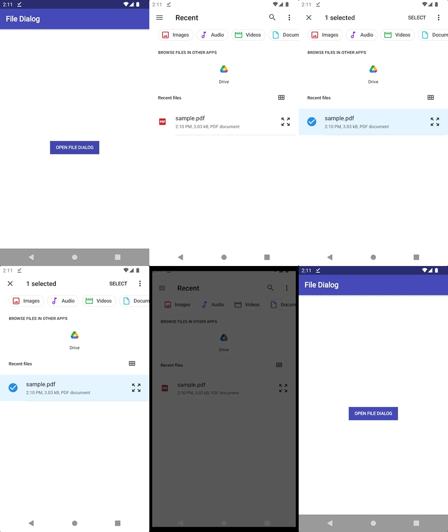
 import Felgo
 import QtQuick

 App {
   NavigationStack {
     Page {
       title: qsTr("File Dialog")

       AppButton {
         text: "Open File Dialog"
         onClicked: NativeUtils.displayFilePicker()
         anchors.centerIn: parent
       }

       Connections {
         target: NativeUtils
         onFilePickerFinished: {
           if(!accepted)
             console.log("File Dialog Canceled")
           else {
             console.log(files)
           }
         }
       }
     }
   }
 }
In addition, the improved control initializes faster and emits the selected(character, itemIndex) signal when the user chooses a section. For advanced use-cases, you can also deactivate the autoUpdate property and use the update() method to synchronize the control with the model of the target view on-demand.
8.4.3.
13.3.0.
Highlights Blog Post: Release 3.10.0: Native Support for NFC Tags, Network Connection Type & Inline AdMob Banners, Qt Creator 7.0.2
Felgo 3.10.0 adds new native features to read NFC messages in NDEF format, access the network connectivity type on iOS & Android or display a native file picker. It also includes a new AdMob type to show banner ads inline with other QML elements.
Felgo 3.10.0 comes as a free update for all Felgo developers.
Starting August 2022, API level 31 or above is required to publish applications on the Google Play Store. Make sure to update your Android build configuration to use the latest recommended settings and get support for Android 12 (API level 31). To do so, open the Qt Creator Android device settings and install all the suggested packages:

Qt Creator will ask you to add the necessary components and automatically download the required packages upon your approval. You can also manually install the packages with the Android SDK Manager. To support Android 12, install the Android SDK Platform 31, as well as Android build tools version 31.0.0. When you build a project, it will automatically default to the highest installed Android SDK and build tools version.
android/build.gradle configuration, update to Android Gradle plugin 7.2.0 or higher:
 buildscript {
     dependencies {
         // UPDATE THIS:
         classpath 'com.android.tools.build:gradle:7.2.0'
     }
 }
android/AndroidManifest.xml configuration:
<activity ... android:exported="true">


 import Felgo
 import QtQuick

 App {
   NavigationStack {
     Page {
       title: qsTr("File Dialog")

       AppButton {
         text: "Open File Dialog"
         onClicked: NativeUtils.displayFilePicker()
         anchors.centerIn: parent
       }

       Connections {
         target: NativeUtils
         onFilePickerFinished: {
           if(!accepted)
             console.log("File Dialog Canceled")
           else {
             console.log(files)
           }
         }
       }
     }
   }
 }
In addition, the improved control initializes faster and emits the selected(character, itemIndex) signal when the user chooses a section. For advanced use-cases, you can also deactivate the autoUpdate property and use the update() method to synchronize the control with the model of the target view on-demand.
8.4.3.
13.3.0.
Highlights Blog Post: Release 3.9.2: WhatsApp Messenger Demo, Clear the Live Reload Cache and Control the App Navigation Flow
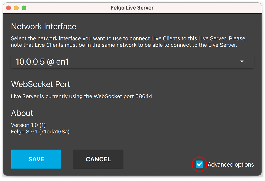
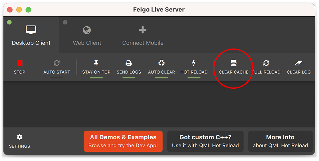
Felgo 3.9.2 includes a messenger demo similar to WhatsApp, adds a new way to clear the Felgo Live project cache, and gives more control over the app navigation flow.
Felgo 3.9.2 comes as a free update for all Felgo developers.
|
|
|
The following example does not block the image selection when the maximum number is reached and instead deselects the first photo to make space for the new one:
 import Felgo
 import QtQuick

 App {
   NavigationStack {
     Page {
       id: page
       title: qsTr("Choose Photos")

       ImagePicker {
         anchors.fill: parent
         maximumNumberOfSelection: 2
         autoSelectClickedPhotos: false
         onPhotoClicked: {
           // clicking a selected photo deselects it
           if(selectionIndices.indexOf(photoIndex) > -1) {
             deselect(photoIndex)
           }
           else {
             // if the maximum selection count is reached, deselect the first photo
             if(selectedCount == maximumNumberOfSelection) {
               let firstPhotoIdx = selectionIndices[0]
               deselect(firstPhotoIdx)
             }

             // select the clicked photo
             select(photoIndex)
           }
         }
       }
     }
   }
 }
event.accepted to false.
 onWillPop: {
   event.accepted = false
 }
Similarly, the NavigationItem::willChange signal triggers whenever the current NavigationItem is about to be changed.
Set event.accepted to false to stop the change from being executed.
 onWillChange: {
   event.accepted = false
 }
Also, the AppModal::willClose signals when the modal is about to close. Set event.accepted to false to stop the
close from being executed.
 onWillClose: {
   event.accepted = false
 }
These signals can be useful to e.g. show a confirmation dialog to check if the user really wants to leave the current page or menu item.
android/build.gradle and update the version to 4.3.10. Also move the gradle plugin from the very bottom to the other plugins.
 buildscript {
     dependencies {
         // update version here:
         classpath 'com.google.gms:google-services:4.3.10'
     }
 }

 apply plugin: 'com.android.application'
 // move this from the very bottom to here:
 apply plugin: 'com.google.gms.google-services'
NativeUtils::displayImagePicker() now preserves the original image format instead of converting every image to JPEG on Android and iOS.
application/pdf content type as binary data.
false.
Qt::AA_EnableHighDpiScaling setting.
Highlights Blog Post: Release 3.9.1: Publish Qt Apps as Android App Bundle on Google Play and Configure Icon Sizes in the Felgo Theme
Felgo 3.9.1 adds support for Android App Bundle builds to publish apps on Google Play and improves the configuration of default icon sizes in the Felgo Theme.
Felgo 3.9.1 comes as a free update for all Felgo developers.
android/AndroidManifest.xml:
<uses-sdk android:minSdkVersion="xx" android:targetSdkVersion="yy"/>
android/build.gradle:
 android {
      defaultConfig {
       multiDexEnabled true
       targetSdkVersion   androidCompileSdkVersion.toInteger()
       applicationId    = productIdentifier
       versionCode      = productVersionCode.toInteger()
       versionName      = productVersionName
       // ADD THIS:
       minSdkVersion    = project.hasProperty("qtMinSdkVersion") ? qtMinSdkVersion.toInteger() : 21
     }
 }
jcenter repository with mavenCentral:
 buildscript {
     repositories {
         // REMOVE THIS:
         jcenter()
         // ADD THIS:
         mavenCentral()
     }

     dependencies {
         // UPDATE THIS:
        classpath 'com.android.tools.build:gradle:3.6.0'
     }
 }

 allprojects {
     repositories {
         // REMOVE THIS:
         jcenter()

         // ADD THIS:
         mavenCentral()
     }
 }
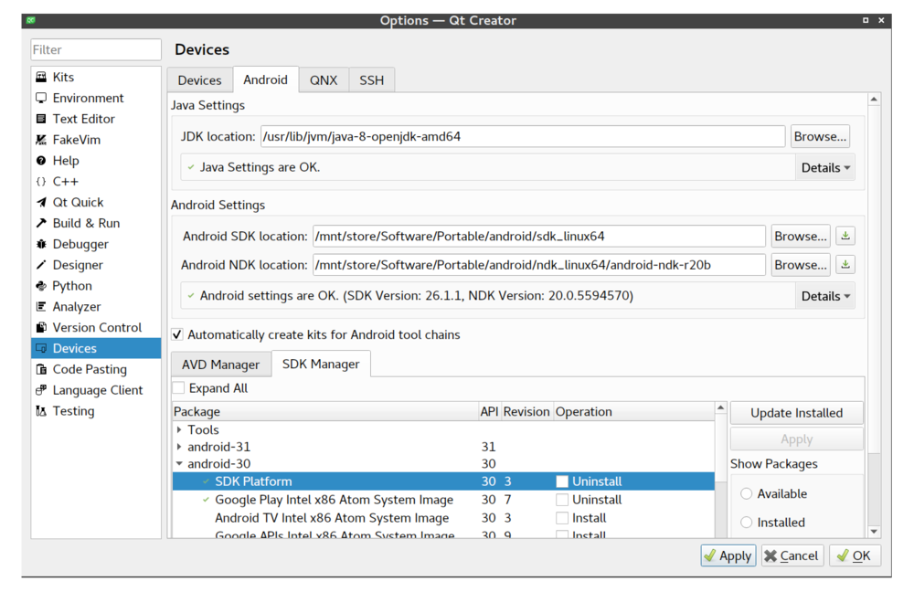
Open QtCreator -> Settings -> Devices -> Android. On the bottom you can find options to install AVD and SDK packages, select the SDK-Manager tab. Expand the section for android-30 (or higher) and install the
SDK Platform. When you build a project now, it will automatically default to the highest installed Android SDK Platform version.
You can now build Felgo projects as AAB (Adndroid App Bundle) for publishing on Google Play.
The App Bundle is a format for release distribution, you cannot install one directly on a device. In contrast, APKs are for use on devices. An AAB file is an archive that contains all necessary data to generate APKs for installation on devices. The distributor (i.e. Google Play, Amazon) uses the App Bundle to generate optimized APKs, which are then signed with your provided credentials. Similar to APKs, an App Bundle needs to be signed with a regular keystore before you upload it. The distributor will check the signature to verify the integrity of the uploaded file.
Starting with August 2021 all applications must be uploaded to Google Play as Android App Bundles. Publishing APKs directly is no longer supported. Furthermore, the minimum Android SDK Platform (targetSdkVersion) increased to API 30. The minimum supported Android version (minSdkVersion) for Qt projects did not change and stays at Android 5.0 (v21).
Visit the Google Play Developer Console and open the dashboard for an existing app (or setup a new app). Open the Internal Test section at the sidebar and start the preparation of a new release. You are asked to enable Google Play Signing and are given multiple options to choose from. Felgo recommends to use the Java KeyStore option with the PEPK-Tool. This way you can continue to use your existing Android keystore. Follow the steps on the website to finish setting up Google Play signing and release preparation.
Open your project and select the Android Multi Kit (Qt 5.15.2). Felgo recommends to keep the Debug build configuration "as is", so you can keep testing your apps on Android with a traditional installable APKs hassle-free.
To create a distributable Android App Bundle, switch to the Android kit Release build configuration in the bottom-left menu. Go to the Projects tab afterwards,
which allows to create AABs for release now. In the first section, enable at least the arm64-v8a ABI.
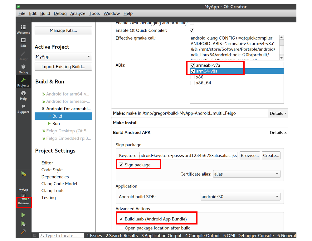
In the Build Android APK section, use the keystore containing the correct upload certificate (previously created up at Google Play Signing). Also check the Build .aab
(Android App Bundle) option and make sure the build SDK is android-30 or higher.
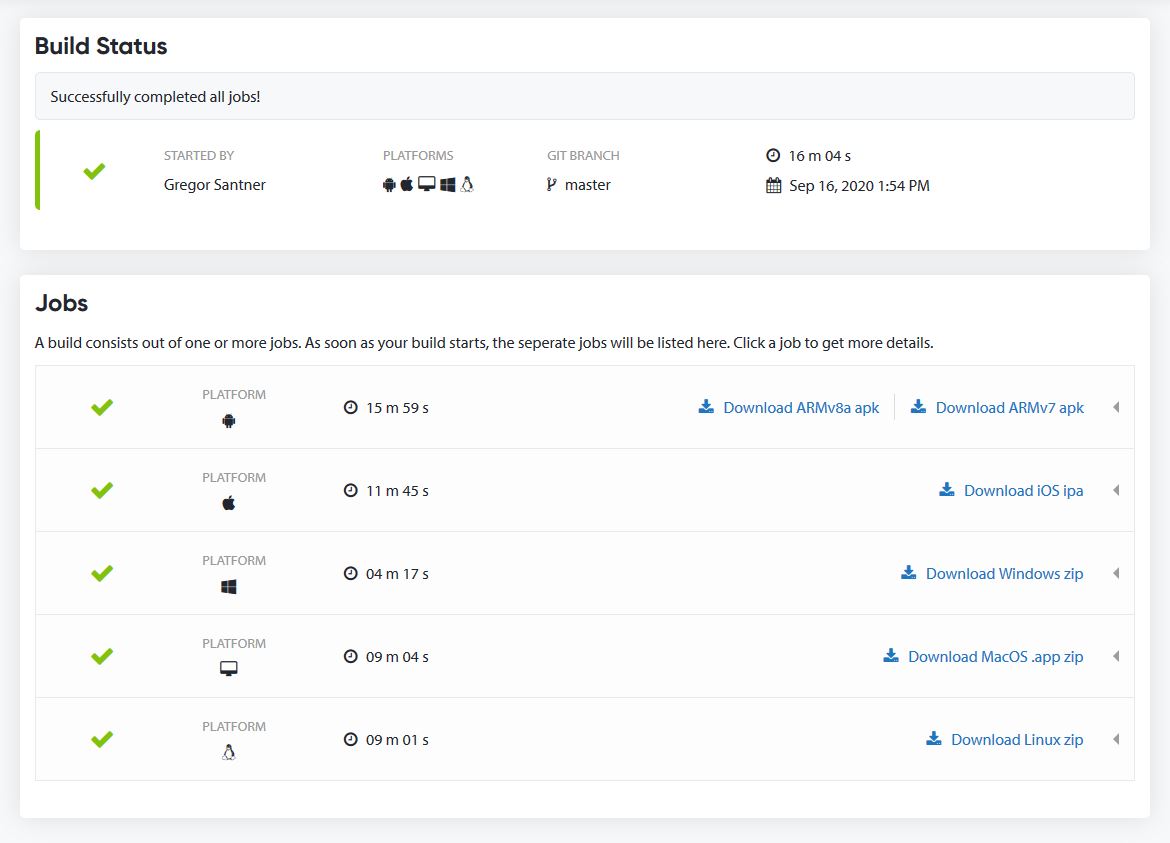
With Felgo 3.9.1, all Android application builds on Cloud Builds will also create App Bundles in addition to APKs. You can find the download buttons for all the build artifacts at the top-right corner of each successful Android build:

If you configured automatic store deployment, Cloud Builds only uploads the App Bundle to Google Play (instead of two APKs).
The new sorter implements a natural sort order based on the current locale setting. For strings that include accents (diacritics), it's also possible to treat accented characters as regular letters. To do so, activate the LocaleAwareSorter::ignoreDiacritics setting.
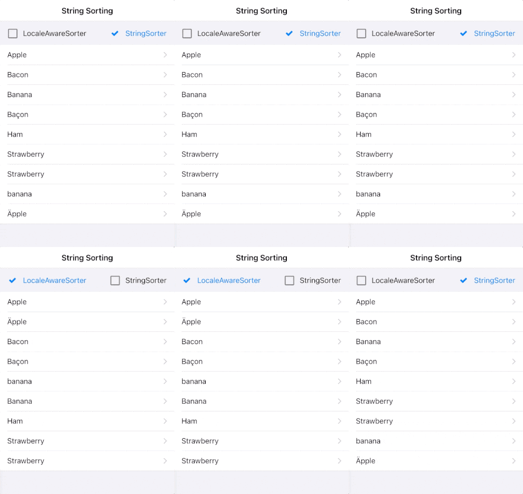
 import QtQuick
 import Felgo

 App {

   // list model for json data
   JsonListModel {
     id: jsonModel
     keyField: "id"
     source: [
       {id: 1, title: "Apple" },
       {id: 2, title: "Ham" },
       {id: 3, title: "Bacon" },
       {id: 4, title: "Banana" },
       {id: 5, title: "Strawberry" },
       {id: 1, title: "Äpple" },
       {id: 3, title: "Baçon" },
       {id: 4, title: "banana" },
       {id: 5, title: "Strawberry" }
     ]
   }

   SortFilterProxyModel {
     id: sortedModel
     sourceModel: jsonModel
     sorters: [
       LocaleAwareSorter {
         id: localeAwareSorter
         roleName: "title"
         ignoreDiacritics: true
       },
       StringSorter {
         id: stringSorter
         roleName: "title"
         enabled: false
       }
     ]
   }

   NavigationStack {
     Page {
       title: "String Sorting"

       AppListView {
         model: sortedModel
         delegate: AppListItem {
           text: model.title
         }
         header: Item {
           anchors.left: parent.left
           anchors.right: parent.right
           anchors.margins: dp(16)
           height: dp(50)

           AppCheckBox {
             text: "LocaleAwareSorter"
             anchors.verticalCenter: parent.verticalCenter
             checked: localeAwareSorter.enabled
             updateChecked: false
             onClicked: {
               localeAwareSorter.enabled = !localeAwareSorter.enabled
               if(localeAwareSorter.enabled)
                 stringSorter.enabled = false
             }
           }


           AppCheckBox {
             text: "StringSorter"
             anchors.right: parent.right
             anchors.verticalCenter: parent.verticalCenter
             checked: stringSorter.enabled
             updateChecked: false
             onClicked: {
               stringSorter.enabled = !stringSorter.enabled
               if(stringSorter.enabled)
                 localeAwareSorter.enabled = false
             }
           }
         }
       }
     }
   }
 }
StringSorter features like the numericMode and ignorePunctation are not yet implemented for the LocaleAwareSorter. In case you require these features for your project or have requests for other sorting options, please contact us.
![]()
null values as "null" string.
Highlights Blog Post: Release 3.9.0: WebAssembly Browser Communication and Improved UX with Overlays, Tooltips and Intros
Felgo 3.9.0 adds easy WebAssembly browser communication using JavaScript, new QML components for overlays and tool tips and many SDK improvements.
Felgo 3.9.0 comes as a free update for all Felgo developers.
For new Felgo projects, no changes are required.
If you created your project with a previous version of Felgo, update your android/build.gradle. Update the android gradle plugin and dependencies:
 buildscript {
     // ... repositories

     dependencies {
         // UPDATE VERSION:
         classpath 'com.android.tools.build:gradle:3.6.0'
     }
 }

 dependencies {
     implementation fileTree(dir: 'libs', include: ['*.jar'])

     // ADD THIS:
     implementation "androidx.appcompat:appcompat:1.2.0"

     // REMOVE THIS:
     // implementation "com.android.support:support-core-utils:28.0.0"
     // implementation "com.android.support:appcompat-v7:28.0.0"

     // ... more dependencies
 }
Also update the file provider class name in android/AndroidManifest.xml:
 <!-- UPDATE android:name HERE: -->
 <provider android:name="androidx.core.content.FileProvider"
     android:authorities="${applicationId}.fileprovider"
     android:exported="false" android:grantUriPermissions="true">
When using Felgo Plugins, make sure to use Java 1.8 in your Android build:
 android {
   ...
   compileOptions {
     sourceCompatibility JavaVersion.VERSION_1_8
     targetCompatibility JavaVersion.VERSION_1_8
   }
   ...
 }
 import Felgo
 import QtQuick

 App {

   webObjects: [
     QtObject {
       id: qmlDefinedObject
       property int count
       property string myString: "Hello!"

       function qmlMethod() {
         console.log("I was called from the browser!")
         return "You can return anything!"
       }
     }
   ]

   AppButton {
     anchors.centerIn: parent
     text: "Increment count"
     onClicked: {
       qmlDefinedObject.count++;
     }
   }
 }
On the browser side you can handle value changes via connections, read or write properties and call methods of your shared objects:
 function felgoInitWebTransport() {
   ...

   new QWebChannel(wasmTransport, function(channel) {
     webObject = channel.objects.webObject;

     let qmlDefinedObject = shareObjects.qmlDefinedObject;

     qmlDefinedObject.countChanged.connect() {
       console.log("Count updated!", qmlDefinedObject.count)
     }

     qmlDefinedObject.myString = "Hi! I was updated from the browser";

     qmlDefinedObject.qmlMethod( result => {
       console.log("qmlMethod returned", result)
     });

   })

   ...
 }
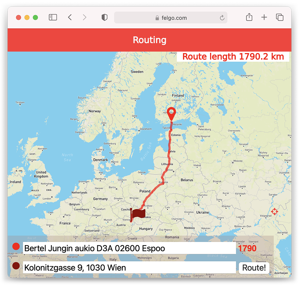
See the WebAssembly routing example for a demo application that uses this technology to control a QML MapView with browser input.
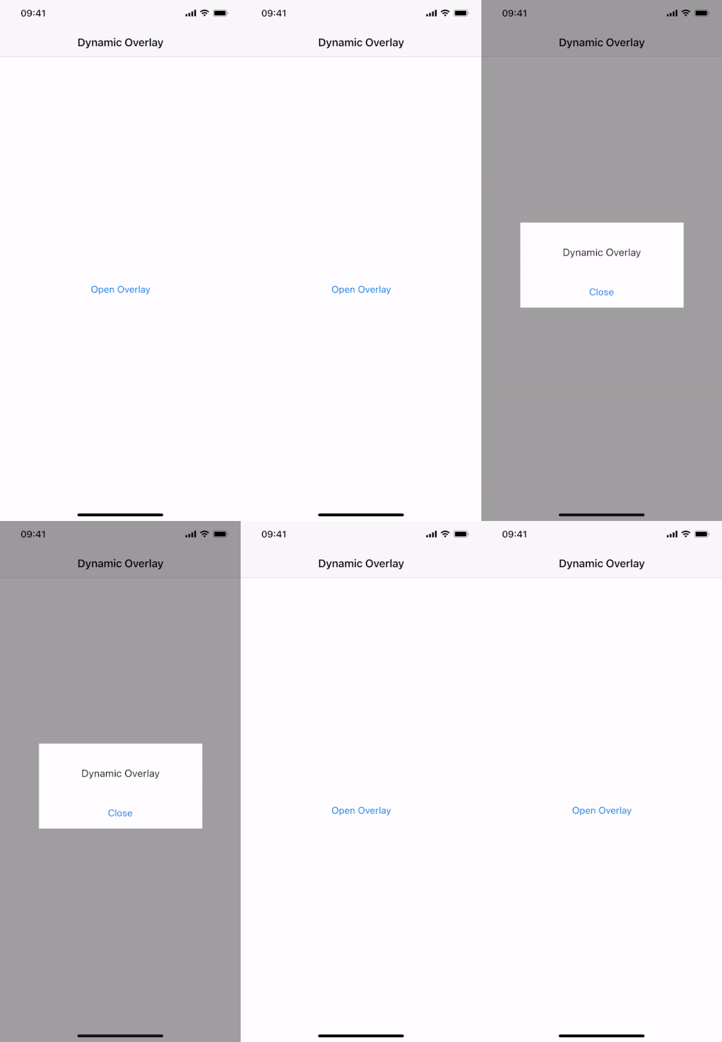
 import Felgo
 import QtQuick

 App {
   NavigationStack {
     Page {
       title: "Dynamic Overlay"

       AppButton {
         text: "Open Overlay"
         anchors.centerIn: parent
         onClicked: myOverlay.open()
       }

       AppOverlay {
         id: myOverlay
         sourceItem: overlayComponent
         onOpening: item.closeClicked.connect(myOverlay.close)
       }

       Component {
         id: overlayComponent
         Rectangle {
           id: item
           anchors.centerIn: parent
           color: Theme.backgroundColor
           width: dp(250)
           height: dp(130)

           signal closeClicked

           AppText {
             text: "Dynamic Overlay"
             y: dp(36)
             anchors.horizontalCenter: parent.horizontalCenter
           }

           AppButton {
             text: "Close"
             anchors.horizontalCenter: parent.horizontalCenter
             anchors.bottom: parent.bottom
             flat: true
             onClicked: item.closeClicked()
           }
         }
       }
     }
   }
 }
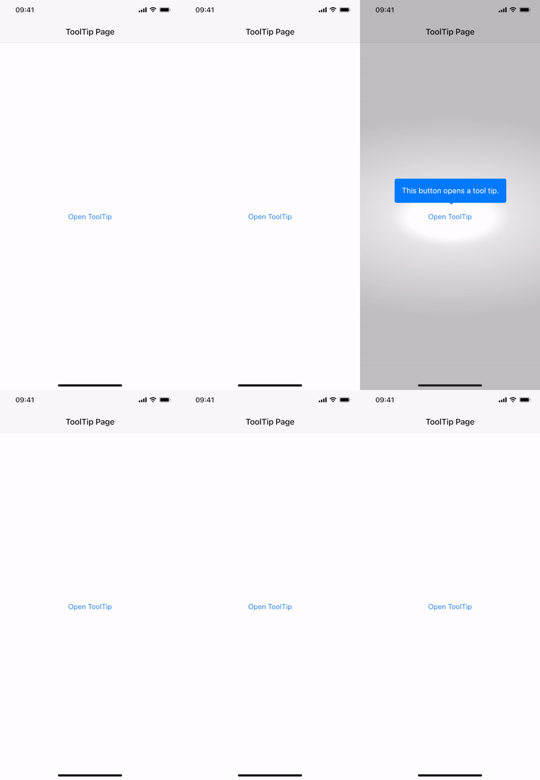
 import Felgo
 import QtQuick

 App {
   NavigationStack {
     Page {
       title: "ToolTip Page"

       AppButton {
         id: myButton
         text: "Open ToolTip"
         anchors.centerIn: parent
         onClicked: myToolTip.open()
       }

       AppToolTip {
         id: myToolTip
         target: myButton
         text: "This button opens a tool tip."
       }
     }
   }
 }
With the latest addition to the Felgo app demos, you can learn how to build an application that shows the latest breaking news:
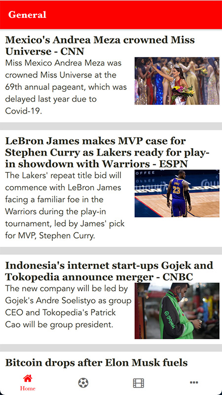
The full source code of the demo is available on GitHub. You can also find the new demo in the latest version of the Felgo Developer App.
 import Felgo
 import QtQuick

 App {
   // data model
   ListModel {
     id: fruitModel

     ListElement {
       name: "Orange"
       cost: 3.25
     }
     ListElement {
       name: "Banana"
       cost: 1.95
     }
     ListElement {
       name: "Apple"
       cost: 3.75
     }
     ListElement {
       name: "Banana"
       cost: 2.35
     }
     ListElement {
       name: "Orange"
       cost: 1.25
     }
     ListElement {
       name: "Apple"
       cost: 2.45
     }
   }

   // sorted model for list view
   SortFilterProxyModel {
     id: sortedFruitModel

     // perform sort in the background, only sorts once when changing many sorters
     delayed: true

     sourceModel: fruitModel
     sorters: [
       StringSorter {
         id: nameSorter
         roleName: "name"
       },
       StringSorter {
         id: costSorter
         roleName: "cost"
       }
     ]
   }

   // list page
   NavigationStack {
     ListPage {
       id: listPage
       title: "SortFilterProxyModel"
       model: sortedFruitModel
       delegate: SimpleRow {
         text: name
         detailText: "cost: "+cost
         style.showDisclosure: false
       }

       // add checkbox to activate sorter as list header
       listView.header: AppCheckBox {
         text: "Sort by name and cost"
         checked: nameSorter.enabled
         updateChecked: false
         onClicked: {
           nameSorter.enabled = !nameSorter.enabled
           costSorter.enabled = nameSorter.enabled
         }
         height: dp(48)
         anchors.horizontalCenter: parent.horizontalCenter
       }
     } // ListPage
   } // NavigationStack
 } // App

Use the sortFinished() signal in case you want to run code after the sorting has completed. In addition to the asynchronous sorting, you can also take advantage of new sorter and proxy role types: FilterSorter, FilterRole, RegExpRole and SingleRole.
The following example uses a TableModel and TableView together with SortFilterProxyModel:
 import QtQuick
 import Felgo
 import Qt.labs.qmlmodels // for TableModel

 App {
   NavigationStack {
     Page {
       title: "Table Model Sorting"
       TableModel {
         id: myTableModel
         TableModelColumn { display: "checked" }
         TableModelColumn { display: "amount" }
         TableModelColumn { display: "fruitType" }
         TableModelColumn { display: "fruitName" }
         TableModelColumn { display: "fruitPrice" }

         // Each row is one type of fruit that can be ordered
         rows: [
           {
             checked: true,
             amount: 4,
             fruitType: "Orange",
             fruitName: "Navel",
             fruitPrice: 2.50
           },
           {
             checked: false,
             amount: 1,
             fruitType: "Banana",
             fruitName: "Cavendish",
             fruitPrice: 3.50
           },
           {
             // Each property is one cell/column.
             checked: false,
             amount: 1,
             fruitType: "Apple",
             fruitName: "Granny Smith",
             fruitPrice: 1.50
           }
         ]
       }

       SortFilterProxyModel {
         id: sortedModel
         sourceModel: myTableModel
         columnRoleNames: ["checked", "amount", "fruitType", "fruitName", "fruitPrice"]
         sorters: [
           RoleSorter {
             id: priceSorter
             roleName: "fruitPrice"
           }
         ]
       }

       AppCheckBox {
         id: sortSetting
         text: "Sort by Price"
         anchors.horizontalCenter: parent.horizontalCenter
         checked: priceSorter.enabled
         updateChecked: false
         onClicked: priceSorter.enabled = !priceSorter.enabled
         y: dp(24)
       }

       TableView {
         anchors {
           top: sortSetting.bottom
           bottom: parent.bottom
           left: parent.left
           right: parent.right
           topMargin: dp(24)
         }
         columnSpacing: dp(12)
         rowSpacing: dp(12)

         model: sortedModel
         delegate: AppText {
           text: model.display
           padding: dp(6)
         }
       }
     }
   }
 }
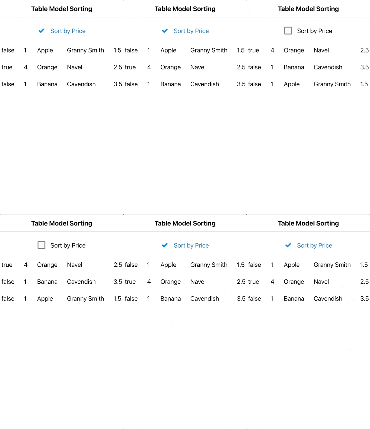
In addition to the TableModel support and better sorting performance, the new customSortOrder property may be used to sort models with a custom list of sort positions.
Note: Similar to iOS, the bottom safe area is not automatically kept blank by the Page component. To handle this in your custom layouts you can use the AppPage::safeArea item for anchoring, or the NativeUtils::safeAreaInsets to add additional spacing in your UI if required. Those insets will be 0 on devices that are not affected, so this will work correct on any device.
 import QtQuick
 import Felgo

 App {
   Navigation {
     navigationMode: navigationModeDrawer

     NavigationItem {
       title: "Page"
       icon: IconType.square

       NavigationStack {
         Page {
           title: "Page"

           Rectangle {
             // Use safeArea item of Page for anchoring custom layouts
             anchors.fill: parent.safeArea
             color: "#f04e26"
           }
           AppButton {
             text: "Bottom Button"
             anchors.horizontalCenter: parent.horizontalCenter
             // Anchor an item to the bottom safe area
             anchors.bottom: parent.safeArea.bottom
           }
         }
       }
     }
     NavigationItem {
       title: "Custom Bottom Bar"
       icon: IconType.minus

       NavigationStack {
         Page {
           title: "Page"

           // This would be your custom bottom bar
           Rectangle {
             color: Theme.colors.tintColor
             width: parent.width
             // Use your content height and add the bottom safe area
             height: dp(50) + NativeUtils.safeAreaInsets.bottom
             // Anchor the whole bar to the very bottom
             anchors.bottom: parent.bottom
           }
         }
       }
     }
     NavigationItem {
       title: "List / Flickable"
       icon: IconType.list

       NavigationStack {
         Page {
           title: "List / Flickable"

           AppListView {
             width: parent.width
             // This is now applied by default already
             bottomMargin: NativeUtils.safeAreaInsets.bottom

             model: 30
             delegate: AppListItem {
               text: "Item " + index
             }
           }
         }
       }
     }
   }
 }
IDFA for tracking purposes. Use the new properties AdMobBanner::requestAdTrackingAuthorization, AdMobInterstitial::requestAdTrackingAuthorization and AdMobRewardedVideo::requestAdTrackingAuthorization to enable the feature.
![]()
Note: To support the ad tracking authorization, adapt your ios/Project-Info.plist. Add the NSUserTrackingUsageDescription key with a description of usage.
Example:
 <key>NSUserTrackingUsageDescription</key>
 <string>This identifier will be used to deliver personalized ads to you.</string>
Note: The usage of the AppTrackingTransparency framework requires Xcode 12 or later for building iOS apps. This update is required for new apps starting with iOS 14.5.
Note: This mandatory update requires you to add your AdMob app ID to your android/AndroidManifest.xml. You can find your AdMob app id in the AdMob app console. Add this code to your manifest:
 <!-- Sample AdMob app ID: ca-app-pub-3940256099942544~3347511713 -->
 <meta-data
     android:name="com.google.android.gms.ads.APPLICATION_ID"
     android:value="ca-app-pub-xxxxxxxxxxxxxxxx~yyyyyyyyyy"/>
For testing, you can use the sample ID as shown above. For publishing your app, use your use your actual AdMob app ID. You can find more information in the official AdMob documentation.
Note: For existing Felgo projects, please update your iOS AdMob frameworks as described in the iOS integration guide.
Note: For existing Felgo projects, please update your iOS Firebase frameworks as described in the iOS integration guide.
assetPath entry will contain a content:// URI instead of a file:// URI starting from Android 10. You can use this URI anywhere a file URI is expected in QML. Read more about the changes in the Android docs.
Note: This is only supported when building with Qt 5.15+. In case you use a lower Qt version, the paths will still use legacy external storage. On Android 10, you can add <application
android:requestLegacyExternalStorage="true" ...> to your AndroidManifest.xml to support this. It will no longer work on Android 11+.
NativeUtils.AdjustPan and NativeUtils.AdjustNothing.
It supports the latest iOS 14.5+ changes regarding App Tracking Transparency when using Amplitude::useAdvertisingIdForDeviceId. See the property's documentation for more information how to support IDFA.
AdMobNative item is no longer supported and has been removed. This is because AdMob stopped supporting Native Express ads. Use the other AdMob Plugin
components instead: AdMobBanner, AdMobInterstitial, AdMobRewardedVideo.
statusBarStyleBlack will now properly show
it black even if dark mode is enabled.
Highlights Blog Post: Release 3.8.0: Call Native APIs from QML with JavaScript, Build for the Raspberry Pi and Update to Qt 5.15.2
Felgo 3.8.0 adds Native Code Components for integrating iOS and Android views or working with native APIs directly from QML. You also get a ready-made Felgo Build Kit to build Qt and Felgo apps for the Raspberry Pi. The update to Qt 5.15.2 brings you all features and improvements of Qt 5.15.
Felgo 3.8.0 comes as a free update for all Felgo developers.
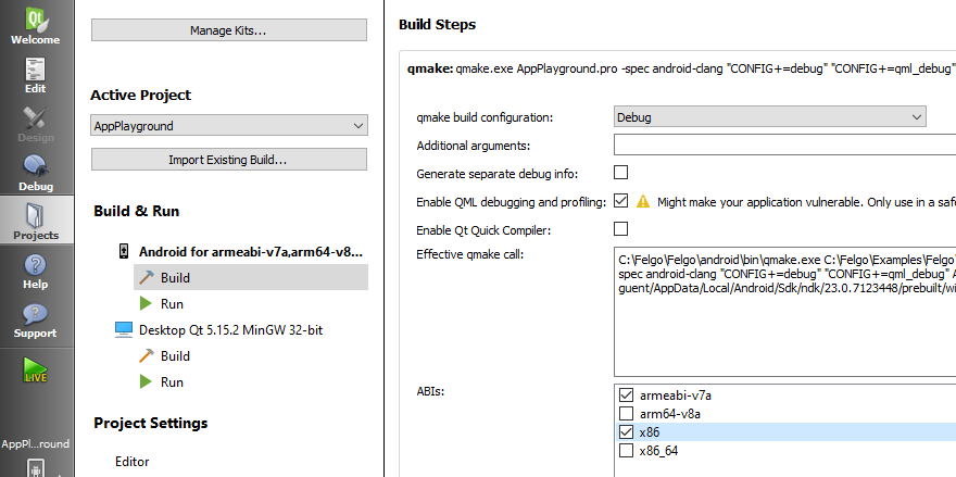
The 3.7.0 Build Kits for Android initially stay in place and can be safely removed after the update with the Add or remove components option of the MaintenanceTool.
You no longer need to provide custom wrapper types in C++ to bridge between QML and native Java or Objective-C code. Access native platform features from JavaScript by calling the desired APIs with the NativeObject item.
You can get references to native classes and objects in QML, and directly call methods to perform native operations or retrieve data. This makes it easy to trigger platform APIs, access device settings or request permissions from the system. This example retrieves the battery level from the system and displays it in QML:
 import Felgo
 import QtQuick

 App {
  AppButton {
    anchors.centerIn: parent
    text: qsTr("Check Battery")
    onClicked: {
      var batteryPercent = Math.round(getBatteryLevel() * 100)
      text = "Battery: "+ batteryPercent + "%"
    }
  }

  // returns battery level between 0 and 1 on mobile platforms
  function getBatteryLevel() {
    // call platform-dependent implementation:
    if(Qt.platform.os === "android") {
      return getAndroidBatteryLevel()
    }
    else if(Qt.platform.os === "ios") {
      return getIosBatteryLevel()
    }
    else {
      return 0
    }
  }

  function getAndroidBatteryLevel() {
    var Intent = NativeObjectUtils.getClass("android/content/Intent")
    var IntentFilter = NativeObjectUtils.getClass("android/content/IntentFilter")
    var BatteryManager = NativeObjectUtils.getClass("android/os/BatteryManager")

    var context = NativeObjectUtils.getContext()
    var filter = IntentFilter.newInstance(Intent.getStaticProperty("ACTION_BATTERY_CHANGED"))
    var batteryStatus = context.callMethod("registerReceiver", [null, filter])

    var level = batteryStatus.callMethod("getIntExtra", [BatteryManager.getStaticProperty("EXTRA_LEVEL"), -1])
    var scale = batteryStatus.callMethod("getIntExtra", [BatteryManager.getStaticProperty("EXTRA_SCALE"), -1])

    return level / scale
  }

  function getIosBatteryLevel() {
    var UIDevice = NativeObjectUtils.getClass("UIDevice")
    var device = UIDevice.getStaticProperty("currentDevice")
    device.setProperty("batteryMonitoringEnabled", true)
    return device.getProperty("batteryLevel")
  }
 }
It is also possible to render a native Android or iOS view in your Qt Quick scene with the new NativeView type. The type can be used cross-platform by specifying different native bindings for each of the platforms. For example, you can add a native Button, ImageView or WebView to your Felgo app:
The Raspberry Pi is a great board to get started with embedded development, but the cross-compilation and initial setup is not an easy task. To simplify application development for the Raspberry Pi 3, which is the most requested board, Felgo now provides pre-built libraries right within the MaintenanceTool:
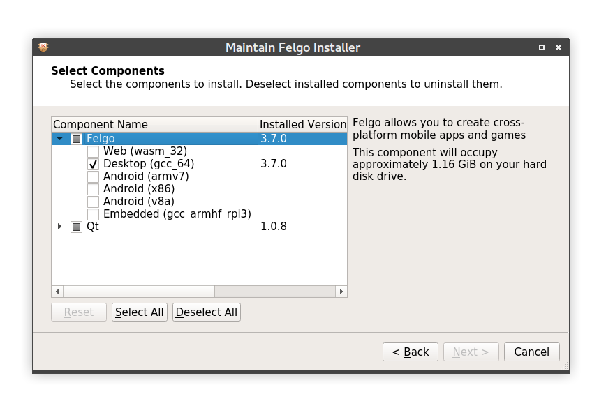
You can also directly jump into development and browse Felgo demos and features by installing the Felgo Developer App on your Pi. See Deploying Felgo Apps to Embedded Devices for more information.
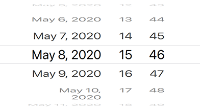
 import Felgo
 import QtQuick

 App {
   NavigationStack {
     Page {
       title: "Date Picker"

       AppText {
         text:  datePicker.selectedDate.toUTCString()
         anchors.horizontalCenter: parent.horizontalCenter
         anchors.bottom: datePicker.top
       }

       DatePicker {
         id: datePicker
         anchors.centerIn: parent
       }
     }
   }
 }
"thumbnailPath".
Highlights Blog Post: Release 3.7.0: Bluetooth LE (Low Energy) with QML
Felgo 3.7.0 adds new QML APIs to use Bluetooth LE from QML in your Qt and Felgo apps. This gives you a convenient way to use Bluetooth LE to connect to IoT, wearables and other custom devices, directly from QML, without any C++ code.
Felgo 3.7.0 comes as a free update for all Felgo developers.
This update contains important migration hints for Felgo projects created with earlier versions of the Felgo SDK.
Theme.navigationTabBar instead of Theme.tabBar. You can find more information in the detailed list of
changes below.Project-Info.plist located in the ios folder of your project, also if
you do not use Bluetooth. This will not be visible for your users, unless you actually use Bluetooth. Apple scans uploaded apps for their capabilities, and since the new APIs enable any Felgo app to make use of Bluetooth, it
is required to add this purpose string, also if not actively used.
 <key>NSBluetoothPeripheralUsageDescription</key>
 <string>App would like to access Bluetooth.</string>
 <key>NSBluetoothAlwaysUsageDescription</key>
 <string>App would like to access Bluetooth.</string>
android:minSdkVersion="21" and android:targetSdkVersion="29".If you make use of the Felgo Hot Reload Module in a new project on iOS, as described here, please create a folder
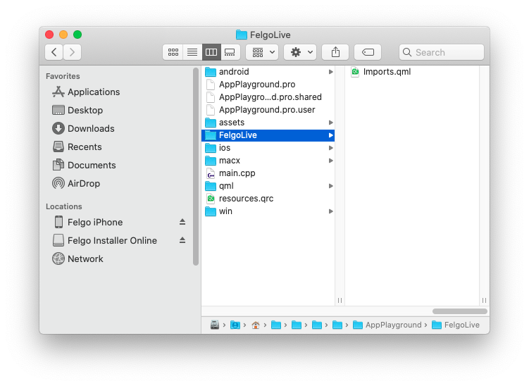
FelgoLive in your project, download this Imports.qml file and paste it into this folder. This will ensure that Qt picks up all the Qt
module imports that the Felgo Hot Reload Module prepares. The result should look like this:

This allows you to easily communicate with IoT, wearables and other custom devices using Bluetooth. You can find more information and examples in the documentation Use Bluetooth Low Energy and in the release blog post.
Here is an example of how such a Bluetooth implementation could look like:
 import Felgo
 import QtQuick

 App {
   NavigationStack {
     Page {
       title: qsTr("BLE Battery")

       Rectangle {
         anchors.centerIn: parent
         width: parent.width * 0.6
         height: parent.height * 0.8
         radius: dp(30)
         border.color: 'black'
         border.width: dp(5)

         Rectangle {
           anchors.bottom: parent.bottom
           width: parent.width
           height: parent.height * batteryCharacteristic.value / 100
           color: batteryCharacteristic.value > 80 ? 'green' : (batteryCharacteristic.value > 30 ? 'orange' : 'red')
           radius: parent.radius
         }
       }

       AppText {
         anchors.centerIn: parent
         text: batteryCharacteristic.value + '%'
         fontSize: dp(15)
       }
     }
   }

   BluetoothLeManager {
     discoveryRunning: true

     BluetoothLeDevice{
       id: myBleDevice

       BluetoothLeService {
         uuid: 0x180F // Battery Service
         BluetoothLeCharacteristic {
           id: batteryCharacteristic
           uuid: 0x2A19 // Battery Characteristic
           dataFormat: 4 // 0x04 for uint8

           onValueChanged: {
             // Value updates
             console.log('Battery Level Changed', value)
           }

           onValidChanged: {
             // Read initial value once characteristic is valid
             if (valid) {
               read()
             }
           }
         }
       }

       onConnectedChanged: {
          // Reconnect logic
         if (!connected) {
           console.log('Trying to reconnect')
           connect()
         }
       }
     }

     onDeviceDiscovered: {
       // Match device with service UUID
       if (device.services.indexOf('{0000180f-0000-1000-8000-00805f9b34fb}') > -1) {
         myBleDevice.setDevice(device, true)
         discoveryRunning = false
       }
     }
   }
 }
| iOS | Android |
|---|---|
|
|
|
This extensive example shows how to create various different common list item layouts using the AppListItem component.
 import QtQuick
 import QtQuick.Controls as QC2
 import Felgo

 App {
   id: app

   NavigationStack {
     Page {
       title: "Custom AppListItem"
       backgroundColor: Theme.colors.secondaryBackgroundColor

       AppFlickable {
         anchors.fill: parent
         contentHeight: column.height

         Column {
           id: column
           width: parent.width

           bottomPadding: 2*dp(Theme.contentPadding)

           SimpleSection {
             title: "Standard Items"
           }

           AppListItem {
             text: "First"
             rightText: "Longer rightText, really long"
           }
           AppListItem {
             text: "Second with longer text"
             rightText: "Hi"
           }
           AppListItem {
             text: "An active item"
             detailText: "This is disabled so it cannot be clicked"
             active: true
             enabled: false
             lastInSection: true
           }

           SimpleSection {
             title: "Images"
           }

           AppListItem {
             text: "Using an image"
             image: "https://via.placeholder.com/300"
           }
           AppListItem {
             text: "Muted with image"
             image: "https://via.placeholder.com/300"
             muted: true
           }

           AppListItem {
             text: "Image with"
             detailText: "some detailText"
             image: "https://via.placeholder.com/300"
             lastInSection: true
           }

           SimpleSection {
             title: "Custom Items"
           }

           AppListItem {
             text: "Oh look, an icon"
             rightText: "Nice!"
             showDisclosure: false

             leftItem: Icon {
               icon: IconType.heart
               anchors.verticalCenter: parent.verticalCenter
               width: dp(26)
             }
           }
           AppListItem {
             text: "Wi-Fi"
             rightText: "Connected"

             leftItem: Rectangle {
               color: Theme.colors.tintColor
               radius: dp(5)
               width: dp(26)
               height: width
               anchors.verticalCenter: parent.verticalCenter

               Icon {
                 icon: IconType.wifi
                 anchors.centerIn: parent
                 color: "white"
               }
             }
           }
           AppListItem {
             text: "General"

             leftItem: Rectangle {
               color: "grey"
               radius: dp(5)
               width: dp(26)
               height: width
               anchors.verticalCenter: parent.verticalCenter

               Icon {
                 icon: IconType.cog
                 anchors.centerIn: parent
                 color: "white"
               }
             }

             rightItem: Rectangle {
               color: "red"
               radius: width/2
               width: dp(22)
               height: width
               anchors.verticalCenter: parent.verticalCenter

               AppText {
                 anchors.centerIn: parent
                 color: "white"
                 text: "1"
               }
             }
           }
           AppListItem {
             text: "Some Wifi Name"
             showDisclosure: false

             leftItem: Icon {
               icon: IconType.check
               color: Theme.colors.tintColor
               width: dp(26)
               anchors.verticalCenter: parent.verticalCenter
             }

             rightItem: Row {
               spacing: dp(5)
               anchors.verticalCenter: parent.verticalCenter

               Icon {
                 icon: IconType.lock
                 width: sp(26)
                 height: width
                 anchors.verticalCenter: parent.verticalCenter
               }
               Icon {
                 icon: IconType.wifi
                 width: sp(26)
                 height: width
                 anchors.verticalCenter: parent.verticalCenter
               }
               IconButton {
                 icon: IconType.info
                 width: sp(26)
                 height: width
                 size: dp(22)
                 anchors.verticalCenter: parent.verticalCenter
               }
             }
           }
           AppListItem {
             id: listItem
             showDisclosure: false
             mouseArea.enabled: false
             topPadding: 0
             bottomPadding: 0

             leftItem: Icon {
               icon: IconType.moono
               width: sp(26)
               height: width
               anchors.verticalCenter: parent.verticalCenter
             }

             textItem: AppSlider {
               height: dp(45)
               width: listItem.textItemAvailableWidth
               value: 0.3
             }

             rightItem: Icon {
               icon: IconType.suno
               width: sp(26)
               height: width
               anchors.verticalCenter: parent.verticalCenter
             }
           }
           AppListItem {
             text: "Custom detailText item"
             image: "https://via.placeholder.com/300"
             textVerticalSpacing: dp(10)
             lastInSection: true

             detailTextItem: Row {
               spacing: dp(10)
               Icon {
                 icon: IconType.heart
               }
               Icon {
                 icon: IconType.paperplane
               }
               Icon {
                 icon: IconType.automobile
               }
             }
           }

           SimpleSection {
             title: "Switches"
           }

           AppListItem {
             text: "This is a switch"
             showDisclosure: false
             mouseArea.enabled: false

             rightItem: AppSwitch {
               anchors.verticalCenter: parent.verticalCenter
               checked: true
             }
           }
           AppListItem {
             text: "Whole item toggles switch"
             detailText: "Switch checked: " + innerSwitch.checked
             showDisclosure: false

             rightItem: AppSwitch {
               id: innerSwitch
               anchors.verticalCenter: parent.verticalCenter
               enabled: false
             }

             onSelected: {
               innerSwitch.toggle()
             }
           }
           AppListItem {
             text: "A muted item"
             muted: true
             showDisclosure: false
             lastInSection: true

             rightItem: AppSwitch {
               anchors.verticalCenter: parent.verticalCenter
             }
           }

           SimpleSection {
             title: "Radio Button Selected: " + ratioButtonGroup.checkedButton.value
           }

           QC2.ButtonGroup {
             id: ratioButtonGroup
             buttons: [radio1, radio2, radio3]
           }

           AppListItem {
             text: "First Option"
             showDisclosure: false

             leftItem: AppRadio {
               id: radio1
               checked: true
               value: "Option 1"
               anchors.verticalCenter: parent.verticalCenter
             }

             onSelected: {
               if(!radio1.checked) radio1.toggle()
             }
           }

           AppListItem {
             text: "Second Option"
             showDisclosure: false

             leftItem: AppRadio {
               id: radio2
               value: "Option 2"
               anchors.verticalCenter: parent.verticalCenter
             }

             onSelected: {
               if(!radio2.checked) radio2.toggle()
             }
           }

           AppListItem {
             text: "Third Option"
             showDisclosure: false
             lastInSection: true

             leftItem: AppRadio {
               id: radio3
               value: "Option 3"
               anchors.verticalCenter: parent.verticalCenter
             }

             onSelected: {
               if(!radio3.checked) radio3.toggle()
             }
           }

           SimpleSection {
             title: "Checkboxes"
           }

           AppListItem {
             text: "First Option"
             showDisclosure: false

             rightItem: AppCheckBox {
               id: checkBox1
               anchors.verticalCenter: parent.verticalCenter
             }

             onSelected: {
               checkBox1.checked = !checkBox1.checked
             }
           }

           AppListItem {
             text: "Second Option"
             showDisclosure: false

             rightItem: AppCheckBox {
               id: checkBox2
               checked: true
               anchors.verticalCenter: parent.verticalCenter
             }

             onSelected: {
               checkBox2.checked = !checkBox2.checked
             }
           }

           AppListItem {
             text: "Third Option"
             showDisclosure: false
             lastInSection: true

             rightItem: AppCheckBox {
               id: checkBox3
               anchors.verticalCenter: parent.verticalCenter
             }

             onSelected: {
               checkBox3.checked = !checkBox3.checked
             }
           }
         }
       }
     }
   }
 }

This plugin offers you 2 new components AppleSignIn and AppleSignInButton to handle signing in with an Apple ID. Here is an example usage:
 import QtQuick
 import Felgo

 App {
   NavigationStack {
     Page {
       title: "Apple Sign In"

       Column {
         anchors.centerIn: parent
         spacing: dp(15)

         AppleSignInButton {
           id: appleSignInButton
           anchors.horizontalCenter: parent.horizontalCenter
         }

         AppText {
           anchors.horizontalCenter: parent.horizontalCenter
           text: !appleSignInButton.enabled
                 ? "Apple Sign-in unavailable."
                 : appleSignInButton.appleSignIn.isLoggedIn
                 ? "Signed in: " + appleSignInButton.appleSignIn.userName
                 : "Click above to sign in with Apple user"
         }
       }
     }
   }
 }
 import Felgo
 import QtQuick

 App {

   AppButton {
     text: "Store in Keychain"
     onClicked: NativeUtils.setKeychainValue("identifier", "value")
   }

   AppButton {
     text: "Read Keychain"
     onClicked: NativeUtils.getKeychainValue("identifier")
   }

   AppButton {
     text: "Delete from Keychain"
     onClicked: NativeUtils.clearKeychainValue("identifier")
   }
 }

Here is an example:
 import QtQuick
 import Felgo

 App {
   Navigation {
     // Use tabs on Android, else default (which is tabs on iOS and drawer on desktop)
     navigationMode: Theme.isAndroid ? navigationModeTabs : navigationModeDefault
     // On Android, only the selected label is shown by default. You can change that by accessing the internal tabs or using the theming
     //tabs.showOnlySelectedLabel: false // can also be changed with Theme.navigationTabBar.showOnlySelectedLabel

     NavigationItem {
       title: "First"
       icon: IconType.heart

       NavigationStack {
         Page {
           title: "First Page"
         }
       }
     }

     NavigationItem {
       title: "Second"
       icon: IconType.book

       NavigationStack {
         Page {
           title: "Second Page"
         }
       }
     }

     NavigationItem {
       title: "Third"
       icon: IconType.bolt

       NavigationStack {
         Page {
           title: "Third Page"
         }
       }
     }
   }
 }
The new bottom tab navigation replaces the top tab navigation if used with the Navigation component. You can still create the top tabs (also known as "segments") using the AppTabBar component.
You can change the theming values of the bottom tab navigation on all platforms using the new Theme.navigationTabBar. Note that this was previously done using Theme.tabBar, you can find details about this theming change in the list of improvements below.
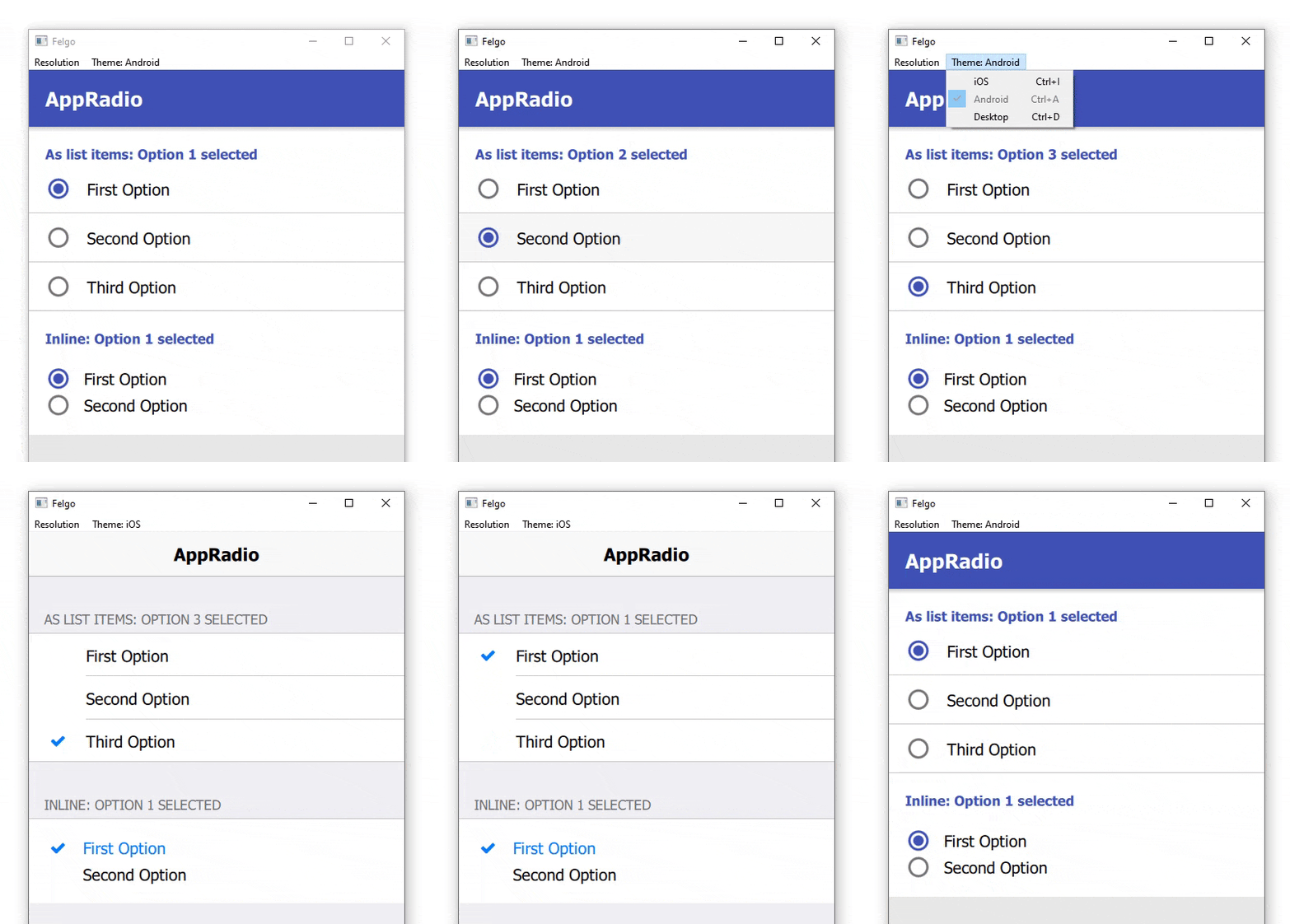
Here is an example of how to use the new control, and how it can be combined with the new AppListItem for a native UI/UX:
 import QtQuick
 import QtQuick.Controls as QC2
 import Felgo

 App {
   NavigationStack {
     Page {
       title: "AppRadio"
       backgroundColor: Theme.secondaryBackgroundColor

       Column {
         width: parent.width

         SimpleSection {
           title: "As list items: " + ratioButtonGroup1.checkedButton.value + " selected"
         }

         QC2.ButtonGroup {
           id: ratioButtonGroup1
           buttons: [radio1, radio2, radio3]
         }

         AppListItem {
           text: "First Option"
           showDisclosure: false

           leftItem: AppRadio {
             id: radio1
             checked: true
             value: "Option 1"
             anchors.verticalCenter: parent.verticalCenter
           }

           onSelected: {
             if(!radio1.checked) radio1.toggle()
           }
         }

         AppListItem {
           text: "Second Option"
           showDisclosure: false

           leftItem: AppRadio {
             id: radio2
             value: "Option 2"
             anchors.verticalCenter: parent.verticalCenter
           }

           onSelected: {
             if(!radio2.checked) radio2.toggle()
           }
         }

         AppListItem {
           text: "Third Option"
           showDisclosure: false
           lastInSection: true

           leftItem: AppRadio {
             id: radio3
             value: "Option 3"
             anchors.verticalCenter: parent.verticalCenter
           }

           onSelected: {
             if(!radio3.checked) radio3.toggle()
           }
         }

         SimpleSection {
           title: "Inline: " + ratioButtonGroup2.checkedButton.value + " selected"
         }

         QC2.ButtonGroup {
           id: ratioButtonGroup2
           buttons: [radio4, radio5]
         }

         Rectangle {
           width: parent.width
           height: contentCol.height

           Column {
             id: contentCol
             width: parent.width
             padding: dp(Theme.contentPadding)

             AppRadio {
               id: radio4
               value: "Option 1"
               text: "First Option"
               checked: true
             }

             AppRadio {
               id: radio5
               value: "Option 2"
               text: "Second Option"
             }
           }
         }
       }
     }
   }
 }
![]()
 import QtQuick
 import Felgo

 App {
   NavigationStack {
     Page {
       title: "AppButton"

       Column {
         width: parent.width

         AppButton {
           text: "Icon"
           flat: false
           icon: IconType.heart
         }

         AppButton {
           text: "Left Icon"
           flat: false
           iconLeft: IconType.heart
         }

         AppButton {
           text: "Right Icon"
           flat: false
           iconRight: IconType.heart
         }

         AppButton {
           id: customButton
           text: "Custom left item"
           flat: false
           leftItem: Rectangle {
             width: dp(15)
             height: width
             rotation: 45
             color: "green"
             // Handling the pressed state on iOS in the custom item
             opacity: Theme.isIos && customButton.pressed ? 0.5 : 1
           }
         }

         AppButton {
           text: "Full width"
           flat: false
           width: parent.width
           iconRight: IconType.heart
         }

         AppButton {
           text: "Circle"
           flat: false
           icon: IconType.heart
           height: width
           radius: width/2
         }
       }
     }
   }
 }
Theme.tabBar. This resulted in potential issues when using both controls at the same time, but trying to apply
different theming. With the introduction of a new style for a bottom tab navigation on Android (see detailed change above), we also split up the themes properly. You can now use Theme.navigationTabBar to style your bottom tab navigation and Theme.tabBar to style general tabs.
For migrating existing projects that already apply theming to the bottom navigation using Theme.tabBar, simply replacing it with Theme.navigationTabBar should be
sufficient.
 import Felgo

 App {
   onInitTheme: {
     // Replace tabBar with navigationTabBar to style the bottom tab navigation
     //Theme.tabBar.titleColor = "red"
     Theme.navigationTabBar.titleColor = "red"
   }
 }
 import QtQuick
 import Felgo

 App {
   NavigationStack {
     Page {
       title: "Pull to refresh"

       rightBarItem: ActivityIndicatorBarItem {
         visible: refreshSimulator.running
       }

       Timer {
         id: refreshSimulator
         interval: 1500
       }

       AppFlickable {
         id: flickable
         anchors.fill: parent
         contentWidth: width
         contentHeight: column.height

         Column {
           id: column
           width: parent.width

           Repeater {
             model: 30
             AppListItem {
               text: "Item " + index
             }
           }
         }

         PullToRefreshHandler {
           listView: flickable
           onRefresh: {
             refreshSimulator.restart()
           }
         }
       }
     }
   }
 }
This includes:
Highlights Blog Post: Release 3.6.0: Modal Dialog and iOS Storyboard Support for Qt & Felgo
Felgo 3.6.0 adds the new AppModal component to display modal dialogs in your apps. You can use this component for both full-screen and custom-height modal dialogs. On iOS, you can now use Storyboard files to create your app launch screen. This update also adds new components and several improvements and fixes.
Felgo 3.6.0 comes as a free update for all Felgo developers.
This update contains important migration hints for Felgo projects created with earlier versions of the Felgo SDK.
| iOS | Android |
|---|---|
|
|
|
Newly created projects already contain an empty launch screen file. You can change the launch screen using Xcode:
<build-folder>/<project>.xcodeproj in Xcode.Launch Screen.storyboard under Bundle Data.
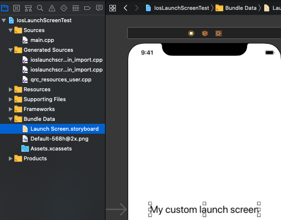
You can add any default UI elements to the launch screen Storyboard.
You can also migrate existing Felgo projects to use the new launch screen Storyboard:
ios/Launch Screen.storyboard to your existing project's <project>/ios directory.<project>/ios/Assets.xcassets/LaunchImage.launchimage.<project>/ios/Project-Info.plist, inside the <dict> tag:
 <key>UILaunchStoryboardName</key>
 <string>Launch Screen</string>
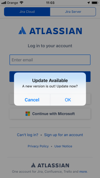

Note: For existing apps, make sure to add and update all the required frameworks listed in Integration Guide.
Note: This new version requires new integration steps.
GoogleMobileAds, GoogleAppMeasurement, GoogleUtilities, nanopb and
FBLPromises from PluginDemo/ios to your project/ios directory.ios/Project-Info.plist:
 <key>GADApplicationIdentifier</key>
 <string>ca-app-pub-(your-app-id)</string>
For more information, see the Integration Guide.
Note: For existing apps, make sure to add and update all the required frameworks listed in Integration Guide.
This update also requires additional migration steps for this plugin:
Add the following repository to the allprojects -> repositories node:
Add the following code as child of the android node, before the defaultConfig node:
 compileOptions {
   sourceCompatibility 1.8
   targetCompatibility 1.8
 }
Highlights Blog Post: Release 3.5.0: Run your Qt and Felgo Apps in the Browser with WebAssembly (WASM)
Felgo 3.5.0 adds support for WebAssembly (WASM) as a new export platform. This allows you to use Felgo and Qt to build applications that also run in the browser, served over the web. With this update you get access to a new target platform, with the same source code and skills you already used to develop mobile, desktop and embedded apps with Felgo and Qt.
Felgo 3.5.0 comes as a free update for all Felgo developers.
With Felgo for WebAssembly, you get an improved version of the Qt WASM port, with several fixes and additional features. You can find a detailed list of the improvements, and much more information about WASM, in the release blog post. You can also use Felgo for WebAssembly with plain Qt applications, that do not include any Felgo components, to benefit from the improvements.
 import Felgo
 import QtQuick

 App {
   id: app

   Page {
     // ... UI items go here ...
   }

   // Simply place the FpsMeter on top of other UI elements, no additional
   // configuration is required as all properties are set to sensible defaults.
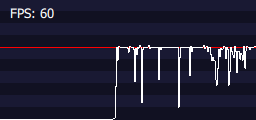
   FpsMeter {
   }

 }
Note that the Amplitude plugin will now also send events during development on desktop by default. If that is not desired, make sure to remove the apiKey during development, or e.g. check if
system.publishBuild is set.
"on"-Syntax. You can add Property Value Sources like PropertyAnimation on x and
Property Value Interceptors like Behavior on x at runtime using Hot Reloading.
Highlights Blog Post: Release 3.4.0: QML Hot Reload with Felgo Live
Felgo 3.4.0 adds hot reloading for QML. This is a major improvement of code reloading, further speeding up development speed with Felgo and Qt.
Felgo 3.4.0 comes as a free update for all Felgo developers.
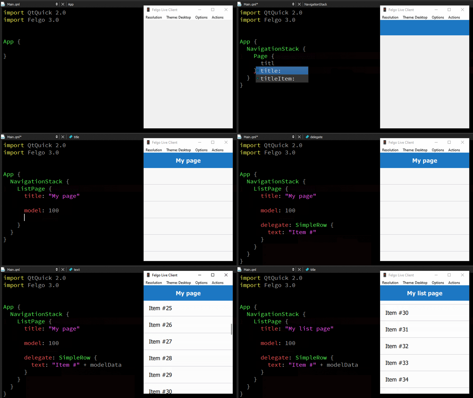
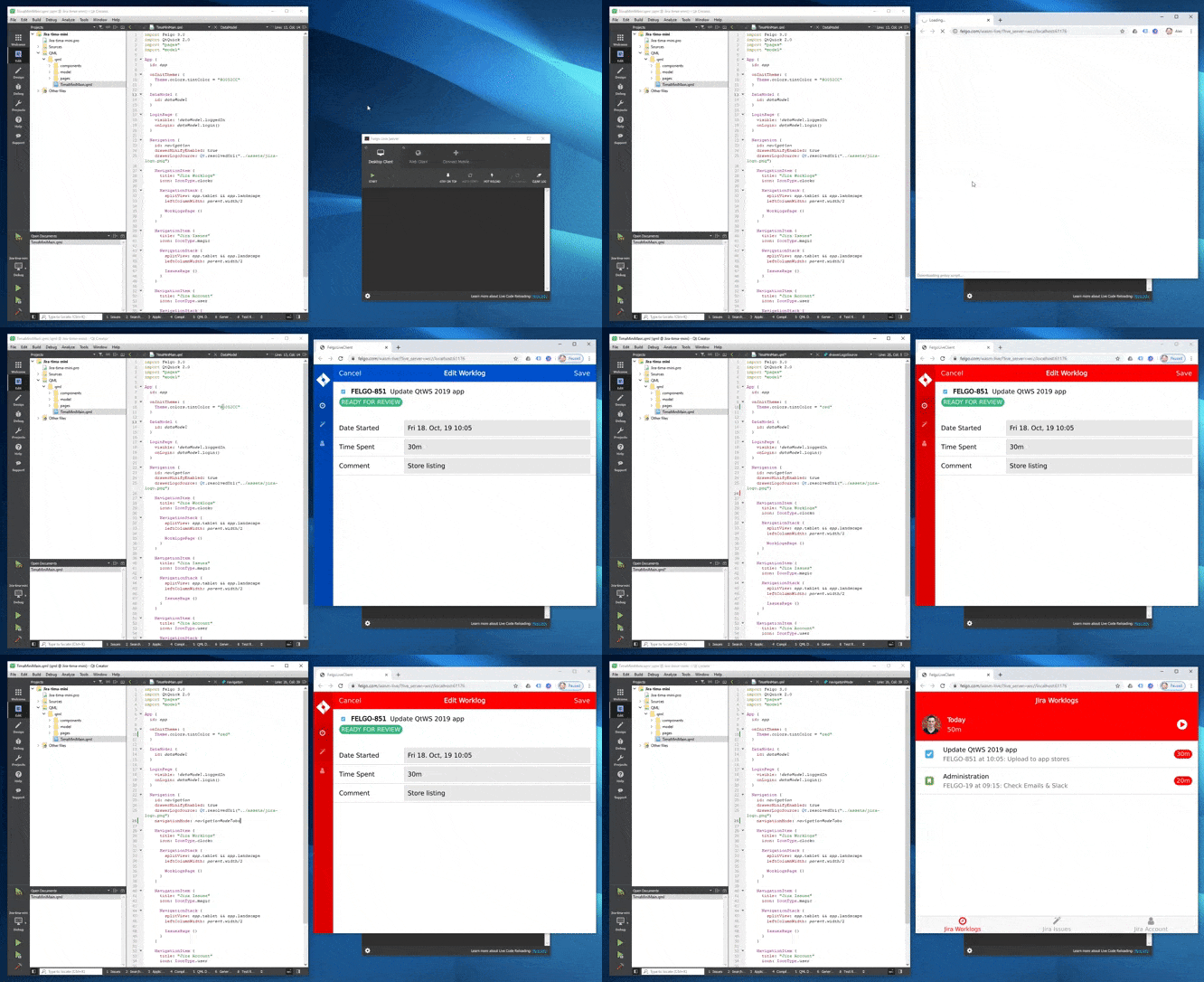
Hot Reload allows you to change your QML & JavaScript source code and view the result in realtime. It applies QML, JavaScript and asset changes instantly on every connected device, immediately after saving. This reduces the long waiting times for build and deployment steps to only a couple of seconds.
Hot Reload applies changes in your source code without losing the state of your application. If you are currently working on a sub page, you will not have to navigate back to it after every change, you will stay exactly where you are in your app.
Learn more in the official docs here.
v5.13.0 on iOS.
Deprecated API Usage warning for UIWebView when uploading an app to the Apple Store.requestTags method.
Highlights Blog Post: Release 3.3.0: Update to Qt 5.13.2 and Qt Creator 4.10.2, Jira Tima App Demo
Felgo 3.3.0 adds support for Qt 5.13.2 and Qt Creator 4.10.2, which brings many features and improvements. This update also adds many new APIs, improvements and fixes to the Felgo components.
Felgo 3.3.0 comes as a free update for all Felgo developers.
android:minSdkVersion="21" and
android:targetSdkVersion="28".If you plan to target devices running Android 5, please download this file and overwrite the existing file in <Path to Felgo
installation>\Felgo\android_armv7\mkspecs\features\, as well as <Path to Felgo installation>\Felgo\android_arm64_v8a\mkspecs\features\. Also rename the following files in both
<Path to Felgo installation>\Felgo\android_armv7\lib\ and <Path to Felgo installation>\Felgo\android_arm64_v8a\lib\:
If you use the OneSignal plugin requestTags method, please replace your maven import URL in the build.gradle file, located in the
android folder of your project directory, so it looks like this:
maven { url 'https://install.felgo.com/maven/' }
With Felgo 3.3.0, you need an additional line in your *.pro file, to use the Facebook plugin with iOS. The integration will look like this:
 FELGO_PLUGINS += facebook

 ios {
   LIBS += -framework Accelerate
 }
You can find more information in the plugin integration guide.
This demo shows best practices for UI design with a shared code-base across Android, iOS and desktop. It works with dummy data based on the Jira time tracking software. It uses several of the latest APIs released with Felgo 3.3.0.
It is based on the official Jira Tima mobile app developed by Felgo.
| iOS | Android | Desktop |
|---|---|---|
|
|
|
|
 import QtQuick
 import Felgo

 App {

   onInitTheme: {
     // You can add custom styles for dialogs now
     //Theme.dialog.backgroundColor = "yellow"
     dialog.open()
   }

   NavigationStack {
     Page {
       title: "Dialog"
     }
   }

   Dialog {
     id: dialog
     title: "Do you think this is awesome?"
     autoSize: true
     positiveActionLabel: "Yes"
     negativeActionLabel: "No"
     onCanceled: title = "Think again!"
     onAccepted: close()

     // You can use Theme.dialog.defaultContentPadding to align your
     // custom content with the rest of the dialog UI.
     AppText {
       padding: dp(Theme.dialog.defaultContentPadding)
       wrapMode: Text.WordWrap
       width: parent.width
       text: "This is a very long sentence to get some line breaks in this content!"
       // Colors and alignment are platform depending for the best appearance
       color: Theme.isIos ? Theme.colors.textColor : Theme.colors.secondaryTextColor
       horizontalAlignment: Theme.isIos ? Text.AlignHCenter : Text.AlignLeft
     }
   }
 }
You can now also access the title item with Dialog::titleItem alias as well as manually set Dialog::titleDividerVisible.
 import QtQuick
 import Felgo

 App {
   NavigationStack {
     Page {
       title: "AppTextField::inputMode"

       AppTextField {
         width: parent.width
         inputMode: inputModeEmail
       }
     }
   }
 }
You can find details on other new properties like AppTextField::passwordVisible and AppTextField::showPasswordVisibleButton in the associated documentation.
Note: This also applies to SearchBar which uses an AppTextField internally.
 import QtQuick
 import Felgo

 App {
   NavigationStack {
     Page {
       title: "AppTextField::clickEnabled"

       AppTextField {
         id: textField
         width: parent.width
         placeholderText: "Select date"
         clickEnabled: true
         onClicked: {
           NativeUtils.displayDatePicker()
         }

         Connections {
           target: NativeUtils
           onDatePickerFinished: {
             if(accepted) textField.text = date
           }
         }
       }
     }
   }
 }
 import QtQuick
 import Felgo

 App {
   NavigationStack {
     Page {
       title: "TextFieldRow"

       Column {
         id: column
         width: parent.width

         TextFieldRow {
           width: parent.width
           label: "Text"
           placeHolder: "Add some text"
         }

         TextFieldRow {
           id: dateRow
           width: parent.width
           label: "Date"
           placeHolder: "Select date"
           clickEnabled: true
           onClicked: {
             NativeUtils.displayDatePicker()
           }

           Connections {
             target: NativeUtils
             onDatePickerFinished: {
               if(accepted) dateRow.value = date
             }
           }
         }
       }
     }
   }
 }
Note: This property must be used with dp().
The item uses the following paddings:
 anchors.leftMargin: NativeUtils.safeAreaInsets.left + dp(Theme.contentPadding)
 anchors.rightMargin: NativeUtils.safeAreaInsets.right + dp(Theme.contentPadding)
 anchors.topMargin: NativeUtils.safeAreaInsets.top + dp(Theme.contentPadding)
 anchors.bottomMargin: NativeUtils.safeAreaInsets.bottom
You can anchor to it or just use its properties like margins or width for your layouts.
 import QtQuick
 import Felgo

 App {
   NavigationStack {
     Page {
       id: page
       title: "AppPage::contentPaddingAnchorItem"

       Column {
         id: column
         spacing: dp(Theme.contentPadding)
         anchors.fill: parent.contentPaddingAnchorItem

         AppText {
           width: parent.width
           text: "Lorem ipsum dolor sit amet, consectetur adipiscing elit, sed do eiusmod tempor incididunt ut labore et dolore magna aliqua. Ut enim ad minim veniam, quis nostrud exercitation ullamco laboris nisi ut aliquip ex ea commodo consequat."
         }

         // Toggle the padding with this button
         AppButton {
           text: "Toggle padding"
           horizontalMargin: 0
           property bool toggle: true
           onClicked: {
             column.anchors.fill = toggle ? column.parent : column.parent.contentPaddingAnchorItem
             toggle = !toggle
           }
         }
       }
     }
   }
 }
Additionally you can display the drawer in a minified sidebar version containing only icons, with Navigation::drawerMinifyEnabled.
 import QtQuick
 import Felgo

 App {
   Navigation {
     id: navigation

     NavigationItem {
       title: "Item1"
       icon: IconType.heart

       NavigationStack {
         Page {
           title: "Page1"

           Column {
             anchors.centerIn: parent
             spacing: dp(15)

             Row {
               AppText {
                 text: "drawerInline "
               }

               AppSwitch {
                 checked: navigation.drawerInline
                 updateChecked: false
                 onToggled: navigation.drawerInline = !navigation.drawerInline
               }
             }

             Row {
               AppText {
                 text: "drawerFixed "
               }

               AppSwitch {
                 checked: navigation.drawerFixed
                 updateChecked: false
                 onToggled: navigation.drawerFixed = !navigation.drawerFixed
               }
             }

             Row {
               AppText {
                 text: "drawerMinifyEnabled "
               }

               AppSwitch {
                 checked: navigation.drawerMinifyEnabled
                 updateChecked: false
                 onToggled: navigation.drawerMinifyEnabled = !navigation.drawerMinifyEnabled
               }
             }
           }
         }
       }
     }
     NavigationItem {
       title: "Item2"
       icon: IconType.star

       NavigationStack {
         Page {
           title: "Page2"
         }
       }
     }
   }
 }
 App {
   onInitTheme: Theme.colors.statusBarStyle = Theme.colors.statusBarStyleSystem
 }
Note: For this to work on Android, add the following line to android/res/xml/file_paths.xml:
<files-path name="files" path="."/>
build.gradle file if you use Cloud Builds to distribute a 64-bit Android app. For that, have a look at the
Android Integration Steps on how to set the new abiFilters definition.
Highlights Blog Post: Release 3.2.0: Update to Qt 5.12.3 with ECMAScript 7, Image Picker and Qt Creator 4.8.2
Felgo 3.2.0 adds support for Qt 5.12.3 and Qt Creator 4.8.2, which brings many features and improvements. The new long term supported Qt release includes lots of fixes, new modules and adds JavaScript support for ECMAScript 7. The updated Felgo IDE Qt Creator version 4.8.2 is more stable and adds compatibility with the latest toolchains and platforms.
Felgo 3.2.0 comes as a free update for all Felgo developers.
This update contains important migration hints for Felgo projects created with earlier versions of the Felgo SDK.
Please see the Android deployment guide if you are not sure how to install and use the new NDK.
We also recommend to delete the old shadow build folders and perform a clean/qmake of your project, to avoid Android build caching issues. You can find the shadow build folder path in the Projects tab of Qt Creator.
No toolchains found in the NDK toolchains folder for ABI with prefix: mips64el, please update your gradle version to com.android.tools.build:gradle:3.6.0. You can find this version if you open android/build.gradle in your project folder. You can find more info in the Gradle Build System guide.
libSoomlaiOSStore.alibKeeva.alibcrypto.alibssl.aAppleIncRootCertificate.cerQt 5.12.3 is the third patch version for Qt 5.12 LTS, which is a long-term-supported release. It incorporates more than 2000 bugs fixes since the previous Qt LTS version, Qt 5.9.7. On top of Qt 5.12.3, the new LTS version will receive many patch releases throughout the coming years. The latest Qt 3D Studio version is based on Qt 5.12 LTS as well.
QML performance and memory consumption improved a lot over the previous Qt versions. Memory usage with Qt 5.12 is 30% lower than with Qt 5.9, the previous LTS version. Qt focuses a lot on improving the QML engine performance, you can read more about Qt 5.12 performance improvements here.
With the new release, you can also take advantage of major improvements to the JavaScript engine that supports QML. Previously compatible with ECMAScript 5, it now fully supports ECMAScript 7. This allows the usage of modern JavaScript and simplifies the integration of Javascript libraries. ECMAScript modules are now also supported and can be loaded both from C++ as well as QML/JS.
Along with the Qt 5.12.3 update, Felgo 3.2.0 also presents you with Qt Creator 4.8.2. The new IDE version is more stable and adds support for the latest build tools and platforms.
On iOS, the IDE now better detects later iPhone models like the iPhone XS. The update also includes many improvements and fixes for macOS Mojave.
For Android, you can now connect and use the debugger on API level 24 and later. The new Qt Creator is also fully compatible with Android SDK 28.
Note: The Android Build Kit now uses the Clang compiler instead of GCC, which got removed with NDK r18b. Thus, older NDK versions are no longer supported and we recommend to upgrade to NDK r19c. You can download it here.
Make sure to configure the new NDK in the Qt Creator settings for Android:

Before you can build projects, we also recommend to clean previous build folders and project settings:
Qt 5.12 and Qt Creator 4.8 also add basic support for the Android ARMv8 architecture. However, there are no pre-built libraries for this architecture with Felgo 3.2.0 yet. If you require early access to Felgo Android ARMv8 support, don’t hesitate to get in touch.
On Windows, Qt Creator does no longer force the use of ANGLE for OpenGL on user applications. You can also expect less issues with antivirus programs on Windows systems. Read more about the bigger improvements of Qt Creator 4.8 in the official release post.
You can now set your Felgo license key as configuration variable from your project file. The Felgo project configuration now supports the PRODUCT_LICENSE_KEY settings:
 CONFIG += felgo

 # Optionally set a license key that is used instead of the license key from
 # main.qml file (App::licenseKey for your app or GameWindow::licenseKey for your game)
 PRODUCT_LICENSE_KEY = ""
New projects created with the Qt Creator wizards use this setup by default. If you want to update your existing project, add the following line of code to your main.cpp file right below the
felgo.initialize() method:
 // Set an optional license key from project file
 // This does not work if using Felgo Hot Reload, only for Felgo Cloud Builds and local builds
 felgo.setLicenseKey(PRODUCT_LICENSE_KEY);
Setting the license key from within the project file with PRODUCT_LICENSE_KEY requires you to do a full rebuild (clean) of your project.
Note: Setting the license key with PRODUCT_LICENSE_KEY is not possible if using the Felgo Hot Reload Client. Felgo Hot Reload Client still picks up the license key set with App::licenseKey for your app or GameWindow::licenseKey for your game.
For more information, have a look at our publishing guide section about the license key.
The in-app purchase plugin now supports subscriptions for iOS and Android apps. Today, subscriptions are the best way to monetize your app, offering recurring revenue from your users. Also Apple and Google only take a 15% share on subscriptions after 1 year, compared to the 30% share for regular in-app purchases, so that is another plus!
If you want to use subscriptions or the built-in virtual economy system, we recommend using the Felgo in-app purchase plugin instead of the default Qt Purchasing module.
Note: With this update, you need to add additional files for iOS, if you use the in-app purchase plugin. Please check out the integration guide to see where you can find those files.
libSoomlaiOSStore.alibKeeva.alibcrypto.alibssl.aAppleIncRootCertificate.cerimport Felgo import QtQuick App { NavigationStack { Page { id: page title: qsTr("Choose Photos") // right bar item to accept selection rightBarItem: TextButtonBarItem { text: "Next" enabled: imagePicker.selectedCount > 0 // your app will probably pop the photo selection page from the stack to move on // this example only logs the selected photos onClicked: console.debug("SELECTED:", JSON.stringify(imagePicker.selection)) } // image picker view for photo selection ImagePicker { id: imagePicker anchors.fill: parent } } } }

You can also build your own UI for picking photos. Call NativeUtils::fetchGalleryPhotos() to load a list of all device photos, which your view can then access with the NativeUtils::galleryPhotos property. To further work with individual images, use NativeUtils::getCachedAssetPath().
The update to Qt 5.12.3 adds several more new features. You can now use the TableView as another type of Item View in Qt Quick. It is similar to a ListView but with multiple columns. Unlike the previous implementation of QtQuick Controls 1, it does not do any styling. The TableView provides the optimal solution for instantiating, pooling and reusing delegates on demand as you scroll the table. A TableModel for the view can be created with a custom C++ QAbstractTableModel implementation.
Also, various controls in Qt Quick Controls 2 gained new methods or new functionalities.
The Pointer Handlers of Qt 5.11 are now renamed to Input Handlers and are fully supported as a first-class feature in Qt Quick. The Input Handlers simplify the creation of complex touch interactions, that used to be difficult to do with MouseArea and TouchArea alone. They can detect events even in cases of deep nesting.
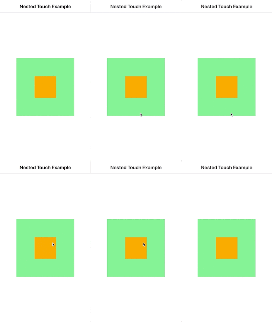
This also applies for the TapHandler, which can detect taps and touch gestures. Unlike MouseArea, it can handle events in multiple nested Items at the same time:
 import QtQuick
 import Felgo

 App {
  NavigationStack {
    Page {
      title: "Nested Touch Example"

      // Outer Rectangle
      Rectangle {
        anchors.centerIn: parent
        id: outerRect
        width: dp(200)
        height: dp(200)
        color: tapHandler.pressed ? "lightyellow" : "lightgreen"

        TapHandler {
          id: tapHandler
        }

        // Inner Rectangle
        Rectangle {
          id: innerRect
          anchors.centerIn: parent
          width: dp(75)
          height: dp(75)
          color: tapHandler2.pressed ? "lightblue" : "orange"

          TapHandler {
            id: tapHandler2
          }
        }
      }

    }
  }
 }
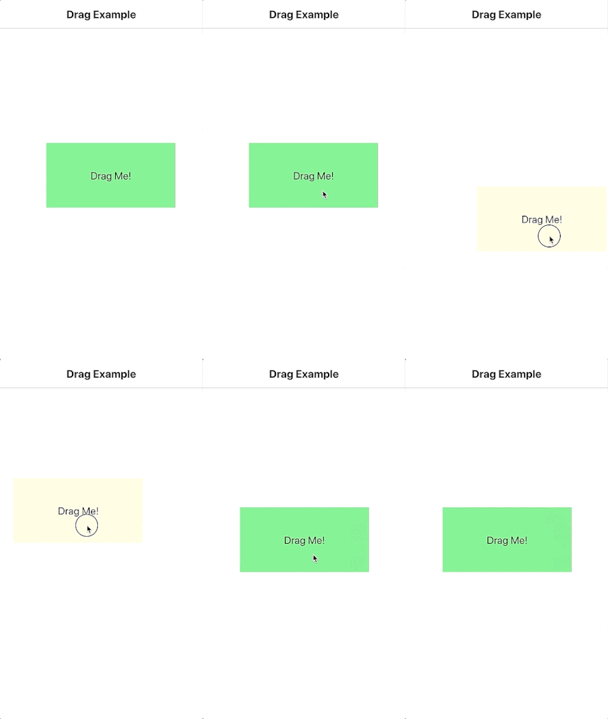
It is also easy to make an Item draggable with the DragHandler.
 import QtQuick
 import Felgo

 App {
   NavigationStack {
     Page {
       title: "Drag Example"

       // Draggable Rectangle
       Rectangle {
         // initial position
         x: (parent.width - width) / 2
         y: (parent.height - height) / 2

         width: dp(200)
         height: dp(100)
         color: dragHandler.active ? "lightyellow" : "lightgreen"

         AppText {
           id: text
           text: "Drag Me!"
           anchors.centerIn: parent
         }

         DragHandler { id: dragHandler }
       }

     }
   }
 }
HoverHandler was added as a new type of handler for detecting mouse hover. As touchscreens generally do not offer hover events, in practice it detects a hovering mouse or tablet stylus.
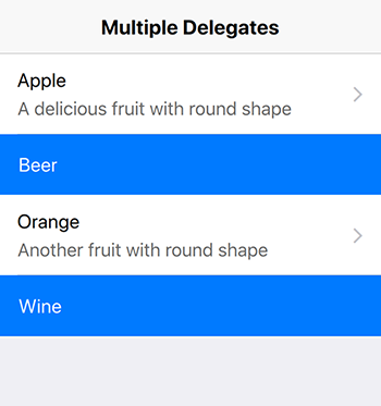
As a new tech preview, you can have a look at the DelegateChooser type. It allows to use different delegates in item views like AppListView. Depending on role values from the model or the index, you can choose between multiple delegates:
 import QtQuick
 import Felgo

 import Qt.labs.qmlmodels // tech preview import

 App {
   NavigationStack {
     Page {
       title: "Multiple Delegates"

       AppListView {
         anchors.fill: parent
         model: [
           {
             text: "Apple",
             detailText: "A delicious fruit with round shape",
             type: "fruit"
           },

           {
             text: "Beer",
             type: "drink"
           },

           {
             text: "Orange",
             detailText: "Another fruit with round shape",
             type: "fruit"
           },

           {
             text: "Wine",
             type: "drink"
           }
         ]

         delegate: DelegateChooser {
           role: "type"

           DelegateChoice {
             roleValue: "fruit"

             // Delegate for "fruit" type
             SimpleRow {
               onSelected: text = "Clicked"
             }
           }

           DelegateChoice {
             roleValue: "drink"

             // Delegate for "drink" type
             Rectangle {
               width: parent.width
               height: dp(50)

               color: Theme.tintColor

               AppText {
                 x: dp(16)
                 anchors.verticalCenter: parent.verticalCenter
                 text: modelData.text
                 color: "white"
               }
             }
           }
         }
       }

     }
   }
 }
There are many more additions you get with Qt 5.12.3, for example:
Also note that the following modules are part of the Qt 5.12 release, but are deprecated and considered for removal in subsequent releases of Qt:
You can also have a look at the official Qt 5.12 blog post or see the full list of changes here.
Highlights Blog Post: Release 3.1.0: New Felgo Plugins Version, Unified App Configuration and FlickablePage
Felgo 3.1.0 introduces a new base version for Felgo Plugins and simplifies maintenance with a unified app configuration for Desktop, iOS and Android.
Felgo 3.1.0 comes as a free update for all Felgo developers.
To match the new Felgo SDK version 3, the version for Felgo Plugins now also increased to 3. This version change is relevant when building your project for the Android platform. You will notice that the configured plugin
dependencies in the android/build.gradle of your project are no longer supported.
To correctly integrate the latest Felgo Plugins in your project, please update the build.gradle configuration to use version 3 of the plugins. For example: To use the AdMob Plugin on Android add
implementation 'net.vplay.plugins:plugin-admob:3.+'
instead of
implementation 'net.vplay.plugins:plugin-admob:2.+'
to the dependencies block of your build.gradle. Note that the version setting at the end of the line changed to 3.+. The same pattern applies to all other plugin
integrations. You can also see the updated integration guide in the Felgo Plugins Documentation.
With this change the Android configuration of your app is correctly set up to use the latest version of Felgo Plugins.
The PRODUCT_IDENTIFIER, PRODUCT_VERSION_CODE and PRODUCT_VERSION_NAME project settings are now fully supported on iOS, Android and
Desktop.
The app identifier and version of your app usually requires to be specified at many different places. For example at the qml/config.json on Desktop, or the AndroidManifest.xml or Project-Info.plist for mobile platforms.
With this release, you can specify the relevant values with a single configuration for all platforms. The Felgo project configuration now supports the PRODUCT_IDENTIFIER, PRODUCT_VERSION_CODE and PRODUCT_VERSION_NAME settings:
 CONFIG += felgo

 # configure the identifier and version information
 PRODUCT_IDENTIFIER = net.felgo.demos.FelgoProject
 PRODUCT_VERSION_NAME = 1.0.0
 PRODUCT_VERSION_CODE = 1
New projects created with the Qt Creator wizards use this setup by default. If you want to update your existing projects to this system, also add the relevant placeholders to your Project-Info.plist:
 <key>CFBundleIdentifier</key>
 <string>$(PRODUCT_BUNDLE_IDENTIFIER)</string>
 <key>CFBundleShortVersionString</key>
 <string>${PRODUCT_VERSION_NAME}</string>
 <key>CFBundleVersion</key>
 <string>${PRODUCT_VERSION_CODE}</string>
Otherwise, the project variables are not used on iOS. For Android, you can modify your build.gradle configuration to also use the specified project settings:
 android {
     defaultConfig {
       applicationId = productIdentifier
       versionCode = productVersionCode.toInteger()
       versionName = productVersionName
     }
 }
For Desktop platforms no additional steps are required. Each time you run qmake for your project, the values are updated with the latest configuration on all platforms.
Many app pages with custom content require an AppFlickable to make the content scrollable. To reduce boilerplate code, you can now use the new FlickablePage, which already contains a pre-configured AppFlickable and AppScrollIndicator:
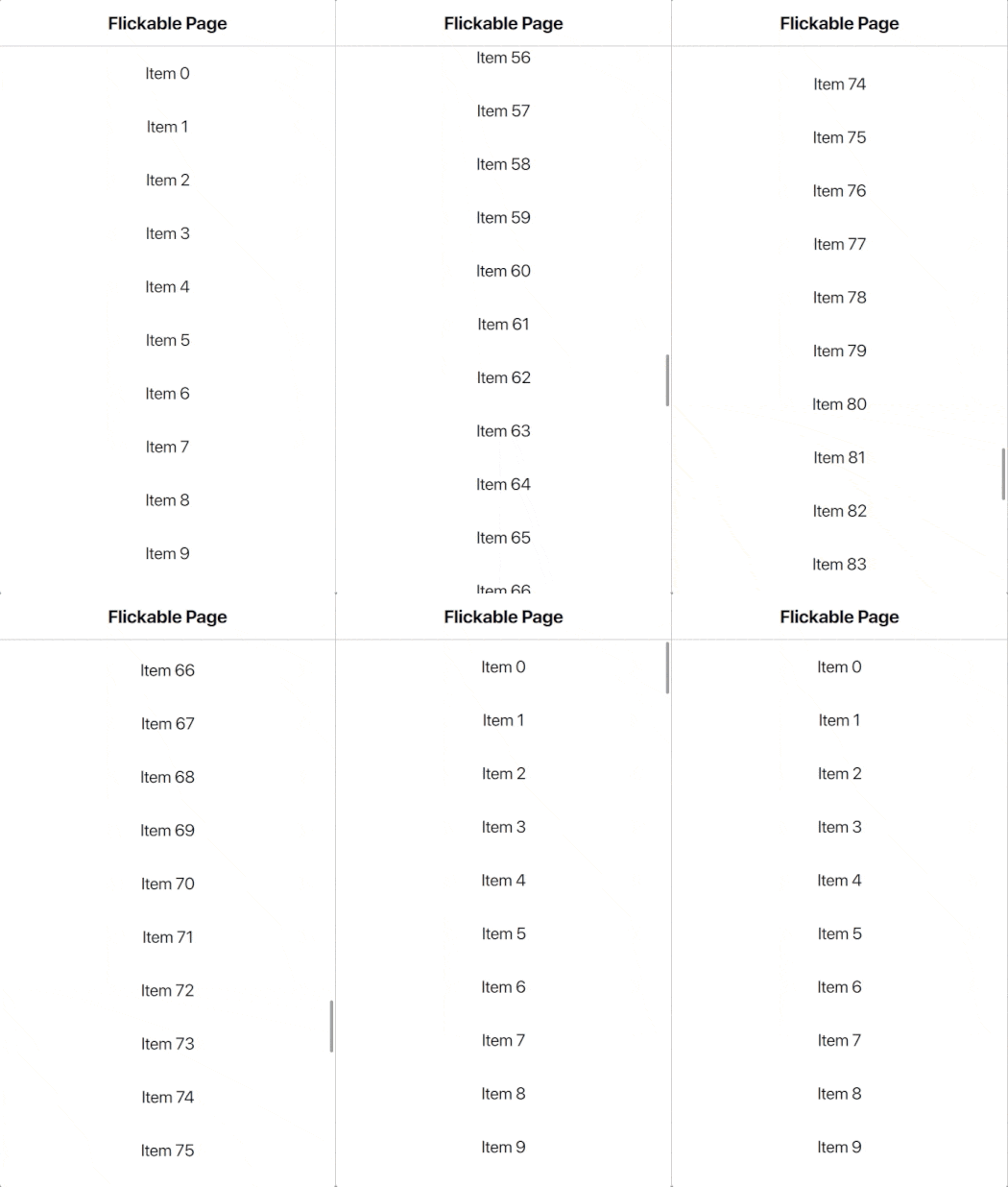
 import Felgo
 import QtQuick


 App {
   NavigationStack {

     FlickablePage {
       title: "Flickable Page"

       // set contentHeight of flickable to allow scrolling if the content is bigger than the page height
       flickable.contentHeight: column.height

       // set false to hide the scroll indicator, it is visible by default
       scrollIndicator.visible: true

       // page content
       Column {
         id: column
         width: parent.width

         // fill column with 100 AppText items using Repeater
         Repeater {
           model: 100
           delegate: Rectangle {
             width: parent.width
             height: dp(50)
             AppText {
               anchors.centerIn: parent
               text: qsTr("Item") + " " + index
             }
           }
         }
       } // Column

     } // FlickablePage

   }
 }
All content items of your FlickablePage get reparented to the internal AppFlickable automatically and are thus scrollable.
It is now easier distinguish the Felgo Hot Reload Server and Felgo Hot Reload Client on macOS and Linux. The different applications now use different app icons on these systems as well:
![]()
VPLAY_PLUGINS project setting. You can now use the setting to link plugin frameworks on iOS again.Highlights Blog Post: Release 3.0.0: V-Play is Now Felgo - New Release & Roadmap
Felgo 3.0.0 combines all app, game and plugin types into Felgo and unifies component naming conventions.
Felgo 3.0.0 comes as a free update for all Felgo developers.
You no longer have to use different import statements when working with Felgo. The components of the V-Play Apps, V-Play Games and V-Play Plugins modules are all available with a single import
Felgo statement:
import Felgo import QtQuick App { // Storage, required import VPlay before Storage { id: felgoStorage } // NavigationStack, required import VPlayApps before NavigationStack { id: appNavStack initialPage: Page { title: "AdMob Page" // AdMob Plugin, required import VPlayPlugins before AdMobBanner { adUnitId: "ca-app-pub-3940256099942544/6300978111" // banner test ad by AdMob testDeviceIds: [ "<a testdevice id>" ] banner: AdMobBanner.Smart anchors.horizontalCenter: parent.horizontalCenter anchors.top: parent.top } } } }
With many recent additions, the line between the Apps and Games SDK got less clear. For example, the Storage type is also relevant for apps but was part of the V-Play Games module. The SocialView, which is based on app components, replaced the VPlayGameNetworkView also for games, and so on.
You can combine both app and game components in your Felgo app. The unified import for all components now further simplifies this. Felgo is still compatible with the old V-Play imports. Your existing V-Play projects still work as they used to.
But we suggest to update your projects for Felgo as soon as you can. The V-Play modules are now deprecated and not maintained further. You can thus only get the latest features and components of future Felgo updates with the new module import.
In case you run into troubles or face an issue after upgrading to Felgo, don’t hesitate to contact us.
Especially for the V-Play Games module, many components used to have a ‘VPlay’ suffix, which is now removed. This helps to keep component names short and the code is easier to read:
 import QtQuick
 import Felgo

 GameWindow {
  activeScene: scene

  Scene {
    id: scene

    // previously: SpriteSequenceVPlay
    SpriteSequence {
      id: spriteseq
      defaultSource: "spritesheet.png"

      // previously: SpriteVPlay
      Sprite {
        name: "walk"
        frameWidth: 32
        frameHeight: 32
        frameCount: 4
        startFrameColumn: 1
        frameRate: 20
        to: {"jump":0, "walk": 1}
      }

      // previously: SpriteVPlay
      Sprite {
        name: "jump"
        frameWidth: 32
        frameHeight: 32
        frameCount: 4
        startFrameColumn: 5
        frameRate: 10
        to: {"walk":1}
      }
    } // SpriteSequence

    Row {
      spacing: dp(4)
      anchors.centerIn: parent

      AppButton {
        text: "walk"
        onClicked: spriteseq.jumpTo("walk")
      }
      AppButton {
        text: "jump"
        onClicked: spriteseq.jumpTo("jump")
      }
    }

  } // Scene
 } // GameWindow
Note: Some of the renamed components in the V-Play SDK have colliding names with Qt components. For Example, the Qt Quick module also holds a SpriteSequence or Sprite type. Qt Creator auto-resolves the types with the imported modules in the QML file. At the moment, the most recent import gets precedence to earlier ones. The above example thus uses the Felgo SpriteSequence and Sprite types, because we import Felgo after Qt Quick.
To avoid issues and mix-ups due to this auto-resolve, you can make sure to always use a specific module by setting a custom module identifier for the import. This is how you could use the Qt Quick types in the above example, without changing the order of imported modules:
 import QtQuick as QtQuick
 import Felgo

 GameWindow {
  activeScene: scene

  Scene {
    id: scene

    QtQuick.SpriteSequence {
      // ...

      QtQuick.Sprite {
        // ...
      }
    } // SpriteSequence

  } // Scene
 } // GameWindow
This is the full list of components that previously used ‘VPlay’ suffix in their name: Scene3D, Camera, AnimatedSprite, Sprite, SpriteSequence, TexturePackerAnimatedSprite, TexturePackerSprite, TexturePackerSpriteSequence, SoundEffect and Particle.
When you update your project to the new Felgo 3.0 import, please also make sure to use the new names for these components. The name changes only apply for the Felgo module import. Your existing project with V-Play imports is not affected and can still use the old names.
With the rename of V-Play to Felgo, the game network and multiplayer components got renamed as well. The VPlayGameNetwork type is now FelgoGameNetwork, and VPlayMultiplayer turned into FelgoMultiplayer.
As the VPlayGameNetworkView and VPlayMultiplayerView are in the process of getting deprecated, they do not get the Felgo name. These types have ‘VPlay’
removed and are available as GameNetworkView and MultiplayerView. Only the SocialView will see updates
and fixes in the future. It is the new default UI for social services and the preferred component to use:
 import Felgo

 App {
 FelgoGameNetwork {
   id: gameNetwork
   gameId: 285
   secret: "AmazinglySecureGameSecret"
   multiplayerItem: multiplayer
 }

 FelgoMultiplayer {
   id: multiplayer
   appKey: "dd7f1761-038c-4722-9f94-812d798cecfb"
   pushKey: "a4780578-5aad-4590-acbe-057c232913b5"
   gameNetworkItem: gameNetwork
 }

 SocialView {
   id: socialView
   gameNetworkItem: gameNetwork
   multiplayerItem: multiplayer
 }
 }
To integrate the Felgo SDK in your project, set CONFIG += felgo in your *.pro configuration:
 # allows to add DEPLOYMENTFOLDERS and links to the Felgo library and QtCreator auto-completion
 CONFIG += felgo # previously CONFIG += vplay

 # uncomment this line to add the Felgo Hot Reload Module and use QML code reloading with your custom C++ code
 # for the remaining steps to build a custom Hot Reload app see here: https://felgo.com/custom-code-reload-app/
 # CONFIG += felgo-live # previously CONFIG += vplay-live
The previous CONFIG += vplay setting is still supported. For QML code reloading with custom C++ code, the CONFIG += vplay-live setting changed to CONFIG += felgo-live as well. If you use Felgo Plugins in your project, link the iOS Plugin Frameworks with the FELGO_PLUGINS configuration:
 ios {
    QMAKE_INFO_PLIST = ios/Project-Info.plist
    OTHER_FILES += $$QMAKE_INFO_PLIST
 }

 FELGO_PLUGINS += admob # previously: VPLAY_PLUGINS += admob
In your main.cpp, the Felgo application and Hot Reload Client class names also got renamed:
 #include <QApplication>
 #include <QQmlApplicationEngine>

 #include <FelgoApplication> // previously: #include <VPlayApplication>

 // uncomment this line to add the Felgo Hot Reload Module and use QML code reloading with your custom C++ code
 //#include <FelgoLiveClient> // previously: #include <VPLiveClient>


 int main(int argc, char *argv[])
 {
  QApplication app(argc, argv);
  FelgoApplication felgo; // previously: VPApplication vplay;

  // ...

  // to start your project as Hot Reload Client, comment (remove) the lines "felgo.setMainQmlFileName ..." & "engine.load ...", and uncomment the line below
  //FelgoLiveClient client (&engine); // previously: VPLiveClient client (&engine);

  return app.exec();
 }
Similar to other changes of this update, the previous class names and includes are still supported as well.
With the power of Felgo Apps at hand, there’s no need to use outdated controls that were part of the Games module. You can take advantage of Felgo Apps Controls and Qt Quick Controls 2 for your games as well.
To make the difference clear and match the name pattern of Felgo app controls like AppButton, those game controls now prepend ‘Game’. In case a ‘VPlay’ suffix was used, it is removed:
Those types are also marked deprecated and won’t receive updates anymore. We advise to not use these types in future projects.
List of older releases: Felgo Updates (Older Releases)